.avif)
“Beetle Beetle is a great, fun team. We really appreciate your vibrancy and creativity!”

Acorn Compliance
Company Size
2 - 10
Headquarters
London, England
Industry
NHS compliance, Cyber security

Acorn Compliance provides customized support for healthtech companies to achieve and maintain compliance success.
Services we provided
Messaging research
Website structure and copywriting
Brand exploration and art direction
Website and landing page design
Webflow website development

Challenge
Low awareness: Acorn Compliance needed to convey the importance of DTAC compliance to startups who didn’t yet realize how critical it was for launching their healthtech.
Knowledge gap: Navigating NHS compliance is a maze, but prospects underestimated the complexity, making it our job to educate them and explain the problem.
Simplify complex concepts: We had to write copy that explained a vast, intricate process without sounding boring or preachy while ensuring we didn’t miss a single detail of what Acorn does—because they don’t miss anything NHS compliance requires.
Lack of flexibility in design: Acorn’s old website was set up in-house in a hurry. Their design lacked cohesiveness and didn’t add any clarity to what they were doing.
The challenge was delivering all this without overwhelming prospects with bulky, unreadable copy, especially for a SaaS audience.
Solution
After going through a ton of research—we wrote copy that:
Built urgency: Clearly highlighted the pain points of DTAC compliance, showing how costly delays would be without the right support.
Generated awareness: Educated prospects step by step on the compliance journey while keeping the tone approachable and engaging.
Differentiated our solution: Showcased Acorn as the complete solution, covering every aspect of NHS compliance in a way that’s easy to understand and actionable.
Balanced messaging: Carefully balanced detailed explanations with concise messaging to keep the copy tight, direct, and compelling without missing any key information.


Results
Compelling copy that educates without overwhelming, making a complex process feel manageable while positioning Acorn as the right comprehensive solution for NHS compliance.

Acorn Compliance helps health-tech companies achieve and maintain DTAC compliance.
Many startups and established players in health-tech struggle with compliance, often delaying it or relying on outdated manual processes—only to face costly setbacks later.
Their DTAC Squirrel™ platform automates evidence generation, covers all DTAC domains, and provides real-time AI guidance.
Whether integrating compliance from the start or stepping in mid-process, Acorn eliminates delays and simplifies the path to market.

Acorn came to us when they decided to step up their marketing game.
Their old website wasn’t effectively communicating the impact Acorn could have.
Low Awareness: Companies didn’t realize how critical compliance is in the early stages of the company. Many put it off—only to hit massive roadblocks later on.
Overpriced Consultancies: People often turned to consultancies because of a lack of a better alternative. These cost a fortune, making them unsustainable for young companies.
DIY Nightmare: If consultancies felt too expensive, founders would try to DIY DTAC compliance.
We needed to communicate how it’s complex, time-consuming, and easy to mess up when you’re figuring it out alone.
Dishonest Competitors: Visitors were comparing us to other tools. These tools promised DTAC compliance but did not cover all areas of DTAC, leaving teams scrambling to fill the gaps.
We needed to educate visitors on this front, so visitors did not fall for fancy marketing and actually looked deeper.
Value Gaps: Visitors weren’t seeing how much time, effort, and stress Acorn could save them.
We needed to shift the narrative to create urgency, build trust, and establish Acorn as the go-to compliance solution.

Fixing the website wasn’t just about making it look better—we needed to create a high-performing platform that effectively conveyed Acorn’s value.
Here’s what we set out to achieve:
Establish the importance of DTAC compliance early on:
The new site needed to highlight why delaying compliance only leads to bigger roadblocks down the line.


Empathize with visitors’ struggles at each stage:
While MailReach’s tools were cutting-edge, their website looked like it had time-traveled from the early 2010s. For a company solving modern email problems, this visual disconnect didn’t inspire confidence.
Showcase the platform’s capabilities in a clear, outcome-driven way:
Instead of focusing solely on features, we wanted to emphasize the real-world benefits—saving time, reducing stress, and ensuring compliance success.
Provide educational resources to position Acorn as an authority:
Incorporating guides, checklists, and client testimonials would help build credibility, and offer tangible value to the visitors.
Shift from Features to Storytelling:
We wanted to create a narrative-driven website that explained the features and process without sounding like a boring manual.
Differentiate from common alternatives:
We wanted to address the alternatives our prospects had in mind, the problems with those routes, and what we could deliver.


Research and messaging: The who, what, and why
As always, we began by thoroughly reviewing all of Acorn’s sales, marketing, and product information, while researching the industry to get a clear picture of their customers.
Next, we had detailed calls with Acorn to nail down the best site structure, dig into who their customers are and how they serve them, and finalize the messaging that would resonate most effectively.
Meeting visitors where they are
Problem: Many health-tech companies don’t even know where they are in the DTAC process, let alone what steps they need to take next.
Solution: We created a DTAC status check in the first section after the hero, so the prospects could anchor themselves to the solution in a real way.
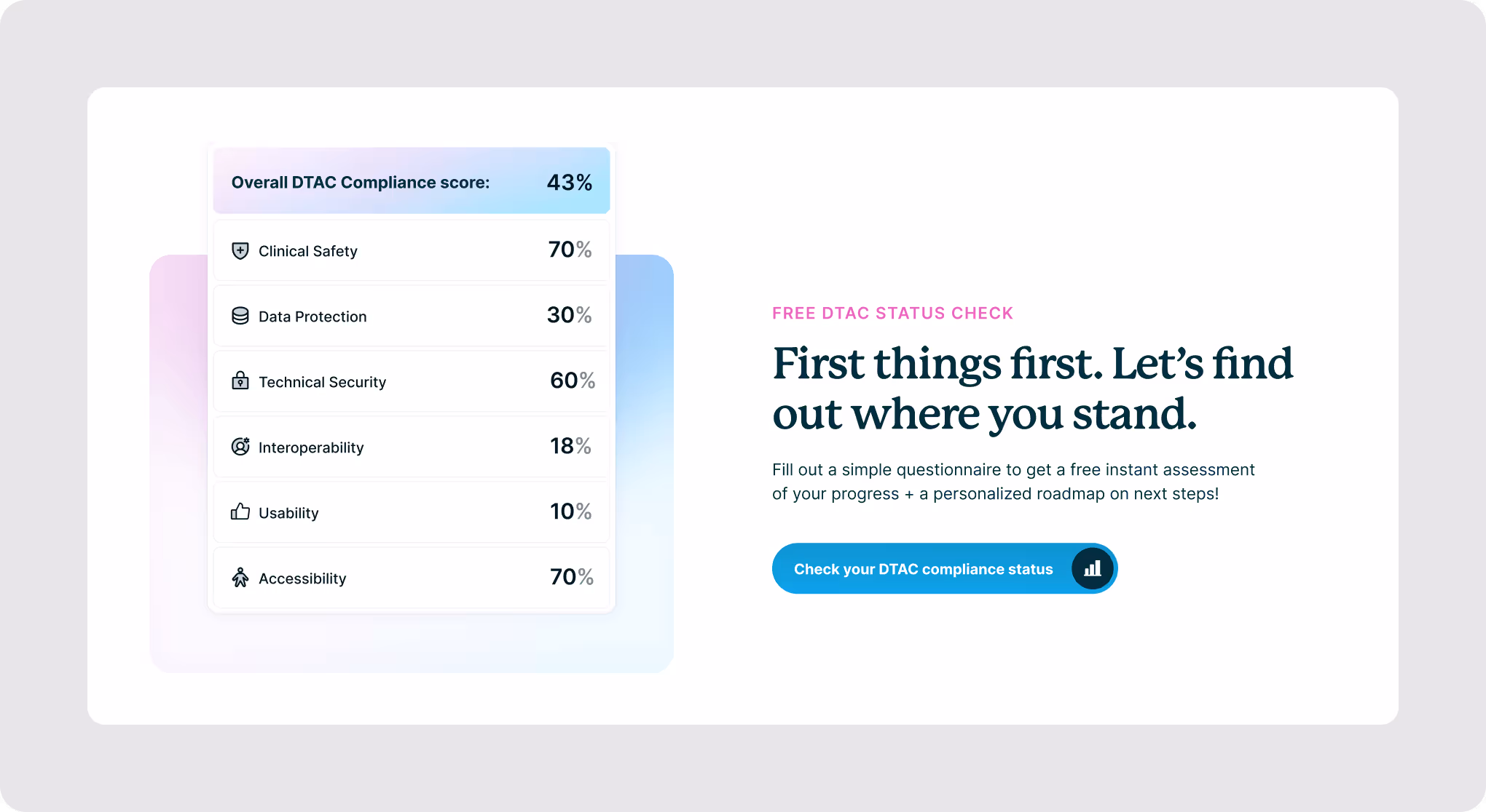
Impact: This instantly gave visitors a clear starting point, making them more engaged and receptive. It also helped us provide personalized value instantly (and collect visitor emails!).
Pitching Acorn as the perfect balance
Problem: We wanted to show that Acorn was
as hands-on as consultancies (while being more cost-effective)
faster and more organized than DIYs
more comprehensive than other tools
automated and AI-powered so >half your work was done-for-you
Conclusion: It was the best bits of all worlds.
Solution: On the product page, we added 4 sections tackling these capabilities without much frill.

We also added a section that explicitly called out that we helped users with ALL the DTAC modules. Not just a few.
Impact: This instantly gave visitors a clear starting point, making them more engaged and receptive. It also helped us provide personalized value instantly (and collect visitor emails!).
Creating the Learn page
Problem: The key problem we wanted to address was low awareness and overwhelm. Our audience was searching for answers: What is DTAC? How long does it take to get compliant? What modules does it include?
Solution: So, we created a dedicated Learn page.
This page broke down the entire DTAC compliance process in detail.
We also provided a range of resources, including blogs and webinar links, so visitors could continue learning about the DTAC process.
Problem: The key problem we wanted to address was low awareness and overwhelm. Our audience was searching for answers: What is DTAC? How long does it take to get compliant? What modules does it include?
Impact: This made it clear to prospects that compliance isn’t a one-time thing. We showed exactly how Acorn could help companies stay compliant as they scale and regulations evolve.
It also helped our audience find our site easily through Google and other search engines. We could direct our more low-awareness audiences to this page instead of selling them on the product straightaway.
Humanizing the company
Problem: Acorn’s old website wasn’t connecting with the visitors because the personal story behind Acorn was lost.
Solution: We created the About Us page for visitors who want to know more about the people behind Acorn.
Given that the DTAC compliance journey can be long and complex, choosing a partner requires trust, and that trust starts with understanding who you’re working with.

Impact: It showed visitors that Acorn is more than just a solution; they’re a team of real people ready to guide them through every step of the compliance process.
Copy that matches the brand tone
Problem: SaaS websites often sound the same, with copy that lacks a personality. Acorn’s unique brand voice didn’t come through on their website, and this made it difficult for them to distinguish themselves.
Solution: We ensured the copy aligned with Acorn’s approachable, informative and non-salesy tone. We focused on maintaining fun and light language to avoid overwhelming the visitor.
We focused on maintaining fun and light language to avoid overwhelming the visitor.

Impact: We were speaking to people who were already confused and swamped with building a new company. The friendly and educational tone helped make the website a value-packet yet peaceful place to be.
Retaining Acorn’s Consultancy Services
Problem: Acorn was shifting towards a product-led model, but many prospects still wanted consulting support rather than just software.
Solution: We included a dedicated Consulting Services section on the homepage. This reassured visitors that Acorn could provide expert guidance even if they weren’t ready to commit to the full platform.
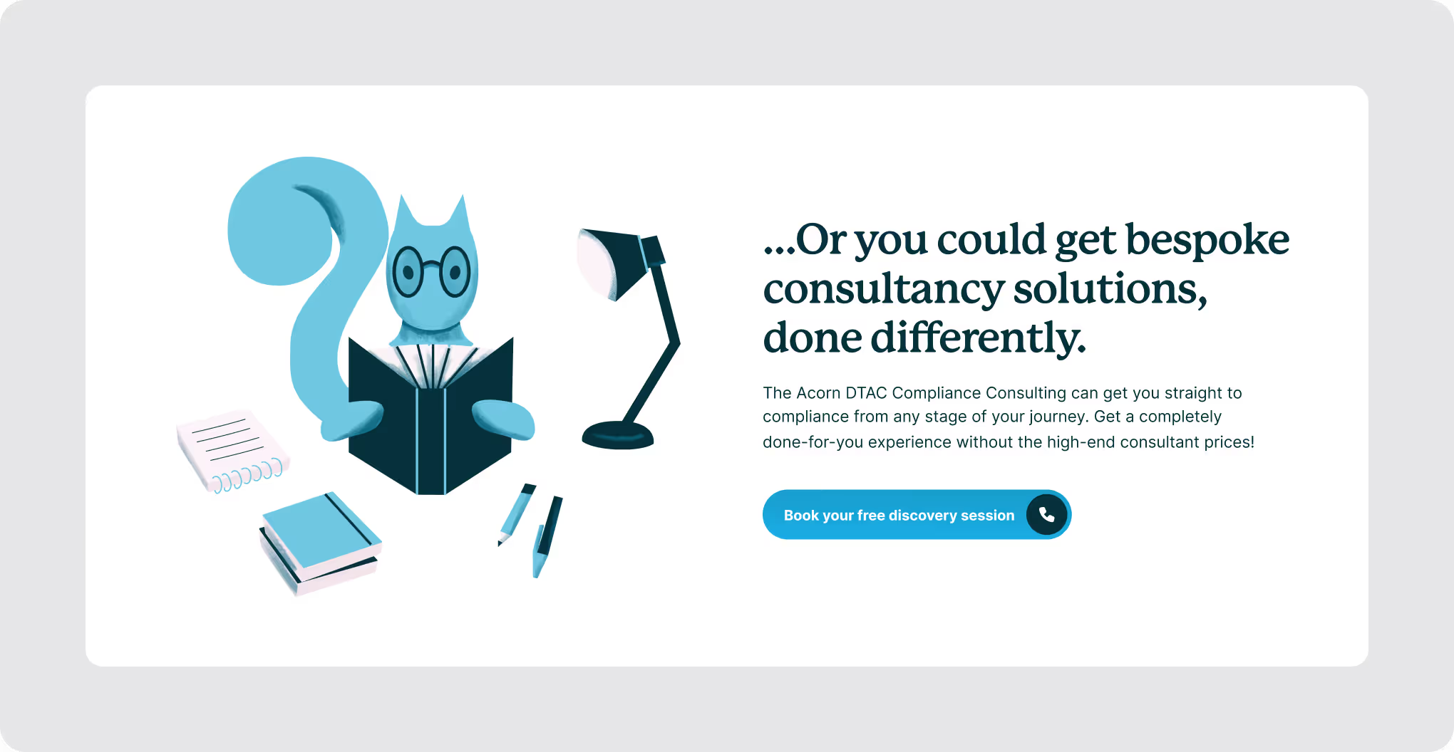
Impact: This ensured Acorn didn’t lose high-intent prospects looking for hands-on expertise, keeping both software and consulting pathways open.

Design
Acorn’s redesign wasn’t just aesthetics—it was enhancing usability, strengthening brand recognition, and creating a more engaging digital experience.
The design brief emphasized maintaining the beloved DTAC Squirrel while elevating the overall brand presence and UX.

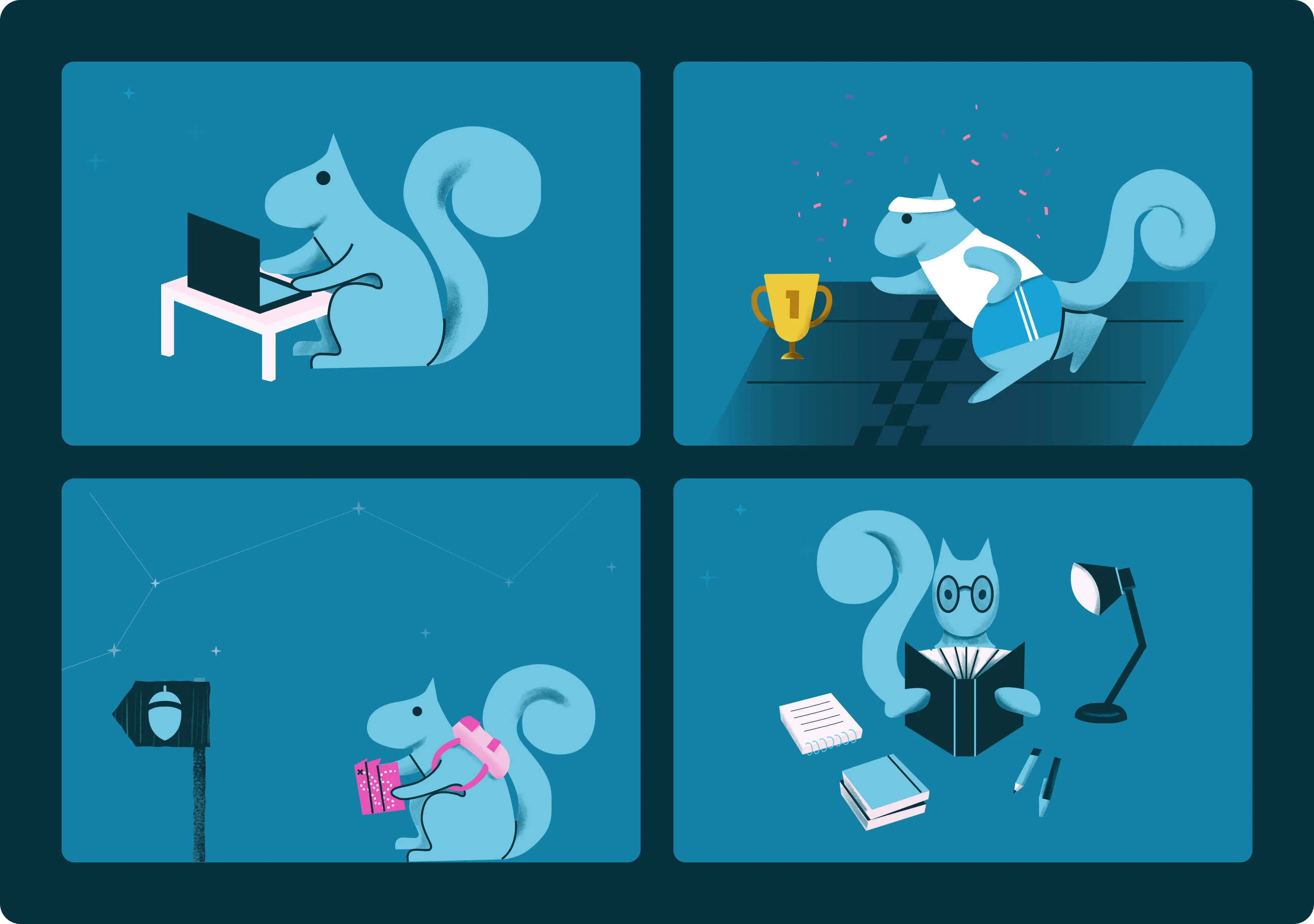
Mascot-Driven Visual Identity
Acorn’s original squirrel logo had strong brand equity, but it lacked presence.
Our solution: fully bring the mascot to life. We designed a series of custom illustrations, incorporating the squirrel across the website to build a cohesive, recognizable brand personality. This created a unique storytelling element, making Acorn more memorable and engaging.

A Playful Yet Functional Design Language
Illustrations & Custom Icons: Beyond the mascot, we developed additional illustrations and icons to maintain visual consistency.
Shapes & Layout: A mix of soft organic shapes and structured elements added visual interest.
Light, Airy Color Palette: We opted for light-based, natural colors to contrast with competitors’ darker, bolder schemes.

Typography for Clarity & Personality
We combined P22 Mackinac Pro (serif) for headings—adding warmth and personality—with Inter (sans-serif) for body text, ensuring readability and a clean, modern aesthetic.

Strategic Use of Color
Building from Acron’s primary brand color, we expanded into a monochromatic palette, adding pops of pink and magenta for emphasis. These highlights strategically draw attention to key sections like CTAs and important messaging, ensuring critical information stands out.

User Experience & Navigation
The redesign simplified navigation, making key pages easily accessible.
Clear CTAs guide users through the journey, ensuring intuitive interactions.
Performance optimizations—including faster load times and lightweight assets—kept the experience seamless

Challenges & Iterations
The biggest challenge was Refining the mascot. Balancing fun and professionalism took multiple iterations to get the right expression and posture.
Additionally, crafting a color palette that was unique yet brand-aligned pushed us to experiment with new combinations.

Final Impact
By fully embracing the squirrel mascot, refining the color strategy, and prioritizing usability,
Acron’s website now offers a more engaging, user-friendly, and visually distinctive experience.
Problem: We wanted to show that Acorn was
The team at Beetle Beetle is brilliant and creative.
They are great at listening and understanding your requirements.
They are flexible and super open to change.

The new website was crafted to firmly capture the market's attention and showcase Acorn's true essence and purpose. The impact was noticeable:
An uncluttered visitor journey: With clear, readable, and skimmable copy, we ensured the user experience remained smooth, avoiding heavy text or jargon that could hinder engagement.
A whole lot of clarity: We crafted messaging that effectively conveys Acorn’s value and offerings while maintaining simplicity and clarity.


417%

82%

207%

230%

125%

122%

74%

60%

60%
158%
25%