.avif)
We didn’t engage with any other agencies. I don’t want to benchmark when I have a crush. I knew I had to work with Beetle Beetle.
.avif)
MailReach
Company Size
1-10
Funding
Seed
Industry
Email, Email Marketing, SaaS
MailReach is an email deliverability solution that helps businesses improve the results of their email campaigns.
Services we provided
Messaging research
Website structure and copywriting
Brand exploration and art direction
Website design
Custom product visuals design
Webflow website development
%20(1).webp)
.webp)
Challenge
Outdated design: The site was bland, outdated, and lacked the spark to stand out from other email tools.
Lack of differentiators: Visitors didn’t understand what made our tool better than the (often, much cheaper) competition.
Unclear product bundling: MailReach had two products: an email warmer and a spam checker. Visitors weren’t sure how they fit in together.
Untargeted messaging: It spoke to no one in particular: too vague for experts, too confusing for beginners.
Solution
Clear differentiation: Laser-focused messaging on email deliverability, standing out from “all-in-one” tools trying to do it all.
Clear product explanation: Highlighted the email warmer and spam checker as distinct, must-have tools for specific needs.
Balanced messaging: Struck the perfect balance—direct and smart enough for the pros, simple enough for newbies.
Modernized design: A sleek, modern design with punchy copy that ditched the cookie-cutter vibe.
Clear user path: Made it effortless for visitors to see the value and take action fast.
Results
Stronger brand identity: The new design reflected MailReach’s strengths and personality while making the value proposition impossible to miss.
Competitive edge: We helped MailReach make a case for ‘Why us and Not them’ with standout design and sharp, user-focused messaging.
Improved conversions: The site turned converted more browsers into customers because the site was more convincing and easy to use.
Future-ready: Built to grow—we gave them a site that is easy to edit and scale as MailReach grows.
.avif)
%20(1).avif)
%20(1).avif)
“You’re great at design and copy, it was super satisfying to discover your creations and what you came up with on the copy and design.”

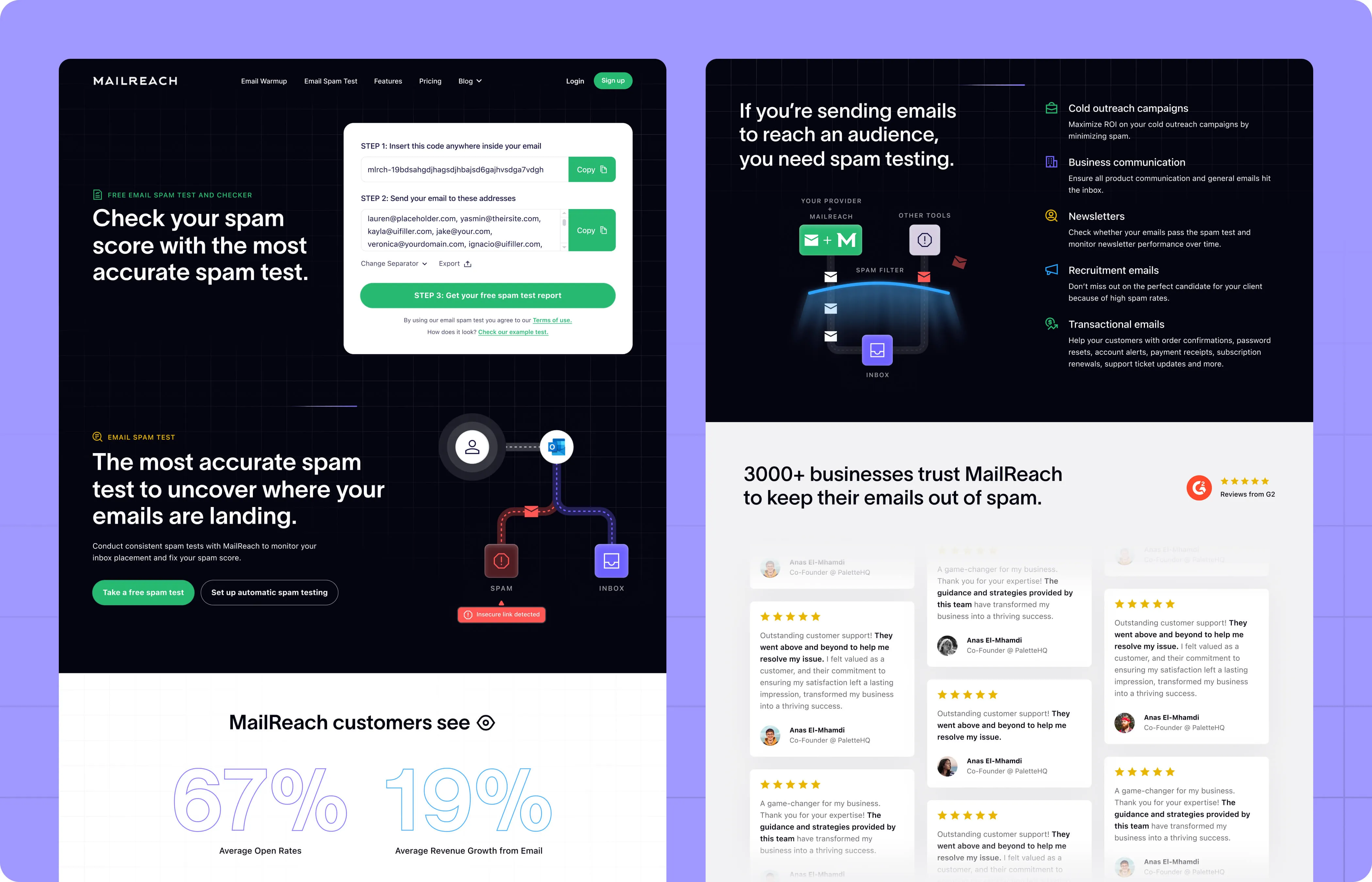
MailReach helps growth marketers and CEOs ensure their email campaigns land in the inbox, not in spam.
Here’s how they do it
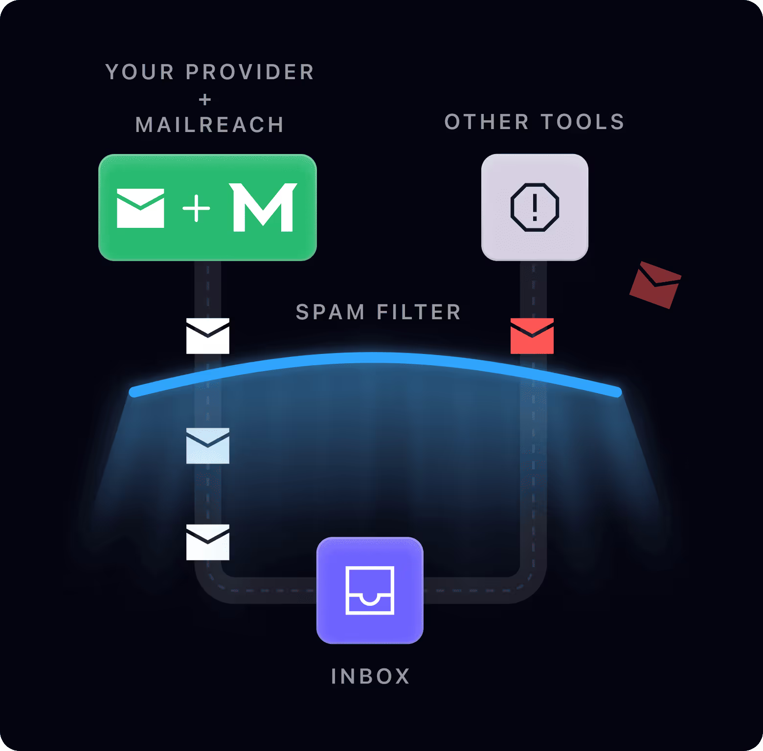
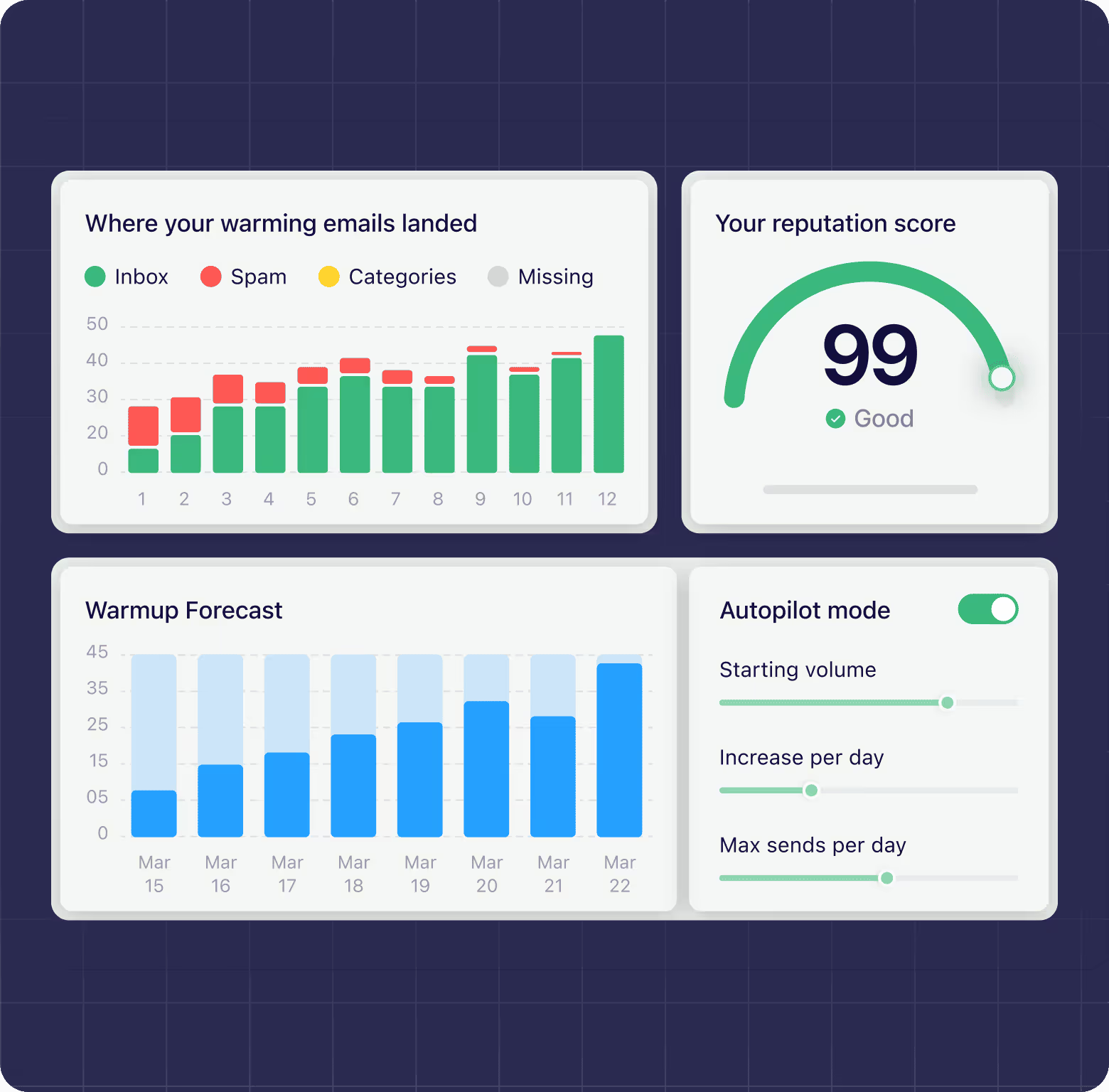
Email Warmer: Rehabilitates your sender reputation by simulating real email engagement—opening, replying, and moving messages—to signal inbox providers that your emails are trustworthy and belong in the inbox.
Spam Checker: Diagnoses deliverability issues before they derail campaigns, ensuring emails reach the right place every time.
They help businesses get through restrictive spam filters, connect with their audiences, and grow without any hurdles to their cold outreach.

MailReach was solving a critical problem for a niche market of SMBs, particularly CEOs and growth marketers who depend on B2B cold outreach.
Their tools were powerful, their reputation solid, and their potential audience vast. So why weren’t more people signing up?
The website was the obvious culprit.
It was ugly, outdated, too neutral, without personality and didn’t differentiate MailReach from our competitors.
A top quality product lost in a crowded market
MailReach showed us a very clear, no-nonsense Excel Sheet of what made their product better than the other tools in the market.
But visitors never saw this list—and were not educated enough to know the difference between effective email warming and poor email warming. Lots of features competitors offered sounded good in marketing, but weren’t making a difference in reality.
We needed to speak up and tell them why our email deliverability practices were superior.
A design from the dark ages
While MailReach’s tools were cutting-edge, their website looked like it had time-traveled from the early 2010s.
For a company solving modern email problems, this visual disconnect didn’t inspire confidence.
Hogde-podge awareness levels
Some visitors to the website arrived fully aware of their problem and ready to solve it.
Others didn’t even know what “email warming” was.
The old website treated every visitor the same, failing to cater to these vastly different levels of awareness.
An educational gap
Many prospects didn’t fully understand their needs, defaulting to all-in-one tools like Instantly as a safe bet.
The old messaging failed to educate them on why specialized solutions like MailReach were better for deliverability and warming. And why it mattered so much.
And in a world where first impressions are everything, this disconnect was costing them leads, customers, and growth.
Fixing the website wasn't just about aesthetics. It was about communicating the full value of MailReach's tools.
Here’s what needed to happen:
.avif)
.avif)
%20(1).avif)
%20(1).avif)
You deliver excellent results. Working with you is a pleasure and is not too time consuming. The ROI is almost guaranteed.

Copywriting
Research and Messaging: Who, what, why
Our process began with analyzing their current messaging and digging into customer pain points. We also took a close look at their competitors to spot key gaps.
From there, we collaborated with the MailReach team in a messaging workshop to clearly define their value proposition as the expert in email deliverability.
This deep dive wasn’t just about the website—it set the tone for how MailReach would communicate across all future channels.
Crafting an engaging hook: Get them to stay
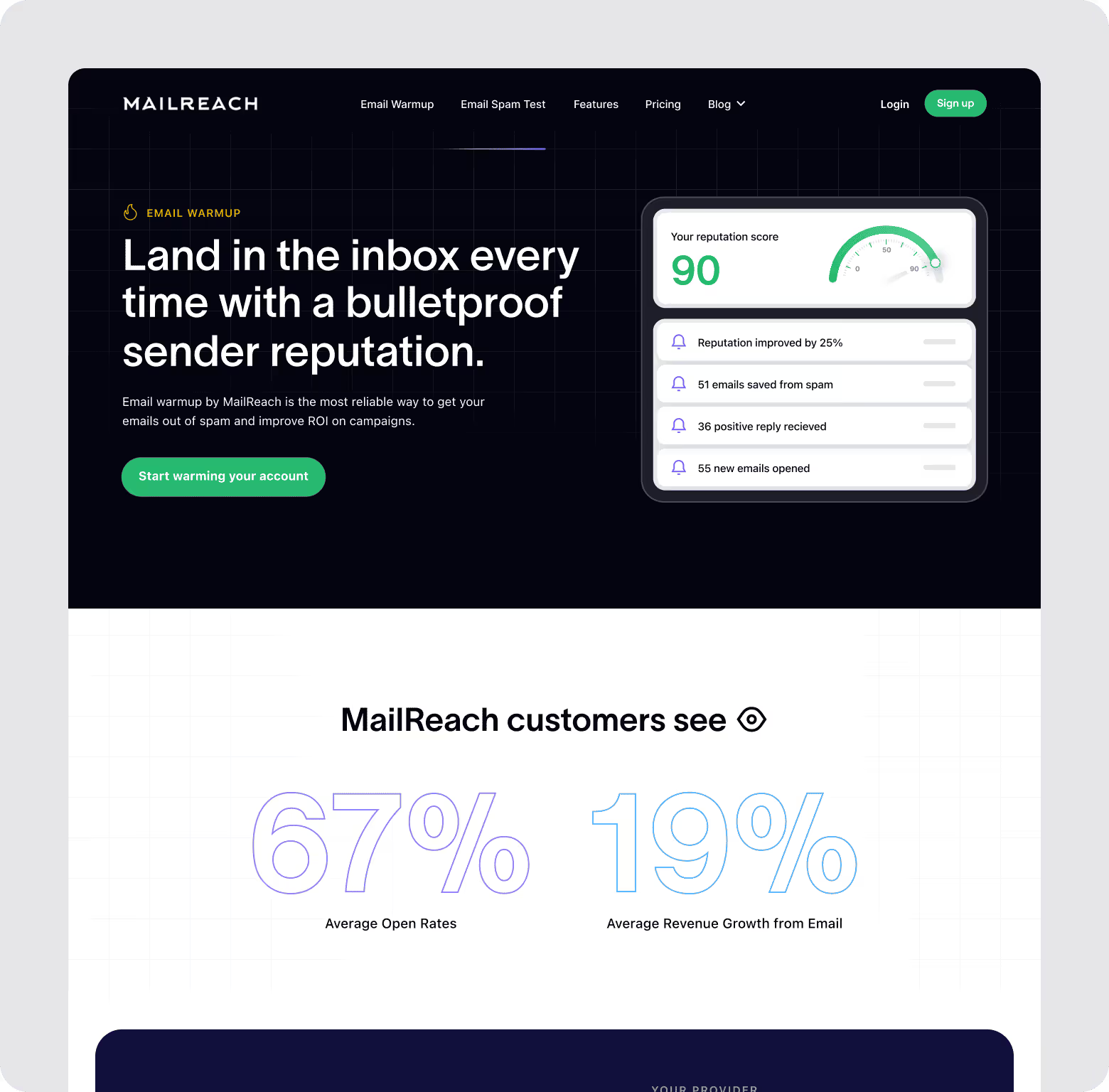
The homepage needed a clear, value-driven hook to immediately convey MailReach’s need.
Problem: MailReach’s old homepage lacked a clear, concise hook, causing visitors to leave without understanding what the product did or what it was.
Solution: Write a headline that immediately addressed what MailReach was, who it was for, and why it mattered.
Impact: Visitors could now quickly understand MailReach’s purpose, leading to improved engagement and reducing bounce rates from the homepage.
.avif)
Differentiating the product with clear value
Highlighting MailReach’s unique value was crucial in a crowded market of email tools.
Problem: Prospects didn’t understand why a specialized tool like MailReach was better than “all-in-one” platforms.
Solution: We introduced a “Why MailReach” section to clearly outline the benefits of a specialized focus on email deliverability. This section emphasized how expertise in email warming and spam testing delivered superior results.
Impact: Visitors became more informed and confident in MailReach’s value, making it easier for them to choose MailReach over less focused alternatives.
%20(1).avif)
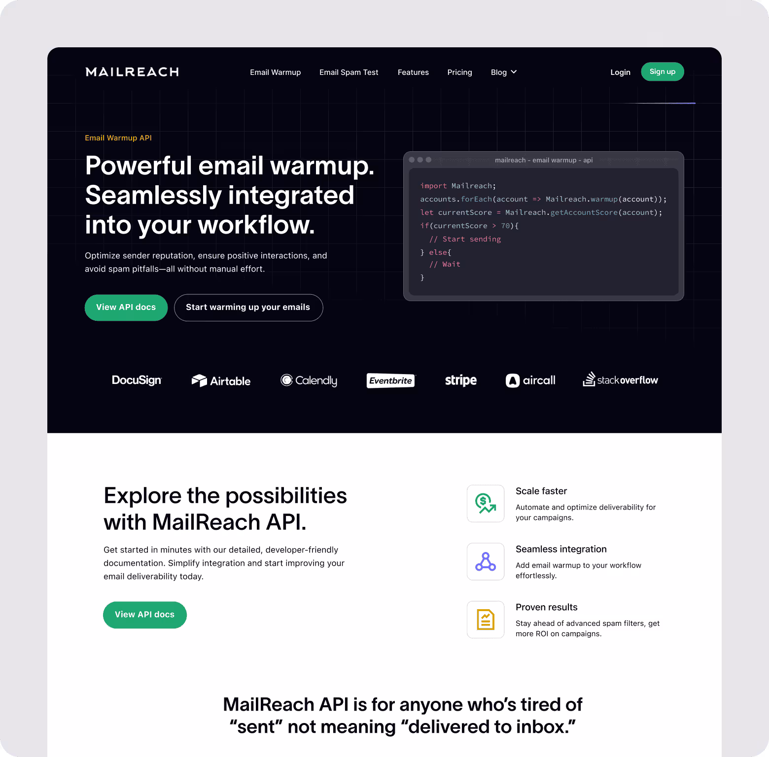
Simplifying the homepage while adding information.
Balancing a light homepage with education can be challenging on a homepage.
Problem: The old homepage was cluttered and overwhelmed visitors, while missing details deterred high-intent users.
Solution: We streamlined the homepage to focus on high-level messaging and created detailed product pages for MailReach’s tools, including email warming and spam testing.
These pages offered deeper insights into how each feature worked and addressed specific user pain points.
Impact: This approach kept the homepage clean and conversion-focused while catering to users needing in-depth information with product pages.
%20(1).avif)
%20(1).avif)
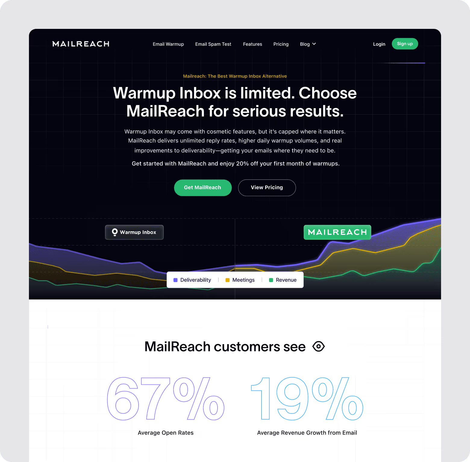
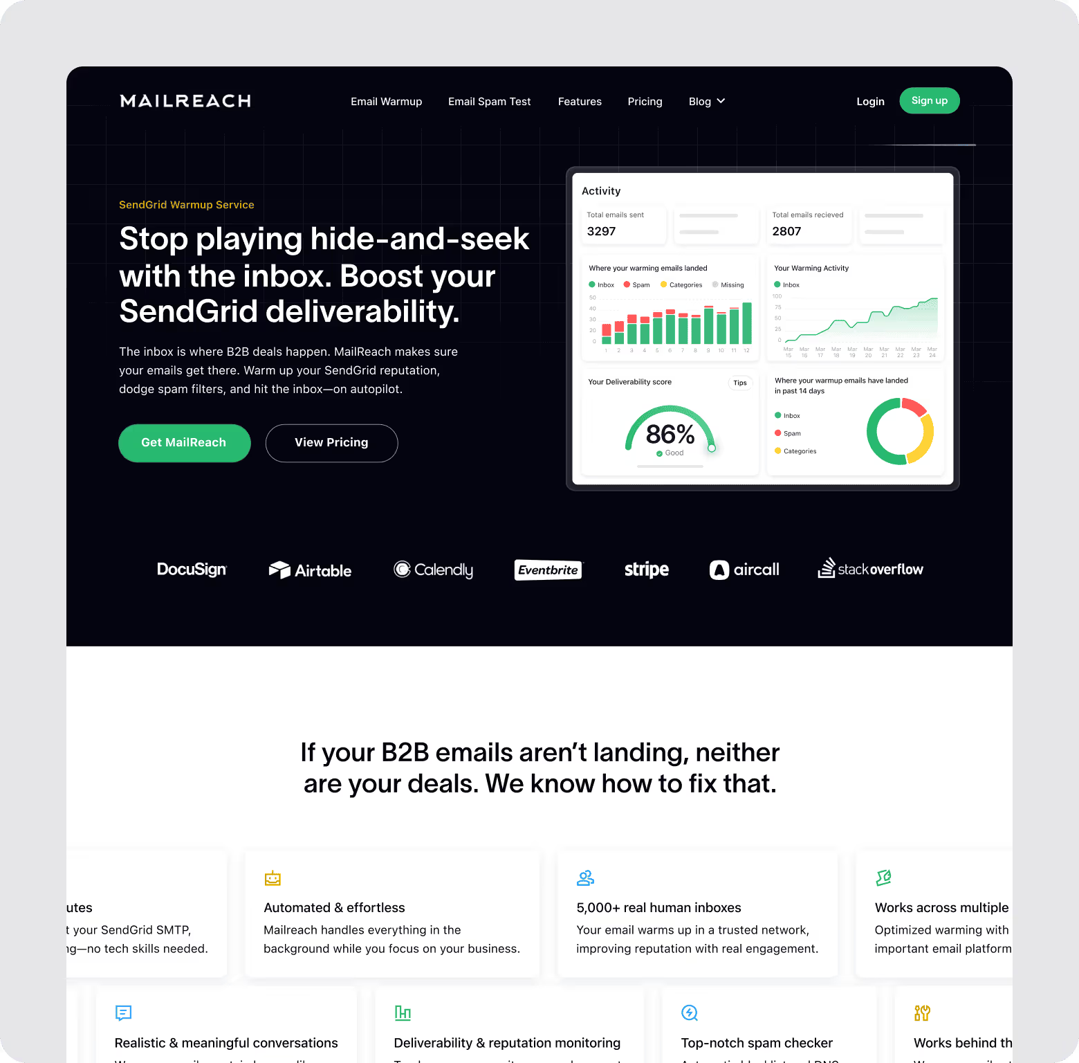
Helping prospects compare with a competitors page
Prospects in the decision phase need transparency to choose confidently.
Problem: MailReach’s site lacked a comparison page, forcing visitors to guess how it stacked up against competitors.
Solution: We created a detailed competitors page that went beyond surface-level comparisons. Instead of just listing features, we explained how MailReach’s approach to email warming and spam testing was fundamentally better—and why that difference mattered for deliverability.
And convey why MailReach was better than any direct email warming or spam checker competitors as well.
Impact: This detailed comparison did more than just inform—it positioned MailReach as the obvious expert choice. Prospects understood not only what MailReach did but also how it solved their challenges better than anyone else.
By addressing competitor weaknesses head-on, we increased trust, engagement, and conversions among decision-stage visitors.
%20(1).avif)
Establishing a brand tone that connects
SaaS websites often sound interchangeable, filled with jargon and lifeless copy that fails to connect with users.
Problem: MailReach’s old copy lacked personality and felt interchangeable with competitors’ generic SaaS language.
Solution: We created copy in a conversational yet authoritative tone that highlighted MailReach’s expertise. We kept it balanced keeping it accessible to both tech-savvy users and non-technical marketers.
Impact: The new tone made MailReach more relatable and memorable, fostering trust and connection with visitors.
In a crowded market, we knew it wasn’t enough to simply list features. We needed to address all concerns, differentiate MailReach clearly, and make the buying decision as straightforward as possible.
The result was a compelling, easy-to-navigate website that made a strong case for MailReach as the best email deliverability solution available.
.avif)
.avif)
.avif)
.avif)
.avif)
.avif)
.avif)
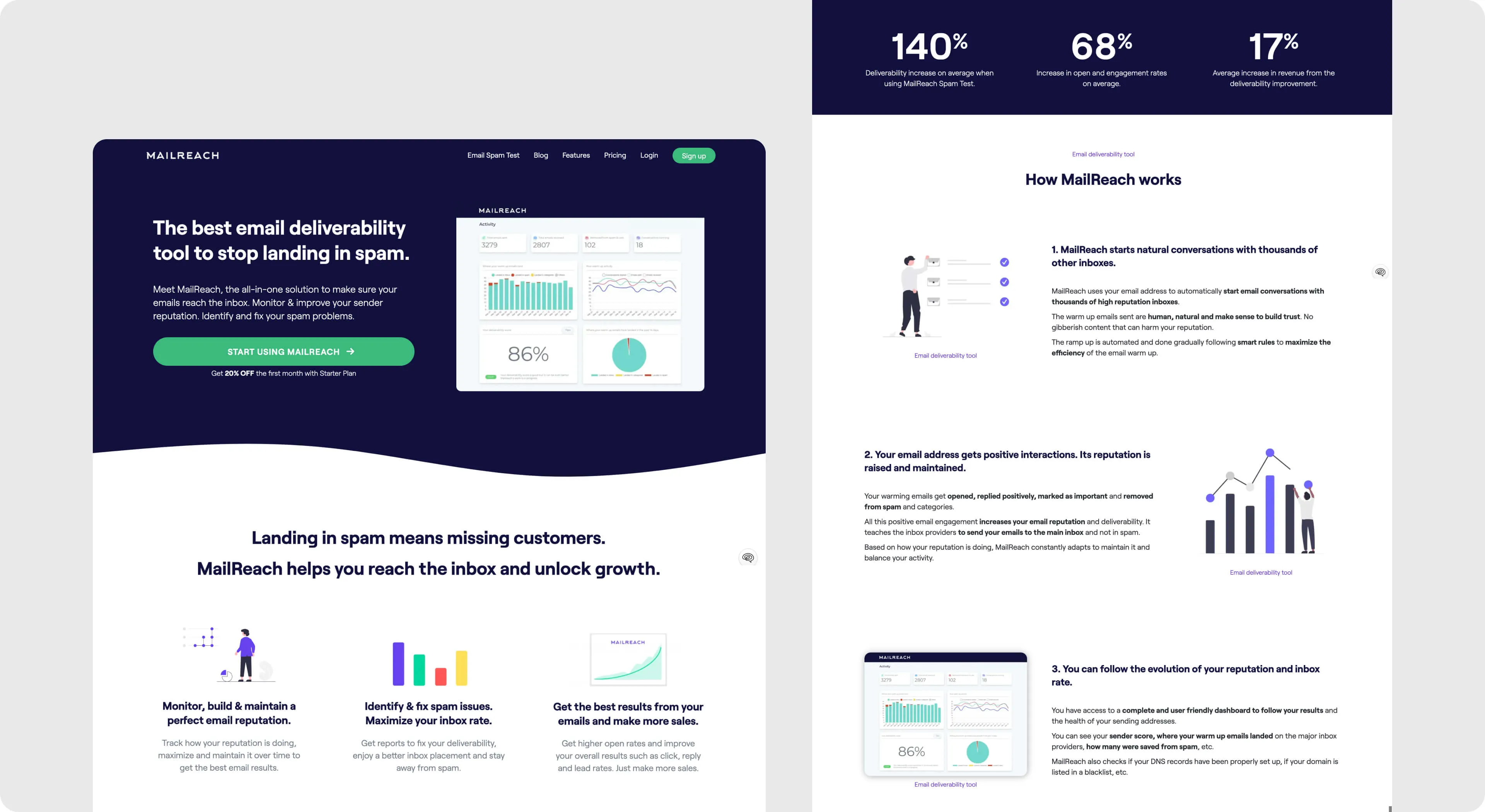
Design
MailReach’s design brief guided us in creating a visually appealing and functional website that reflects its no-nonsense, premium positioning while remaining user-friendly.
The aim was to balance clean, modern design with high-quality visuals and a compelling user experience.
Here’s how we approached the design for MailReach’s new website
.avif)
Color and Visual Elements
MailReach’s color palette includes a dark blue (#11103C) for a premium feel, complemented by a range of lighter backgrounds.
%20(1).avif)
Typography
We retained the Roobert font for its modern and elegant appearance. Our goal was to maintain readability while giving the site a fresh, sophisticated feel.
%20(1).avif)
User Experience:
The website's layout was crafted to clearly communicate MailReach’s core offerings—email warming and spam testing—through easy-to-digest sections. The main visuals include Product UI inspired graphics to show what the users will be dealing with and make the product seem more approachable.
%20(1).avif)
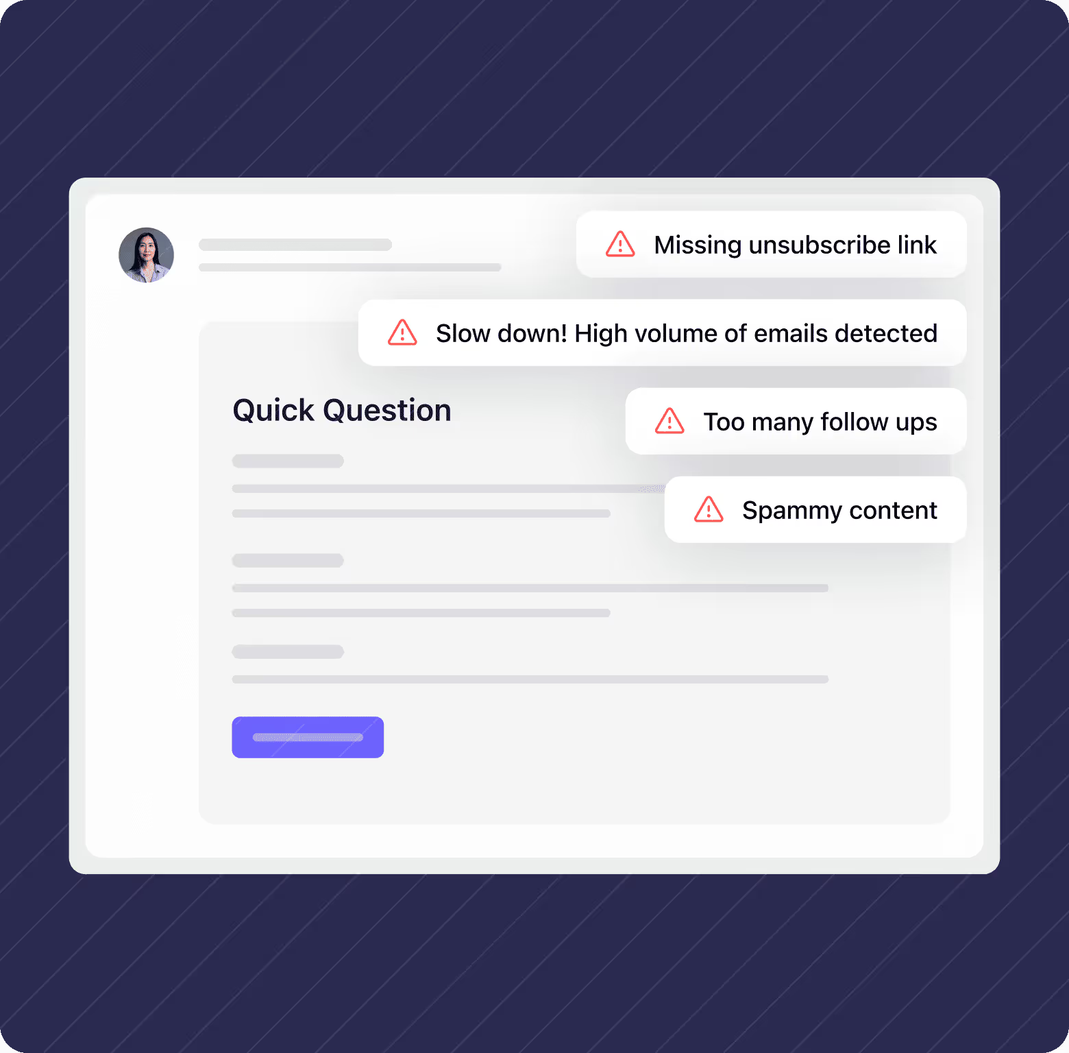
Visual Strategy:
Custom animations and visuals explain MailReach’s unique features and advantages in a straightforward manner. For instance, animations on the homepage illustrate how much further you can get with MailReach’s tools compared to other tools.
.webp)
Overall, the design maintains a high-quality, professional appearance while being accessible and easy to navigate, providing a strong foundation for future expansions and updates.
Development
MailReach’s website presented some unique challenges, especially with a focus on maintaining lightning-fast loading times.
Here’s how we tackled the build
Our design and development teams worked closely together and made these elements not only visually appealing but also optimized for quick loading, crucial for user experience.
We provided MailReach with a comprehensive style guide so that they could easily update the site as needed. This guide made the handover process smooth and allowed the team to maintain the site’s performance standards over time.
After the handover, we implemented additional feedback and provided support for any bugs that appeared on the live site, ensuring everything was polished and functioning at optimal speed.


MailReach sharing their thoughts on working with us
“Working with you is a pleasure and is not too time consuming.”
.avif)
%20(1).avif)

Here’s what stood out to them the most
“That’s great and immediately shows you’re experts, know your stuff, take care of offering a great customer experience. And that confirms you’re good at design.”
“The communication was very fluid with everyone on the team on Slack. Each member has his specialty, no fluff talking, to the point. You care to add tutorials to help save time, etc.”
“You always suggest several options / alternatives which is great, we have the choice and that saves time going back and forth.”
“You’re great at design and copy, most of the time, it was super satisfying to discover your creations and what you came up with on the copy and design.”
%20(1).webp)
When the new MailReach site went live, the impact was undeniable.
.avif)
A Clear Identity
The new design and copy finally captured MailReach’s unique personality and value proposition, ensuring visitors immediately understood what set it apart from competitors.

Big Wins in Conversions
Our conversion rate per session increased by 60%, and per user by 82%. That’s absolutely great.

A Design That Delivers
What was once described as “ugly” and “outdated” is now an attractive, premium, and super-convincing website that not only draws attention but converts interest into action.

%20(1).avif)