.avif)
“We buy SaaS for a living so we see a lot of websites every day, I’m pretty confident that our site would be in the top 5% of all SaaS websites in the world. If you’re a SaaS company, you’re probably leaving a lot of money on the table by not hiring them. These guys are the best when it comes to SaaS website, don’t even bother looking anywhere else. If you can afford the best, then hire them asap.”
%20(1).webp)
Spendflo
A SaaS procurement and renewal solution dedicated to helping businesses negotiate, buy, and renew their SaaS tools.
Services we provided
Messaging research
Website structure and copywriting
Brand exploration and art direction
Website and landing page design
Custom product visuals design
Webflow website development

Challenge
Low-awareness: Spendflo was struggling to convey their value to visitors who didn’t understand the need for or value of such a product.
New market category: Fostering trust was difficult because visitors had little context on the category.
Overcome resistance: Convincing companies to adopt a completely new procurement system was going to be difficult.
Solution
With extensive research, we wrote, designed, and built a website that
Helped visitors pinpoint the specific problems they faced
Introduced them to Spendflo’s most impressive features as solutions to their procurement woes
Preempted most objections reported by the sales and customer success teams


Results
A sleek new website that other SaaS products use as a benchmark for great copy and design.

“I am really excited about the new website— it looks like no other site in the SaaS world right now. It has a unique personality of its own that matches our brand. I’ve seen people use our site as a benchmark for messaging clarity and visual design, which makes us super proud as a team.”

Spendflo is a SaaS procurement platform that helps companies save up to 30% on their software spend. By centralizing SaaS buying, renewals, and compliance, it simplifies the process for procurement teams, finance, IT, and department heads.

Spendflo came to us when they started getting serious about their marketing.
Their old website wasn’t bad, it ticked all the boxes for a standard SaaS site. But their audience wasn’t standard.
The usual visitor was vaguely aware of SaaS sprawl, but rarely were they actively looking for a solution.
Even when Spendflo piqued their interest, the old site didn’t provide enough context or resources to win over all the decision-makers.
With stakeholders spread across organizations, Spendflo needed to speak to multiple personas.
Their website covered the basics but lacked depth.
The messaging needed to agitate the problem and establish the urgency of a solution. It never clearly showcased how Spendflo could help without relying on vague promises.

Here’s what the client had to say about why they chose us:
“We spoke to a lot of agencies but Beetle Beetle stood out because of their unique experience and expertise in B2B SaaS websites.”
.webp)

The new website needed to:
Educate visitors about the scale of SaaS mismanagement and its impact.
Showcase Spendflo’s product in a clear, outcome-focused narrative.
Provide resources for all stakeholders to build consensus.
Inspire trust and urgency through credibility, data, and a structured message.
They already had a functional site—the revamp was about turning curiosity into understanding and skepticism into buy-in.

“Working with Beetle Beetle helped us get a lot more clarity on our positioning and value props and it dictated all the sales and marketing material we worked on after. The research that they did was very thorough, they took the time to understand what we needed and came back with targeted deliverables. They also took ownership and drove the success of the project so we could free up our in-house team.”
Research to nail messaging
Our research included reading every sales, marketing, and product document they shared, and conducting our own research to understand the SaaS procurement space.
After that? A messaging workshop to get on the same page about who Spendflo’s customers are and exactly how the product fits into their lives.
This deep dive didn’t just inform the website—it shaped all future sales and marketing materials.
Creating a hook that sticks
A good hook doesn’t just try to get eyes, it needs to spark interest.
Problem: Spendflo’s star outcome—saving 30% on SaaS spend—felt too good to be true. We couldn’t risk visitors brushing it off as another big promise without substance.
Solution: We didn’t shy away from the number—instead, we tackled skepticism head-on.
The headline boldly stated: “Save up to 30% on SaaS stack” and we immediately backed it up with “or get your money back.”
Below that? Social proof galore, with testimonials and stats to seal the deal.
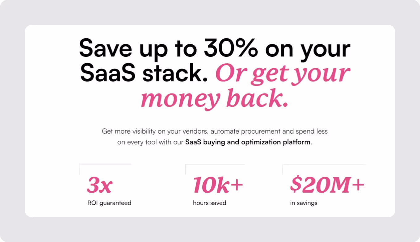
Impact: The bold claim no longer felt implausible. Instead, visitors stuck around to learn more rather than bounce off in disbelief.
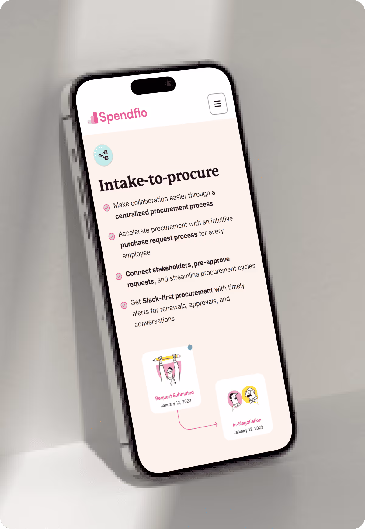
Addressing low visitor awareness
Problem: Many visitors weren’t aware that SaaS procurement was broken—or that there was a smarter way to do it. We needed to show them why Spendflo was needed at all.
Solution: We laid out a problem section right at the start to paint a clear, direct picture of what’s wrong with traditional SaaS procurement.
.webp)
From there, we naturally transitioned to Spendflo as the solution.
To reinforce this, we included a detailed features section, showing how visitors could save big and exactly why better SaaS procurement was needed.

Impact: This context-building turned Spendflo into a must-have rather than just a nice-to-have. Visitors left the page thinking, “we do need this.”
Tackling hesitation: Why now?
If visitors don’t see a reason to act now, they’ll move on because no decision is the easiest decision.
Problem: Even if visitors understood the problem and solution, we had to answer a lingering question: “Why should I act now?”
Solution: We pulled out all the stops—adding a savings calculator for tangible proof of ROI, an FAQ section to handle common concerns.
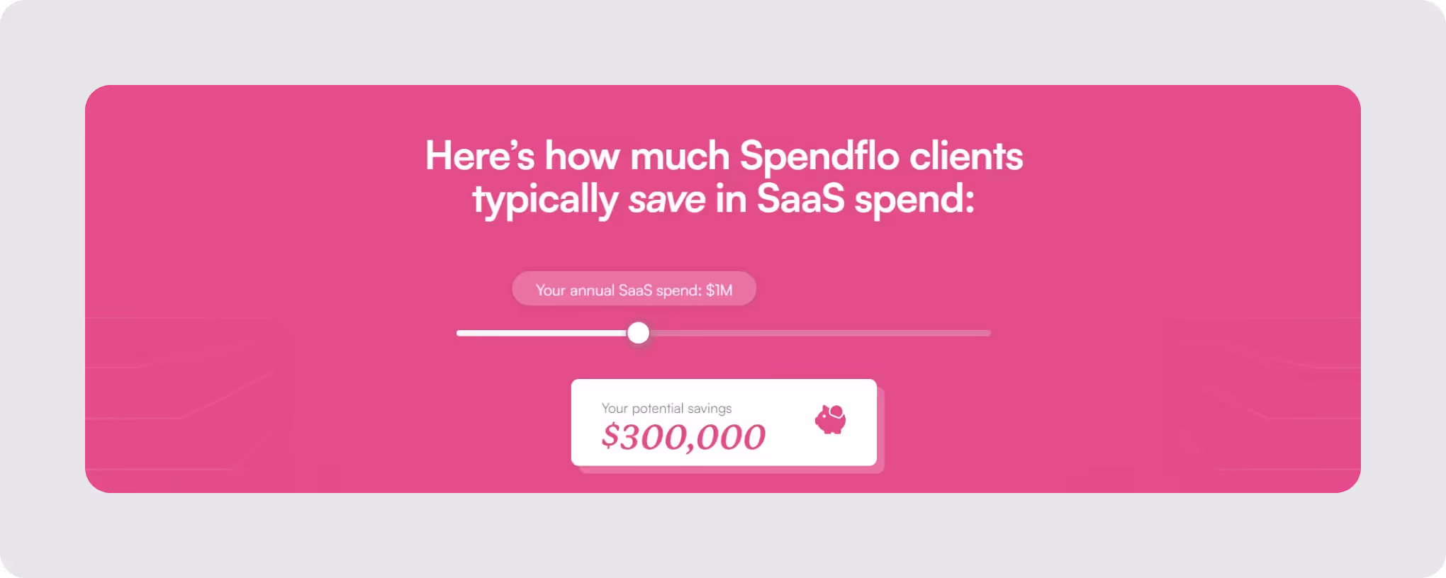
A clear How It Works section that demystified the process. The final CTA sweetened the deal with a free savings analysis.
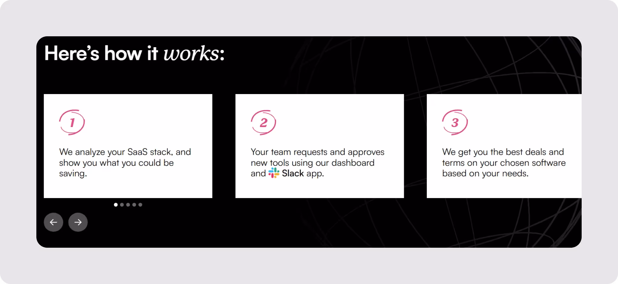
Impact: Visitors weren’t left with vague promises they had to trust on faith. They saw the numbers, understood the process, and felt confident about taking the next step.
%20(1).avif)
%20(1).avif)
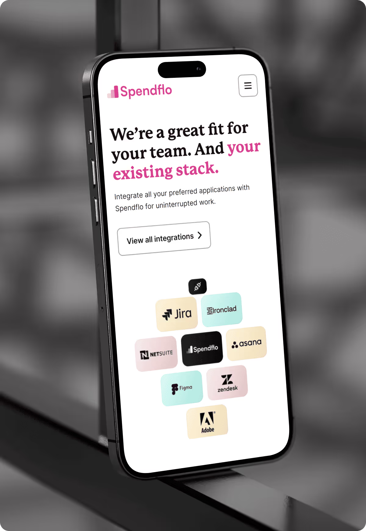
Speaking to every stakeholder with use cases and solution pages.
Big decisions don’t come from one person—especially when it comes to procurement.
Problem: SaaS procurement isn’t just one person’s job. Finance, IT & Security, and department heads all play a role—and Spendflo needed to speak to all of them.
Solution: We introduced a use case section on the homepage that clearly outlined what each stakeholder stood to gain.
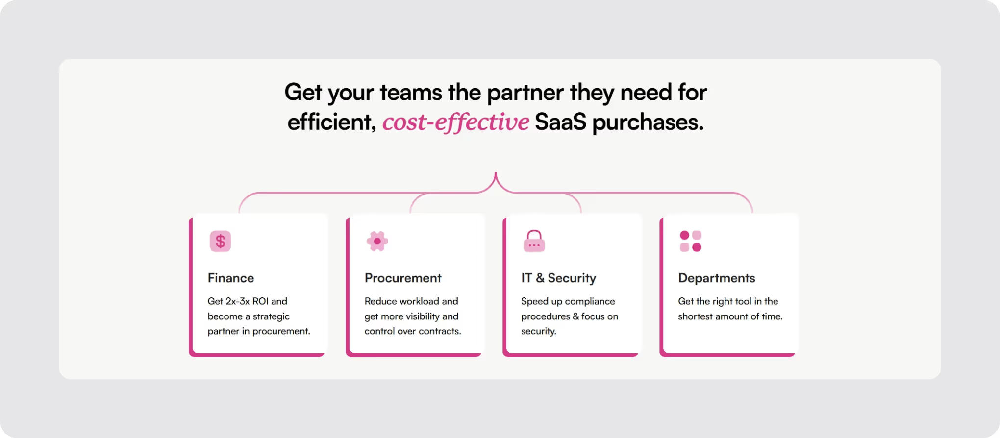
Then, we went further and created individual solution pages tailored to each persona. These pages tackled their specific pain points and highlighted the outcomes Spendflo delivers.

Impact: These pages became game-changers, making all stakeholders feel seen and understood. They clearly mapped Spendflo’s benefits to each team’s “jobs to be done.”
The pricing page: More than just numbers
Pricing pages aren’t just about cost—they’re about showing value.
Problem: A plain old pricing table wouldn’t cut it. This was a chance to convince high-intent visitors to convert.
Solution: We replaced the traditional pricing table with a calculator that demonstrated Spendflo’s flexible pricing and ROI. The page emphasized that Spendflo pays for itself, making the investment a no-brainer.

Impact: Visitors left the pricing page not just knowing what they’d pay, but also feeling assured it was worth every penny.
Giving the website personality
In a sea of bland SaaS websites, the goal was to stand out, not blend in.
We leaned into conversational, upbeat copy and a creative, personality-driven design. Jargon? Out. and in came skimmable, fun, and direct.
“I am really excited about the new website—it looks like no other site in the SaaS world right now. It has a unique personality of its own that matches our brand,” said the team.
Impact: “I’ve seen people use our site as a benchmark for messaging clarity and visual design, which makes us super proud as a team.”

Development
Spendflo was one of our favorite projects to develop.
Our process includes creating a style guide tailored to every project we work on, and we stick to it religiously. This makes it easy for our clients to update the website in future.
We created a CMS for the blogs and case studies so that the Spendflo team can easily add and transfer content.
We went with a custom build for the calculator and range slider because there was no way to do it natively on Webflow. We built it using HTML, CSS, and Javascript.
(We have a soft spot for interactive elements that make a serious impact.)
Handover was just as smooth and the Spendflo team continues to modify, manage, and maintain the website without any bugs or glitches, even a year later.

The end result was a website that helped distinguish and strengthen Spendflo’s brand identity, improved conversions, and is frequently featured on lists offering design inspo from the best SaaS websites in the world.

Spendflo’s team couldn’t have put it better:
“If you’re a SaaS company, you’re probably leaving a lot of money on the table by not hiring them. These guys are the best when it comes to SaaS websites—don’t even bother looking anywhere else. If you can afford the best, then hire them ASAP.”
With clarity on positioning, targeted messaging, and a unique, personality-packed design, Spendflo’s website isn’t just a plain old website—it’s a competitive edge.

“We also loved the transparency and communication throughout the project. Beetle Beetle was easy to work with, would regularly update us via Slack and ensured things were always moving forward. If you’re a SaaS company, you’re probably leaving a lot of money on the table by not hiring them. These guys are the best when it comes to SaaS websites, don’t even bother looking anywhere else.”
%20(1).avif)

417%

82%

207%

230%

125%

122%

74%

60%

60%
158%
25%