.avif)
“We wanted the new website to create strong visitor paths to our main conversion points. Beetle Beetle helped us do just that. Working with them felt like I had an entire marketing, design & dev team in-house. We’ve gotten amazing feedback from prospects on the new site. Whoever said ‘Good, fast, and affordable...you can only have two’ never worked with them.”

Close
Customers
High-speed salespeople and tech-savvy companies who need to scale.
Headquarters
San Francisco, USA
Industry
SaaS
Company Size
50-100
Funding
Seed

An all-in-one CRM for startups and small businesses with built-in sales communication tools.
Services we provided
Brand exploration and art direction
Website and landing page design
Custom product visuals design
Webflow website development


Challenge
Blending in, not standing out: The old site played it way too safe—generic, forgettable, and just another SaaS website in a sea of sameness.
Updating was a nightmare: Hardcoded in HTML/CSS, which meant even the tiniest change required wrangling with code. No one on the marketing team had time for that.
Too many screenshots, not enough story: Product visuals were everywhere, but they didn’t clearly communicate the value. Visitors had to connect the dots themselves—and they weren’t sticking around to do it.
Inconsistent design: Some pages felt modern, others felt… not. A scattered experience that didn’t do Close any favors.
Solution
We gave Close a complete digital makeover that was:
Bold, confident, and impossible to ignore: A striking new look that actually differentiates them in the market. No more vanilla.
Built for speed (and sanity): A flexible CMS that lets the marketing team make updates without breaking into a cold sweat. No more HTML handcuffs.
Clear, compelling, conversion-focused: Simplified visuals and messaging that make Close’s value crystal clear—no guesswork required.
Consistent and cohesive: A streamlined design system that makes every page feel like it belongs.


Results
A website that finally matches Close’s personality: Bold, opinionated, and built to stand out.
A marketing team free from coding purgatory: Updates are now fast, easy, and anyone can do them.
Stronger conversion paths: Clearer design narrative and optimized flows guiding visitors straight to signups and trials.
A site that grows with them: Scalable, flexible, and ready for whatever comes next.
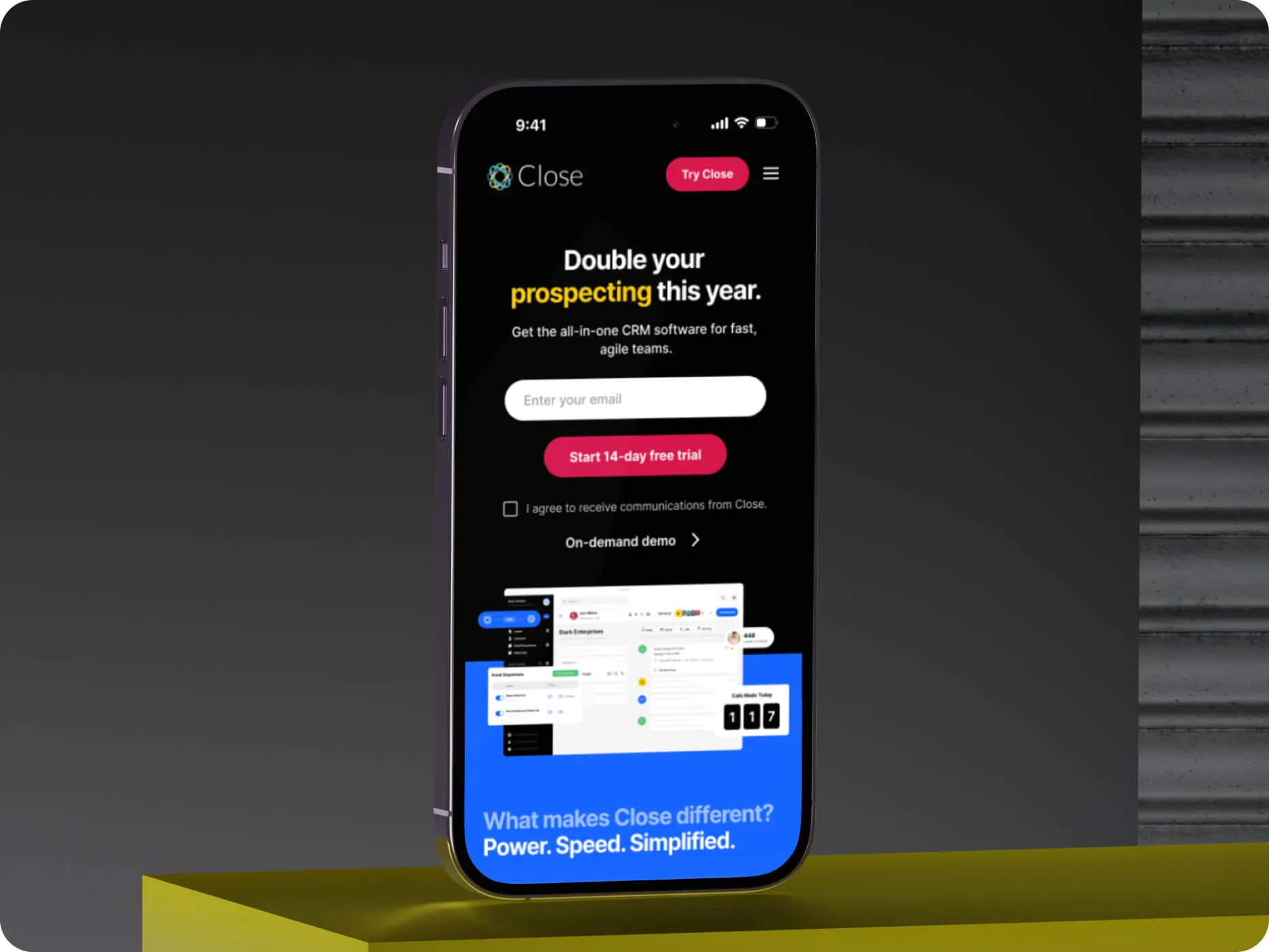
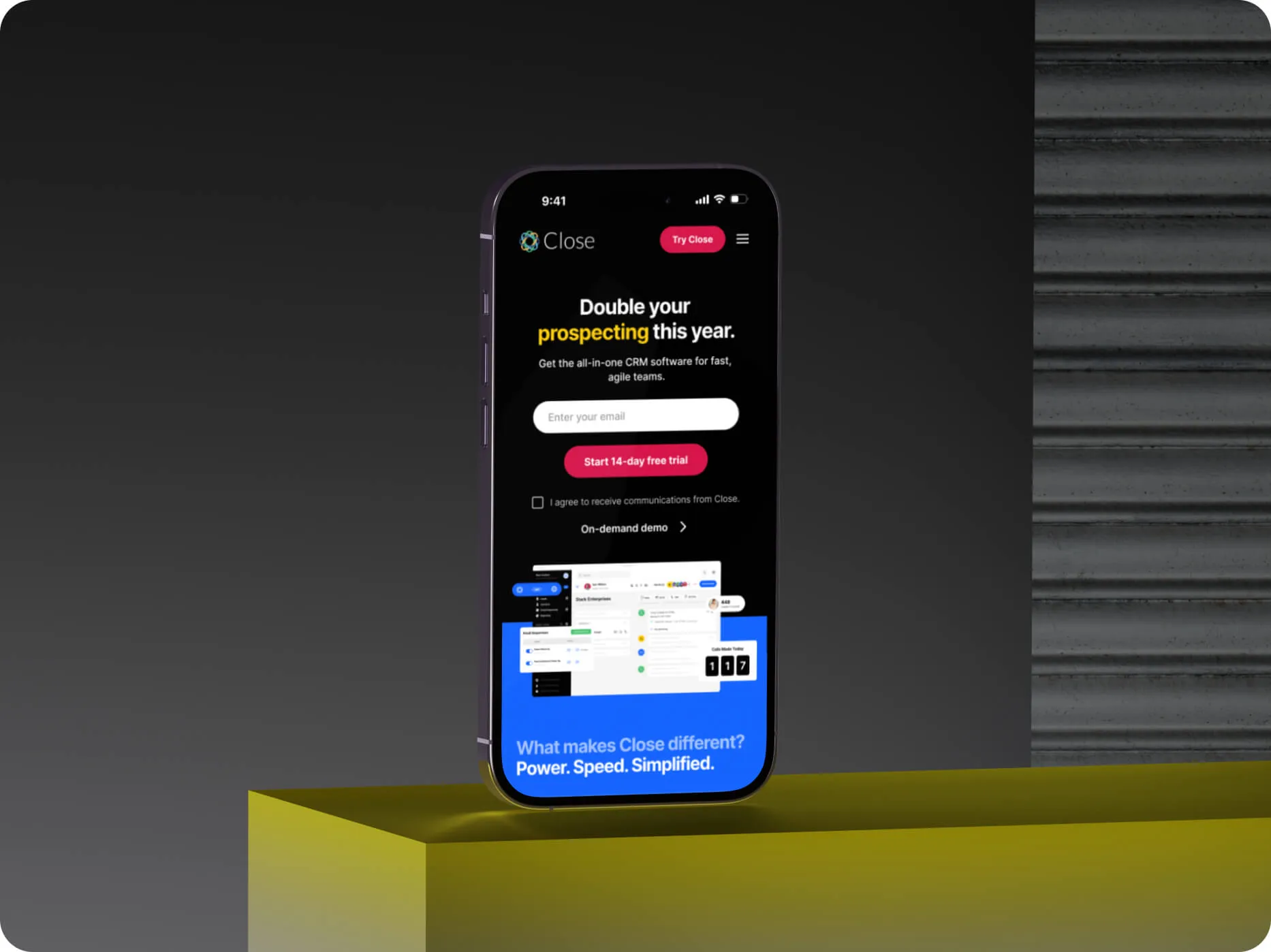
Close wanted a website that felt powerful and effortless. Now they have one.

“Our entire team is ecstatic. The website represents who we are as a product and company, and where we want to go in the future. We’ve gotten feedback from both customers and prospects alike that they absolutely love our website — saying things like it’s “bold, confident, fresh”....which is exactly what we were going for when we set out on this project.”


Close is the all-in-one CRM for growing teams.
Their customers are SMBs, startups, and tech-savvy companies who need to turn leads into revenue and scale.
Helping make sales as efficient as possible, Close helps you engage and communicate with your leads via text, email, or phone — all without add-ons.
Close is bold, opinionated, and built for teams that want to move fast and close deals faster. But if you landed on their old website, you wouldn’t know that.
Vanilla Design:
the team admitted.
The design wasn’t bad—but it didn’t stand out.
Technical Headaches:
The entire site was hardcoded—which meant even the smallest update required diving into HTML and CSS.
For a lean marketing team without dedicated engineering resources, this was a major bottleneck.
For a lean marketing team without dedicated engineering resources, this was a major bottleneck.
they told us.
The Website was a Bottleneck:
dding new pages? Slow. Keeping the design consistent across the site? Even slower.
The website wasn’t just an inconvenience—it was holding the marketing team back from experimenting, iterating, and driving conversions.
But this wasn’t just about making their lives easier. Close saw the website revamp as an opportunity to rethink how they present themselves to the world—and they wanted to go big.
“We wanted to be bold. We wanted to challenge the status quo.”
They needed a website that:
Stood out in a crowded CRM market.
Was easy to update—without wrestling with code.
Made their value crystal clear to every visitor.
They came to us to make that a reality—and we were all in.

This wasn’t a simple facelift. Close wanted a website that could do three major things—and do them well.
1. Build a bold, opinionated identity
Close’s old website didn’t do their bold, standout product and personality justice.
This disconnect between their online presence and their actual brand was a missed opportunity.
They wanted a design that felt as confident and no-BS as their product. No more generic SaaS vibes. We needed to create a site that:
Visually stood out in a sea of competitors.
Embraced Close’s bold, confident, opinionated brand voice.
2. Make the website fast and flexible
Close’s marketing team needed to move quickly—but the old site slowed them down. “Updating the website was a chore. We couldn’t afford to keep bottlenecking simple changes,” they said.
We needed to rebuilt the site on Webflow, giving them:
A flexible CMS—so anyone on the team could make updates without touching code.
Scalable architecture—so they could spin up new landing pages in minutes, not weeks.
Design consistency—so every page looked sharp, no matter how much they added.
3. Guide visitors to action
A bold design is useless if it doesn’t drive results.
Close wanted the new site to do more than just look good—it needed to convert.
We focused on:
Clear value—Simplifying product visuals to make the benefits instantly obvious.
Optimized visitor paths—Mapping out a smooth, intuitive journey from landing page to signup.
Conversion-first design—Every page is designed to lead visitors to a trial, demo, or sign-up—without distractions.

“Beetle Beetle strove for perfection and our satisfaction. From the tiniest design tweaks to major page revisions, they never settled for mediocrity or took ‘an easy way out.’ Instead, they continued iterating until producing the best possible result.”
Design
The Close team knew what they wanted, and they weren’t afraid to experiment. This gave our designers the space to have fun.
They wanted big, bold, fresh—without the clutter or overwhelm.
They wanted to avoid being loud or aggressive, but still use colour effectively. After a few rounds of clear, constructive feedback and design exploration, we hit upon the right direction.
So here's what we did:

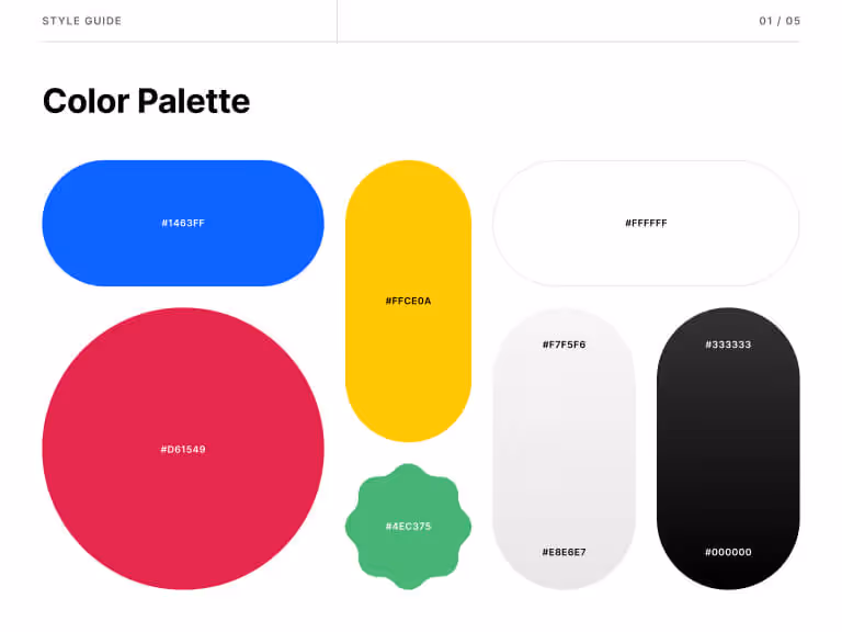
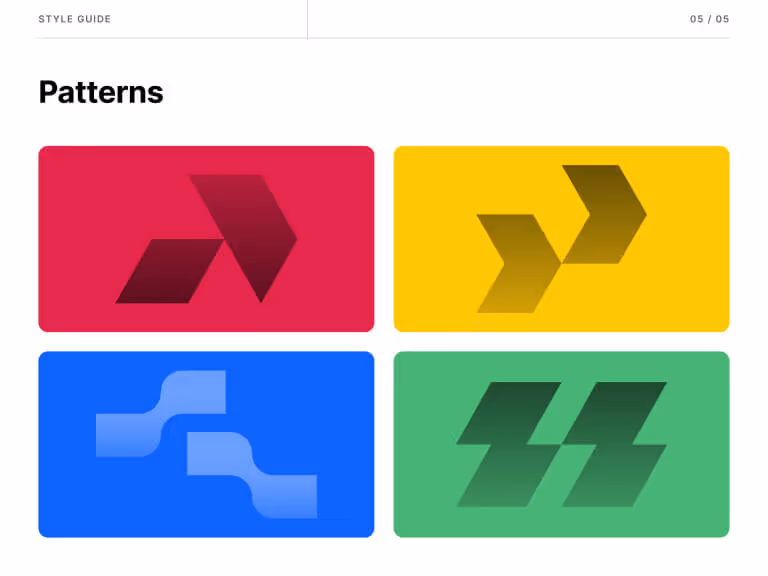
Colors
For the website, Close wanted to explore having different-colored backgrounds for sections. We chose Crimson (#D61549) as the primary, and Neon blue (#1463FF) as the secondary color. We also chose Mikado Yellow (#FFCE0A) and Emerald (#4EC375) for the visuals, with dark and white sections for a confident, professional look.

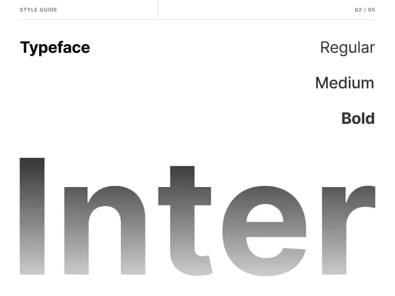
Typography
Close wanted a typeface with a large character set, with focus on the bold weight. Inter fit their bill perfectly. Inter gives a bold and clean appearance in large font sizes, and also looks sharp as body font.

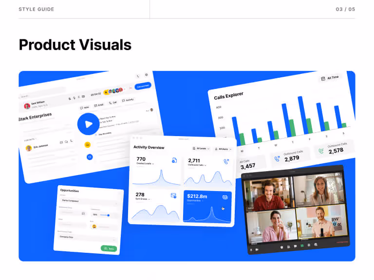
Clear visuals
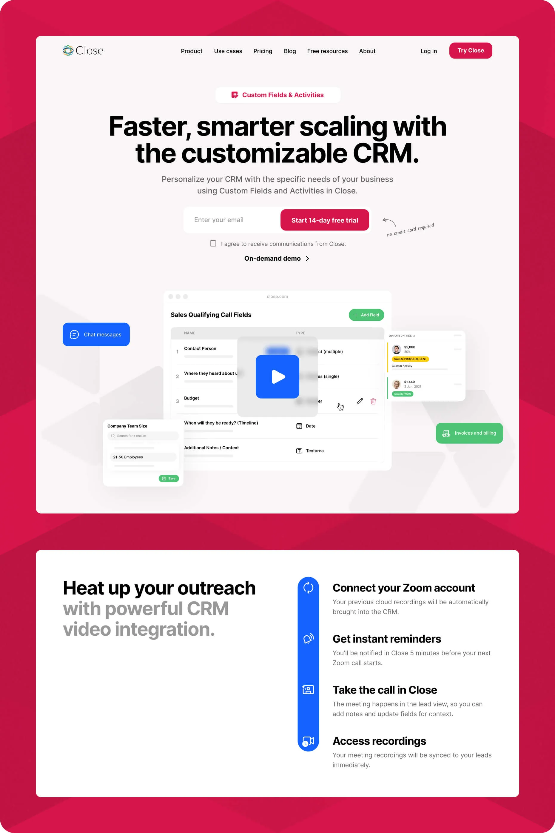
Close provided the product visuals, and we redesigned them to be readable in smaller sizes. We broke down the product shots into simple, conceptual designs—making the site design slicker and uncluttered.
Our goal with the design was to present all information clearly, and highlight the platform’s user-friendliness.

Development
Close knew from the very beginning that they wanted their website built on Webflow.
The team wanted a CMS option so they could create multiple pages at once. They wanted a fast, optimized website that’s easy to update or manage.
Close wanted to build strong visitor paths so customers could find what they were looking for. We worked closely with the team to understand the structure and make relevant updates.
To make sure the project launched on time,
Our process began with a style guide tailored to the project and for the design. This helps us ensure our clients can update the website as needed in future.
Taking the unique structure into account, we designed ebooks in the CMS to extend beyond Webflow’s capabilities. According to our structure, the ebooks were to go to separate chapters. We didn’t just implement that in Webflow, we also created a form customers could easily fill up to get the ebook.
To communicate the brand and product’s value clearly, we custom-built certain elements such as navigation dropdowns and the pricing toggle. We also created unique scroll interactions for feature displays to level up the user experience.
Handover was smooth and successful, and we concluded with documentation the Close team could use to make the Webflow experience easier.
The Close team continues to modify, manage, and maintain the website glitch-free.

Here’s what the team at Close had to say about our endeavor:
Working with Beetle Beetle felt like I had an entire in-house marketing design and development team.
Beetle Beetle understands design—and even more importantly, the positive impact it can have on your business’s bottom line.
Here’s 3 more reasons why they loved working with us, in their own words:
“Beetle Beetle excels at communication. I always felt aware of what was happening with the website project, when to expect updates, and was able to reach out anytime to ask questions.”
“Beetle Beetle specializes in B2B websites, mostly for SaaS companies, and it shows. I appreciated how they not only looked at the website from a design perspective but also how design might impact goal conversions and user experience.”
Beetle Beetle strove for perfection and our satisfaction. From the tiniest design tweaks to major page revisions, they never settled for mediocrity or took ‘an easy way out’. Instead, they continued iterating until producing the best possible result.”

Close didn’t just get a website refresh—they got a site that still looks great, works flawlessly, and drives results.
The impact was immediate. Customers responded positively, conversion rates improved, and the Close team finally had a website that reflected their brand.
But more importantly? The site still holds up. No major redesigns. No urgent fixes. Just a well-built, future-proof website that continues to deliver.
Here’s what makes it a win:

Accurate:
“This site actually feels like us,” the Close team shared.
Their new website doesn’t just look good—it perfectly represents who they are as a company and where they’re headed. It’s bold, opinionated, and unmistakably Close.

Fast:
“We no longer have a massive backlog of website updates,” they told us.
Instead of waiting on developers, the Close marketing team—even those with zero web design experience—can now jump in, make updates, and test new ideas instantly. The result? More flexibility, faster experiments, and more time to focus on growth.

Simple:
“It just looks so clean.”
By simplifying product visuals and breaking them into conceptual designs, we made the site more polished and intuitive—while also better communicating the value of Close’s features.


417%

82%

207%

230%

125%

122%

74%

60%

60%
158%
25%