.avif)
“We’ve been a rapidly-expanding SaaS company for the last 8 years. We’ve tested and re-tested lots of headlines and landing pages and had great conversion rates on our website. But the brand needed a great design. We needed an overhaul or rebrand, and of course, we wanted even better conversion rates.”

Review Wave
Company Size
51-100
Headquarters
Greater Los Angeles Area, USA
Industry
Healthcare, Consumer Reviews
Review Wave is your trusted partner in simplifying your healthcare practice's workflow.
Services we provided
Customer and market research
Website audit
Content recommendations
New content review
Brand exploration and art direction
Website and landing page design
Custom product visuals design

Challenge
Lack of differentiation: Review Wave struggled to stand apart from competitors on their old website.
Unclear value props: Their messaging wasn’t compelling enough to convert prospects.
Visitor hesitations: They needed to break through reluctance of switching review management systems.
Solution
After a deep-dive into their customer and market, we helped Review Wave with:
An deep-dive audit: That helped find gaps and areas of improvement in their messaging and design.
Content recommendations: That refined the content strategy, and helped find out what the website needed to talk about to convert visitors.
Copy review: To refine and strengthen the copy their team wrote for the new website.
A fresh website design: Which clearly showcased the reliability and ease-of-use of their product.
Results
Stronger positioning: A website that clearly differentiates Review Wave from competitors.
Higher engagement: Messaging and design that resonated with prospects.
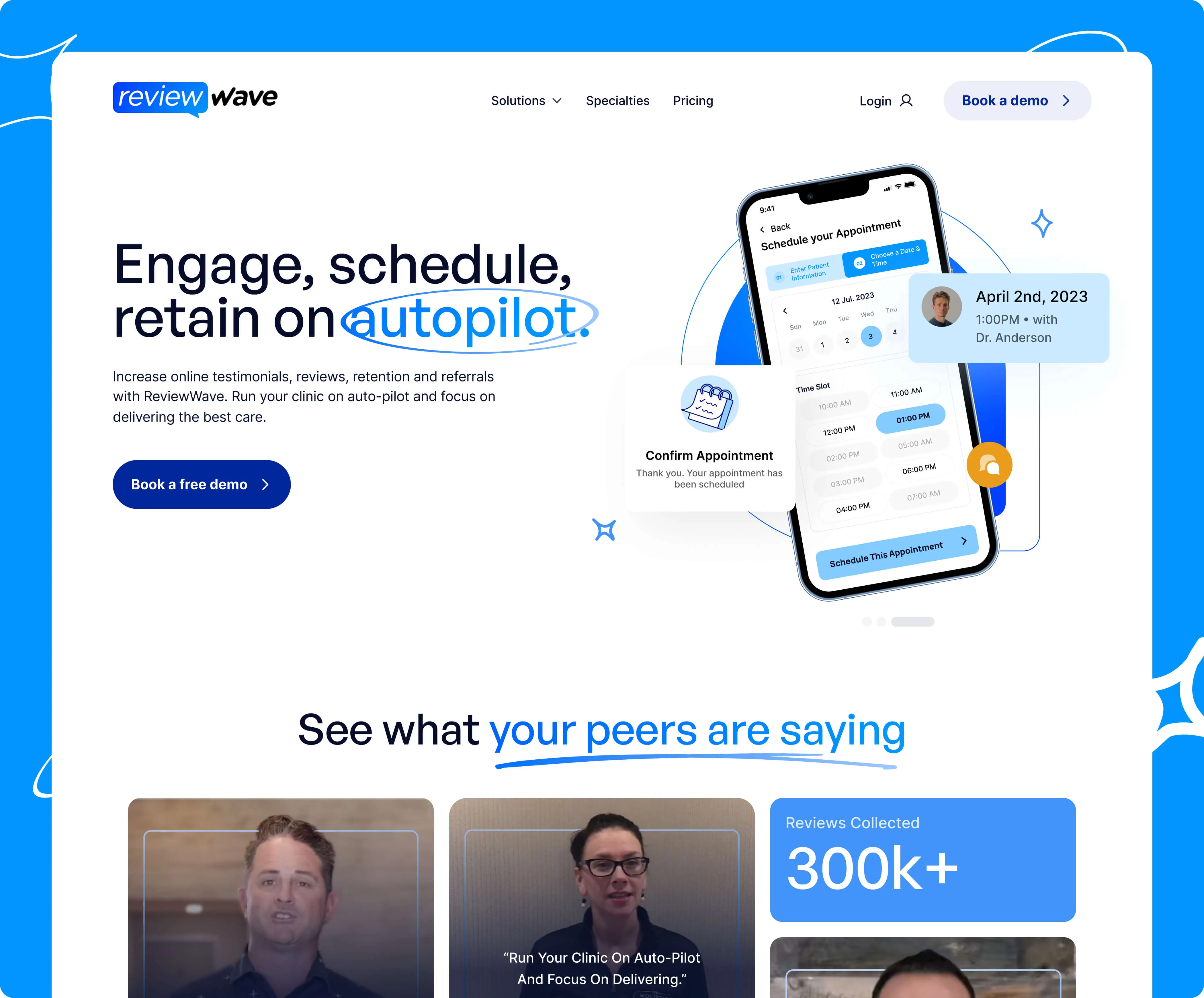
Doubled conversions (almost) overnight: A more compelling, frictionless experience led to instant results.
“We signed up with Beetle Beetle and very rapidly, very easily, they helped study our brand and figure out what messaging we wanted, what our competitors were doing, what would work, etc.”
2x Conversions
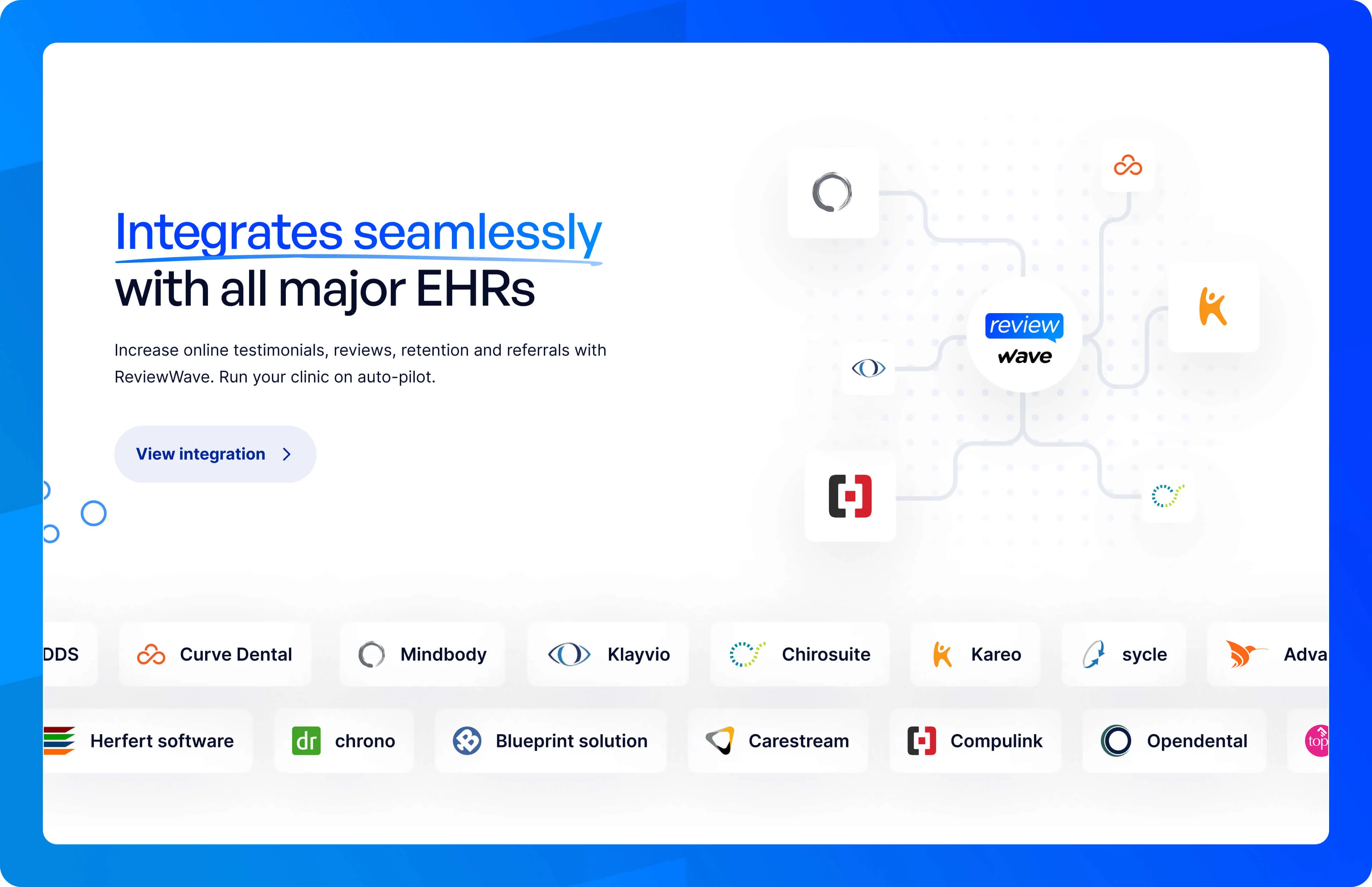
Review Wave is a review management and patient engagement software.
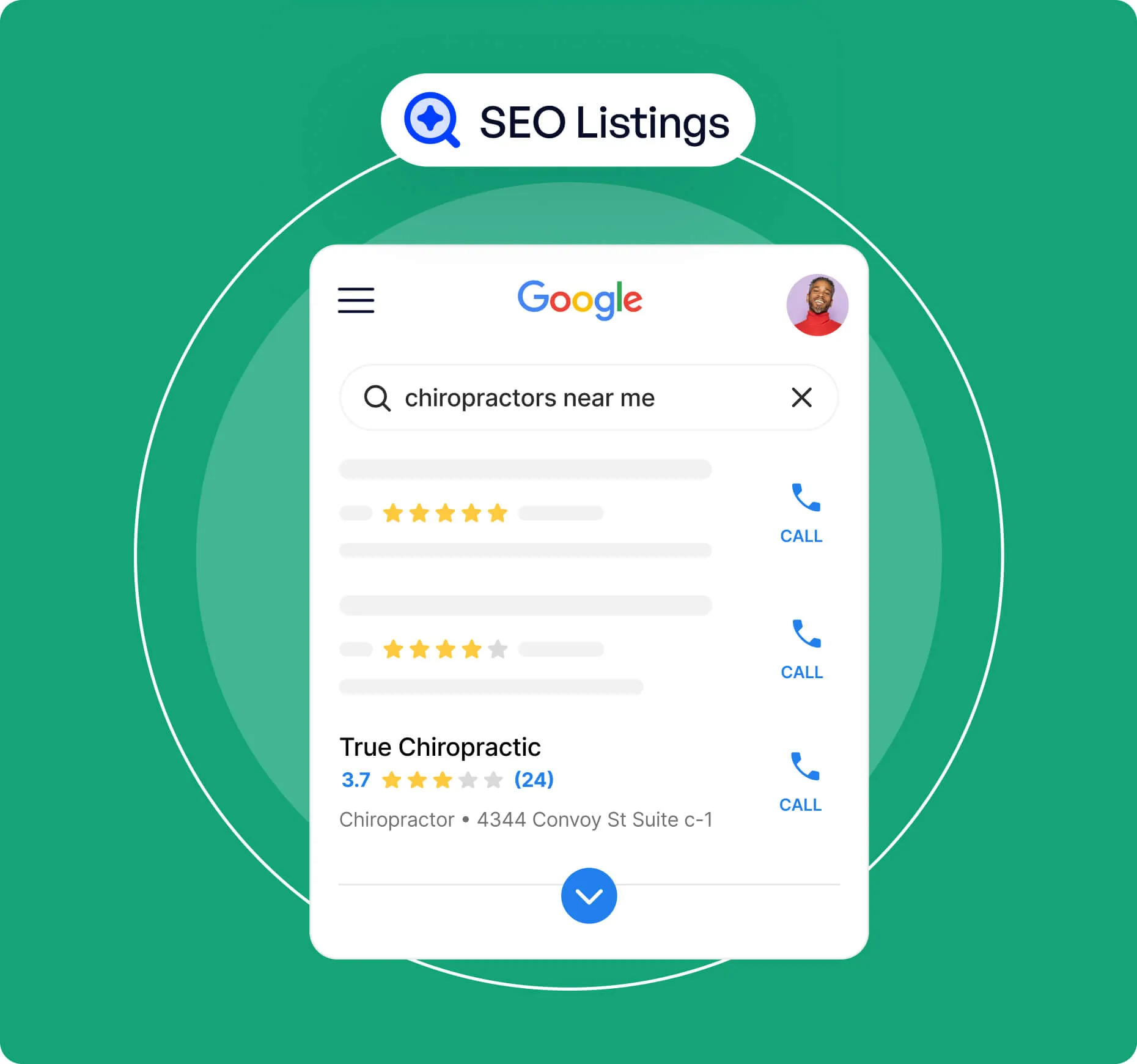
They help clinic owners increase online testimonials, reviews, retention, and referrals.
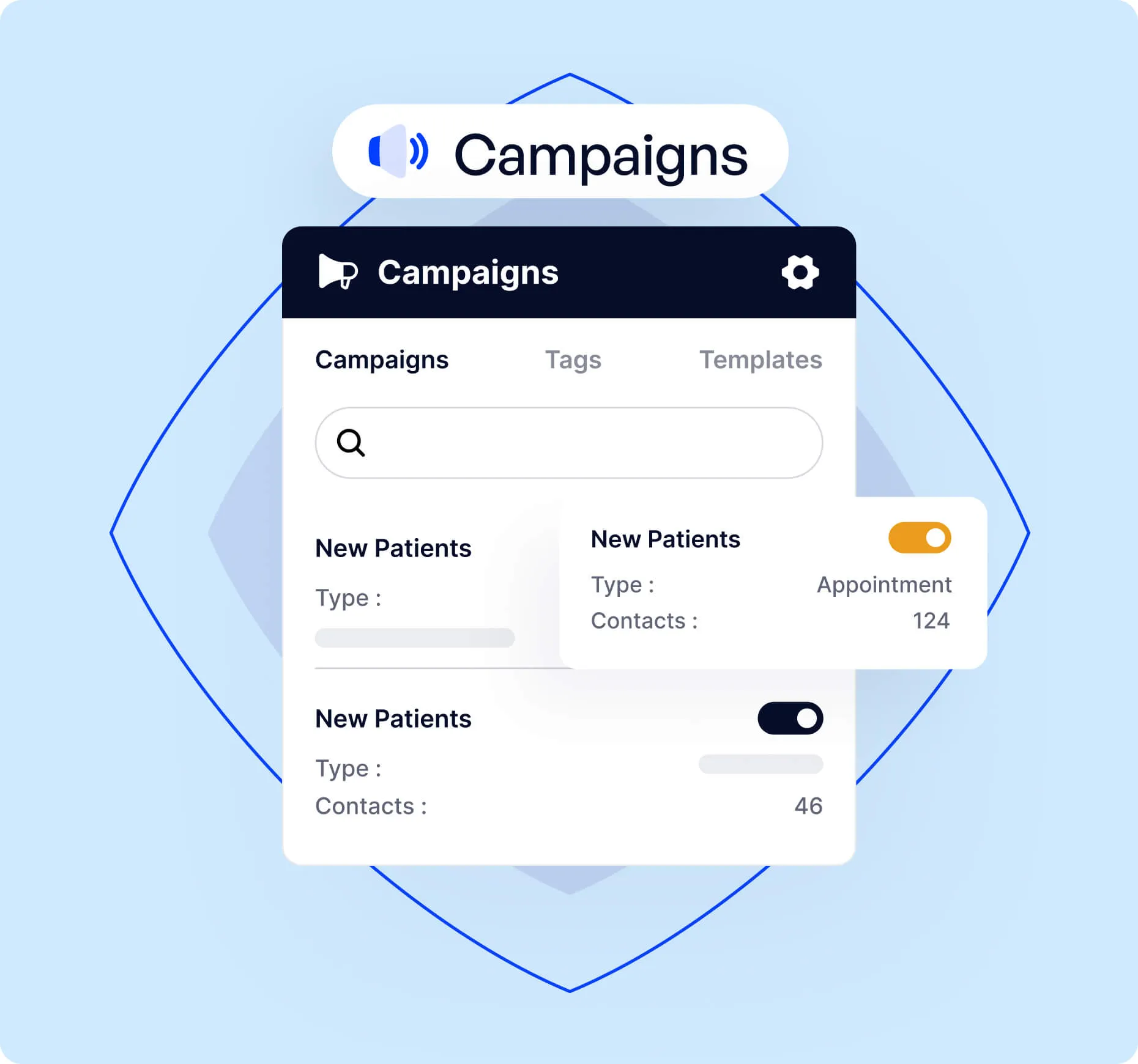
In addition, they help automate several admin tasks around the practice like appointment scheduling, communication, marketing, and more.
Their customers are primarily chiropractors or optometrists.
Review Wave’s website wasn’t doing its job. The main problem was differentiation, or rather a lack of it.
Struggling to Stand Out: Their prospects—especially chiropractors and optometrists—were product-aware.
They knew of Review Wave, but they were also aware of plenty of other review management solutions. Some were direct competitors. Others were just a mix of different tools that got the job done.
Fear of Switching: Even when prospects saw the value of Review Wave, they hesitated. They worried about the time and effort needed to switch—the learning curve, training their staff, and the risk of disrupting their existing workflow.
Resistance to Change: And for those not using a competitor? They were still reluctant to abandon their current tech stack. The site wasn’t reassuring them that making the switch would be easy and worthwhile.
At its core, the website wasn’t speaking clearly to Review Wave’s ideal customer profile (ICP). It wasn’t driving home the major value props or reinforcing the brand.
The new website needed to:
Speak directly to specific practice-owners with tailored messaging.
Clearly show how Review Wave transforms daily operations.
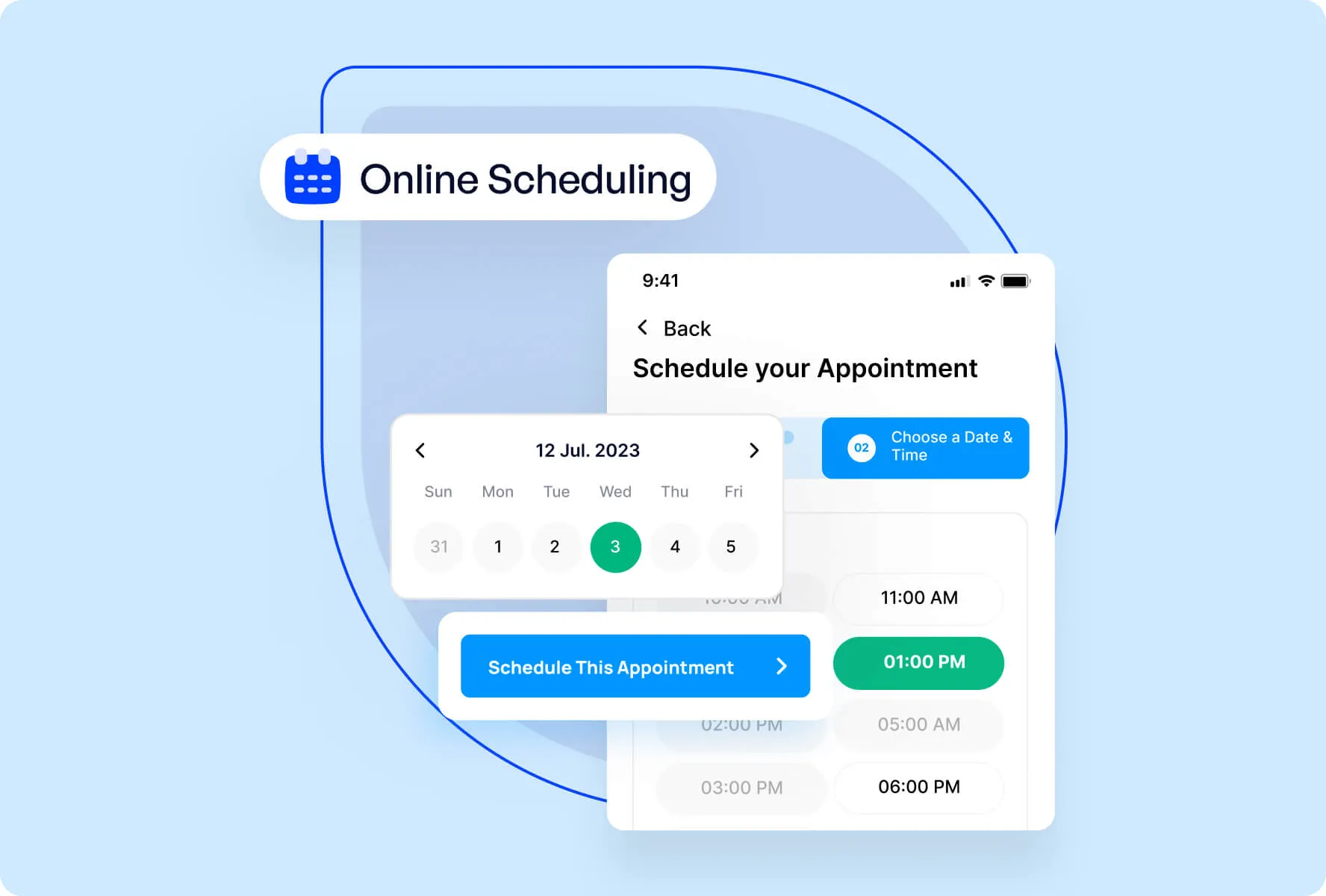
Make the product feel real with visuals and in-context demos.
Strengthen differentiation with a clear “Why Review Wave?” section.
Build urgency and trust with sharper messaging and stronger social proof.
Copywriting
Research and messaging
We started by analyzing Review Wave’s existing messaging, customer insights, and competitor landscape.
A thorough dive into surveys, sales calls, and product docs helped us pinpoint what key messaging the website was missing out on.
Through a positioning workshop, we got everyone on the same page and refined their value proposition—ensuring the messaging was clear, compelling, and built for conversion.
Website audit
After concluding the research, we did an extensive audit of their old website.
The goal was to understand where the old website was falling short and how Review Wave could turn those gaps into opportunities.
Our audit explained why we marked some things as problems and offered broad recommendations to address those problems.
Content recommendations
Beyond the general audit recommendations, we delivered detailed page outlines packed with targeted content recommendations.
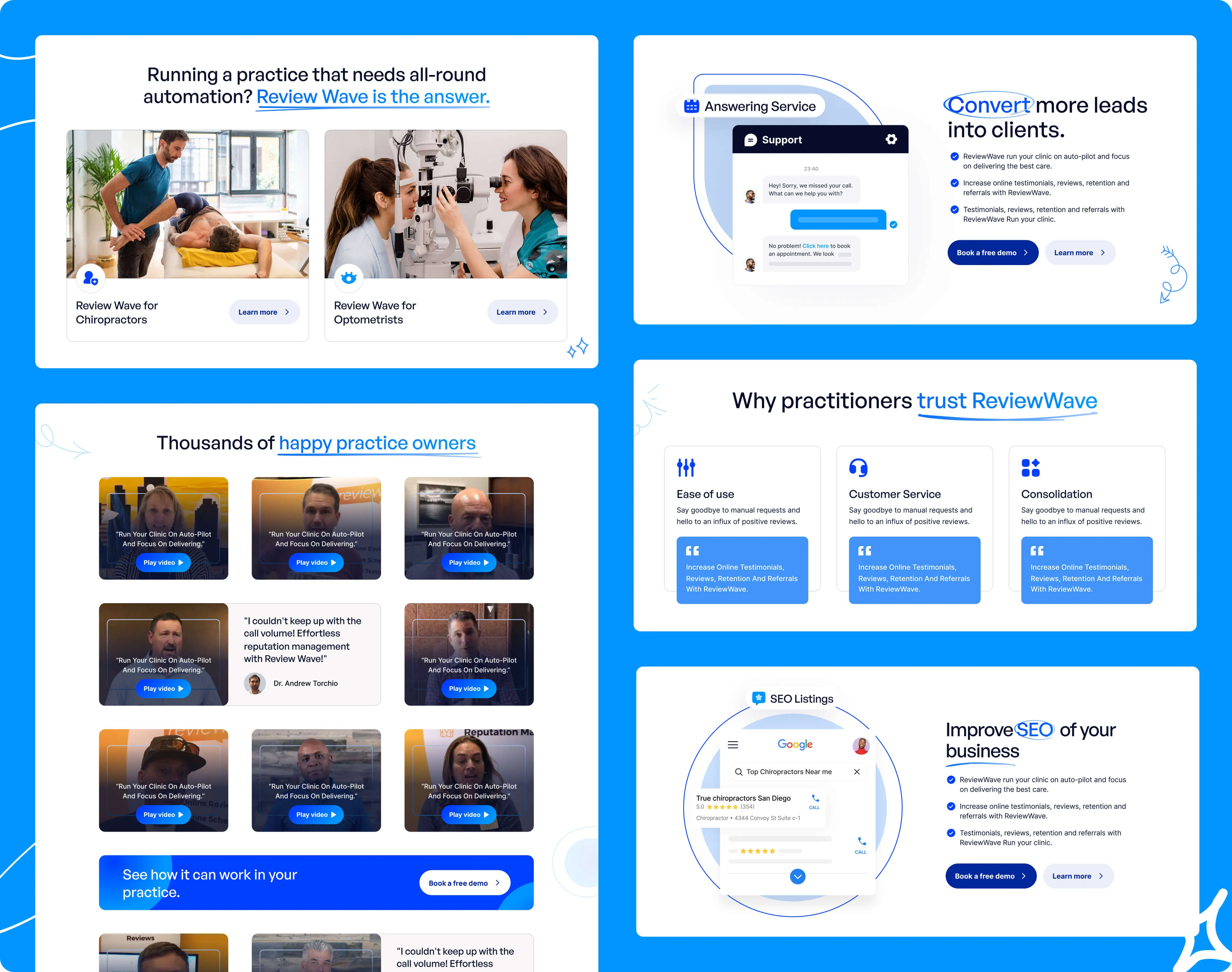
On the homepage, we advised:
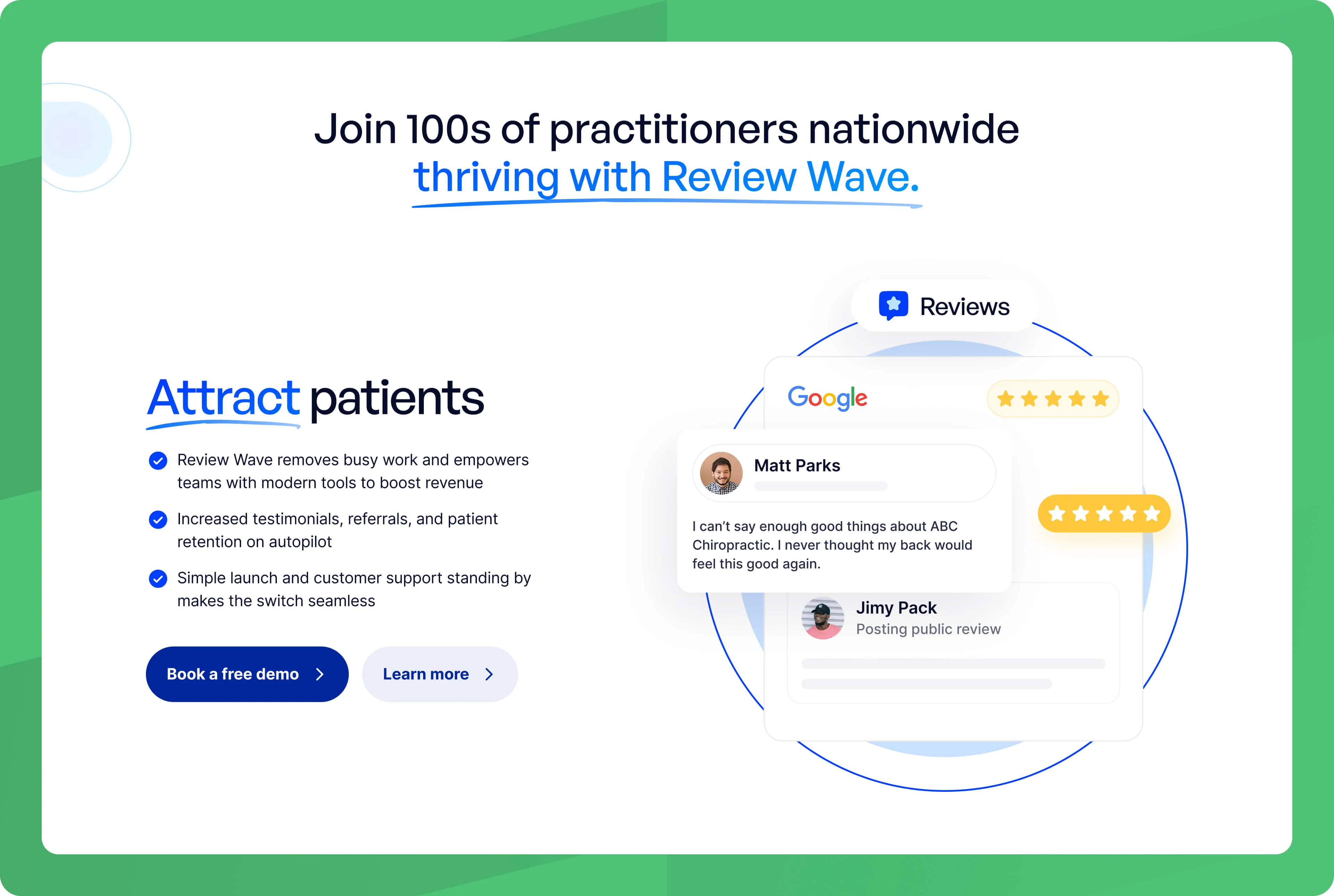
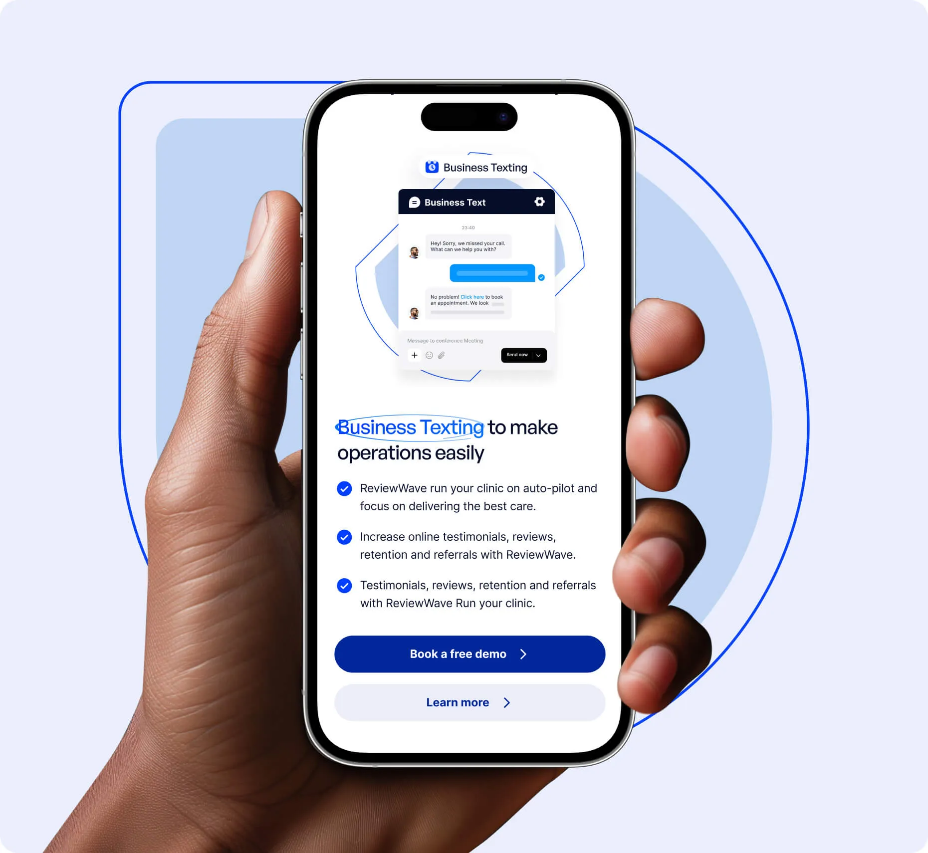
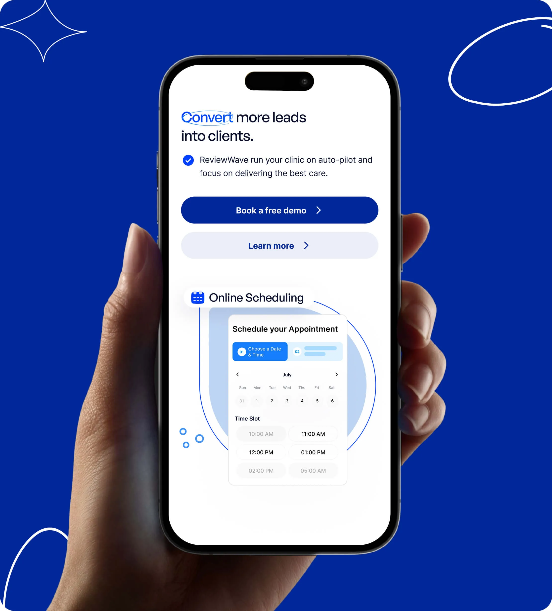
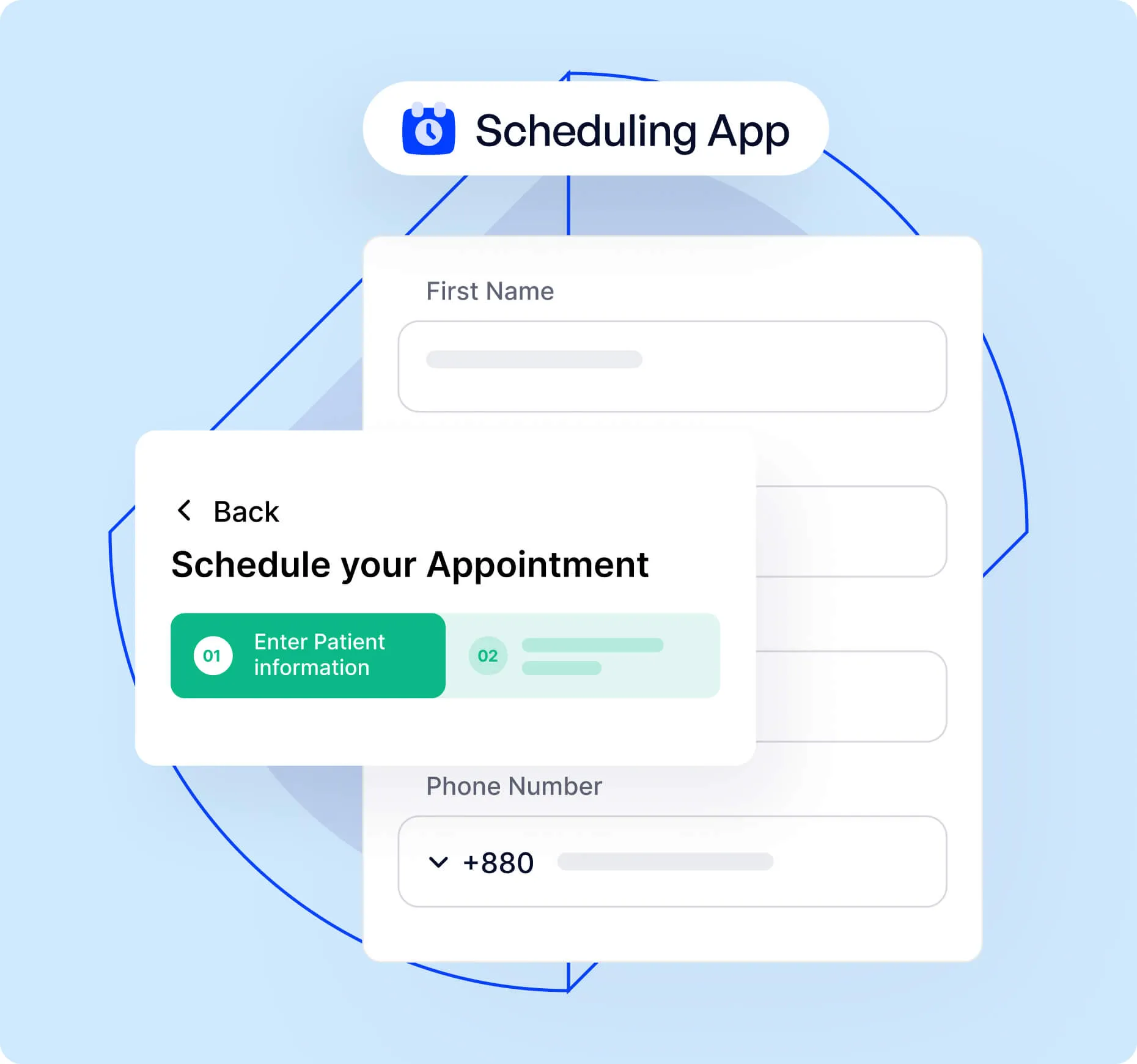
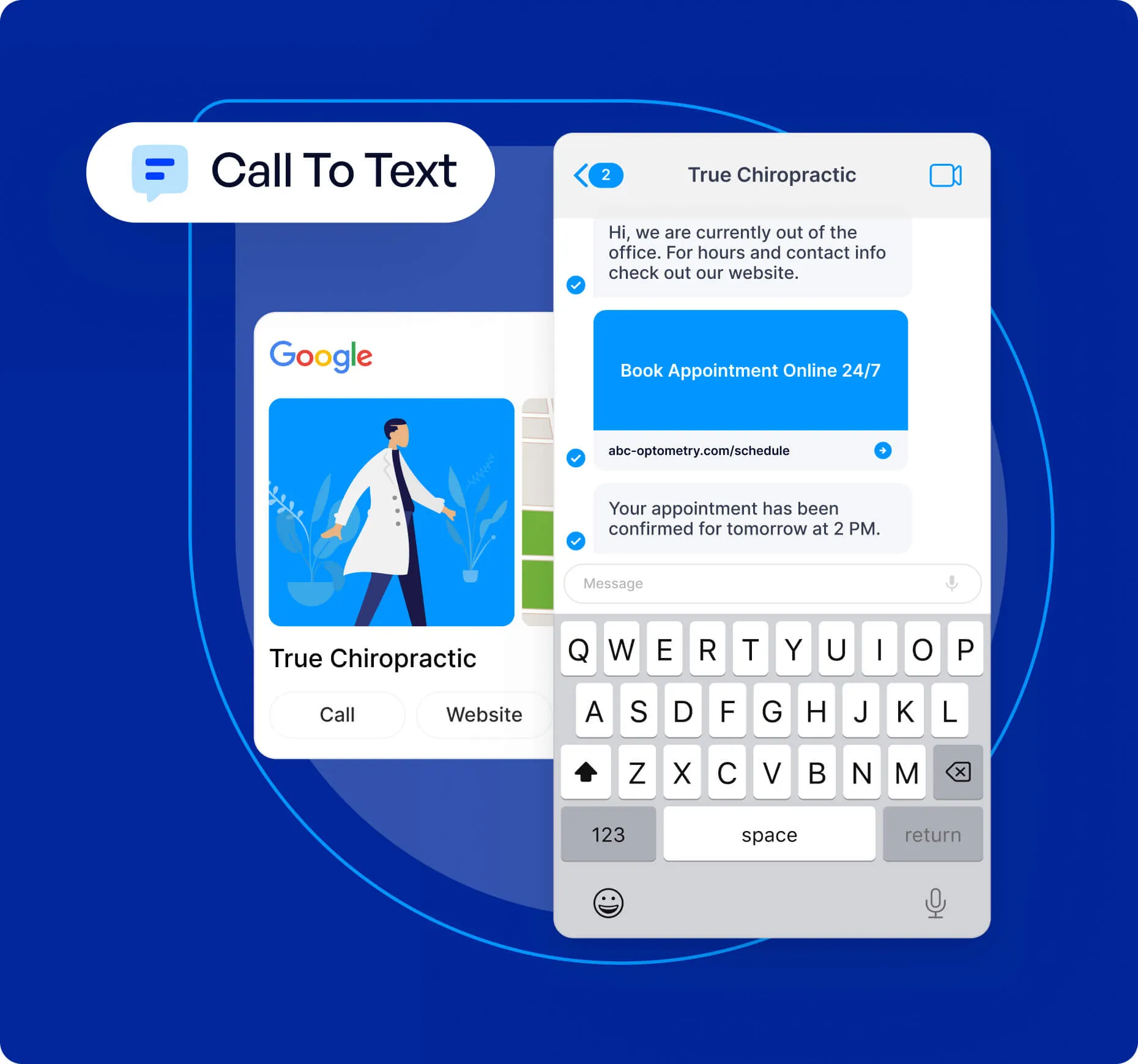
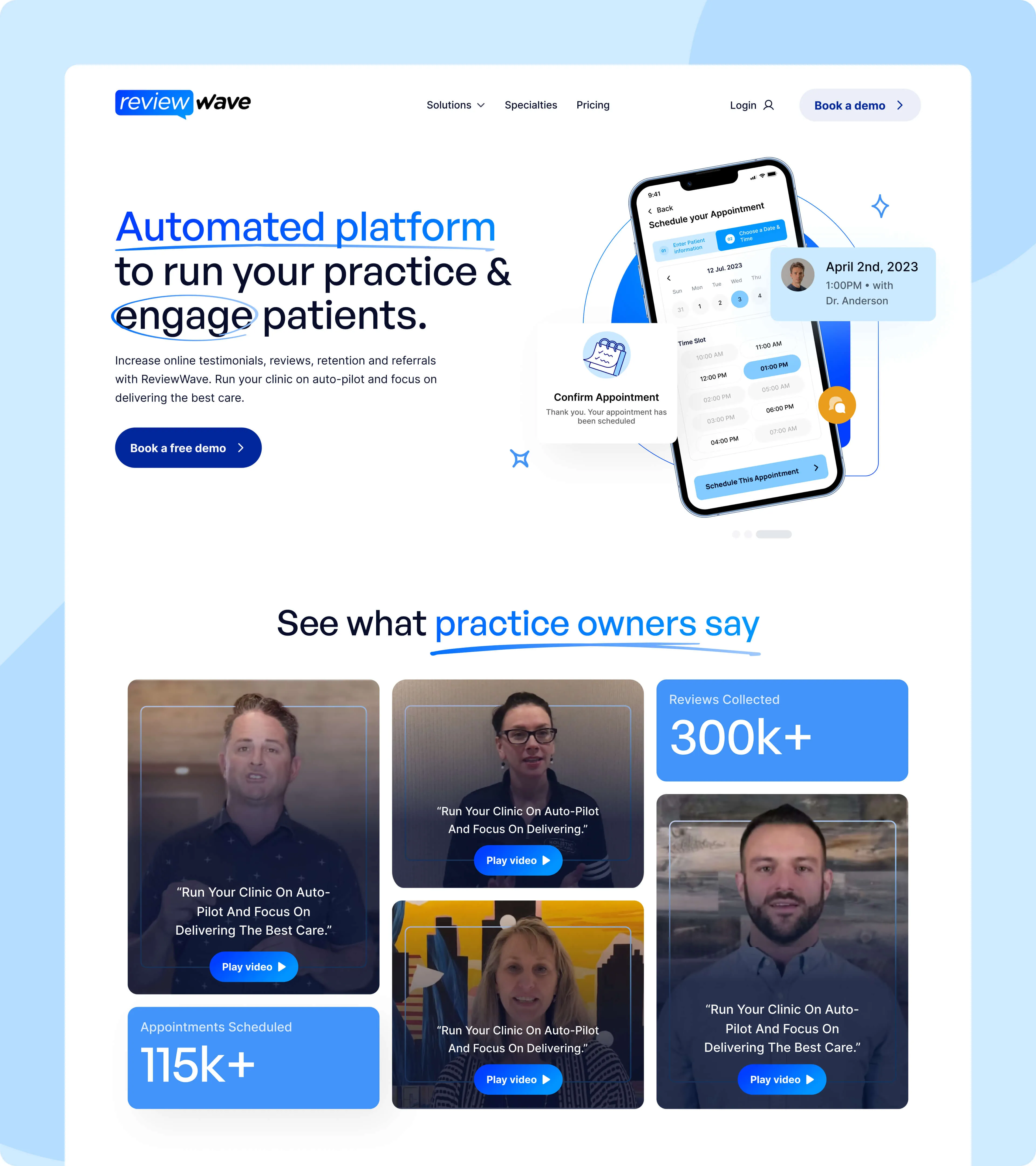
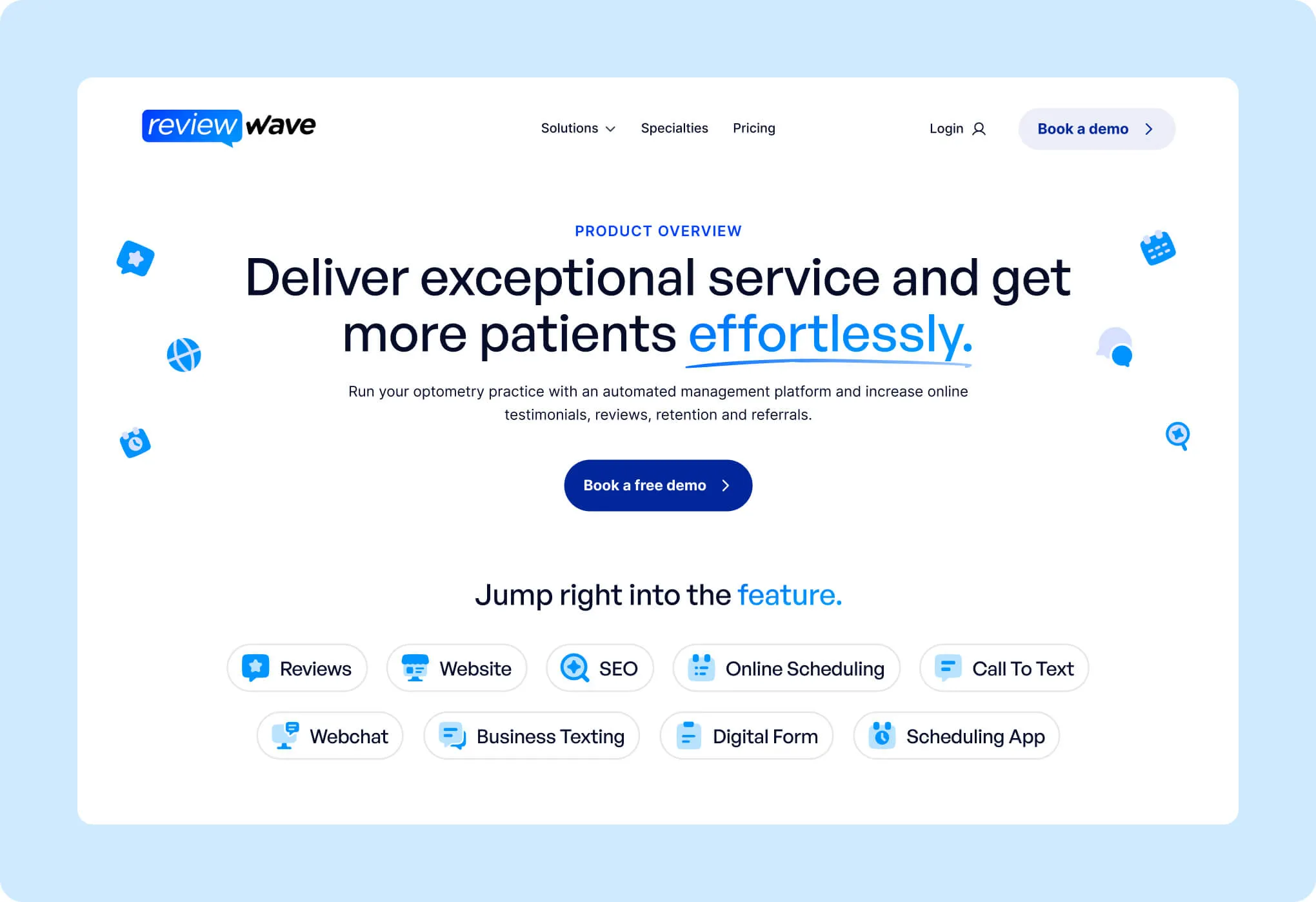
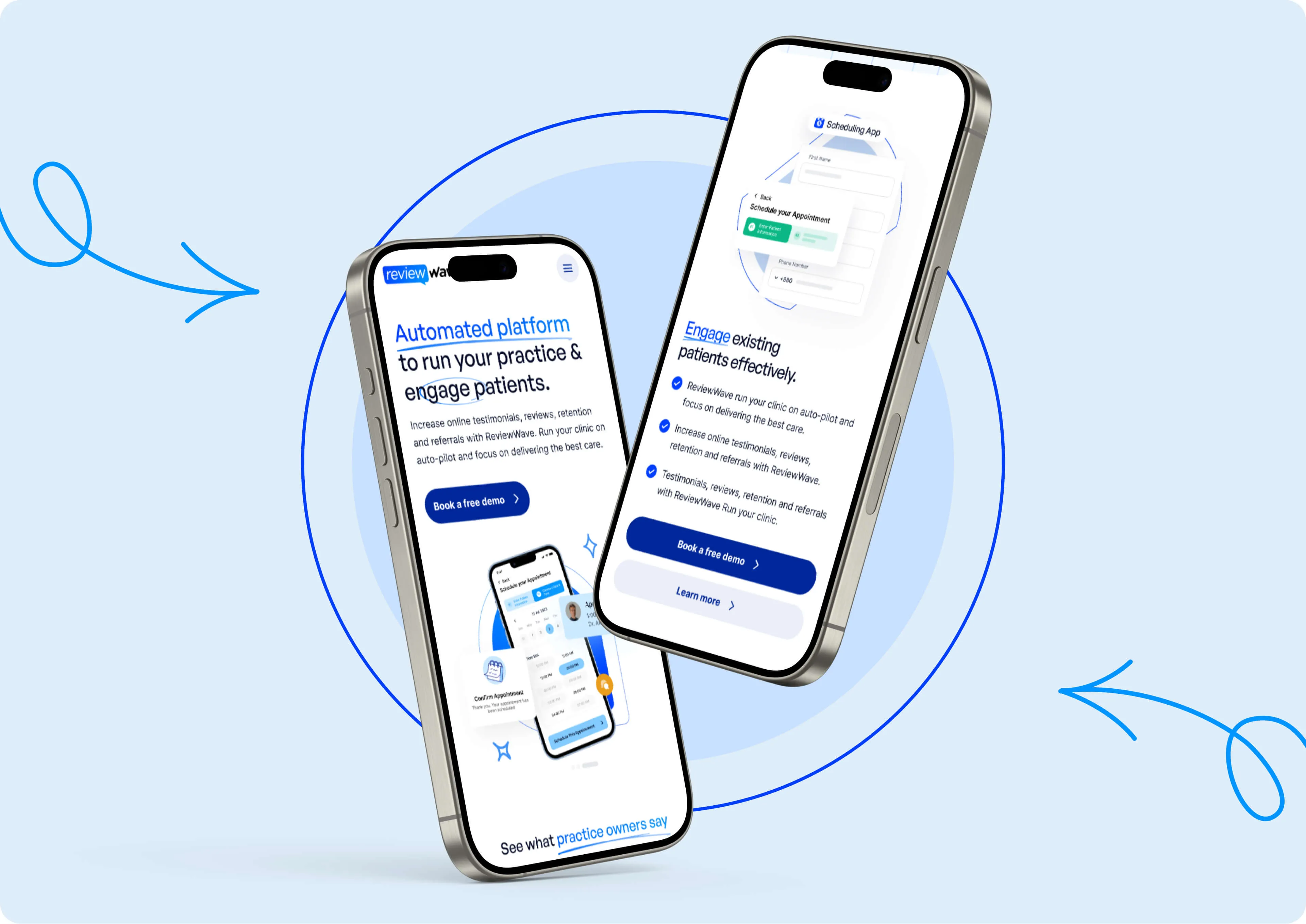
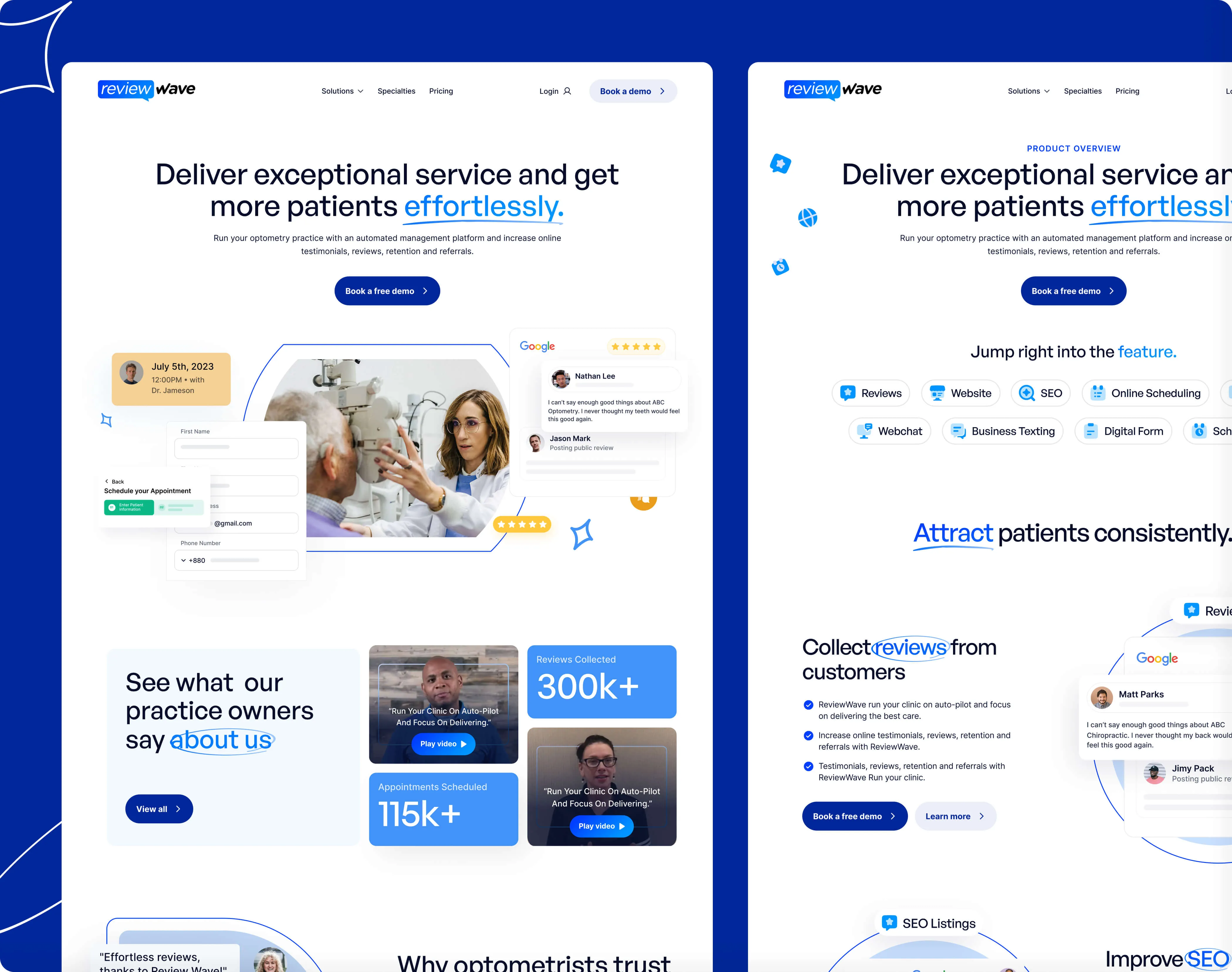
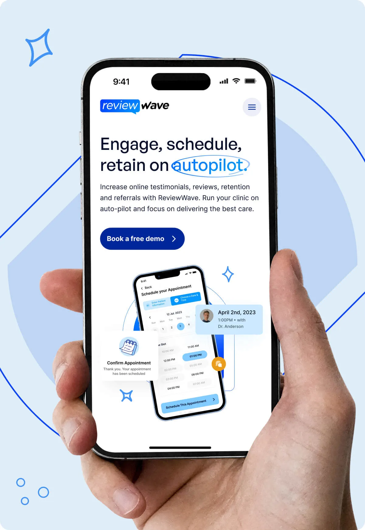
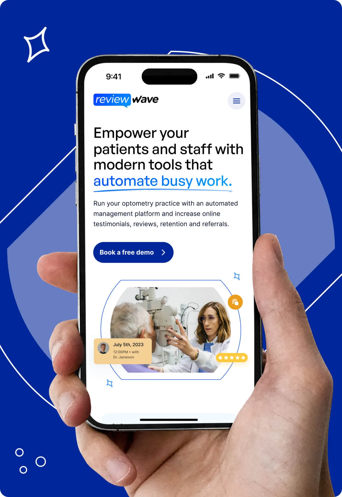
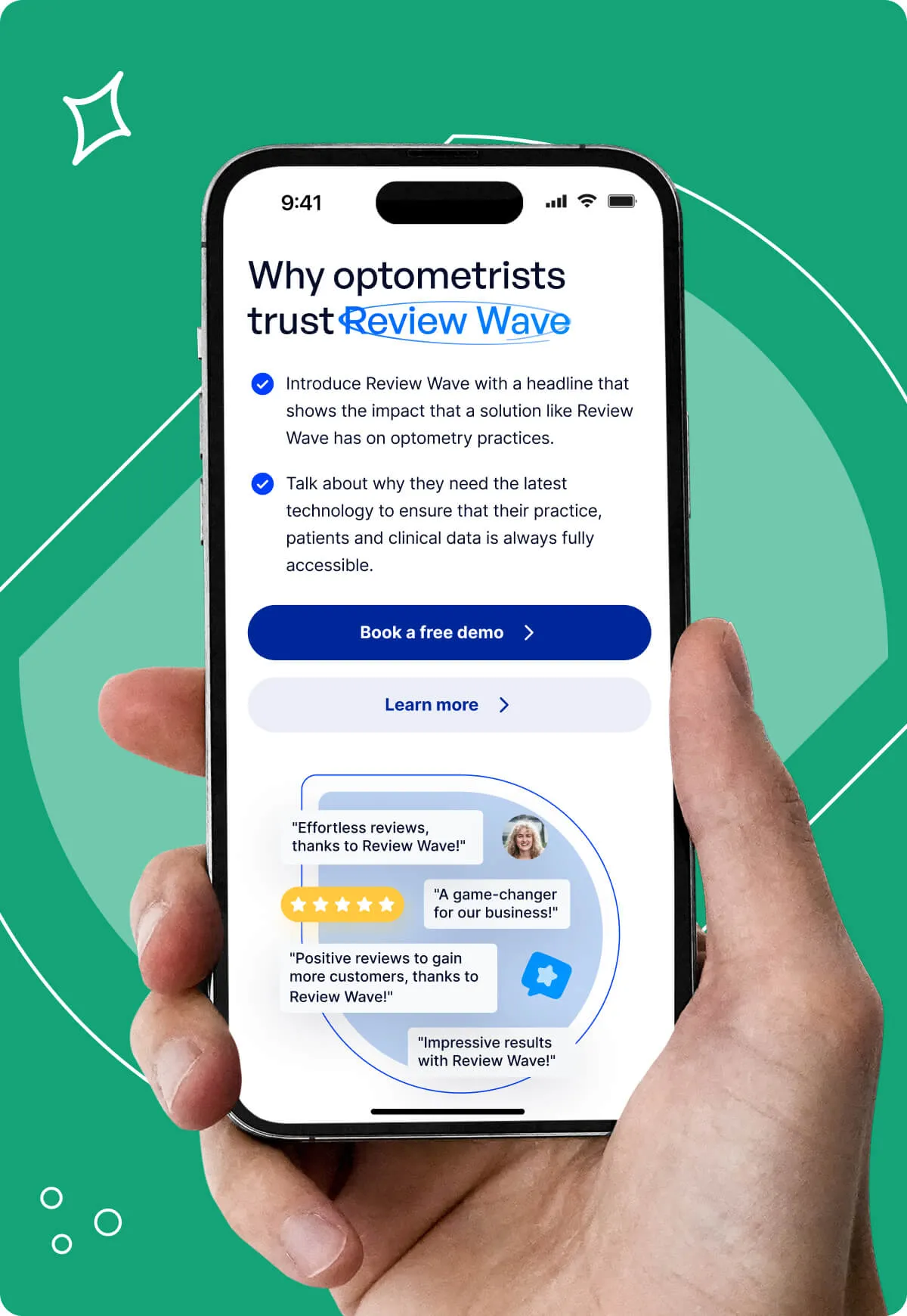
Hero Section: Use compelling visuals and an outcome-driven headline that positions Review Wave as the all-in-one practice management solution, accompanied by a clear "Book a demo" CTA.
Trust Indicators: Place key stats and logos above the fold to build immediate credibility.
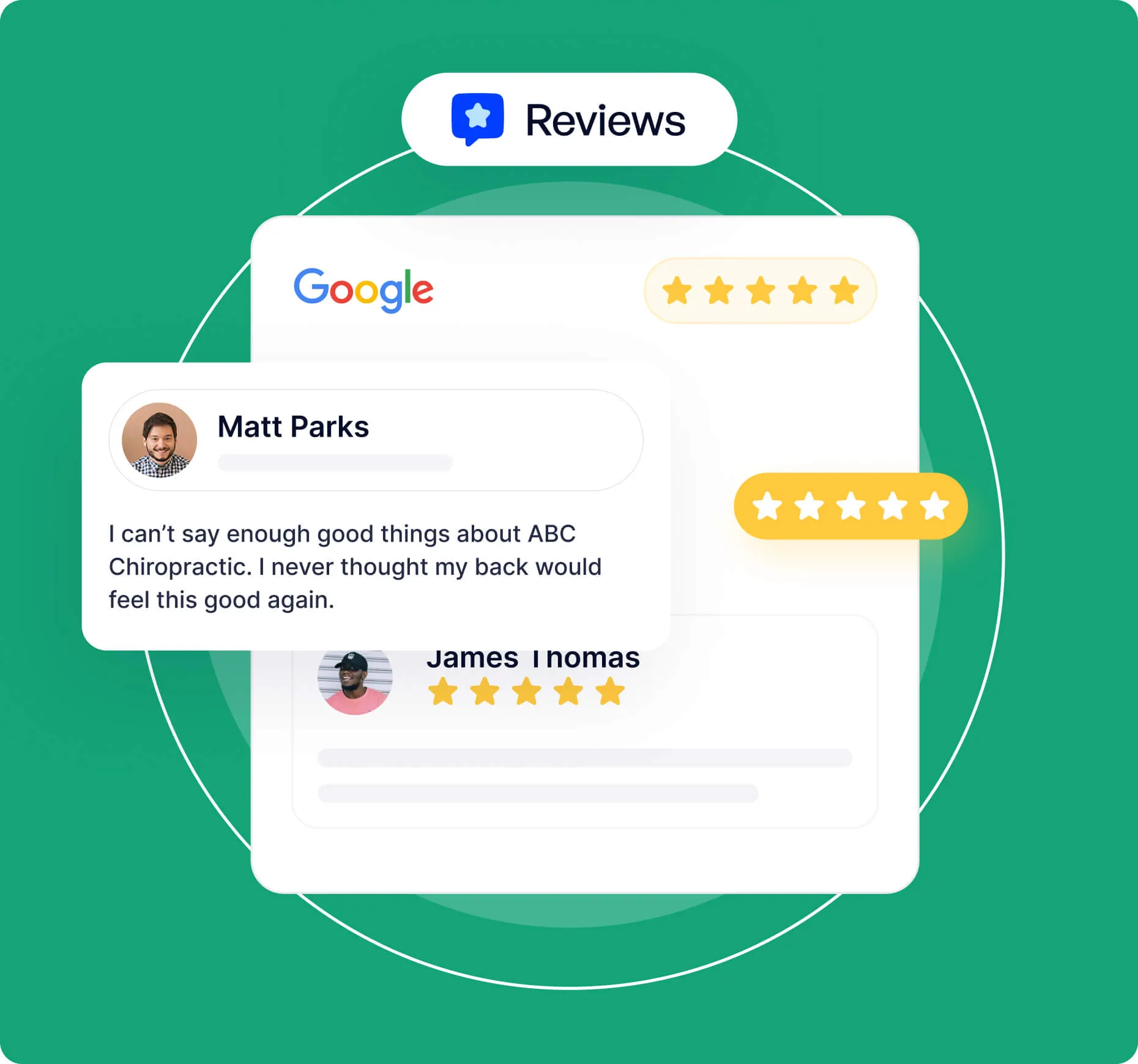
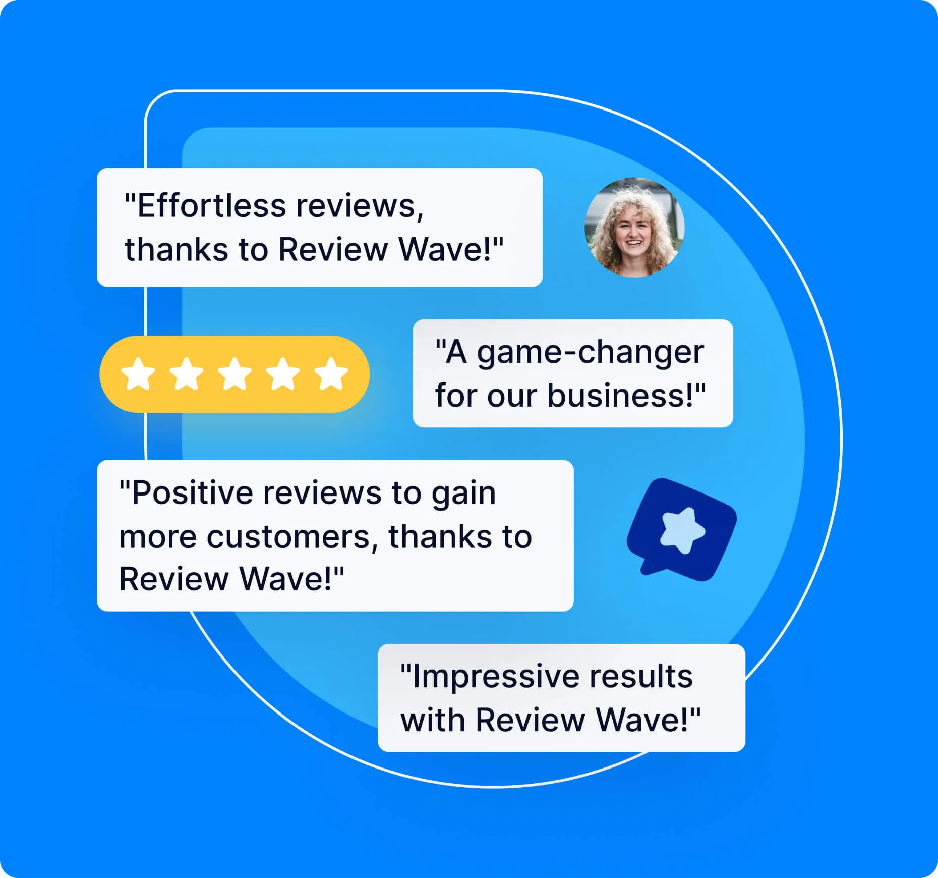
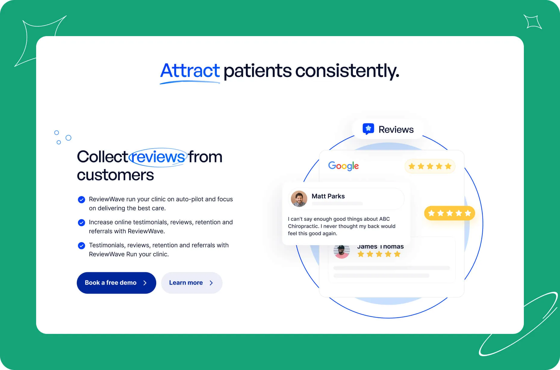
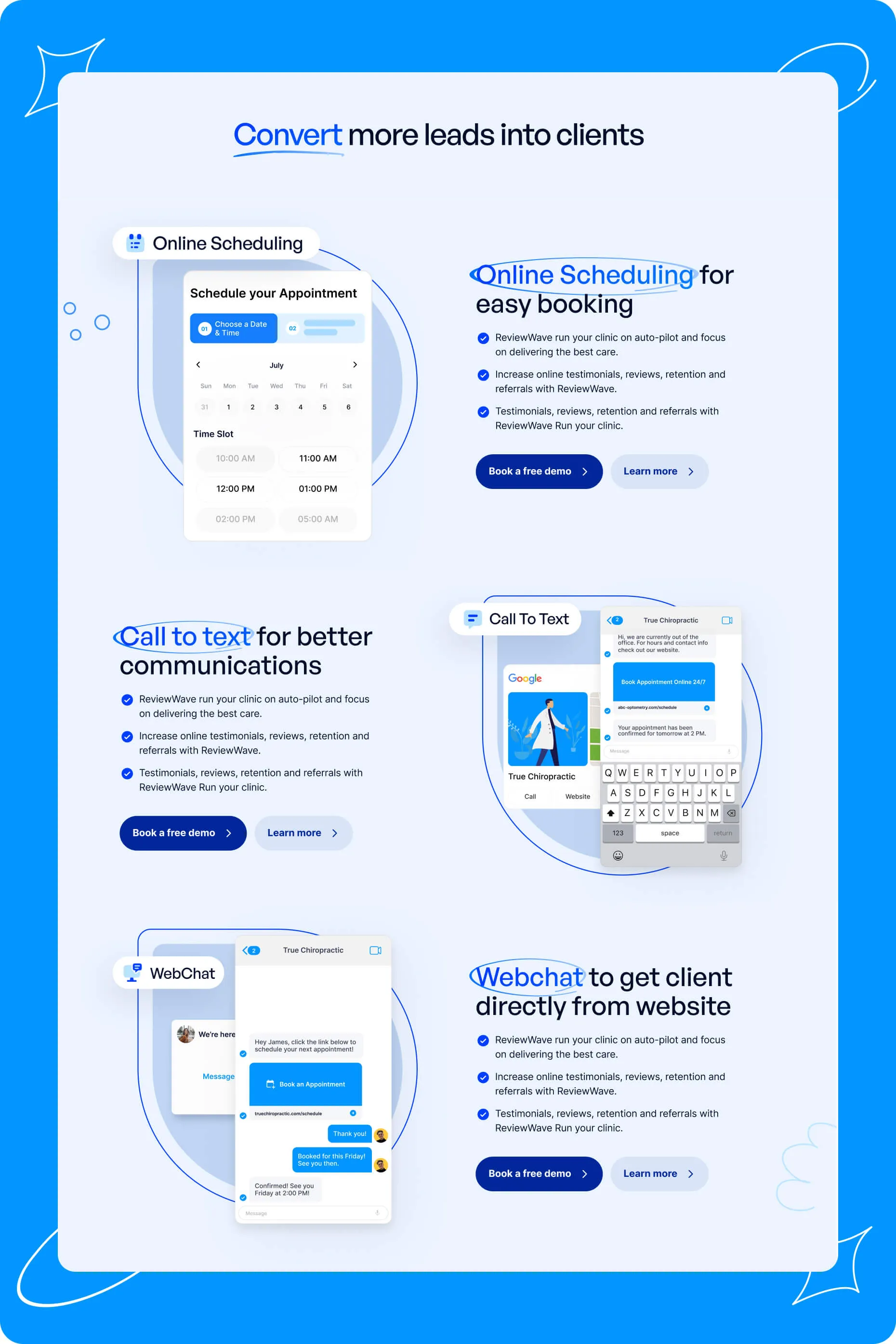
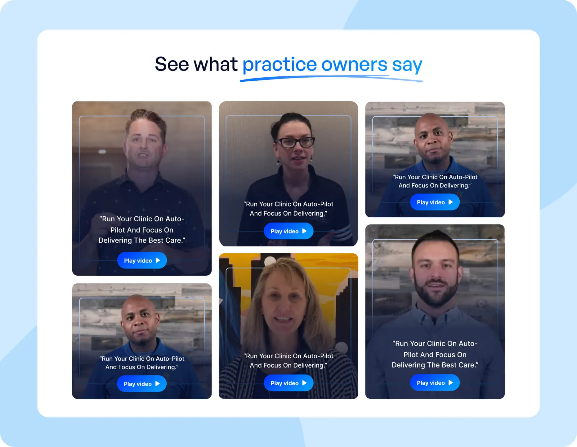
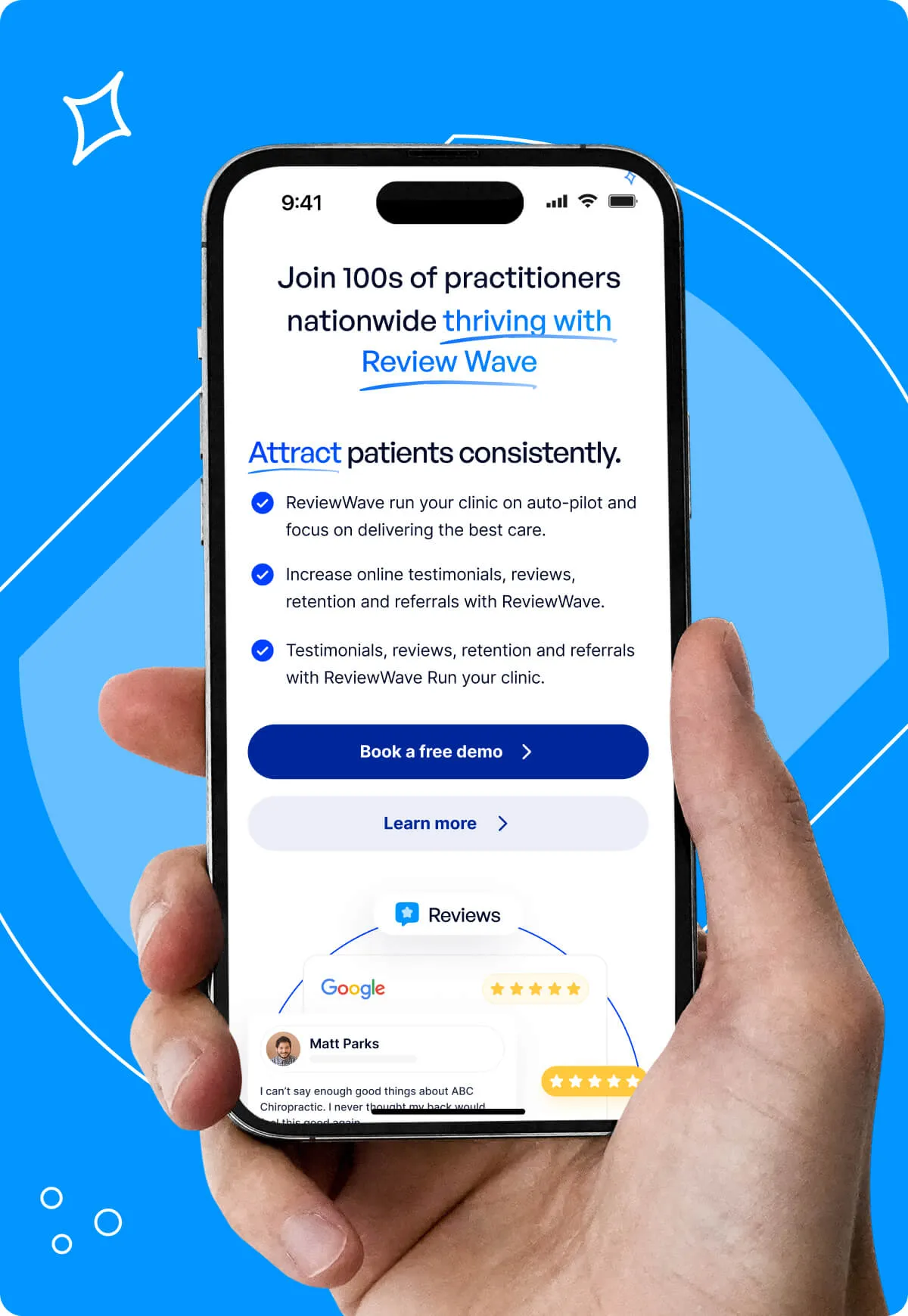
Before/After Section: Show text-based testimonials that highlight the benefits of consolidating multiple tools into one comprehensive solution.
Features + Social Proof: Organize features under the pillars—Attract, Convert, Retain, Systemize—with outcome-led headlines, supporting testimonials, and CTAs to explore further.
Differentiators & Additional Benefits: Emphasize ease of use, stellar customer service, and tool consolidation through clear visual elements.
Video Testimonials, Blog, and Final CTA: Incorporate dynamic social proof and resources, ending with a strong prompt to book a demo.
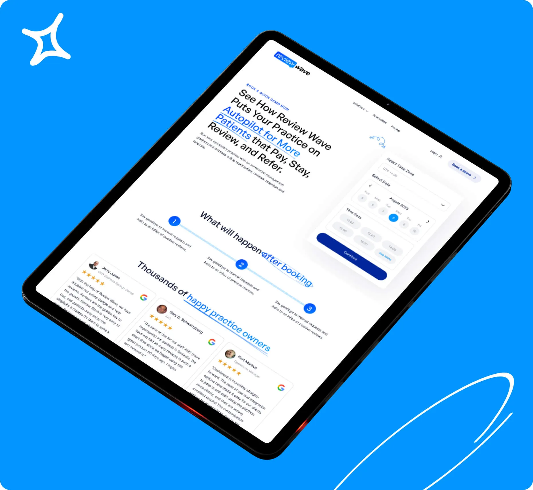
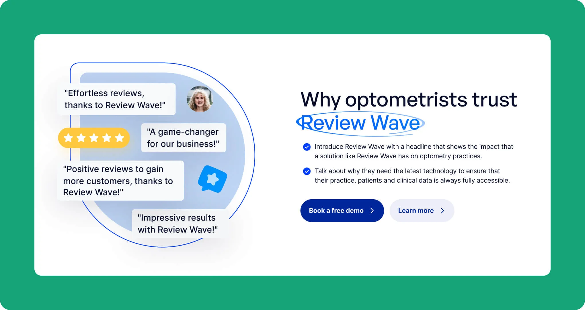
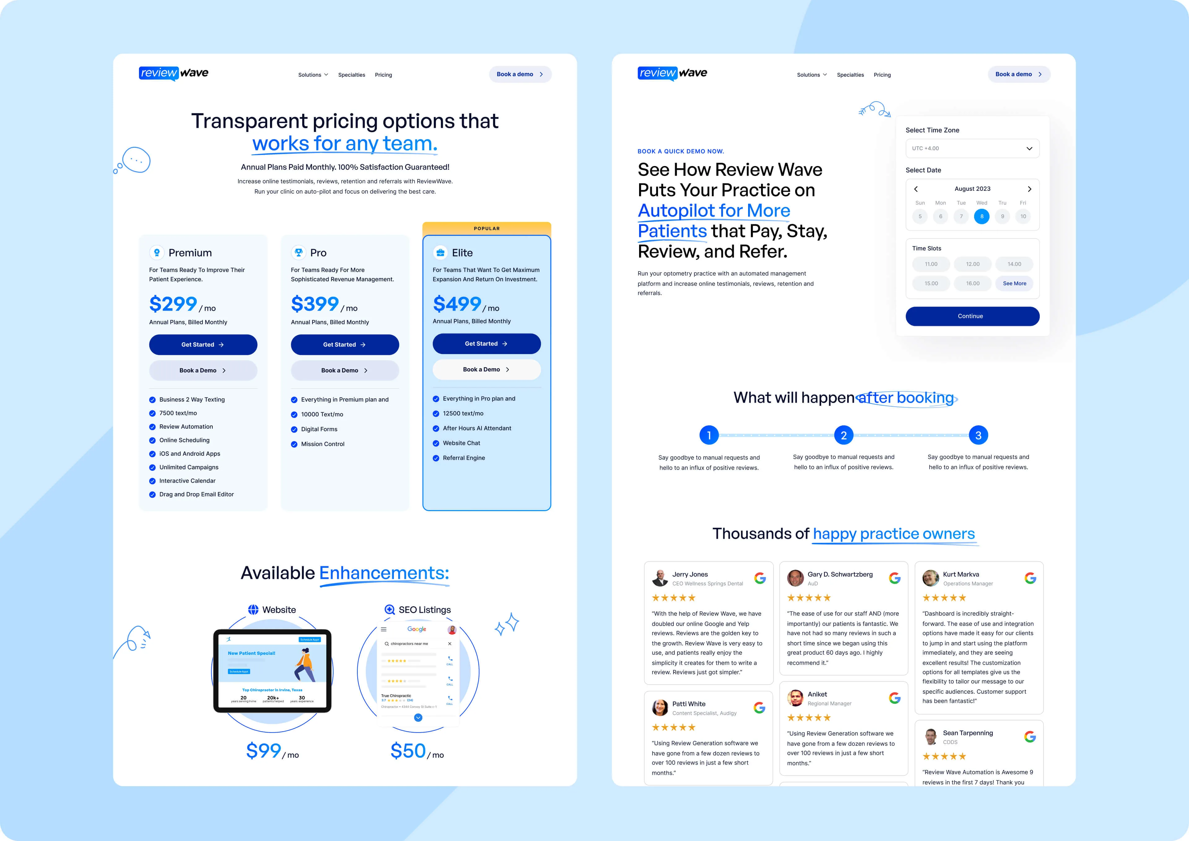
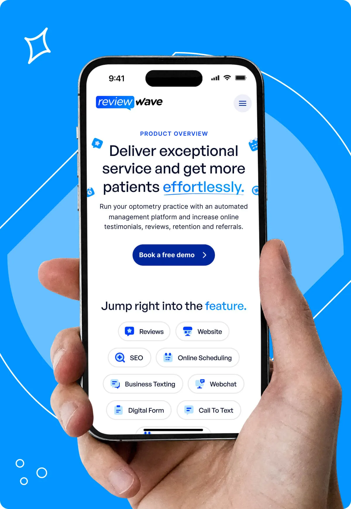
For the product page,
we recommended a consistent layout featuring an outcome-focused hero, trust indicators, detailed feature lists with real-life case studies, and a final CTA to reinforce the product’s value.
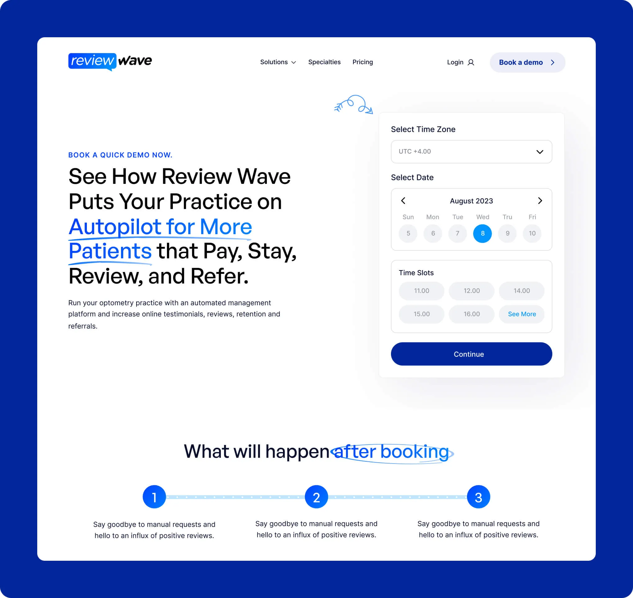
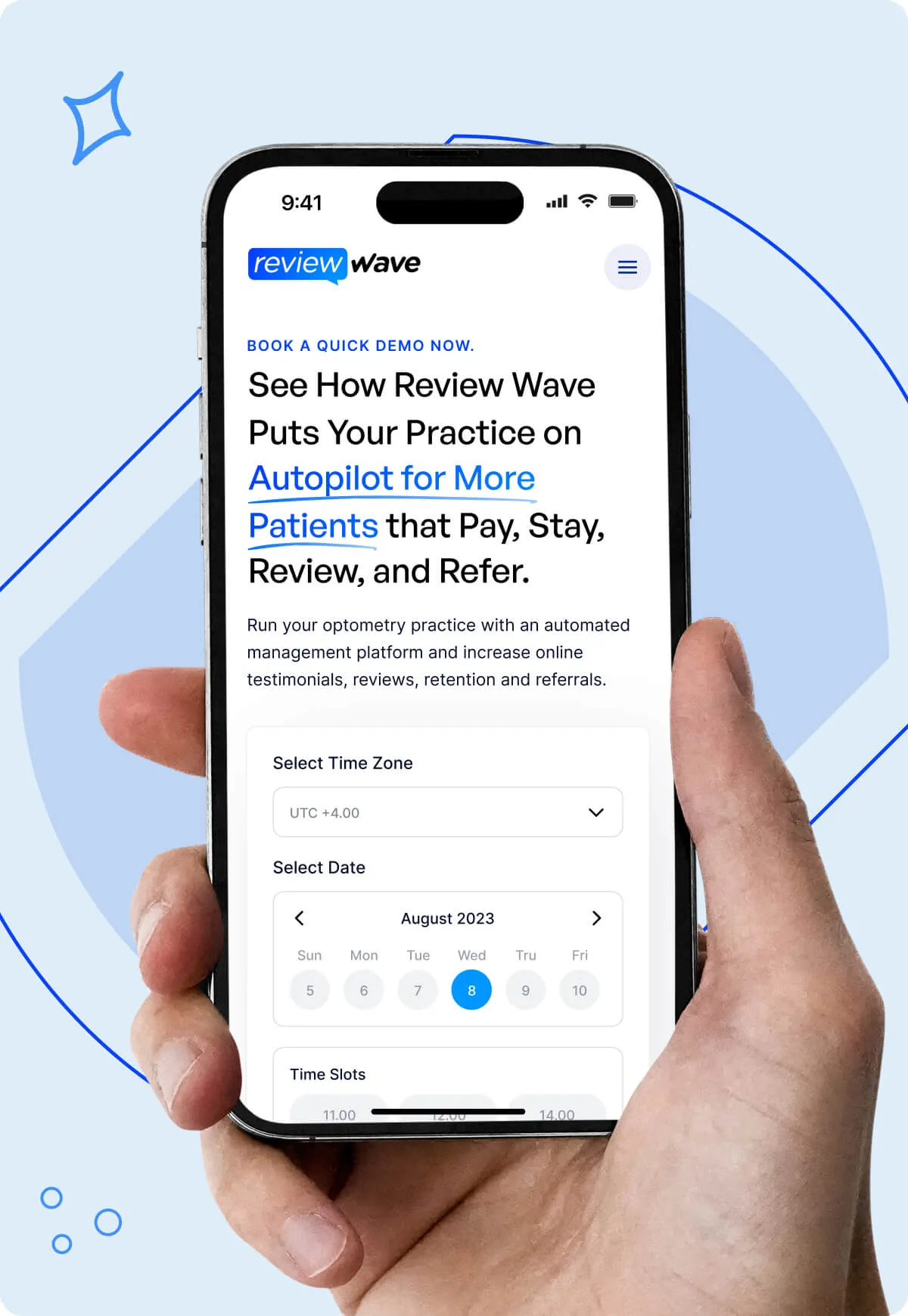
Lastly, for the Demo page,
we advised a concise hero,
an easy-to-use form,
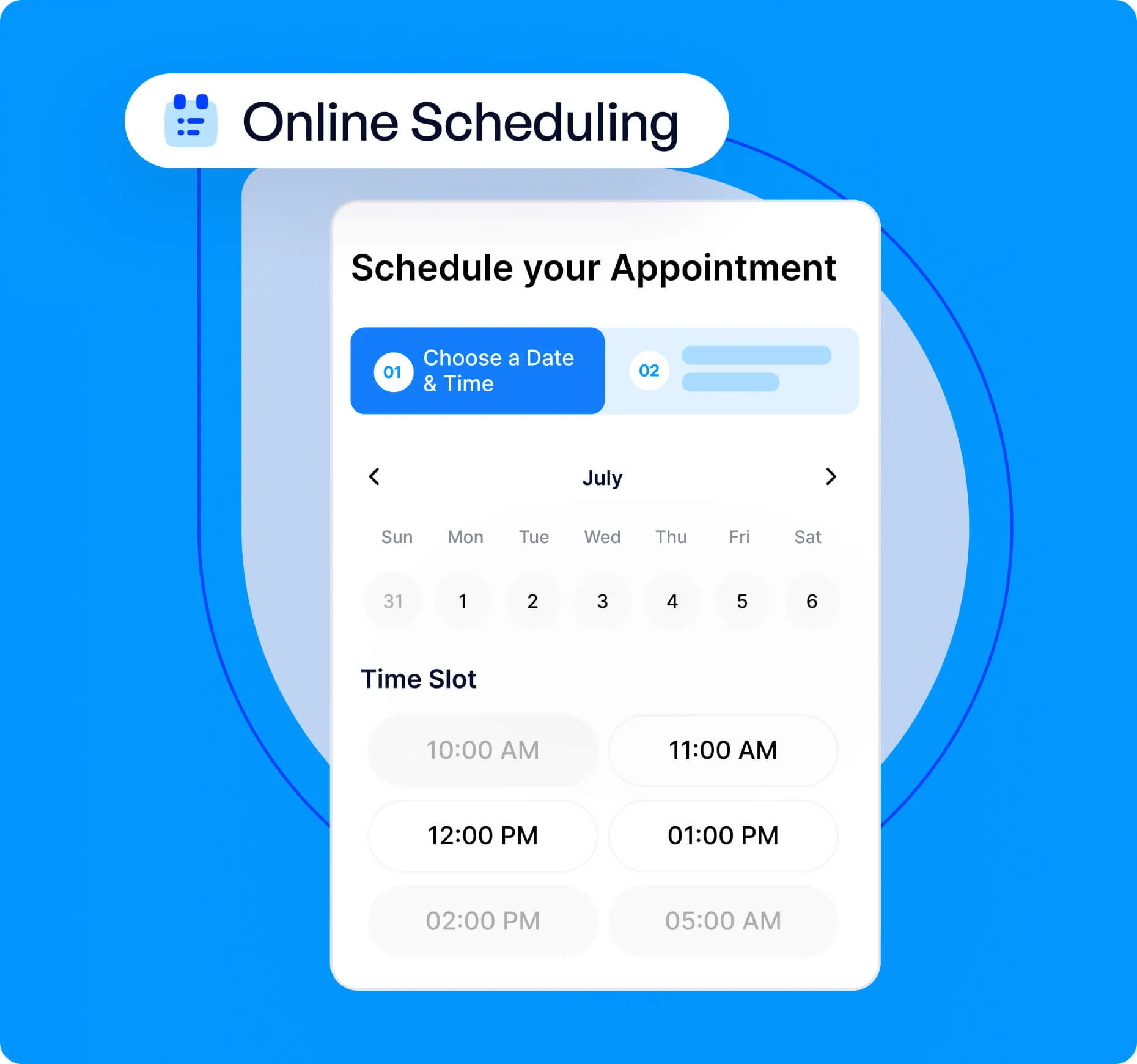
a clear outline of what the demo includes (supported by a grid of features), and
a final CTA that creates urgency and reassurance.
These recommendations led to a coherent narrative that resonates with their ICP and positions Review Wave as the clear choice in a crowded market.
Copy review
The final step was a thorough copy review.
We provided line-by-line feedback, refining everything from individual sentences to entire sections—ensuring their messaging was as clear and compelling as possible.
%20(1).avif)
%20(1).avif)
Design
Review Wave wanted a simple design that would help the different parts of the product shine and show the drastic difference it made to a customer’s practice.
The brief was simple: they wanted a clean and light tech website with no dark sections.
The vibe needed to be “business casual”—professional-looking in order to nurture trust and appeal to the healthcare industry, with some fun elements that would make us approachable.
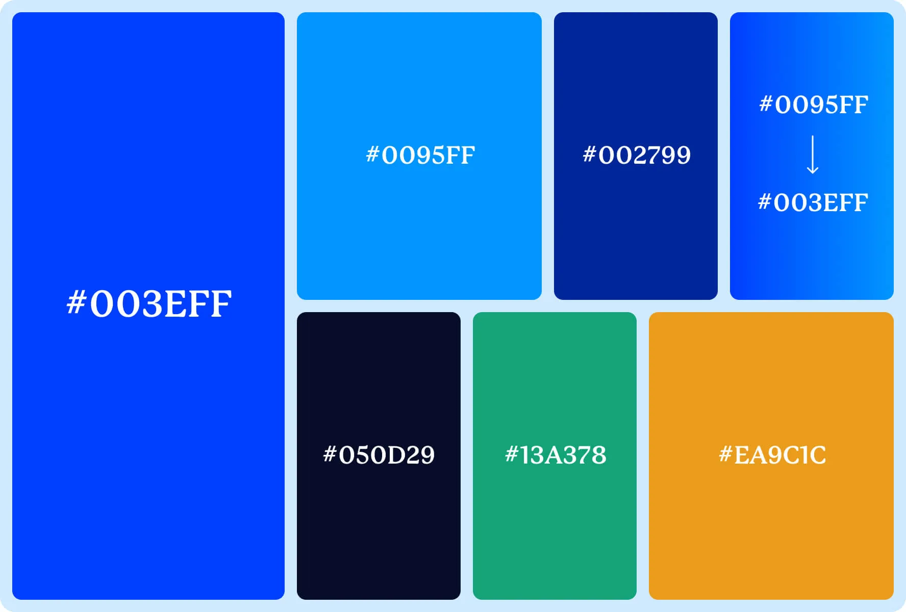
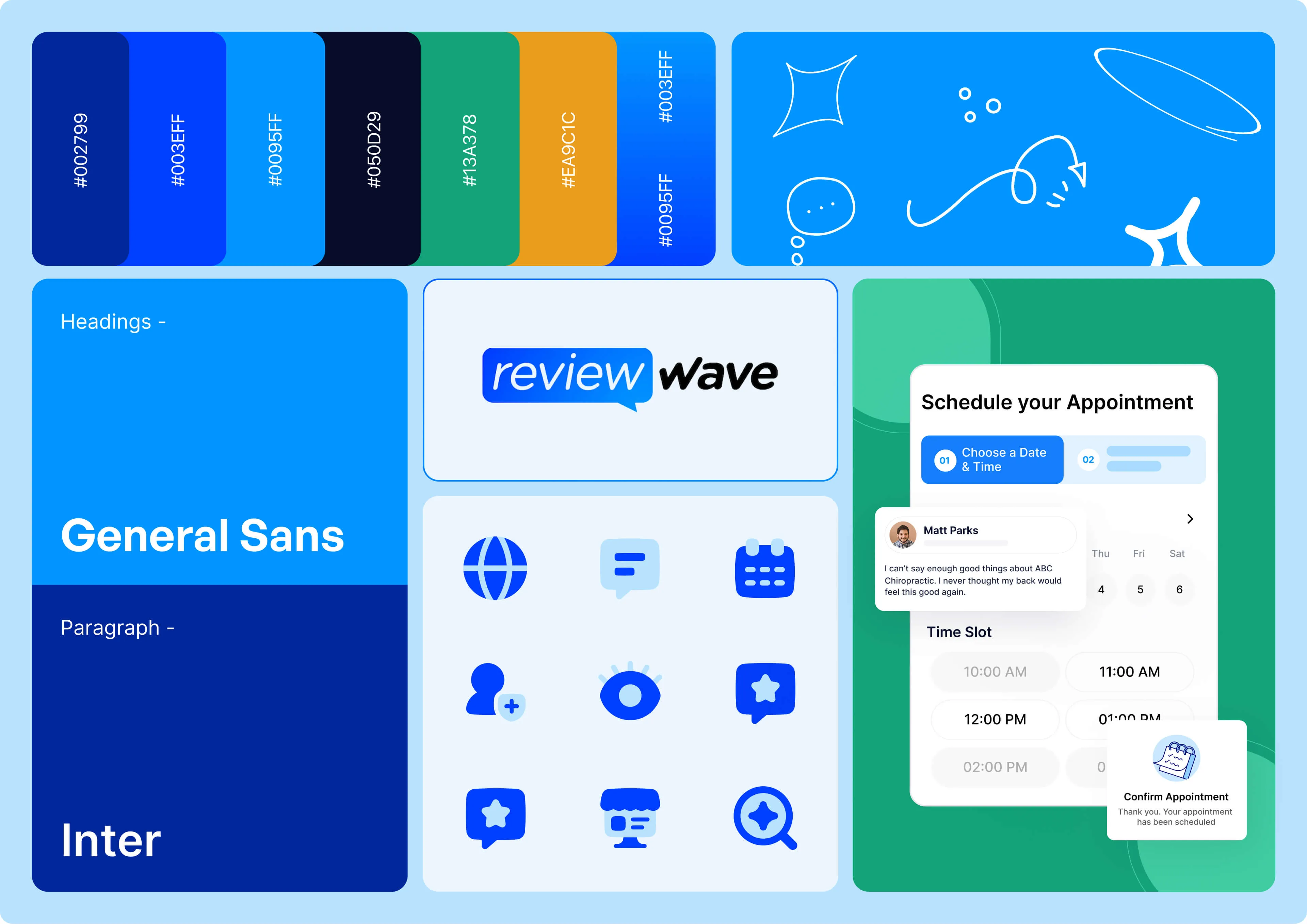
Colors
We stuck to the characteristic blue as their brand color, used tonal variations and loads of white to keep things fresh. We also ensured that the colors within the visuals complement the primary palette.
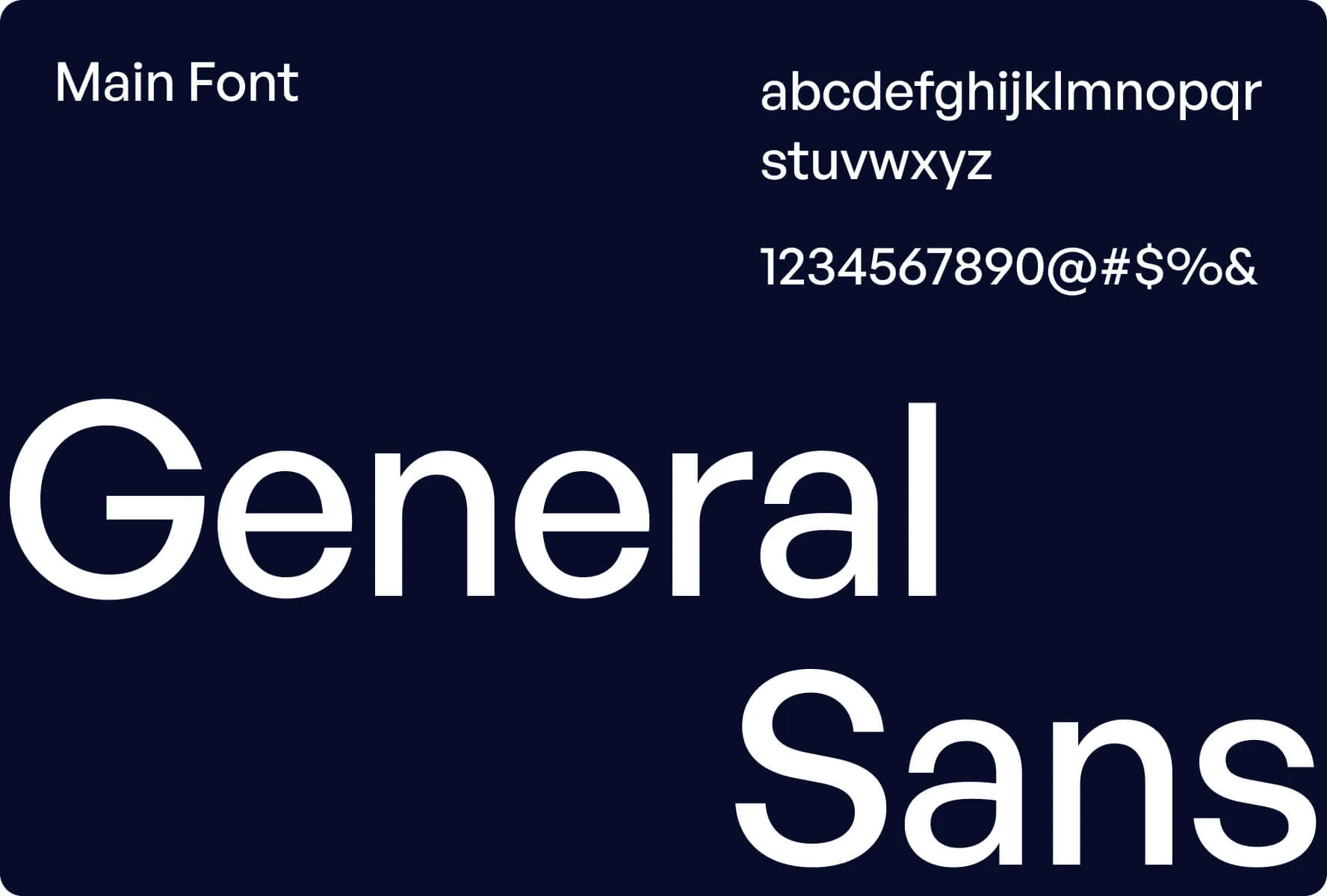
Fonts
We used a sans-serif font called General Sans for a simple yet distinct look.
Illustrations
We combined structured shapes for a professional feel with doodles for personality.
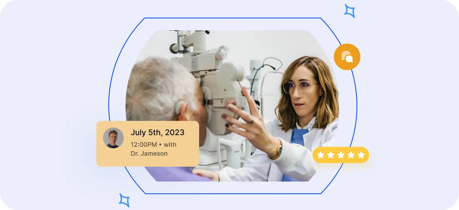
To balance the visuals, we mixed high-quality stock images with product shots, adding a human touch.
Finally, we refined the layout and animations to showcase the product at its best.
We solved the main challenge of maintaining a balance between the professional and fun side, and the client was stoked with our effort.
Development
Here’s how we tackled the build
We created a comprehensive style guide, making it easy for their team to manage updates while ensuring a smooth handover.
The design focused on clarity and efficiency, with a streamlined interface and intuitive navigation.
To boost engagement, we integrated step-by-step guides and well-defined CTAs, helping users navigate key processes effortlessly.
With a feature-rich site, extensive testing was a must. We optimized performance across all major browsers, ensuring fast loading times and seamless functionality.
Here’s what the client had to say about why they chose us:
“These guys are professionals, they know what they’re doing, and if you’re on the fence, you should just suck it up and get on board.”
Result
We helped Review Wave build a professional-looking website that addressed their ICP, highlighted the right outcomes and differentiators, showcased the product, and inspired trust.
A bonus? They doubled their conversion rate overnight!