

.jpg)


Nobody scrolls back up to read a hero section twice. If the top of your website doesn't say something worth stopping for, the rest doesn't matter.
The issue isn’t design flair or clever phrasing. It’s that too many hero sections sound like filler - broad claims, no context, nothing specific enough to stick. That’s where you lose people.
People don’t read websites the way they read brochures. They skim, scan, and bounce fast when a headline feels like filler.
Good hero sections do one thing well: they lock attention in under five seconds. In this article, we’ll shed light on what that looks like in practice and how you can apply it without sounding like everyone else. Sounds good?
TL;DR:
- Good design won’t save vague messaging. Your headline has five seconds to earn attention; if it’s generic, even great visuals won’t hold interest.
- Most SaaS products are complex - your hero section can't be. The more layered your offering, the simpler and sharper your top message needs to be.
- One CTA is usually stronger than three. Give users one clear action to take. Too many choices = no choice.
- Speed matters more than style. The best headline in the world won’t matter if it loads a second too late. Optimize assets ruthlessly.
Key Elements of a Hero Section
The average time on page is 52 seconds, and the majority of that gets spent above the fold, glancing over the hero section. But you won't get that far unless the hero section stops the scroll first.
We have seen companies pour resources into perfecting their product pages while their hero section screams "generic startup template." Then there's the opposite extreme: brands that treat their hero like a billboard, cramming every possible message into one screen until nothing stands out.
One client had a full-screen image of a mountain range with the line “Reaching New Heights.” Nice sentiment, but no one could tell what they actually did.
Another had a sharp product but led with three stacked CTAs before a single line of context. That kind of thing only makes visitors second-guess where they are.
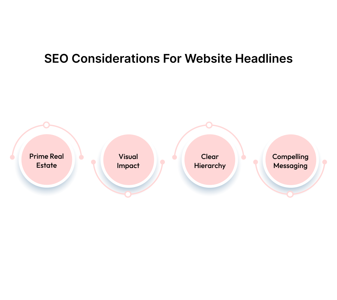
An impressive website hero section comes down to just a handful of elements -
1. Prime Real Estate Positioned at the Top
The top portion of your website gets the most attention (57% time on page goes here) because that's where people start reading. You have roughly 1,024 pixels of height on most screens before visitors need to scroll.
Everything that matters most should fit within this space. The moment someone has to scroll to understand what you do, you've already lost half your audience.
2. Visual Impact with Full-Screen, High-Quality Visuals
Your hero image or video does more than fill space - it sets expectations about your brand quality. A blurry product shot or generic stock photo signals amateur work before visitors read a single word.
The visual should connect directly to your core message, not distract from it. Full-screen coverage creates immersion, but only when the image adds context to your value proposition.
3. Clear Hierarchy and Navigation
Once you've stopped the scroll, visitors need to know where to go next. The primary call-to-action should stand out visually and use action-oriented language. Secondary navigation should be present but not compete with your main message.
Too many options create decision paralysis. One clear path forward converts better than five mediocre ones.
4. Compelling Messaging Alongside Visuals
The headline and subtext need to work together to answer one question: why should someone care? Generic phrases like "innovative solutions" or "transforming businesses" tell visitors nothing about what you do.
Specific language that addresses a real problem gets attention. Your message should be clear enough that someone could explain your service to a friend after reading it once.
Also read: Website Copywriting Examples from Incredible Businesses.
Now that the basics are on the table, let’s look at some real websites that have nailed it. Clean messaging, sharp visuals, and not a word wasted.
Top 10 Website Hero Section Examples in 2025 for Inspiration
We chose smaller SaaS businesses over household names because they face the same constraints you do - limited budgets, tight timelines, and the pressure to convert every visitor.
These brands can't rely on brand recognition to carry weak messaging, so their hero sections work harder and smarter.
1. SmartMoving
- Outcome-focused headline: "Crush the Profit Ceiling" cuts straight to the core frustration of moving company owners who work harder but don't see proportional returns.
- Concrete promises over vague claims: "Achieve peak profitability" tells visitors exactly what they'll get instead of generic improvement language.
- Social proof placement: Revenue growth numbers like "60% revenue growth" and "doubled profits" sit right in the hero area, where they can't be missed.
- Strategic testimonial stacking: Multiple customer results create immediate credibility without requiring visitors to scroll for validation.
- Visual hierarchy that converts: The bold promise flows logically down to credible testimonials, building trust before asking for action.
2. SPRY
- Testimonial-first strategy: Opens with customer quotes instead of self-promotion, letting satisfied users explain the value proposition.
- Peer validation over marketing copy: Physical therapy practice owners trust other practitioners more than company messaging.
- Rotating quotes with context: Each testimonial includes speaker credentials and practice details so prospects can identify with similar users.
- Specific outcome mentions: Testimonials highlight concrete results like "saving time in documentation" and "improving workflow" rather than vague benefits.
- Multiple pain points covered: Different testimonials address various concerns without overwhelming visitors with too many messages at once.
3. Truckbase
- Anti-spreadsheet positioning: "It's time to ditch the spreadsheets" immediately calls out the manual processes that trucking operators hate most
- Industry-specific metaphor: "Puts carriers back in the driver's seat" uses familiar trucking language to communicate control and empowerment
- Dispatcher liberation angle: "Free up your dispatchers to book more high-paying loads" targets the person who influences software decisions while promising revenue growth
- Visual product demonstration: The dashboard screenshot shows actual functionality instead of generic illustrations, proving the software works in real trucking environments
4. DearDoc
- Market reality statement: "Most patients are looking for doctors online" establishes the fundamental shift in patient behavior that practices must address
- Competitive imperative: "Make sure they find you" creates urgency around visibility and patient acquisition in a crowded digital marketplace
- Quantified value proposition: "400% increase in website visits" provides a specific metric that medical practices can evaluate against their current performance
5. Infisign
- Headline is bold but borders on marketing-speak: “Zero Breaches, 100% Security” is high-stakes language - eye-catching but could use a qualifier or proof nearby.
- Gradient CTA draws the eye immediately: The “Get a Free Trial” button pops more than the primary headline, which might be unintentional.
- Subhead clarifies product use without fluff: Talks about identity, access, and governance with plain language - useful for first-time visitors.
- Search bar below the hero is a clever touch: Encourages interaction right away, though it slightly distracts from the main CTA stack.
6. BPR Hub
- Headline pairing reflects strong intent hierarchy: “Get certified faster” delivers the immediate win. “Stay audit-ready every day” balances it with long-term value. The sequence feels deliberate - short-term hook, sustained outcome.
- The supporting copy brings surprising specificity: Instead of vague benefits, it lists “clause mapping,” “audit workflows,” and “expert-backed templates” tied to 30+ standards. That kind of detail builds authority fast.
- CTA is visually distinct and frictionless: “Book a free demo” appears both in the nav and mid-hero, placed just after value has been established. The button styling doesn’t try to be clever, it’s just clear.
- The visual, while relevant, lacks connection to product UI: The factory image makes sense for a manufacturing audience but doesn’t reinforce how the product works. A dashboard or feature tease would help close that gap.
7. Acorn Compliance
- The value prop feels both credible and charming: “Automated Compliance that works like magic” sets a trustworthy tone while adding a touch of personality. It tackles a tedious problem with a whimsical, easy-to-trust promise.
- Typographic contrast helps the message land: Mixing serif and sans-serif fonts (plus the pink vs. navy color split) adds clarity and pacing to the message. It’s not just pretty - it nudges the eye where it needs to go.
- Subtle visuals support the theme: The soft stars and pastel gradients reinforce the “magic” idea visually, without stealing attention from the copy. It adds brand personality while keeping the page clean.
- CTAs respect different user moods: Offering both “Book a Discovery Call” and “See a guided demo” gives users freedom. One for those just browsing, the other for buyers already evaluating.
8. Avoma
- The headline mixes clarity with character: “All-in-won AI” is playful, and immediately makes Avoma feel like more than just another productivity suite. It makes you pause just enough.
- Colour highlights break up cognitive load: Each key capability is in its own colour—“note-taking,” “scheduling,” “coaching,” etc, which makes it easier for the reader to parse the product's scope at a glance.
- Objection-handling copy does heavy lifting: The line “All-in-one doesn’t mean you have to buy all at once” squashes buyer hesitation. It’s small but mighty, answering a big question before it’s asked.
- CTAs are split by commitment level: “Schedule a demo” for high-intent buyers, “Start a free trial” for testers. Both are equally prominent, making it easy to act regardless of mindset.
- Clean layout tempers the bold visuals: Even with the multi-colored text, the whitespace and clean typography help the section breathe. It doesn’t feel like too much - just enough to intrigue.
9. MailReach
- The headline leads with real outcomes: “Better email deliverability, faster growth” is plainspoken and powerful. It skips fancy phrasing in favor of what users actually want.
- The subtext backs up the big promise: ROI, more meetings, better hires - it’s all laid out, and each phrase gives concrete form to what “better deliverability” actually means.
- Dual CTAs feel tactical, not pushy: “Start improving deliverability” is action-focused, while “Take a free spam test” is low-stakes. Both options create a sense of momentum.
10. Close
- The headline starts with shared frustration: “Stop using slow, cluttered CRMs” leads with pain, not product. It instantly validates how many CRMs feel, especially for small teams.
- Bold color contrast draws attention to the enemy: Highlighting “cluttered CRMs” in electric blue not only adds pop, but it also doubles down on the positioning. Close = clean alternative.
- The subheading talks like the user does: Phrases like “fast,” “automated,” and “focused on relationships” sound human, not corporate. It’s clear the product was built around real user priorities.
- Trust boosters sit right below the CTAs: A quick trio of “14-day free trial,” “no credit card,” “free support & migration” lowers the barrier to entry. You feel safe clicking.
So what do these hero sections have in common? They are intentional. Every word, color, and call-to-action is doing a job. Together, they show us that strong hero sections don’t happen by accident.
Next, we’ll walk through how to build that kind of impact from scratch - the thinking, structure, and choices that go into crafting a hero section people don’t scroll past.
Crafting a Great Website Hero Section
The best hero sections don't just look good - they convert visitors into customers within seconds. But getting there requires more than copying what worked for someone else.
Most companies get stuck tweaking colors and fonts when the real work happens at the strategy level. Here's how to build a hero section that makes a great first impression:
Getting the structure right is one part of the job. But even a well-written, fast-loading hero section won’t stay effective forever. Messaging gets stale, buyer behavior shifts, and what worked once may slowly stop converting. Therefore, thorough continuous testing is the answer.
Tools and Methods for Testing the Hero Section
A/B testing reveals what strategies actually work, not what you think should work. Start with high-impact elements like headlines and CTAs before testing smaller details.
- Crazy Egg and Optimizely make it easy to test different hero variations with real visitors. Start simple - test one headline against another, then move to CTA button colors or positioning.
- Hotjar's heatmaps show where visitors are looking and for how long, revealing how well your hero section is guiding attention towards the key message and primary CTA.
At Beetle Beetle, we like to run 3-5 hero experiments per quarter to gradually improve performance rather than making dramatic changes that might backfire.
Design a Hero Section Worth a Second Look With Beetle Beetle
Building a strong hero section is hard enough, but in B2B SaaS, it’s a different kind of challenge. Products are complex. Buyers are busy. If the first screen doesn’t explain the value instantly, no one’s sticking around to figure it out. Unless it’s clear in five seconds, it’s forgotten in three.
Beetle Beetle helps businesses like yours make that first moment count with hero sections that get straight to the point - clear, relevant, and impossible to ignore.
Our web designers and SaaS-focused copywriters are extensively trained to package complexity into clarity.
We’re trusted by 100+ B2B SaaS teams for full website design, development, conversion copy, and revamp strategy. What we do differently? We write like your buyer thinks and design for how they browse.
Ready for a website that's instantly clear, compelling, and conversion-optimized? Hire us for SaaS website design and copywriting today.
FAQs
1. What are hero sections?
A hero section is the topmost area of a webpage, usually the first thing visitors see. It sets the tone, communicates the core offer, and drives first-click decisions.
2. What is an example of hero content?
Hero content typically includes a short headline, a subheading, a CTA, and a supporting visual. For example, “Automated Compliance that works like magic” with a demo button and UI preview, like on Acorn Compliance.
3. What is the perfect hero section?
There’s no universal template, but great hero sections share a few traits: clear benefit-focused copy, minimal distractions, quick load time, and a CTA that matches user intent.
4. How to write a hero section?
Start with the outcome your user cares about. Use concise, confident language. Avoid feature dumps. Write like you’re explaining your product to someone who’s already distracted.


