

.jpg)


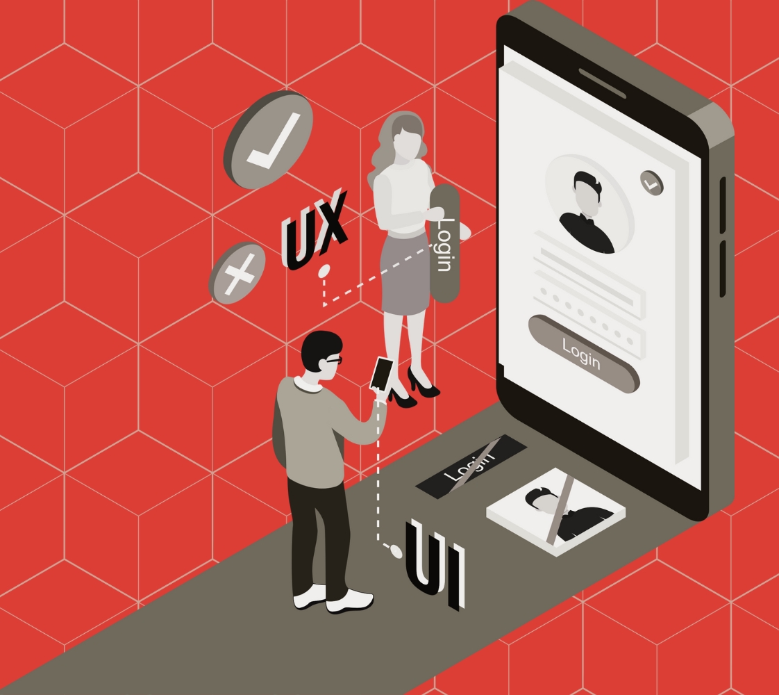
15 Ways to Humanize Your B2B Website for Better Engagement
Why do people scroll right past your homepage, even though your product solves real problems?
It’s not the features. It’s not the pricing table. It’s how the site makes them feel - unseen, unheard, and overwhelmed. B2B buyers don’t lack options; they lack trust. A wall of jargon and stock imagery won’t earn it. When everything feels templated, they tune out.
You’re not selling to personas. You’re speaking to real decision-makers who are short on time, cautious with change, and allergic to vague claims.
Allow us to explain what it means to weave authentic human elements throughout your site while maintaining the credibility enterprise buyers demand.
When done right, website humanization transforms sterile product pages into compelling experiences that build trust and drive conversions.
Key Insights
- Customer Language Reveals Everything: Customers don't say "optimize workflows" - they say "stop wasting time on reports." Use their exact phrases in your copy and watch engagement improve dramatically.
- Pricing Transparency Is a Competitive Advantage: Even complex B2B solutions can show starting points or ranges. This approach filters out bad fits early and builds trust with decision-makers who need budget approval.
- Context Transforms Features Into Solutions: A reporting dashboard means nothing until you explain it pulls monthly performance data for board meetings in five minutes. Every feature needs a specific use case that busy professionals can immediately picture themselves using.
- Founder Authenticity Outweighs Perfect Marketing: One genuine video from the person who built the product carries more weight than dozens of polished testimonials. B2B buyers want to understand the problem-solving passion behind the solution, not just its capabilities.
#1 Rewrite Copy Like You're Explaining To A Peer, Not Pitching To A Lead

Your website visitors aren't blank slates waiting for corporate messaging. They're professionals dealing with real problems under real pressure. When you write like you understand their world, they pay attention.
Drop the formal pitch language.
Instead of "Our enterprise-grade solution enables organizations to optimize workflows," try "Your team wastes hours on manual processes. This fixes that." The second version acknowledges their pain and offers a direct solution.
This shift toward personalized communication matters more than you might think. Over three-quarters of business leaders cited personalization as invaluable to their business's success.
Yet most B2B websites still sound like they're addressing a boardroom instead of a real person sitting at their desk, wondering if this product will actually solve their problem.
Corporate tone creates distance while peer-to-peer communication builds connection. Write like you're having coffee with someone who does the same job as your ideal customer. They'll recognize authenticity immediately.
#2 Add Specific Context To Features
A raw feature list doesn’t mean much if it reads like a spec sheet. Buyers don’t care that a feature exists. They care about whether it fixes something annoying, repetitive, or costly. That means describing the “when” and the “why,” not just the “what.”
Even something as simple as version history isn’t useful until it's clear how that solves a daily problem. For example:
Instead of:
“Built-in approval workflows”
Say:
“Send mockups for internal sign-off without switching tools. Everyone stays on the same version. Comments don’t get lost in email threads.”
Additional Tips:
- Frame features around common user workflows, not technical capabilities.
- Use time-specific scenarios that busy professionals face daily.
- Connect each feature to a measurable outcome they care about.
- Test your descriptions with actual users to ensure clarity.
This way, you’re not just explaining how it works. You’re showing where it fits in someone’s day.
#3 Highlight Real Outcomes, Not Claims
Vague success stories don't convince anyone. Specific results from real customers do. Replace broad claims with concrete examples that your prospects can relate to and verify.
Instead of "Company X improved efficiency by 40%," say "Marketing team at TechCorp reduced report generation from 3 hours to 45 minutes weekly." The second version gives context, timeframe, and a believable improvement.
Real outcomes include the messy details that make them credible. Don't sanitize customer stories. Include the initial challenges, implementation hiccups, and specific metrics that changed. Authenticity beats polish.
#4 Use Photos Of Your Actual Team

Stock photos signal that you're hiding something. Even a simple photo of your real team working builds more trust than perfect strangers smiling at a laptop. Your prospects want to know who they're potentially working with.
Real team photos don't need professional lighting or expensive photography. A candid shot of your team in your actual office works better than any stock image. People connect with people, not concepts.
Consider adding names and roles below the team photos. When prospects see real faces with real titles, your company stops feeling like a faceless entity. This small change makes your entire organization feel more approachable.
Additional Tips:
- Include team shots in the About page and support sections.
- Use images of your actual developers, support agents, or onboarding reps, especially where they’ll be interacting with customers.
- Candid moments work better than posed headshots.
- Avoid filters or over-editing. Keep it honest.
#5 Bring Product Screens Into Real Scenarios
Isolated screenshots tell visitors nothing about how your product fits into their daily workflow. Context transforms confusing interfaces into clear solutions. Show screens within the bigger picture of how work gets done.
Example:
Instead of just showing a dashboard, add a label:
“Here’s where your CSM sees all at-risk accounts before renewal season.”
That small addition anchors the viewer in reality.
Real scenarios help prospects imagine themselves using your product. When they see exactly how a feature solves their specific problem, the value becomes obvious. Context beats clean product shots every time.
#6 Pull Insights From Support Conversations Into Content
Support tickets, pre-sales DMs, and demo call questions aren’t just operational noise. They’re data points telling you exactly where your site is vague, unclear, or too surface-level.
If the same five questions come up repeatedly, they shouldn’t be buried in a help doc or a PDF tucked inside onboarding.
Example: If potential customers keep asking, “Will this integrate with HubSpot and still retain contact history?”, don’t just add it to your FAQ. Mention it clearly in the integrations section of your homepage or product page, with a simple answer and a screenshot if possible.
Even microcopy can help. A single tooltip or short in-product line like “Yes, we sync custom fields from HubSpot” gives users the confidence to keep moving forward without opening a support ticket.
The more you surface what people are already asking, the more trustworthy and usable your site appears.
Additional Tips:
- Review support tickets monthly to identify recurring themes.
- Create FAQ sections based on real questions, not assumed ones.
- Use customer language in your messaging, not internal jargon.
- Address objections directly rather than avoiding difficult topics.
#7 Design For Skimmers Without Insulting Their Time
Your visitors are busy. They want information fast without feeling rushed or overwhelmed. Smart visual hierarchy helps them find what matters without reading every word. Respect their time constraints while providing thorough information.
Use descriptive subheadings that tell the story alone. Someone should understand your main points by reading headlines only. Short paragraphs and focused calls-to-action prevent cognitive overload while maintaining depth.
Avoid layout tricks that treat users like they have infinite patience. Nobody wants to hunt for answers inside a visual puzzle. If something isn’t helping users decide faster, it’s just getting in the way.
And don’t confuse minimalist design with empty space. Negative space is fine, empty messaging isn’t.
The point is every element should serve a purpose. Dense information presented clearly beats sparse content that forces excessive scrolling. Make scanning efficient without sacrificing substance.
#8 Stop Hiding Your Pricing
When someone is evaluating vendors, every unclear step adds delay. And pricing is usually the first detail they try to find. If it’s hidden behind a form or email request, most move on. Not because the cost is too high, but because they don’t trust what’s coming next.
According to a 2023 TrustRadius survey, 72% of B2B software buyers said unclear pricing was the biggest blocker during vendor selection. Not product features. Not UI. Pricing transparency.
If your model is custom, fine. But say why. Maybe the pricing depends on API usage, user tiers, or the number of integrations. Tell them that upfront, and give a realistic range or example scenario.
Transparency shows you're confident in your value. Silence implies something’s being padded.
#9 Let Your Customers Write Parts Of The Page
Buyers read between the lines. When every testimonial sounds like it was filtered through PR, they stop believing any of it. What actually resonates is casual, honest feedback - the kind people share on Slack, not in a case study interview.
Ask your users simple, unexpected questions like:
- What almost stopped you from signing up?
- What surprised you after the first month?
- What’s your team using more than expected?
Answers like “Honestly, we planned to cancel after the free trial, then it became the one tool we couldn’t drop” are more persuasive than a rehearsed quote about ROI.
Feature those snippets on product pages, not just a testimonials section. Sprinkle them in context, near relevant features or pain points. Let your customers make the case in their own words.
#10 Clarify Who Your Product Is Not For

Clear positioning prevents bad-fit customers from wasting your time and theirs. It also makes your ideal customers feel like you built the product specifically for them. Exclusivity creates appeal in B2B markets.
Instead, take a stance. If your platform isn’t built for small agencies or early-stage teams, say that upfront. A line like “Best suited for teams with 10+ sales reps or multi-touch deal cycles” helps the right leads self-select in and the wrong ones self-select out.
This doesn’t alienate people. It gives buyers clarity. It also saves you from bloated pipelines full of unqualified demos that waste time on both sides.
Drawing clear lines shows confidence. People trust companies that know their ideal customer and don’t hedge their messaging.
#11 Avoid Clickbait CTA Language
Your call-to-action buttons should match the experience you're offering. Overly dramatic language creates false expectations and erodes trust. Let your product's actual value drive conversions, not hype.
"Get Started" clearly communicates next steps. "Transform Your Business Now" sounds like a pop-up ad. Professional buyers recognize and avoid marketing manipulation. Straightforward language builds more confidence than excitement.
Match your CTA language to the commitment level you're requesting. "Schedule a Demo" is honest. "Revolutionize Your Workflow" overpromises. Clear expectations lead to better-qualified leads and higher conversion rates.
#12 Use Microcopy To Acknowledge Bottlenecks

Every website has friction points. Loading screens, error messages, and form fields create small moments of confusion. Thoughtful microcopy guides users through these experiences like a helpful colleague, not a robot.
Instead of "Error 404," try "We can't find that page. Try our search or check these popular sections." The second version acknowledges the problem and offers solutions. This approach turns frustration into assistance.
A blank loading screen? That feels broken. A short line like “We’re pulling in your workspace. It usually takes under 30 seconds” feels considerate. Even better if it adds something useful or slightly light-hearted:
“Hang tight - we’re getting your reports ready. Might be a good time to refill that coffee.”
When an error occurs, don’t blame the user. Say what happened and what they can do next, in clear terms. “Looks like something went wrong with the upload. You can retry or email us at support@example.com.”
Good microcopy shows empathy for user challenges. During long loading times, explain what's happening. "Analyzing your data..." feels better than a spinning wheel.
#13 Make The Founder Or Product Owner Visible
One authentic message from the person behind the product can outweigh dozens of marketing paragraphs. Founders and product owners bring credibility that no amount of polished copy can match. Their presence makes your company feel real.
A short video or written note from the founder humanizes your entire brand. They can explain the problem they set out to solve and why they built this specific solution. This backstory creates emotional connection beyond features and benefits.
Keep founder messages focused and genuine. Don't script them heavily. Authentic passion for solving customer problems resonates more than a perfect presentation. People buy from people they trust and relate to.
#14 Write With Clarity Over Creativity
Clever taglines that mean nothing waste valuable attention. Your prospects want to understand what you do, who you help, and why it matters. Clear communication beats creative wordplay every time in B2B environments.
Say what your product actually does in plain language. Avoid metaphors and abstract concepts. If someone can't explain your product to a colleague after reading your homepage, your messaging needs work.
Test your copy with people outside your industry. If they understand your value proposition immediately, you're on the right track. Clarity should never be sacrificed for creativity in B2B messaging.
#15 Reduce Layers Between Question And Answer

Every click, scroll, or guess between a visitor's question and your answer erodes trust. Bring essential information upfront. Don't force people to hunt for basic details about your product, pricing, or capabilities.
Common questions should have obvious answers. If prospects regularly ask about integrations, feature that information prominently. If pricing questions dominate sales calls, address costs clearly on your website. Reduce friction at every opportunity.
Information architecture matters as much as content quality. Well-organized, easily accessible information shows respect for your visitors' time. This consideration builds trust and moves prospects through your sales funnel more efficiently.
This level of customization requires dedicated time and strategic thinking about every piece of content on your site. Unless you have an experienced team that understands both B2B psychology and conversion optimization, it's best to work with specialists who do.
Reinvent Your Visual Identity With a Customized Website by Beetle Beetle
Implementing these humanization strategies across your entire website takes deep market research, strategic messaging, and visual design that actually converts visitors into customers.
At Beetle Beetle, we study your market and deeply understand your customers before crafting crystal-clear messaging that resonates with prospects. Our team develops high-performing sites that are easy to manage and scale while designing your brand and website to stand out from competitors.
We create custom product visuals that explain the true value of your features, helping visitors understand your offerings through beautiful, targeted design that engages visitors, reduces bounce rates, and drives conversions.
Working with skilled artists and illustrators, we ensure all content remains readable while following design best practices to create unique visuals for your website and marketing assets.
Over six years, we've transformed visual identities for 100+ brands. We typically work with companies that maintain a minimum ARPU of $100 per month or $12k annually.
If you're pulling in $30k+ MRR or have a solid ARPU, we should talk more.
Book a clarity call with our founder today to discuss your ideas.
FAQs
1. How long does a typical project take from start to finish?
Most full-scale brand and website projects take between 8–12 weeks. Timelines vary depending on complexity, number of pages, and stakeholder availability.
2. Do you only work with SaaS companies?
Primarily, yes. The team works best with funded SaaS companies or those doing $30k+ in MRR, where clear messaging and visual clarity directly impact conversions.
3. Can you help with content too, or just visuals and design?
Absolutely. Messaging and content strategy are baked into the process. This includes positioning, homepage copy, product descriptions, and microcopy guidance.
4. Will showing real team photos make us look unprofessional or small?
Real team photos actually increase trust and credibility with B2B buyers. Enterprise customers want to know who they're potentially working with. An authentic team photo of five people working together looks more professional than stock images of twenty strangers pretending to collaborate.
5. Should we display pricing even if our deals are mostly custom?
Yes, but provide context. Show starting ranges like "Implementation begins at $15k" or "Monthly plans start at $500/user." Explain what drives pricing variations without being defensive. This transparency qualifies better leads and reduces time wasted on unqualified prospects.


