

.jpg)


Nobody lands on a SaaS homepage looking for a product breakdown. They are looking for proof, a face behind the logo, a voice that sounds real. That’s where your “About Us” page either makes it or loses the reader.
In fact, more than half of visitors (52% to be precise) instinctively head there first, before clicking anywhere else. The sole reason being they are trying to decide whether to trust what’s being sold.
And yet, this page is where design standards still lag. Some crowd it with origin stories that read like resumes. Others flatten their entire identity into a handful of mission-statement clichés. Neither approach holds attention nor builds confidence.
This article looks at SaaS brands that got it right - where design, structure, and copy come together to create something with real staying power.
We will further break down how to build the kind of About page that answers questions before they're asked. And helps close the sale before a demo ever starts.
But before we share top About Us page design examples, let’s ensure we have got the basics right.
Key Insights
- Visual hierarchy drives conversion more than copy quality. Strategic design that guides attention to trust signals matters more than persuasive writing. SmartMoving's badge placement and Credit Repair Cloud's metric visualization show how visual weight influences credibility before visitors read content.
- Problem universality creates stronger engagement than solution differentiation. Acknowledging widespread industry frustrations builds an immediate connection. Prospects engage more when recognizing their struggles in your narrative than when you lead with unique capabilities.
- Founder vulnerability builds trust faster than achievement lists. Personal admissions of being overcharged or facing struggles create an authentic connection that generic success stories cannot match. This transforms vendors into allies who understand customer pain firsthand.
- Industry-specific language signals expertise better than broad claims. Precise sector vocabulary demonstrates insider knowledge while generic SaaS language suggests surface-level understanding. Hakimo's security terminology and Acorn's compliance frameworks immediately communicate deep expertise.
Core Components of B2B SaaS Website About Us Pages
Visitors who check out your About Us page end up spending 22.5% more than those who bypass it completely, according to Business Dasher. This pattern reveals something important about buyer behavior. These aren't casual browsers killing time. They're serious prospects conducting due diligence on your company.
B2B software purchases involve multiple stakeholders, lengthy approval processes, and significant financial commitments. Your About Us page becomes part of their risk assessment.
They want proof that your company can deliver on promises, support their growth trajectory, and remain stable throughout a multi-year relationship.
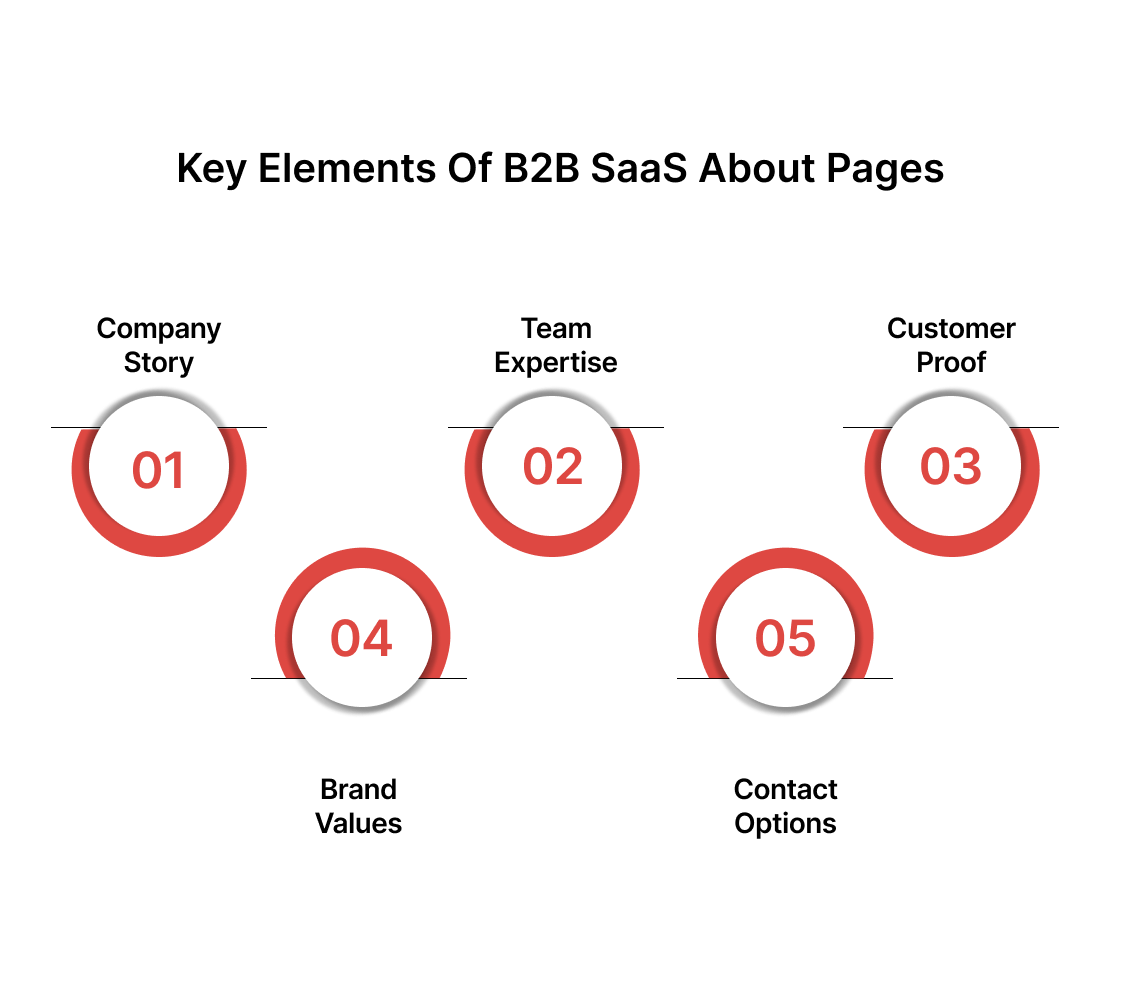
The most effective pages address these concerns through five core components:
1. Company Story And Mission
Skip the generic "we make business better" statements. Instead, articulate the specific market inefficiency or customer pain point that sparked your company's creation. Explain why existing solutions fell short and how your approach differs.
B2B prospects want to understand your problem-solving methodology because it indicates how you'll handle their unique challenges.
Include concrete details about your market focus, whether that's helping mid-market companies scale operations or enabling enterprise teams to reduce manual processes.
2. Team Credentials And Expertise
Decision-makers evaluate your team's ability to execute on technical promises and navigate complex implementations. Highlight relevant industry experience, previous company exits, technical certifications, and domain expertise.
If your CTO built similar systems at recognizable companies, mention it. If your customer success team has experience with companies in their vertical, make that connection clear. Avoid generic bios that could apply to any software company.
3. Customer Social Proof
According to a 2025 Gartner report, 90% of B2B consumers admit that their purchase is influenced by social proof on the vendor’s website, be that expert endorsements, comparison sites, or user feedback. So if your About page skips over these signals, it’s leaving money on the table.
Gartner Generic testimonials carry little weight. Instead, showcase specific outcomes from companies facing similar challenges. Include customer logos grouped by industry or company size to help prospects identify with your client base.
Feature case studies that detail implementation timelines, integration complexity, and measurable results. When possible, include customer titles and company sizes to help prospects gauge relevance to their situation.
4. Company Values And Culture
B2B partnerships continue long after the initial purchase through onboarding, support, and ongoing optimization. Your prospects want insight into how you handle pressure, resolve conflicts, and prioritize customer needs versus internal goals.
Share your approach to customer support, product development philosophy, and how you measure success. If you maintain 99.9% uptime or respond to support tickets within specific timeframes, include these operational commitments.
5. Clear Contact Pathways
Different stakeholders need different types of engagement. Technical evaluators want product demos and integration details. Budget holders need pricing conversations and ROI projections.
End users want to understand the daily workflow impact. Design multiple entry points that connect prospects with the right person or resource based on their role and current evaluation stage.
Each element works together to build credibility and reduce perceived risk. When prospects see relevant experience, satisfied customers, and transparent communication, they move closer to a purchasing decision.
Now, before you go ahead and start refining the page, it helps to know what not to do. Each misjudgment on this page chips away at the confidence you're trying to earn.
Most Common About Us Page Design Mistakes That Can Affect Your Conversions (Badly!)
Even well-intentioned companies sabotage their conversion potential through predictable design errors. These mistakes signal unprofessionalism, create friction in the buyer journey, and give prospects reasons to explore competitor alternatives.
- Generic stock photos of diverse teams pointing at laptops - Prospects immediately recognize fake imagery and question what else might be inauthentic about your company's claims or capabilities.
- Vague mission statements filled with buzzwords like "innovative solutions" - Business buyers need specific problem-solving approaches, not corporate speak that could apply to any software company in existence.
- Leadership bios without relevant industry experience or previous company details - Decision-makers want proof your team can execute complex implementations, not just friendly personality descriptions and hobby lists.
- Customer logos without context, testimonials, or case study details - Random logo walls provide zero insight into client satisfaction, implementation success, or measurable business outcomes achieved.
- No clear next steps or contact information for different stakeholder types - Technical evaluators, budget holders, and end users need different engagement pathways to move forward in their evaluation process.
- Outdated team photos, company milestones, or product screenshots - Stale content suggests poor attention to detail and raises questions about product development velocity and company growth trajectory.
- Mobile-unfriendly layouts with tiny text or broken formatting - Many B2B buyers research on mobile devices during commutes or between meetings, making accessibility essential for conversion optimization.
Also read: How to Optimize Your Website for Mobile Devices
Getting the fundamentals right becomes even more important when you see how top-performing SaaS companies execute their About Us pages in practice. This brings us to our next section - the one most of you came here for.
Top 10 B2B SaaS About Us Page Design Examples and Detailed Analysis
We analyzed hundreds of B2B SaaS About Us pages across different market segments and company stages.
Our selection criteria focused on pages that demonstrate measurable conversion principles: clear value proposition communication, strategic use of social proof, authentic storytelling that builds trust, and design elements that guide visitors toward specific actions.
Each example represents a different approach to solving the core challenge of turning skeptical visitors into engaged prospects.
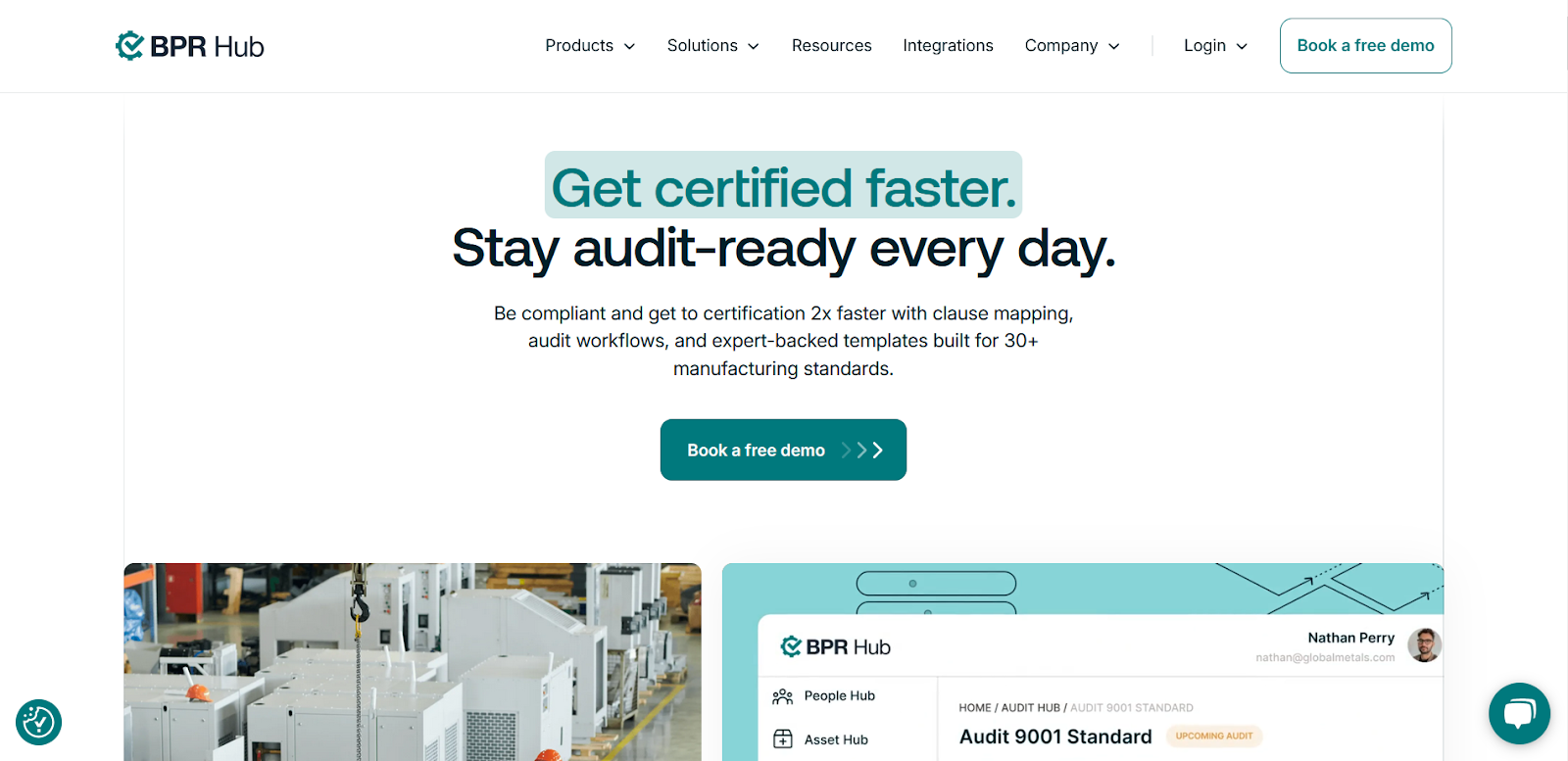
1. BPR Hub
Source
Problem-Solution Narrative Architecture: BPR Hub opens with a direct question that mirrors their target audience's exact pain point: "Struggling to manage compliance and core business ops?" This isn't generic positioning. It's a surgical targeting of manufacturing and industrial companies drowning in regulatory complexity.
Visual Storytelling Through Industry Context: The rotating image carousel shows real manufacturing environments, not stock photos of people pointing at whiteboards. Workers in hard hats, industrial machinery, and actual compliance documentation create immediate recognition for their core audience.
Strategic Social Proof Placement: The media logos (Forbes, Business Insider, Fortune) appear after the value proposition but before the detailed explanation. This sequencing builds credibility at the exact moment when visitors are deciding whether to keep reading.
Conversion-Focused Copy Structure: Notice how "built to help you scale" appears in the headline, then gets expanded in the subtext with specific outcomes: "smoothly while ensuring complete transparency." They're selling the result, not the features.
Trust Signal Integration: The bottom section uses a software interface screenshot rather than abstract graphics. Prospects can see exactly what they're buying, reducing the perception of risk that kills B2B conversions.
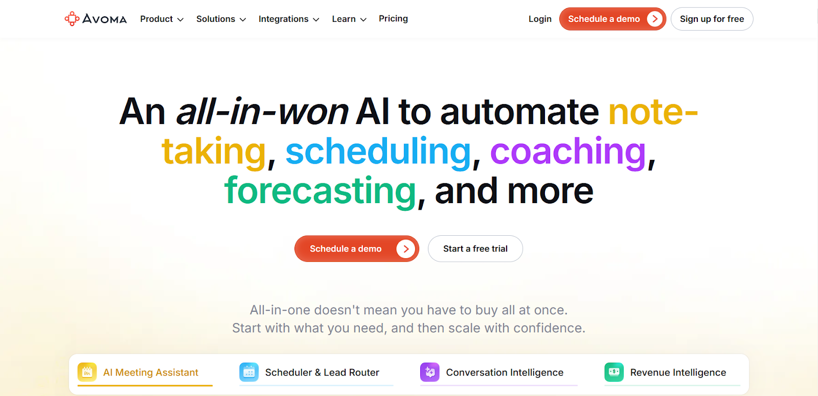
2. Avoma
Source
Dynamic Visual Engagement: The hero images cycle through different meeting scenarios with subtle animation. This movement captures attention without being distracting, solving the common problem of visitors scanning past About sections too quickly.
Narrative Vulnerability as Trust Builder: "All of us have a love-and-hate relationship with meetings" immediately creates a connection through shared frustration. This emotional entry point makes the technical solution feel more approachable and necessary.
Technical Credibility Through Specificity: The explanation of "Human Intelligence and advancements in Artificial Intelligence" positions them in the AI space without overhyping. They're threading the needle between innovation and reliability that B2B buyers demand.
Brand Story with Strategic Purpose: The acronym explanation ("A Very Organized Meeting Assistant") serves dual purposes: it makes the brand name memorable while reinforcing the core value proposition. This kind of storytelling sticks with prospects long after they leave the page.
Environmental Context Design: The background images show real office environments and meeting spaces, not generic corporate imagery. This environmental storytelling helps prospects visualize their own teams using the product.
3. Close
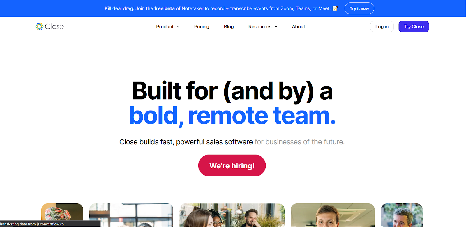
Value-First Opening Statement: "Close builds fast, powerful sales software for businesses of the future" leads with capabilities before company history. This prioritizes what matters to prospects: what you can do for them, not when you were founded.
Quantified Mission Statement: "Double the productivity of every sales rep" gives a specific, measurable outcome rather than vague promises about "improving" or "optimizing" sales processes. B2B buyers respond to concrete claims they can evaluate.
Culture as Competitive Advantage: The emphasis on being "100% remote" and "bootstrapped, profitable" speaks directly to modern sales teams' values around flexibility and working with financially stable vendors.
Values That Drive Decision-Making: Each value connects to customer experience: "Build successful relationships with your coworkers and customers" shows how internal culture impacts client service. This transparency builds trust with prospects evaluating vendor partnerships.
Hiring Process Transparency: Detailing their interview process serves dual purposes: it attracts top talent while demonstrating the thoughtful, systematic approach they likely bring to customer success.
4. Acorn Compliance
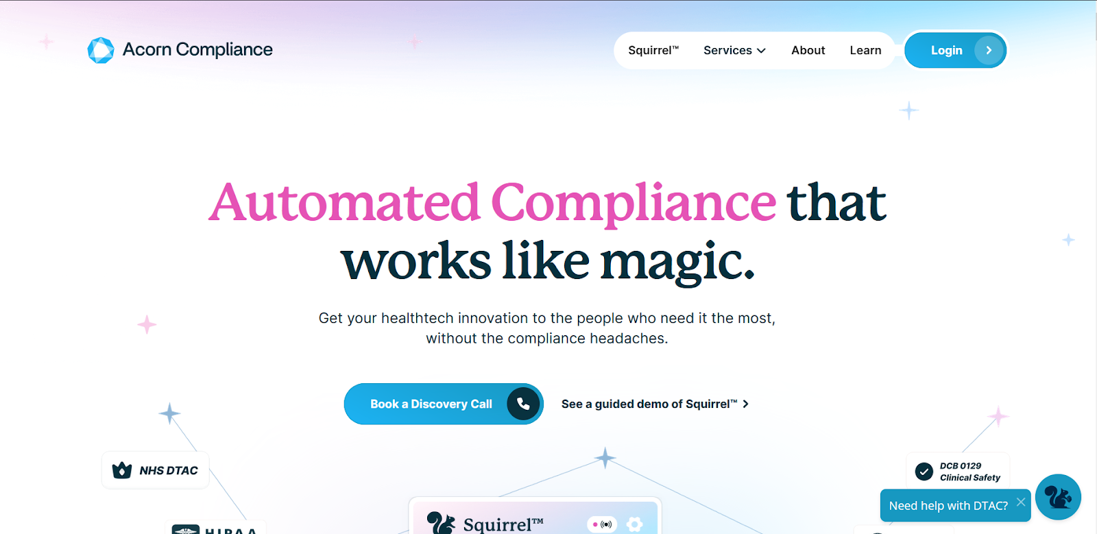
Source
Mission-Driven Problem Framing: "Helping world-changing healthtech innovations get to those who need them most" positions compliance not as a bureaucratic necessity but as a bridge to patient impact. This reframes their service from a regulatory burden to a humanitarian mission.
Founder Credibility Through Context: Michael Bell's 25 years of healthtech experience and COVID-era NHS X assessment work provides specific, verifiable authority. The timeline connects his firsthand observation of compliance struggles directly to the company's founding motivation.
Product as Character Development: The "DTAC Squirrel™" branding transforms complex regulatory compliance into an approachable, almost friendly process. This mascot strategy makes intimidating healthcare regulations feel manageable while maintaining professional credibility.
User Research Integration: "Conducting user research with 100s of healthtechs" demonstrates market validation before product development. This signals to prospects that solutions were built from real customer pain points, not theoretical assumptions about what the market needs.
Outcome Guarantee Strategy: "We assure all of your DTAC evidence and guarantee that your DTAC evidence file will be approved by the NHS" removes the primary risk concern for healthcare innovators. This guarantee shifts the entire sales conversation from capability assessment to partnership evaluation.
5. Hakimo
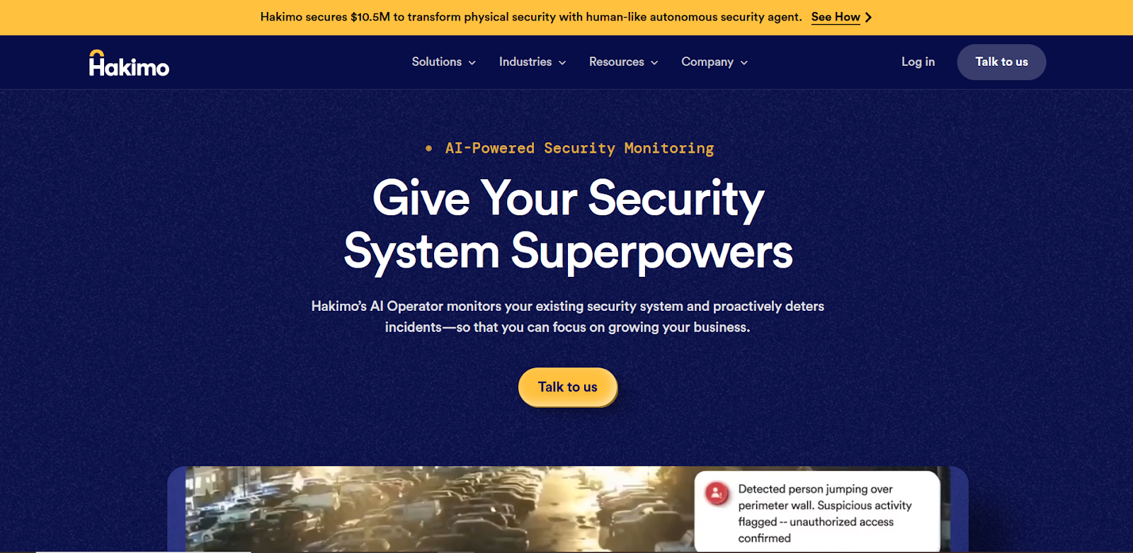
Source
Industry Evolution Narrative: Opening with "physical security has remained largely unchanged" while "cybersecurity has rapidly evolved" creates urgency through comparative stagnation. This positions their AI approach as inevitable industry evolution rather than experimental technology.
Founder Pedigree Positioning: "Stanford AI researchers Sam Joseph and Sagar Honnungar" immediately establishes technical credibility without requiring detailed explanations of their methodology or approach. The institutional authority speaks for itself.
Vision Scale Communication: "Instead of merely solving individual security problems, we set out to redefine security as a whole" demonstrates ambition that attracts enterprise buyers seeking transformational rather than incremental improvements.
Proactive vs Reactive Differentiation: The emphasis on "truly proactive, AI-powered system" addresses the core frustration with traditional security: discovering problems after they've already caused damage. This speaks directly to ROI concerns around prevention versus response costs.
6. Fyno
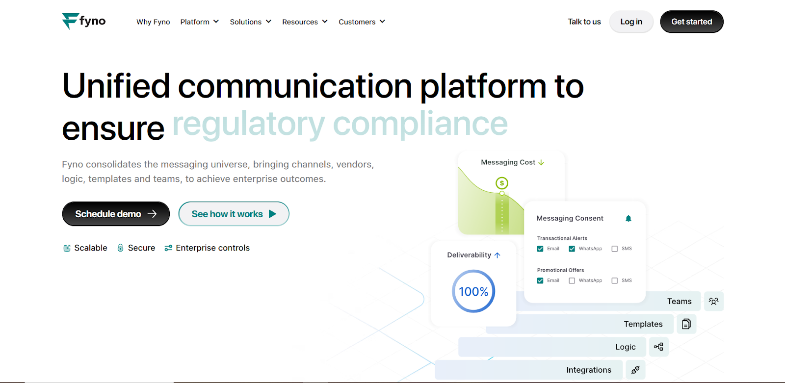
Source
Minimalism with Intentional Focus: Fyno’s About page opens with an ultra-clean layout that puts the mission statement front and center. No clutter, no noise -just a clear articulation of what they’re solving in the notifications infrastructure space.
Product-Led Mission Statement: The description of “a universal notifications layer” speaks directly to their core differentiator. It’s precise enough to matter to developers while still accessible to non-technical stakeholders.
Design That Matches Developer Expectations: The aesthetic mirrors what technical audiences value: clean typography, functional layout, and short, purposeful text blocks. It reflects product thinking in design, just as they should.
Founders Section With Strong Signal: The founder bios are kept brief but informative, with professional images and quick-hit credentials. The presence of this section anchors the tech credibility with human accountability.
7. Credit Repair Cloud
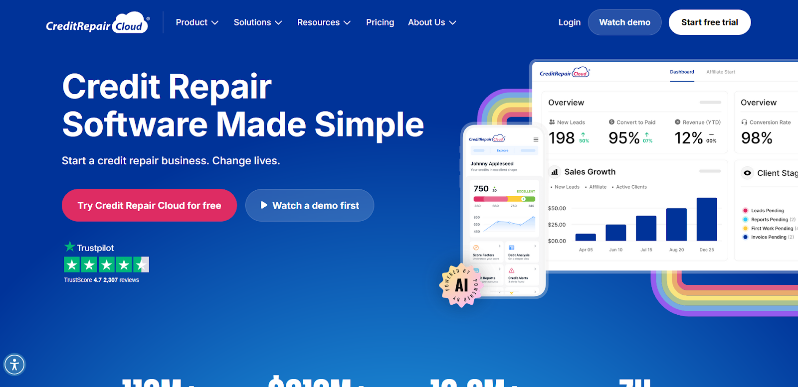
Source
Hero Number Hierarchy: "53M Americans" appears prominently at the top, immediately establishing market size and social impact. The visual weight given to this statistic makes the business opportunity feel massive and urgent.
Metric Visualization Strategy: Key numbers (20.3k users, $229M revenue, 81 millionaires) appear in large, bold typography with visual separation. This design treatment makes impressive statistics impossible to miss during page scanning.
Trust-Building Through Vulnerability: Instead of leading with a mission statement, the company begins with adversity: failure, reinvention, and persistence. This lends authenticity, particularly for a business in the financial services space.
Strong Use of Social Proof: Client success stories, community references, and recognitions (like being Inc. 5000 listed) appear throughout. What’s particularly noteworthy here is that these elements are embedded within the storytelling.
Community as a Brand Pillar: Credit Repair Cloud emphasizes its academy, community, and conference, showing that the business isn’t just transactional. This positions the brand as a larger movement, not just a software vendor.
Clear Audience Fit: The tone, layout, and copy are tailored to small business owners and aspiring entrepreneurs, not financial institutions. Every element reinforces accessibility and approachability.
8. Infisign
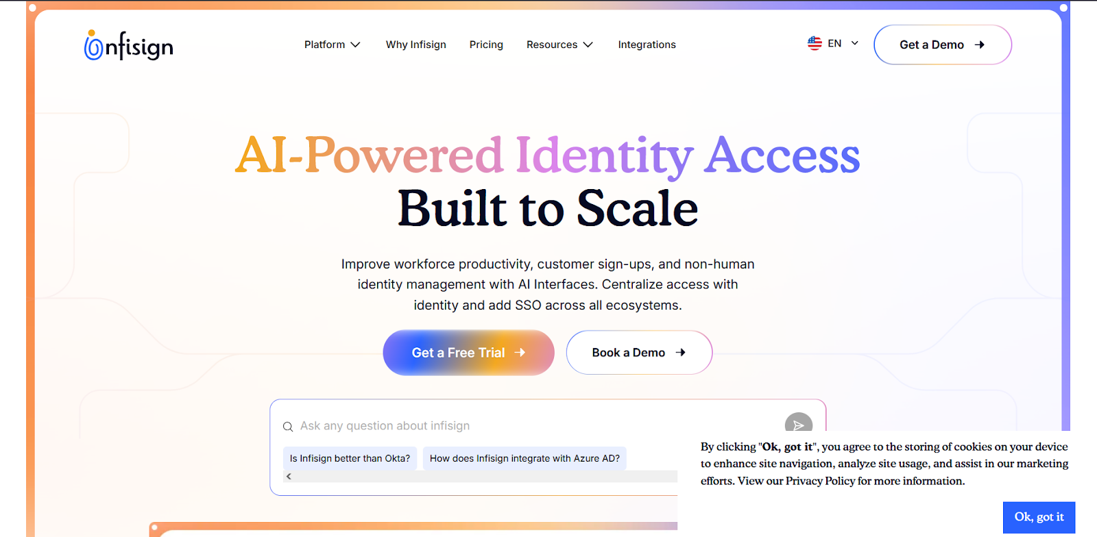
Source
Corporate Minimalism Approach: Clean, sparse design with limited visual elements reflects the security industry's preference for straightforward, no-nonsense presentation. The minimal aesthetic reinforces their focus on substance over style.
Technical Concept Visualization: Zero Trust and SSI concepts appear without complex diagrams or flowcharts, relying on clear typography to communicate advanced security architecture. This restraint suggests confidence in their ability to explain complex topics simply.
White Space as Authority Signal: Generous spacing around core concepts gives each idea visual importance and reading breathing room. This design choice suggests they don't need to overwhelm visitors with information to establish credibility.
Mission Framed as Enablement, Not Fear: Unlike many security-focused companies that lean into threat-based messaging, Infisign frames its value as empowerment: simplifying access while securing digital identities. This reframing helps position them as enablers, not gatekeepers.
9. GetProven
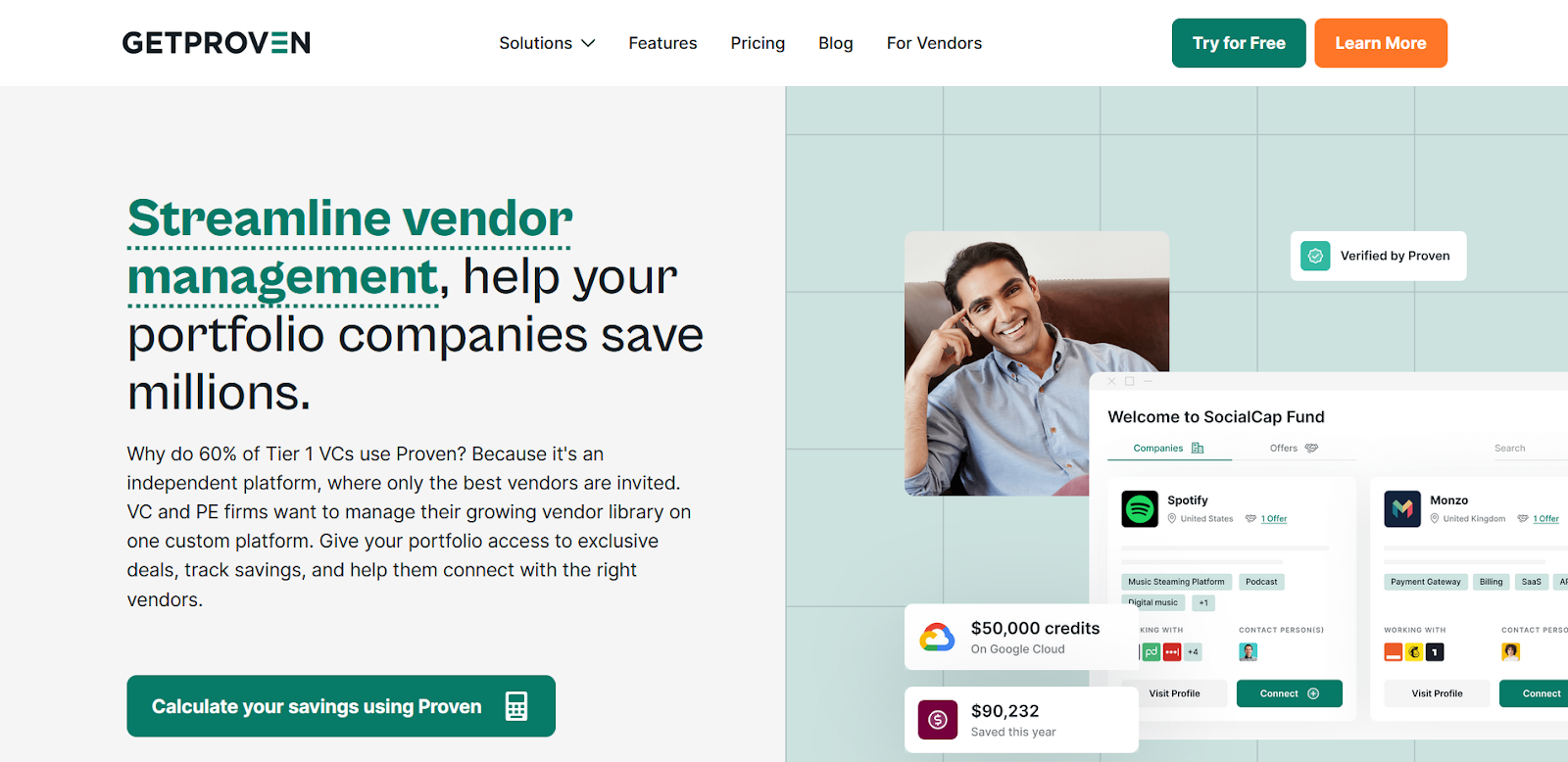
Source
Question-Led Engagement Architecture: Opening with a series of pain point questions ("How many times have startups hired an exorbitantly priced law firm...") creates immediate recognition and engagement. Each question builds frustration that their solution resolves, making the value proposition feel inevitable.
Personal Vulnerability as Trust Foundation: "I started my journey in Silicon Valley with hiring an expensive law firm, that overcharged me" transforms founder experience into prospect empathy. This admission of being ripped off positions them as protectors rather than vendors.
Problem Universality Design: The repeated "How many times" structure creates visual rhythm while reinforcing that these aren't isolated incidents but systemic industry problems. This repetition design amplifies the pain points without feeling manipulative.
Solution Breadth Expansion: Moving from startup focus to "VC and PE firms," "Government agencies," and "Banks" demonstrates platform versatility without diluting core messaging. The visual hierarchy shows growth trajectory rather than scattered targeting.
Founder-to-Platform Evolution: The transition from "I" to "we" to "Proven" mirrors the company's development from personal frustration to scalable solution. This narrative structure helps prospects see their own potential journey with the platform.
10. SmartMoving
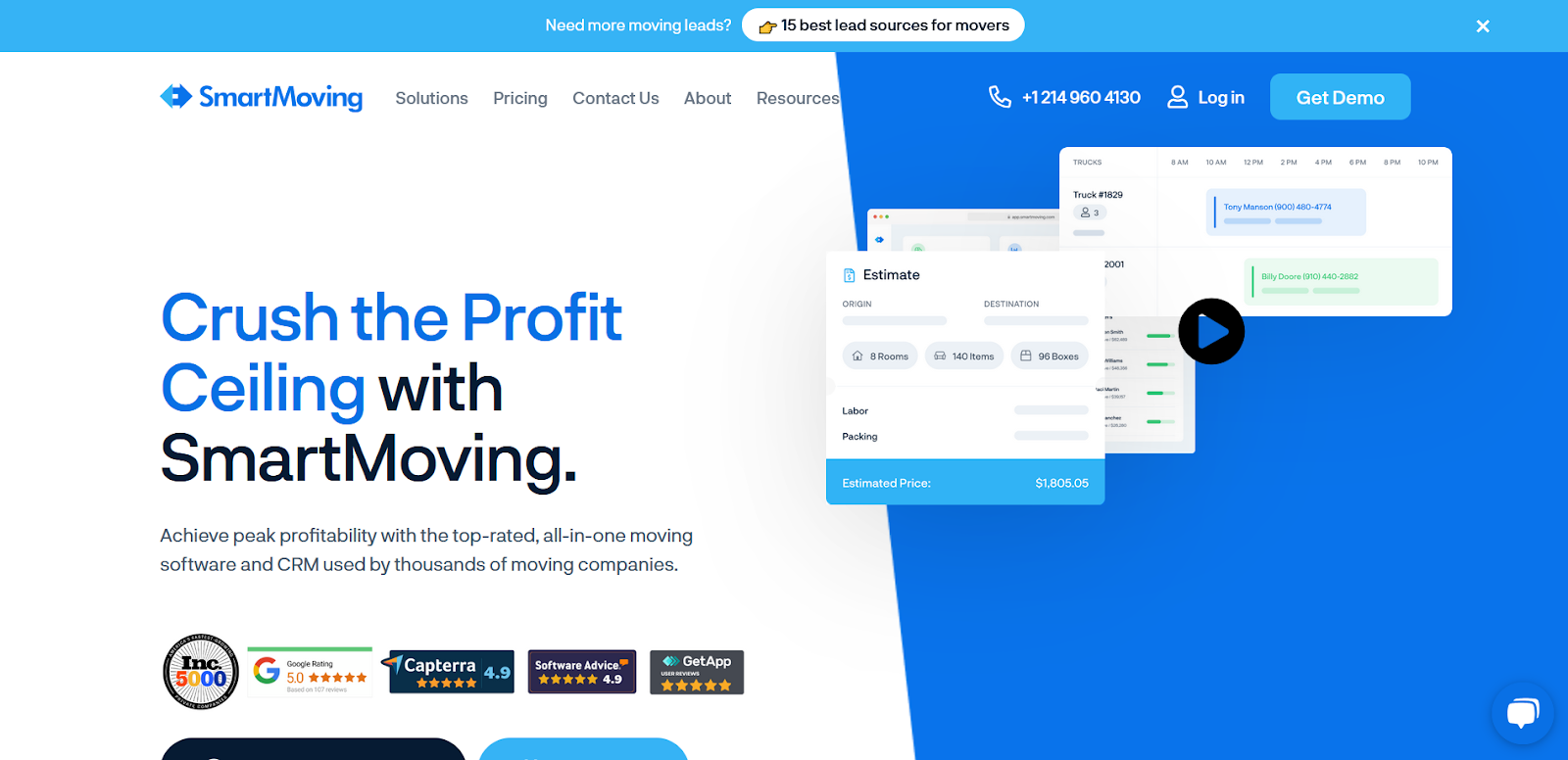
Source
Industry-Specific Authority Positioning: "We help moving companies increase their profitability" leads with the ultimate business outcome rather than software features. This direct value statement cuts through typical SaaS positioning to address what actually matters to moving company owners.
Exclusive Achievement Credibility: "The Only Moving Software on the Inc. 5000" creates immediate differentiation through third-party validation. This exclusivity claim positions them as the undisputed category leader rather than one option among many.
Tone That Mirrors the Audience: SmartMoving’s copy feels like it was written for and by the people who’ve worked in the moving industry. It’s informal but knowledgeable, making it easy for operators and business owners to relate quickly.
Mutual Success Philosophy: "When our customers win, we win" positions the vendor relationship as a partnership rather than a transaction. This alignment messaging reduces the typical buyer's skepticism about vendor motivations.
Transformation Language Strategy: "Transforming the way moving companies run their business" suggests fundamental change rather than incremental improvement. This positioning appeals to business owners frustrated with status quo operations and ready for significant operational shifts.
The bottom line: Creating an effective About Us page, and by extension, a high-performing site, requires an acute understanding of what your audience really wants to know. Without that clarity, there's a good chance you’ll end up with a predictable, forgettable page that feels like every other SaaS site out there.
How Beetle Beetle Can Help
At Beetle Beetle, we don’t start with templates; we start with questions. We study your market, deeply understand your customers, and craft messaging that speaks directly to their intent. Then we design and build standout SaaS websites in Webflow that are conversion-ready from day one.
We’re selective (because we have to be). Only 3 in 10 companies we talk to move forward. If your product is solid and you're ready to grow with purpose, let’s talk.
👉 Book your free consultation today and find out if we’re a good fit.
Frequently Asked Questions
1. How long should a B2B SaaS About Us page be?
Focus on scannable sections rather than word count. Enterprise buyers need more detail about credentials and stability, while SMB prospects prefer concise value propositions. Include enough depth to build credibility without overwhelming early-stage researchers.
2. What's the difference between an About page and a company overview?
About pages target prospects evaluating partnerships, focusing on trust and expertise. Company overviews target investors and the press, emphasizing metrics and market position. Your About page answers "Why trust you?" not "What's your traction?"
3. Should we include our founding story on our About Us Page?
Only when it directly relates to customer pain points or demonstrates relevant expertise. Skip generic origin stories unless they show deep market understanding, like Close's bank error or Proven's expensive law firm experience.
4. How do we balance being human with B2B credibility?
Establish authority through specific achievements first, then add personality through authentic details. Lead with capability proof, follow with humanizing elements that make your team memorable without undermining expertise.
5. What metrics should we highlight on the About Us page?
Choose metrics that impact buyer confidence in your delivery capability. Customer success numbers (revenue generated, problems solved) matter more than vanity metrics like total users or years in business.


