


You can have the best support team in the world, but if your customer service website design is confusing, slow, or buried behind log-ins and menus, customers won’t wait. They’ll bounce, churn, and tell others. Still think design is “just aesthetics”? 96% of customers say customer experience directly impacts their loyalty.
In 2025, support isn’t a cost center, it’s a loyalty engine. And your customer service website is where that trust gets built or broken. Users expect instant clarity, self-serve answers, smart AI assistance, and a seamless path to a human.
This guide breaks down the customer service website designs that are winning, and the ideas you can steal to build support experiences people actually love.
Quick Take:
- The best customer service website designs in 2025 focus on speed, clarity, and self-service empowerment, not ticket deflection gimmicks.
- Modern users expect instant answers, intuitive search, and smart AI assistance that guides them instead of blocking them.
- High-performing support sites organize content around real user intent with clean navigation and clear paths to help.
- Trust is earned fast through uptime visibility, SLAs, support hours, and transparent communication, not vague promises.
- Human support stays accessible; AI and chatbots act as accelerators, not barriers to real help when it’s needed.
- Mobile-ready support experiences matter, because users troubleshoot on the move and across devices.
- Proof and feedback loops turn confidence into loyalty, with useful metrics, article helpfulness scores, and public improvements.
- Customer-service-first design reduces frustration, lifts retention, and turns support from a cost center into a growth lever.
What High-Performing Customer Service Websites Get Right in 2025
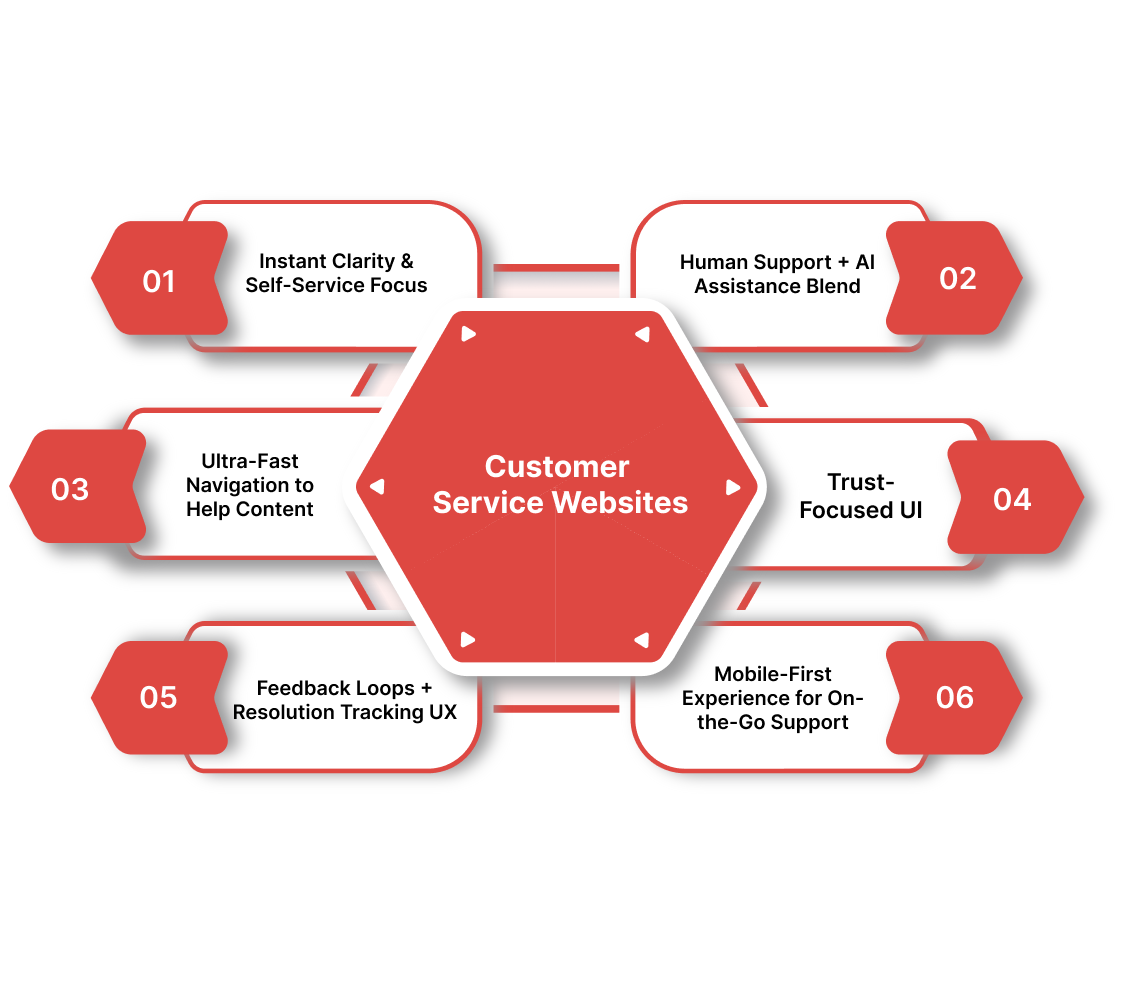
The best brands aren’t waiting for tickets to come in; they’re building support experiences so intuitive, users rarely need to submit one. If your support experience still feels like a maze or forces people to “contact us” for basic answers, you're already behind.
Here’s exactly what high-performing customer service websites get right in 2025.
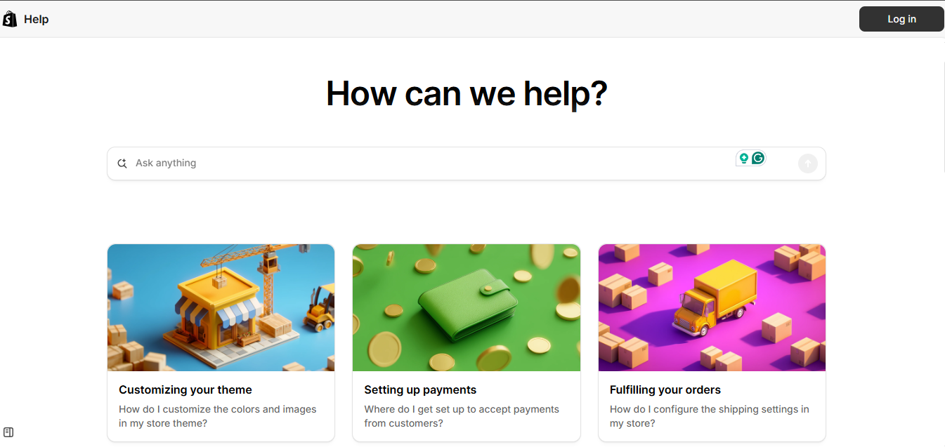
1) Instant Clarity & Self-Service Focus
The strongest support sites make the first 5 seconds count, customers instantly see where to go and how to get answers without friction or forms.
They do this with:
- Clear page hierarchy (“Get Help,” “Product Guides,” “Troubleshooting,” etc.)
- Search bar front and center, not buried under menus
- Popular topics surfaced automatically
- AI-suggested articles as you type
Real-world inspiration:
- Notion — clean help hub with intelligent search + popular topics
- Apple Support — paths by device + top actions above the fold
2) Human Support + AI Assistance Blend
AI handles speed; humans handle nuance. Winning support sites combine both instead of forcing users into one lane.
They do this with:
- AI chat for instant answers + article recommendations
- Smooth escalation to a human agent when needed (no dead ends)
- Suggested FAQs inside chat based on user behavior
- Guided workflows (“Start with quick assistant → talk to expert”)
Real-world inspiration:
- Intercom — AI bot + fast live-agent escalation
- Zendesk — smart routing + hybrid support chat
3) Ultra-Fast Navigation to Help Content
Support shouldn’t feel like digging. Great customer service website design removes clicks, scrolling, and guesswork.
They do this with:
- Mega-menus with problem-type categories
- Breadcrumbs + persistent search bar
- “One click to core actions” UX (track order, reset password, billing help)
- Contextual help embedded within product dashboards
Real-world inspiration:
- Amazon Help — priority actions at the top (“Track package,” “Returns”)
- Shopify Support — structured by business task + clear shortcuts
4) Trust-Focused UI (Safety, Transparency, SLAs)
Customers trust clarity — not marketing language. High-trust support sites make policies, timelines, and data safety visible.
They do this with:
- Clear SLAs and expected response times
- Data privacy + security language near support touchpoints
- Transparent escalation paths
- Verified account indicators before sensitive actions
Real-world inspiration:
- Wise (TransferWise) — transparency on security + support expectations
- HubSpot — clear status pages + uptime transparency
5) Feedback Loops + Resolution Tracking UX
The best support experiences build confidence by letting users see progress, not guess.
They do this with:
- “Was this helpful?” micro feedback inside articles
- Ticket dashboards with live status + timestamps
- Resolution step indicators (Received → Assigned → In Progress → Resolved)
- Automated satisfaction surveys post-resolution
Real-world inspiration:
- Atlassian Support — clean ticket timeline + progress flow
- Figma Community help — fast reaction tools + feedback loops
Also Read: Common SaaS UI and UX Design Practices
6) Mobile-First Experience for On-the-Go Support
Support isn’t desktop-only anymore; users need answers in meetings, on factory floors, in transit, everywhere.
They do this with:
- Thumb-friendly navigation and buttons
- Smart collapsible categories + sticky search
- Persistent chat icon for quick help
- Page speed optimized for LTE and 5G traffic
Real-world inspiration:
- Slack Help Center — mobile-friendly layouts + searchable docs
- Airtable Support — structured content that reads well on mobile
Great support design isn’t theory, it’s already live on the web, shaping how users expect help to work. So let’s move from principles to proof and look at the customer service website designs setting the standard in 2025.
10 Best Customer Service Website Designs in 2025
The best way to understand modern support UX isn’t by reading theories, it’s by studying the brands getting it right in the wild. These aren’t “pretty help pages.” They’re customer service website designs built to reduce effort, increase retention, and turn frustrated users into loyal advocates.
Let’s break down the websites.
1. Apple Support

Apple doesn’t make you hunt. The moment you land, you’re guided by product tiles, smart search, and contextual help flows. It feels like the website already knows what you're trying to solve.
Why it works
- Visual entry points by device (iPhone, Mac, Watch, etc.)
- “Top solutions” surfaced instantly
- Seamless handoff between articles, chat, and store-visit scheduling
- Smart prompts that narrow down issues and eliminate guesswork
What to steal
- Use product-based navigation for fast problem identification
- Keep a persistent search + refined suggestions
- Prioritize self-service but make human help one tap away
2. Zendesk Help Center
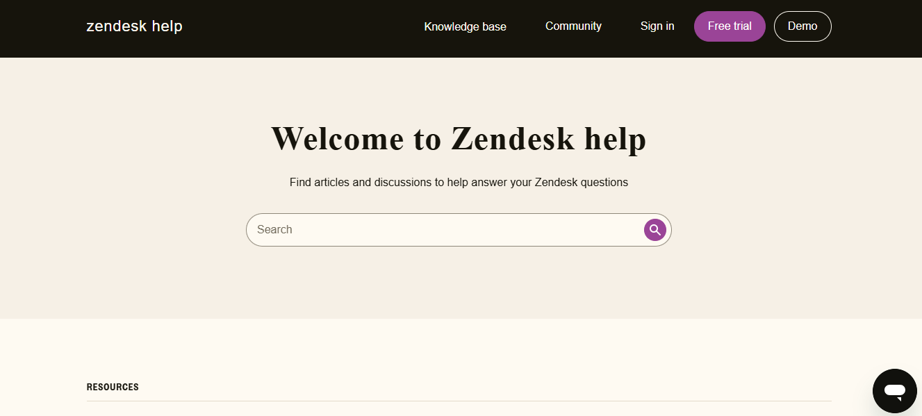
Zendesk builds support software, so expectations are sky-high, and they deliver. Their help center blends powerful search, instant AI-suggested content, and a seamless route to human support.
Why it works
- Search-first UX with recommended articles as you type
- AI assistant that suggests solutions based on intent
- Clear escalation path to agent support
- Structured content architecture (help docs, community, status page)
What to steal
- Make search the primary action, not a buried tool
- Use AI for predictive help suggestions
- Offer escalation options early, don’t trap users in AI loops
3. Notion Help Center
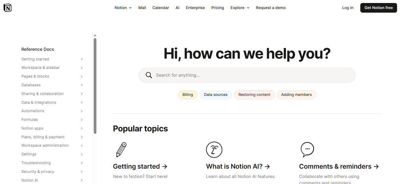
Notion’s support experience looks and feels like the product: clean, minimal, and insanely intuitive. No clutter, no overwhelm, just fast answers.
Why it works
- Crisp layout with high-scan readability
- Popular topics and onboarding guidance above the fold
- Expandable content and lightweight visuals
- Community + docs integrated for layered support
What to steal
- Keep article design clean, scannable, and distraction-free
- Surface trending topics and must-know guides up front
- Use collapsible sections and structured headings for clarity
4. Amazon Help
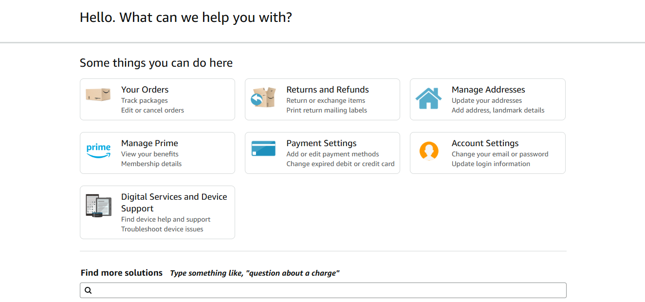
Amazon doesn't decorate support, it optimizes it. Everything is built for speed and task completion, not “information browsing.” You land, and the interface immediately anticipates your intent.
Why it works
- Priority actions front-loaded (track order, returns, refunds)
- Prominent search + auto-suggested flows
- Personalized links based on past orders/account
- Instant connection between account and issue type
What to steal
- Put your most-requested tasks above the fold
- Personalize help journeys with user/account context
- Default to action buttons instead of paragraphs
5. Shopify Support
Shopify serves solo founders, scaling brands, and enterprise operators, and its support hub reflects that complexity without ever feeling overwhelming.
Why it works
- Support categorized by job-to-be-done (store setup, payments, shipping)
- “Start here” learning paths for new users
- Search + forum + docs + support ticket in one unified flow
- Calls out trending problems + new features proactively
What to steal
- Design support around use cases, not menus
- Provide learning paths for beginners, depth for experts
- Combine docs, community, and human support in one hub
6. Slack Help Center

Slack’s support feels like Slack: friendly, conversational, and efficient. Everything is scannable, searchable, and suited for fast problem-solving, even on mobile.
Why it works
- Friendly tone + everyday language
- Smart search with contextual suggestions
- Bite-sized articles with step-by-step guidance
- Prominent troubleshooting shortcuts + tool-based categories
What to steal
- Drop corporate tone, support should sound human
- Use short steps + screenshots for clarity
- Make mobile support feel native, not shrunk-down
7. Airtable Support
Airtable’s help center mirrors its product philosophy: structured, flexible, and visual. It gives users multiple ways to learn, from docs to templates to video walkthroughs.
Why it works
- Modular card-based navigation for fast scanning
- Step-by-step guides with screenshots + short videos
- Community + templates + help docs integrated in one view
- “Start building” mindset, support that encourages adoption, not just answers
What to steal
- Use visual blocks to segment support topics
- Pair documentation with video micro-tutorials
- Lean into community + resources, not just FAQs
8. Figma Community Support
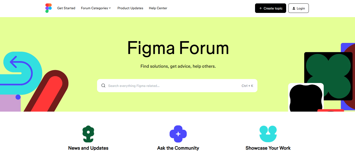
Figma treats support as a shared ecosystem, docs, forums, live events, and community answers live side-by-side. Users feel supported, not siloed.
Why it works
- Mixed support channels: docs, videos, community Q&A, events
- Upvote-driven problem solving (users surface best answers)
- Minimalist, clean design — instant scan + action
- Fast feedback model (“Was this helpful?”) on every guide
What to steal
- Let community amplify your support, not replace it
- Add fast feedback loops to every help asset
- Blend tutorials, docs, events, and community content
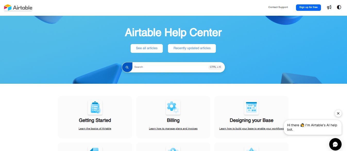
9. HubSpot Support
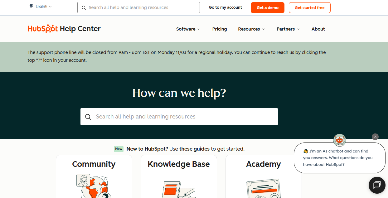
HubSpot’s support experience leans heavily into clarity and accountability. You know where to go, what’s happening, and how long a resolution will take.
Why it works
- Knowledge base + academy + community in one system
- Real-time system status + uptime transparency
- Personalized dashboard for tickets + learning tracks
- Guided setup + courses for long-term onboarding
What to steal
- Surface system status and uptime, build trust
- Offer structured onboarding pathways, not random docs
- Give users a personal support dashboard
10. Intercom Help Center
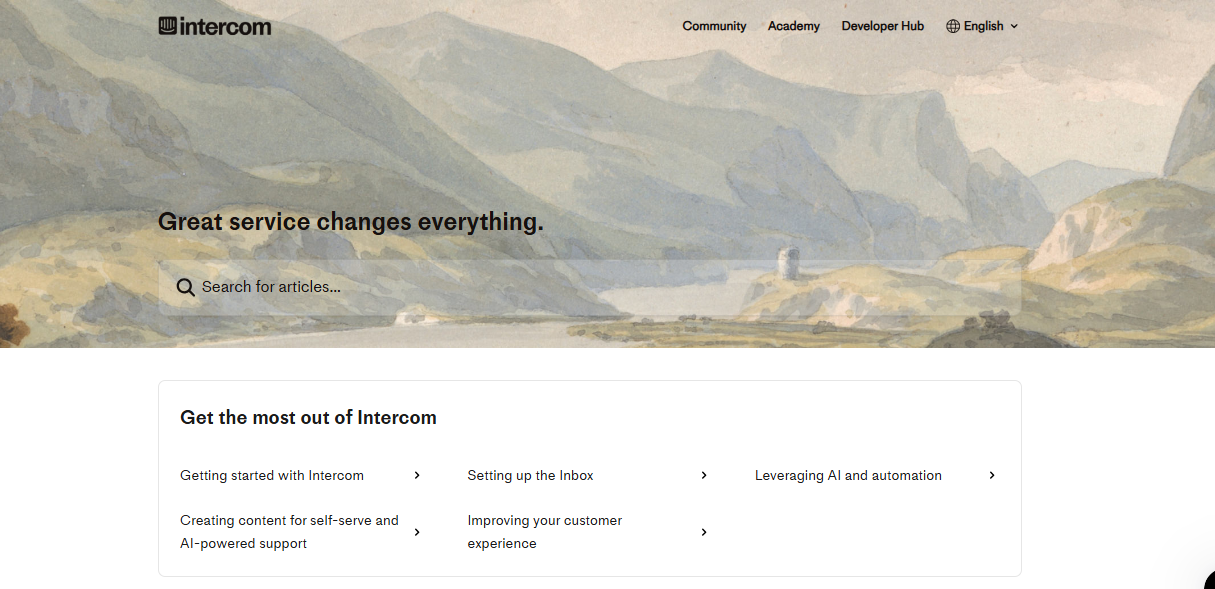
Intercom proves what modern support should feel like: automated where possible, personal where necessary. It blends AI chat, structured docs, and human intervention without ever feeling robotic or disjointed.
Why it works
- AI chat that can troubleshoot, summarize issues, and escalate
- Structured guides + product tours integrated into support
- Clear escalation path when automation isn't enough
- Task-based navigation (“Get started,” “Manage billing,” “Report an issue”)
What to steal
- Let AI handle first-touch troubleshooting + triage
- Use guided product tours inside your help experience
- Provide a “talk to a person” escape hatch, always
When you want your support site to convert users, resolve issues faster, and build trust at scale, Beetle Beetle builds customer-service-first websites that make every interaction feel effortless.
How Beetle Beetle Builds Customer-Service-First Websites
Great support UX is not decoration. It is engineered. At Beetle Beetle, we apply proven SaaS conversion playbooks to help and support websites so users solve problems faster and brands earn trust sooner.
We identify every point where users get stuck and design a friction-free path from question to resolution. Here’s how we do it:
- Start With Real Support Insight: We get into your support reality: top questions, friction points, ticket patterns, user personas, and resolution hurdles. The goal: a help experience built around how customers actually seek answers.
- Build Zero-Friction Paths to Answers: No maze-like menus. No guessing. We create fast-navigation flows so users get to the right solution in seconds.
- Show Confidence, Not Claims: We surface what builds trust fast: SLAs, live status, release notes, and real support workflows. Visitors feel supported, not left hoping someone replies.
- Turn Proof Into Trust: We place proof where it matters: ratings, fast-resolution snapshots, article helpfulness data, and real success examples. Confidence becomes a design element, not an afterthought.
- Make Human Support Easy to Reach: AI helps. But people still win complex moments. We create clear, fast paths to humans without forcing endless bot loops or form overload.
- Design for Speed and Scale: We build fast, Webflow-powered support sites that are easy to update, SEO-friendly, and built for product evolution and team growth.
- Support Real Customer Journeys: Self-serve when possible. Human when needed. We design for real user behavior, urgency levels, and context so support feels effortless, not procedural.
Make your support site the reason customers stay, not the reason they leave. Book your intro call and let’s build one that resolves faster, retains better, and keeps users coming back.
FAQs
1. What if my customers prefer talking to a human instead of using a support site?
Many users still value human help, so your customer service website design should offer both self-service and clearly visible live support options to create trust and flexibility.
2. Will adding AI overwhelm customers who aren’t tech-savvy?
Not if implemented well — strong customer service website design uses AI as a guide, not a gatekeeper, helping users find answers faster without forcing automation.
3. Should support articles sound formal or conversational?
A clear, friendly tone improves readability and trust, so your customer service website design content should feel human, not corporate or robotic.
4. How do I keep my help center from becoming outdated?
Add a content ownership plan and update cadence — an effective customer service website design includes systems to refresh articles, remove obsolete steps, and add new workflows.
5. Do support websites still matter if I have in-app help?
They do — in-app help covers quick tasks, while a full customer service website design handles deep workflows, troubleshooting, onboarding, and long-tail education.


