

.png)


Is above-the-fold still a thing? We get to hear this question a lot these days. After a quick walk around the nooks of Reddit and design forums, we discovered that there is an increasing sentiment that above-the-fold optimization is a thing of the past.
Some developers and designers are calling it an outright "myth" and argue that modern users scroll naturally. If you ask us, we would say the reality is far from it. The fundamentals of conversion-optimized web design have remained largely unchanged, even with evolving user behaviors and device variations.
The truth is more nuanced than either camp wants to admit. What matters now is separating outdated assumptions from principles that drive real results.
Key Takeaways:
- Prioritize Key Information Above the Fold: The most essential elements, e.g., your value proposition and primary CTA, must appear above the fold. Users form a judgment in just seconds, so clarity is crucial for retention.
- Speed is a Major Factor: Above-the-fold content must load in under three seconds for optimal user experience. Slow-loading elements here can drive visitors away before they even get a chance to engage with the rest of the site.
- Above-the-Fold Isn’t Static: As devices and user behavior evolve, so should your design. Mobile-first design and dynamic personalization are now essential to creating a responsive, engaging above-the-fold experience across various devices.
- Visual Hierarchy Can Make or Break Engagement: The way you organize content above the fold plays a huge role in guiding users’ attention. A clear visual hierarchy that highlights your primary message and CTA ensures users don’t get distracted.
- Real-Time Data is Key to Refinement: Continuously measure and test your above-the-fold content’s performance using tools like heatmaps and A/B testing. Insights gathered from real-time user data help refine the content, ensuring ongoing improvement and higher conversion rates.
Above-the-fold vs Below-the-fold: What Goes Where?
Let's clear up the confusion first. Above-the-fold is everything visible on your screen without scrolling. According to a Nielsen study, visitors spend 57% of their time on the website in this section. One old study by the same claims that ads above the fold get 73% viewability, whereas ads below the fold get only 44% of viewability.
Below-the-fold is everything else that requires a scroll to see. Simple enough, right? But here's where it gets tricky.
Modern above-the-fold space operates within dynamic parameters. Desktop users typically view approximately 1,000 pixels of vertical content. Mobile users encounter roughly 600 pixels of visible area.
Tablet users experience dimensions that fall between these two extremes. This variability means your design must accommodate multiple fold lines simultaneously rather than optimizing for a single breakpoint.
The strategic placement of content determines user engagement from the first moment of interaction. Above-the-fold content functions as your primary conversion opportunity, while below-the-fold areas serve users who demonstrate initial interest through scrolling behavior.
What Belongs Above-the-Fold:
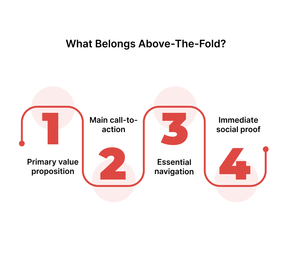
- Primary value proposition - Your core benefit statement requires immediate visibility. Users form judgments within three seconds of page load, making clarity essential for retention.
- Main call-to-action - Your primary conversion goal needs prominent placement. Secondary actions can reside lower on the page without compromising performance.
- Essential navigation - Core site sections deserve top-level visibility. Complex dropdown menus create friction rather than facilitating user journeys.
- Immediate social proof - Customer logos or user testimonials establish credibility instantly. Detailed case studies perform better when placed strategically below initial content..
What performs better below-the-fold:
- Detailed product specifications - Feature explanations work effectively after users express interest. Technical details can overwhelm visitors who haven't yet connected with your core message.
- Extended content formats - Blog posts, comprehensive guides, and educational resources benefit from below-the-fold placement. Users who scroll demonstrate engagement levels suitable for consuming detailed information.
- Supporting company information - Team profiles, company history, and detailed contact information support your main narrative without competing for primary attention.
- Multi-step form fields - Complex data collection requires progressive disclosure. Breaking forms across scroll sections reduces abandonment while maintaining conversion potential.
The mobile revolution fundamentally altered user interaction patterns. Desktop users continue following F-pattern and Z-pattern scanning behaviors. Mobile users scroll more naturally but retain the same rapid decision-making timeframes.
Your content strategy must address both interaction models without compromising either experience through oversimplification or complexity.
Now, you can debate the value of the fold all day, but without data, it’s just guesswork. The smarter move is to start with one clear idea about what belongs in that first visible space and see how it actually performs.
Check it against your real traffic, on different devices, and from different sources. That’s when patterns start to show, and you can decide what’s worth keeping above the fold and what can safely sit lower.
Measuring Above-the-Fold Impact: Metrics and Experiments
Begin with a clear, testable hypothesis. For example, assert that moving the main CTA into the visible area increases trial signups among new visitors. Define the fold for each audience segment using actual viewport heights, not generic breakpoints.
Measure what matters. Track viewability to see which elements appear without scrolling. Track scroll depth to gauge interest beyond the fold. Track time-to-first-meaningful-paint to judge perceived speed. Pair these with click-through and conversion rates to link visibility to outcomes.
Run controlled A/B experiments. Segment traffic by device, source, and new versus returning users. Use real-user monitoring and session replay to reconcile quantitative signals with observed behavior. Statistical rigor matters; small lifts can compound into meaningful revenue when scaled.
Once you start tracking the numbers, certain patterns will stand out. Some of them will confirm long-held beliefs about the fold. Others will challenge the way it’s been approached for years.
That’s where it helps to step back and look at how broader shifts in technology and user habits are shaping the above-the-fold strategy today.
How 2025 Is Changing the Fold Conversation
The fold hasn’t disappeared, but the environment around it has evolved. Designing for above-the-fold space today isn’t quite the same as it was even two years ago.
- Core Web Vitals now drive design decisions – Google’s ongoing focus on metrics like Largest Contentful Paint (LCP) means anything in this first visible space must load almost instantly. Oversized hero images, bloated carousels, or resource-heavy animations here can cost you in both rankings and user satisfaction.
- Personalisation has gone real-time – AI-powered testing tools can now adapt headlines, images, and CTAs above the fold in milliseconds based on user intent, device, or referrer source. This makes it possible to serve the most relevant version of your page to each visitor.
- Interaction models have expanded – Voice-driven navigation, mixed reality previews, and in-app browsing through SaaS marketplaces have created new fold scenarios beyond the traditional desktop or mobile browser. Your “visible first impression” now happens in more contexts than ever.
Deciding What Gets the Top Spot
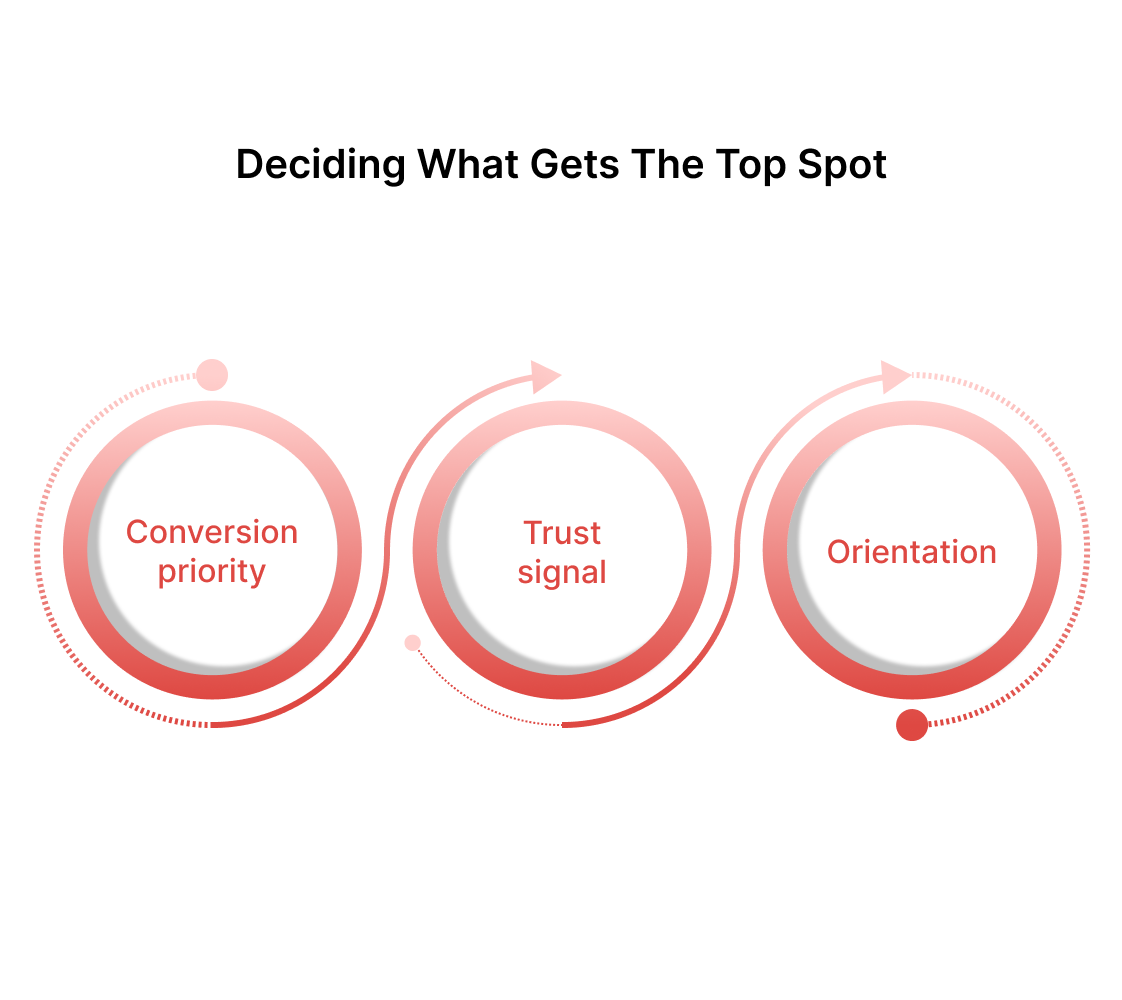
When above-the-fold space is limited, you need a way to rank competing elements. Here’s a simple priority framework:
1. Conversion priority – The single most important element for achieving your core business goal.
2. Trust signal – A fast, unobtrusive credibility boost that supports the conversion (e.g., a client logo bar or star rating).
3. Orientation – A navigation cue or visual hint that helps visitors take the next logical step.
If two elements are vying for the same space, run an A/B test and keep the one that produces the stronger impact.
Knowing what goes where only solves half the equation. The other half involves executing these placements effectively across different contexts and user scenarios.
Some Useful Above-the-Fold Optimization Tips in 2025
When your above-the-fold content loads slowly, needless to say, it’s bad news. Users abandon pages that take longer than 3-4 seconds to display meaningful content. This means your hero section needs to render before secondary elements load completely.
Speed optimization fundamentals:
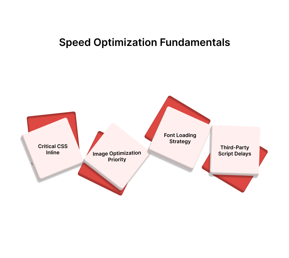
- Critical CSS inline - Your above-the-fold styles should load directly in the HTML document. This prevents render-blocking while secondary stylesheets load asynchronously.
- Image optimization priority - Above-the-fold images require immediate attention. Use WebP formats when possible and implement proper sizing for different screen densities.
- Font loading strategy - Web fonts can delay text rendering significantly. Use font-display: swap to show fallback fonts while custom fonts load in the background.
- Third-party script delays - Analytics, chat widgets, and tracking codes should load after above-the-fold content renders. These tools provide value but shouldn't compromise the initial user experience.
Mobile-first design philosophy shifts traditional desktop assumptions. Touch targets need adequate spacing to prevent accidental taps.
Text size must remain readable without zooming. Interactive elements require thumb-friendly positioning rather than mouse-optimized placement.
Mobile-specific considerations:
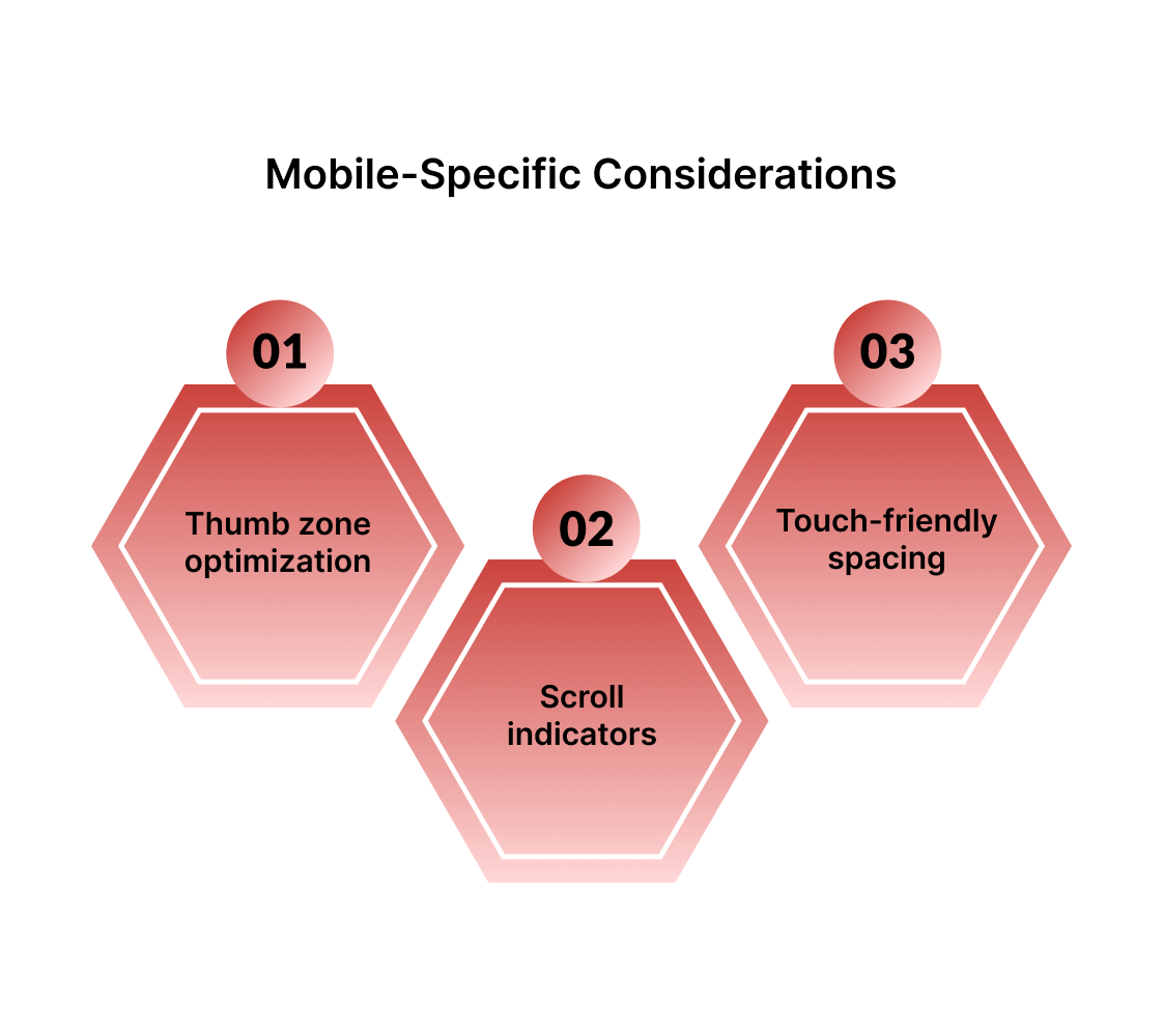
- Thumb zone optimization - Place primary CTAs within easy thumb reach on standard device sizes. The bottom third of mobile screens offers the most comfortable interaction area.
- Scroll indicators - Subtle visual cues that suggest additional content below can increase scroll rates. Partial content visibility at the bottom edge encourages downward movement.
- Touch-friendly spacing - Interactive elements need a minimum 44-pixel touch target according to accessibility guidelines. Cramped interfaces create frustration and reduce conversion rates.
Visual hierarchy becomes your next consideration once technical performance is optimized. Your most important message needs to dominate the space through size, contrast, or color intensity. Supporting elements should complement rather than compete with your primary content.
Typography decisions affect how quickly users can scan and process information. Sans-serif fonts generally work better for digital screens, though line spacing impacts readability more than your actual font choice. Make sure your text contrasts sufficiently with background colors while maintaining your design consistency.
Your call-to-action button deserves special attention in the color department.
- High-contrast buttons consistently outperform subtle design choices, but the contrast should feel natural within your overall color scheme.
- A bright orange button might convert well, but could clash terribly with your brand aesthetic.
Testing remains the only reliable way to validate these optimization decisions. Focus on single-element tests rather than changing multiple variables simultaneously. You'll get cleaner data and clearer insights about what actually drives results for your specific audience.
Also read: Website Speed Optimization: Tips for Faster Websites in 2025
With your above-the-fold space well-optimized, the next step is to focus on refining and adapting your strategy over time.
User behavior shifts constantly, and what works today might lose effectiveness as market conditions change.
Continuous Iteration and Refinement
Successful above-the-fold optimization requires ongoing attention rather than one-time implementation. Market dynamics, user preferences, and competitive landscapes evolve continuously, making static approaches increasingly ineffective over time.
Regular audit schedule:
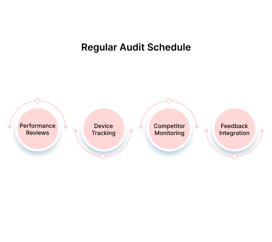
- Quarterly performance reviews - Analyze conversion rates, bounce rates, and engagement metrics every three months. Look for gradual declines that might indicate shifting user expectations or market saturation.
- Device usage pattern tracking - Monitor how your audience splits between desktop, mobile, and tablet usage. Shifts in device preferences should trigger corresponding design adjustments.
- Competitor landscape monitoring - Keep tabs on how similar companies structure their above-the-fold content. Market leaders often pioneer trends that eventually become user expectations across entire industries.
- User feedback integration - Direct feedback from customer surveys or support interactions can reveal pain points that analytics miss. Pay attention to comments about confusing navigation or unclear value propositions.
Testing iteration strategies:
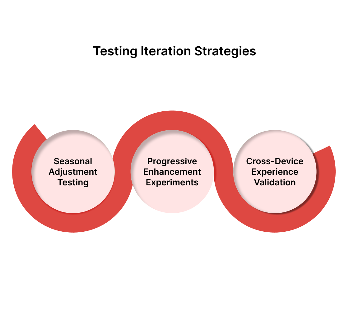
- Seasonal adjustment testing - User behavior changes with business cycles, holidays, and industry seasons. Test different messaging approaches during peak and slow periods to maximize year-round performance.
- Progressive enhancement experiments - Instead of dramatic redesigns, test incremental improvements to existing elements. Small changes compound over time without disrupting proven conversion patterns.
- Cross-device experience validation - Test how above-the-fold changes perform across different devices and screen sizes. Desktop improvements sometimes hurt mobile performance and vice versa.
Your optimization efforts should respond to both quantitative data and qualitative insights. Numbers tell you what happens, but user research explains why certain patterns emerge and persist across different audience segments.
If your conversion rates don’t see any significant improvement even after optimizing above-the-fold content, it might not be enough. The problem could lie in the overall user experience or the core messaging itself. In such cases, targeted tweaks might not cut it.
What you might need is a full website revamp, focusing on everything from messaging and sales positioning refinement to a potential visual rebranding, ensuring every element aligns with your conversion goals.
How Beetle Beetle Can Help
We specialize in comprehensive B2B SaaS website optimization that goes beyond surface-level tweaks. Our team conducts deep-dive conversion audits to identify whether your challenges stem from above-the-fold issues, broader UX problems, or fundamental messaging misalignment.
We combine data-driven testing methodologies with strategic positioning work to create websites that convert visitors into qualified leads consistently. From initial analysis through implementation and ongoing optimization, we handle the technical complexities while you focus on running your business.
Ready to get rid of subpar conversions?
Schedule your free website audit today and discover exactly what's preventing your site from reaching its full potential.
Frequently Asked Questions
Q: Does above-the-fold optimization still matter with mobile-first indexing?
A: Absolutely. While Google's mobile-first indexing prioritizes mobile-friendly design, above-the-fold content still determines user engagement within the critical first few seconds.
Mobile users make even faster decisions than desktop users, making your immediately visible content more important than ever for conversion rates.
Q: How do I handle above-the-fold content when screen sizes vary so dramatically?
A: Design for your smallest common denominator first, then enhance for larger screens. Focus on your core message and primary CTA working perfectly on a 320px mobile screen. Everything else should be progressive enhancement that adds value without compromising the mobile experience.
Q: Should I put my entire value proposition above-the-fold or just the headline?
A: Your main benefit should be immediately clear, but you don't need to cram everything above-the-fold. A compelling headline with supporting subtext works better than paragraphs of explanation. Use the space below-the-fold to elaborate on benefits for users who scroll.
Q: How long should I run A/B tests for above-the-fold changes? A: Run tests until you reach statistical significance, typically requiring at least 1,000 conversions per variation. This usually takes 2-4 weeks for most B2B SaaS sites. Don't stop tests early just because you see positive trends - wait for conclusive data to avoid false positives.
Q: What's the biggest mistake companies make with above-the-fold optimization? A: Trying to fit too much information above-the-fold. Companies often cram multiple CTAs, detailed features, and lengthy explanations into the visible area. This creates decision paralysis rather than driving action. Focus on one primary goal and make it obvious.


