.jpg)

A good-looking website isn't always a well-built one. And if it confuses more than it helps, it’s already losing business.
Nearly 90% of B2B buyers look through two to seven websites before deciding who to contact. That means your site doesn’t get second chances. So, it needs to work right the first time. But most new business owners get stuck trying to figure out what even goes where. Header, hero, call to action... it all starts sounding like jargon.
What you need is clarity. What matters, what doesn’t, and how each part fits into the bigger picture. Knowing this upfront can save you both time and credibility.
TL;DR:
- A functioning website is made up of distinct systems - front-end interfaces, back-end logic, structured content, and delivery mechanisms - all working in sync to serve the user.
- Visual design is secondary to how well a page is structured. Misplaced headings, inconsistent flow, or unclear CTAs often lead to user drop-offs, even on visually polished pages.
- Schema markup, content delivery networks, and modular layouts are now foundational. They affect loading speed, search visibility, and how easily content scales over time.
- Many underperforming sites suffer from poorly defined positioning and unclear messaging. Visual clutter or technical lag is often a symptom, not the root cause.
- The webpage is where decisions happen. Layouts, copy, media, and interactive elements either guide the user forward or introduce friction. Structure directly influences outcomes.
A Full Scan of the Anatomy of a Website
Every website, regardless of its size or purpose, is built on a predictable structure. It doesn’t matter if it's a startup's landing page or a giant retailer's eCommerce hub. They all rely on the same core building blocks - some you can see, some you can’t.
This is not to be confused with webpage anatomy, which refers to how individual screens are laid out. Think of webpages as the rooms in a house.
The website is the house itself. In simpler terms, every website is built on a framework of core components - some visible, some working quietly in the background. With that said, let’s walk through the core components that every website needs to function.
1. Front-End Components
The front-end is everything users see and interact with on your website. It's the visual layer that runs in web browsers. When you click a button, scroll through content, or fill out a form, you're interacting with front-end components.
- HTML (HyperText Markup Language): HTML provides the basic structure of your website. It tells browsers what content to display and how to organize it. Think of HTML as the skeleton that holds everything together.
- CSS (Cascading Style Sheets): CSS controls how your website looks. It handles colors, fonts, layouts, and visual elements. Without CSS, every website would look like a plain text document.
- JavaScript: JavaScript makes your website interactive. It powers dropdown menus, form validation, animations, and real-time updates. Modern websites rely heavily on JavaScript for user engagement.
- Responsive Design: Responsive design ensures your website functions optimally on phones, tablets, and desktops. It automatically adjusts layouts and content based on screen size.
Additional Front-End Components:
2. Core Back-End Components
This is where the heavy lifting happens. It's the part of the website users never see but absolutely rely on.
Every time someone submits a form, logs in, views a dashboard, or makes a payment, the back-end is working quietly in the background. It processes requests, talks to databases, applies business logic, and returns the right response to the front-end.
Let’s have a quick rundown of the key components of a website’s back-end:
3. Web Hosting and Domain
Every website needs two things to exist online: a place to live and an address so people can find it. That’s where hosting and domain names come in. Hosting stores your site’s actual files, and the domain name makes those files reachable in a browser.
Without these, even the most well-designed website would be invisible to the world. This section breaks down how both work and what to look for when choosing them.
- Domain Name System (DNS) and Domain Registration: Your domain name is your website's address on the internet. DNS translates human-readable domain names into IP addresses that computers understand.
- Selecting the Right Hosting Type for Your Website: Shared hosting works for small websites, while dedicated servers suit high-traffic sites. Cloud hosting offers scalability and reliability for growing businesses.
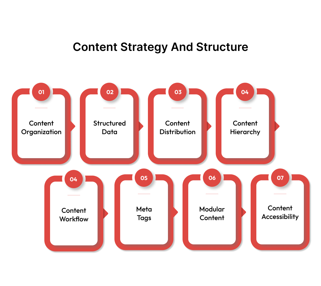
4. Content Strategy and Structure
Design can only go so far without solid content. The way your information is structured affects how easily users understand it, how long they stay, and what actions they take. It also matters for search engines.
From placing text and images to using schema markup, this section covers the invisible logic behind how content is arranged, delivered, and found online.
- Content Types and Organization: Websites contain various content types, including text, images, videos, and documents. Proper organization makes content easy to find and update.
- Content Schemas and Structured Data: Schema markup helps search engines understand your content better. It can improve search rankings and enable rich snippets in search results.
- Content Delivery Networks (CDN): CDNs distribute your content across multiple servers worldwide. This reduces loading times for visitors regardless of their location.
- Content Hierarchy and Flow: This covers how content is prioritized on each page. What shows up first? What do users see above the fold? A strong hierarchy improves readability, attention span, and conversions.
Include headings (H1, H2, etc.), callouts, and visual cues to guide users and search engines through your message.
- Content Governance and Workflow: Who creates, approves, updates, and retires content? Beginners often skip this step, but it becomes a mess quickly without a system in place, especially in growing teams or multi-page sites.
Even a simple publishing flow with version control, roles, and review checkpoints makes things sustainable long term.
- Metadata and Meta Tags: Not all content is visible. Metadata includes your title tags, meta descriptions, alt text, and Open Graph tags. These tell search engines and social platforms what your content is about and how to display it.
- Content Reusability (Modular Content): Instead of repeating the same block of content on five pages, use a modular content system. Many modern CMSs (e.g., WordPress with Gutenberg, or headless CMSs) support reusable blocks or components that can be updated once and used everywhere.
- Content Accessibility (a11y): Content should be understandable and usable for all users, including those with visual, hearing, or cognitive impairments. This means clear headings, alt text, readable font sizes, proper contrast, and support for screen readers.
5. User Experience and Design
Users decide whether to stay or leave within seconds. And that decision usually hinges on how the site feels to use. Web design involves guiding users smoothly from point A to point B.
Key elements include:
6. Security Measures
Online security isn’t optional. It doesn’t matter if you run a blog or an online store—bad actors are constantly looking for weak spots. A hacked site can hurt your reputation, lose customer data, or even get blacklisted by search engines.
This section will cover the basics of keeping your site protected, from securing connections to using safer login practices and staying ahead of common threats.
- SSL/TLS Certificates and HTTPS: SSL certificates encrypt data between browsers and servers. They're essential for e-commerce sites and improve search rankings while building user trust.
- Web Application Firewalls (WAF): Firewalls filter malicious traffic before it reaches your server. They block common attacks like SQL injection and cross-site scripting automatically.
- Regular Security Updates and Patches: Outdated software creates vulnerabilities hackers exploit. Consistent updates for CMS platforms, plugins, and server software prevent most security breaches.
- Strong Authentication Systems: Multi-factor authentication adds extra security layers beyond passwords. Strong password policies and regular credential updates reduce unauthorized access risks.
- Backup and Recovery Systems: Regular automated backups ensure you can restore your site after attacks. Multiple backup locations and tested recovery procedures minimize downtime.
- Malware Detection and Removal: Security scanning tools identify infected files and suspicious code. Early detection prevents malware from spreading and damaging your site's reputation.
- DDoS Protection: Distributed denial-of-service attacks overwhelm servers with fake traffic. Protection services filter legitimate visitors from attack traffic automatically.
- Database Security: Encrypted databases and restricted access prevent data breaches. Regular security audits identify potential vulnerabilities before hackers find them.
- Secure File Permissions: Proper file permissions limit what users and scripts can access. Restricting unnecessary permissions reduces potential attack vectors significantly.
- Security Monitoring and Logging: Real-time monitoring detects suspicious activity immediately. Detailed logs help identify attack patterns and improve future security measures.
- Content Security Policy (CSP): CSP headers prevent cross-site scripting attacks by controlling resource loading. They specify which scripts and stylesheets browsers should trust.
7. SEO and Analytics
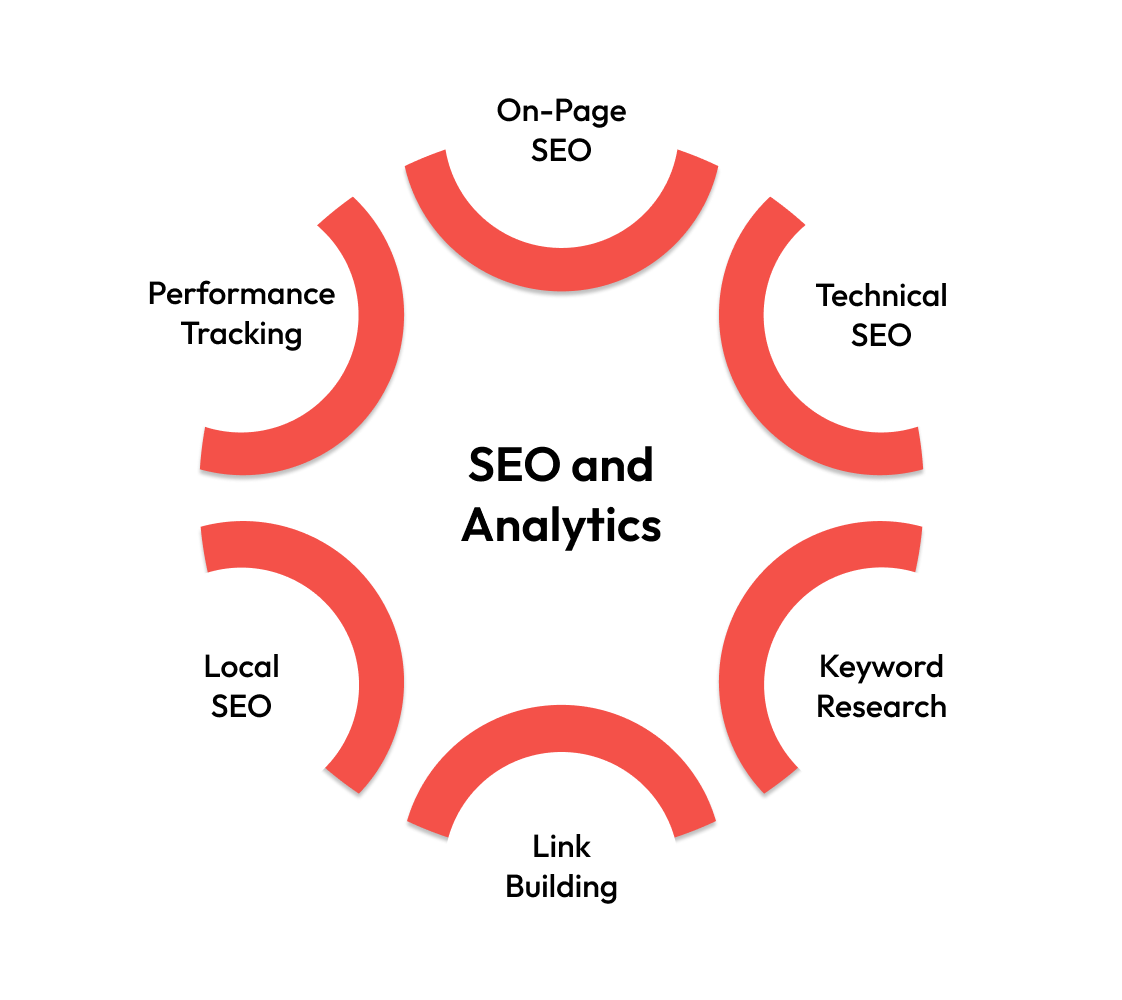
SEO determines whether your target audience can find your website through search engines. Analytics reveal how visitors behave once they arrive.
Without SEO, you're invisible to potential customers actively searching for your products or services. Without analytics, you're flying blind when making decisions about content, design, and marketing strategy.
- On-Page SEO Elements: Title tags, meta descriptions, and header tags tell search engines what your pages are about. Proper keyword placement and content optimization improve search rankings.
- Technical SEO Infrastructure: Site speed, mobile responsiveness, and crawlability affect search engine rankings. Clean code structure and proper URL formatting help search engines index your content.
- Content Strategy and Keyword Research: Strategic content creation targets specific search terms your audience uses. Keyword research reveals what potential customers are actually searching for online.
- Link Building and Domain Authority: Quality backlinks from reputable sites signal authority to search engines. Internal linking structure helps distribute page authority throughout your website.
- Local SEO and Business Listings: Google My Business and local citations help businesses appear in location-based searches. Reviews and local content targeting geographic keywords drive nearby customers.
- Analytics and Performance Tracking: Google Analytics and Search Console provide insights into user behavior and search performance. Conversion tracking measures which traffic sources generate actual business results.
Also read: SEO Checklist for Website Redesign: Retaining Rankings and Avoiding Mistakes.
8. Content Management Systems (CMS)
A CMS is like having a word processor for your website. It eliminates the need to write code every time you want to add or change content. Most business owners choose a CMS because it makes website management accessible to non-technical users.
Popular CMS Platforms and Their Features
WordPress powers 60.9% of all websites, while Shopify dominates e-commerce. Each platform offers different features and customization options.
Webflow CMS, on the other hand, is often a better fit for SaaS and tech websites. It gives more design control without needing a developer for every tweak.
You can build high-converting landing pages, set up CMS-driven content, and push updates visually - all while keeping the code clean and performance sharp. That makes it easier to iterate fast, which matters a lot in tech and product-focused companies.
So far, we’ve covered the full stack that makes a website function, all the way from servers and code to content and security. But all of that comes together in a single place: the webpage.
The next section unpacks how individual webpages are built, structured, and optimized to guide users and drive action.
Decoding the Anatomy of a Webpage
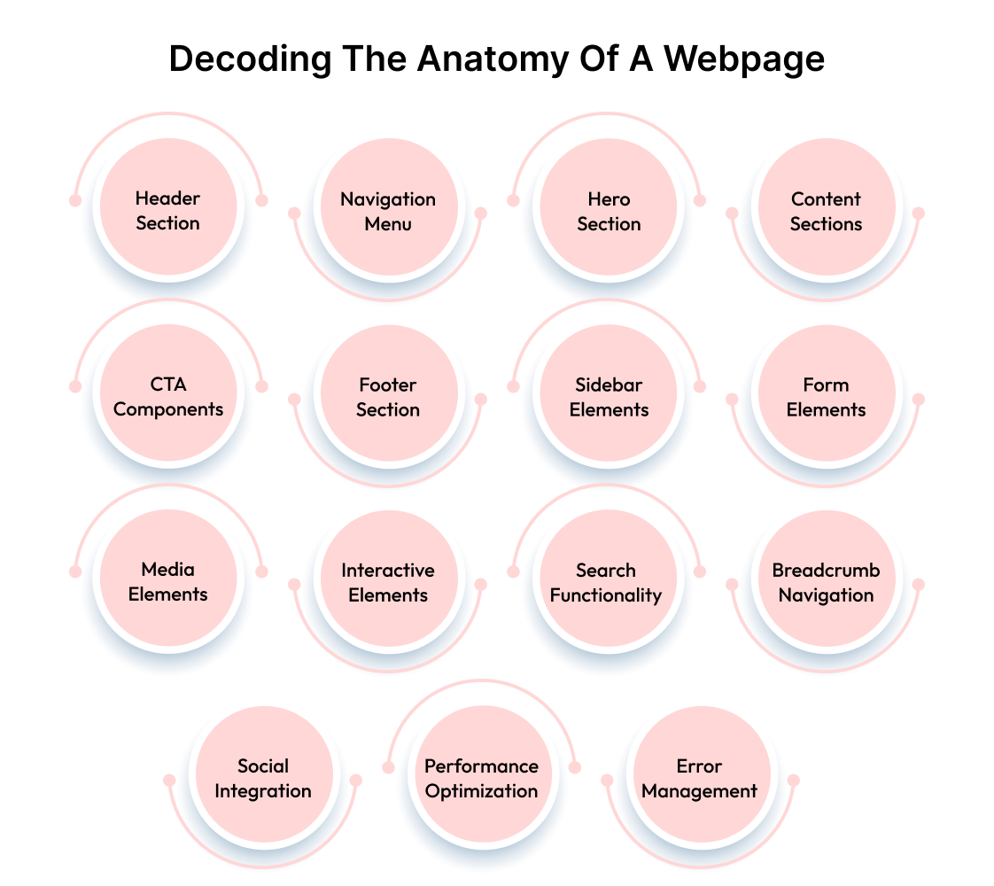
Individual webpages are the building blocks of your website. Each page follows a predictable structure that users expect and search engines understand. These components work together to create cohesive experiences that guide visitors toward specific actions.
1. Header Section
The header appears at the top of every page and serves as your digital storefront. It establishes brand identity, provides navigation, and sets expectations for the entire website experience. A well-designed header reduces bounce rates and improves user engagement.
- Primary Navigation Header: Features the main menu with core business categories. Clean design with 5-7 menu items prevents overwhelming visitors while ensuring easy access to important sections.
- Mega Menu Header: Dropdown menus display multiple categories and subcategories simultaneously. Popular with e-commerce sites and content-heavy websites needing comprehensive navigation options.
- Sticky Navigation Header: Remains visible while users scroll down the page. Improves usability by keeping navigation accessible without requiring users to scroll back to the top.
- Minimal Header: Focuses on essential elements like logo and primary call-to-action. Reduces distractions and works well for landing pages designed to drive specific conversions.
2. Navigation Menu
Navigation determines how easily users can find information on your website. Poor navigation causes frustration and increases bounce rates. Strategic menu design guides users through your content logically and intuitively.
- Horizontal Navigation: Menu items arranged across the top of the page in a single row. Works best with limited menu items and desktop-first designs.
- Vertical Navigation: Menu items stacked vertically, typically in a sidebar. Accommodates more menu items and works well for content-heavy websites.
- Hamburger Menu: Three horizontal lines that expand to show navigation options. Common on mobile devices, but can reduce discoverability on desktop.
- Breadcrumb Navigation: Shows the path from the homepage to the current page. Helps users understand their location within the site hierarchy.
- Footer Navigation: Secondary menu in the website footer. Contains less important links like privacy policies and contact information.
3. Hero Section
The hero section is the first content area visitors see below the header. It communicates your value proposition and encourages users to take action. Effective hero sections combine compelling headlines with clear calls-to-action.
- Full-Width Hero: Background image or video spans the entire screen width. Creates visual impact but requires careful text overlay considerations for readability.
- Split Hero: Content divided into two columns with text on one side and image on the other. Balances visual appeal with readable content presentation.
- Video Hero: Background video demonstrates products or services in action. Engages visitors but requires fast loading times and mobile optimization.
- Carousel Hero: Multiple slides showcase different products or messages. Allows more content but can reduce focus and increase cognitive load.
- Minimal Hero: Clean design with simple headline and call-to-action button. Reduces distractions and works well for conversion-focused landing pages.
4. Content Sections
Content sections organize information into digestible chunks that guide users through your message. Strategic content layout improves readability and helps visitors find relevant information quickly.
- Feature Sections: Highlight key benefits or product features with icons and descriptions. Help visitors understand value propositions without overwhelming them with details.
- Testimonial Sections: Customer reviews and success stories build trust and credibility. Social proof influences purchasing decisions and reduces buyer hesitation.
- FAQ Sections: Address common questions and concerns proactively. Reduce support requests while helping visitors make informed decisions about your products.
- About Sections: Share company story and team information to build personal connections. Humanize your brand and establish credibility with potential customers.
- Portfolio Sections: Showcase previous work and case studies with visual examples. Demonstrate expertise and help visitors envision working with your company.
5. Call-to-Action Elements
Call-to-action elements prompt users to take specific actions that support your business goals. Strategic placement and design of these elements significantly impact conversion rates and user engagement.
- Primary CTA Buttons: Main action buttons with contrasting colors and clear text. Should stand out visually and use action-oriented language like "Get Started" or "Buy Now."
- Secondary CTA Buttons: Less prominent buttons for alternative actions. Often used for "Learn More" or "Contact Us" options alongside primary buttons.
- Inline Text CTAs: Hyperlinks within content that encourage specific actions. Useful for guiding readers to related content or sign-up forms naturally.
- Pop-up CTAs: Overlay windows that appear after specific user behaviors. Can be effective for email capture, but must be timed appropriately to avoid annoyance.
- Sticky CTAs: Buttons that remain visible while scrolling. Ensure users always have access to conversion opportunities regardless of page position.
6. Footer Section
The footer appears at the bottom of every page and serves multiple important functions. It provides secondary navigation, contact information, and legal compliance elements while reinforcing brand identity.
- Multi-Column Footer: Organized sections with different types of information. Typically includes navigation links, contact details, and social media connections.
- Minimal Footer: Simple design with essential information only. Works well for landing pages and websites with limited secondary content.
- Rich Footer: Comprehensive information, including recent blog posts and newsletter signup. Provides additional engagement opportunities for interested visitors.
- Sticky Footer: Remains at the bottom of the viewport regardless of content length. Ensures consistent access to footer information on all pages.
7. Sidebar Elements
Sidebars provide additional content and navigation options without cluttering the main content area. They enhance user experience by offering related information and alternative pathways through your website.
- Blog Sidebar: Recent posts, categories, and search functionality for content websites. Helps visitors discover related articles and stay engaged longer.
- E-commerce Sidebar: Product filters, categories, and shopping cart information. Streamlines the shopping experience and improves product discoverability.
- Contact Sidebar: Quick contact forms and business information. Provides easy access to communication options without leaving the current page.
- Social Media Sidebar: Links to social profiles and embedded feeds. Encourages social engagement and builds community around your brand.
8. Form Elements
Forms collect user information and enable interactions between visitors and your website. Well-designed forms reduce abandonment rates and improve data quality while maintaining user privacy.
- Contact Forms: Basic inquiry forms with name, email, and message fields. Essential for lead generation and customer communication.
- Newsletter Signup: Email collection forms for marketing campaigns. Should be prominently placed and offer clear value for subscribing.
- Registration Forms: Account creation forms with necessary user information. Should request minimal information initially to reduce barriers to signup.
- Checkout Forms: Purchase completion forms with payment and shipping details. Must be secure, intuitive, and optimized for mobile devices.
- Search Forms: Allow users to find specific content or products quickly. Should be easily accessible and provide relevant, accurate results.
9. Media Elements
Media elements include images, videos, and audio content that enhance user experience and communicate information effectively. Strategic use of media improves engagement while supporting your overall message.
- Product Images: High-quality photos showcasing products from multiple angles. Essential for e-commerce sites and significantly impact purchasing decisions.
- Background Images: Visual elements that support content without overwhelming it. Should be optimized for fast loading and work across all devices.
- Video Content: Embedded videos for demonstrations, testimonials, or explanations. Increases engagement but requires careful optimization for page speed.
- Image Galleries: Collections of related images with navigation controls. Useful for portfolios, product catalogs, and visual storytelling.
- Icons and Graphics: Visual elements that support content and improve understanding. Should be consistent in style and appropriately sized for clarity.
10. Interactive Elements
Interactive elements engage users and encourage deeper exploration of your website. They transform passive browsing into active participation while providing valuable user feedback.
- Dropdown Menus: Expandable navigation options that reveal subcategories on hover. Save space while providing comprehensive navigation options.
- Accordions: Collapsible content sections that expand when clicked. Organize large amounts of information in compact, scannable formats.
- Tabs: Horizontal navigation that switches between different content sections. Allow users to access multiple topics without scrolling extensively.
- Sliders: Image or content carousels that rotate automatically or manually. Showcase multiple items in limited space, but can reduce individual item focus.
- Modal Windows: Overlay windows that display additional information or forms. Provide detailed content without leaving the current page context.
11. Search Functionality
Search functionality helps users find specific content quickly without navigating through multiple pages. Effective search features improve user experience and reduce bounce rates on content-heavy websites.
- Global Search Bar: Site-wide search accessible from every page. Should be prominently placed and provide relevant, fast results.
- Filtered Search: Advanced search with category, price, or attribute filters. Essential for e-commerce sites and large content libraries.
- Autocomplete Search: Suggests search terms as users type. Improves user experience and helps discover relevant content faster.
- Search Results Pages: Dedicated pages displaying search results with sorting options. Should include clear headings and relevant snippets.
12. Breadcrumb Navigation
Breadcrumb navigation shows users their current location within the website hierarchy. This secondary navigation system improves user experience and helps with SEO by providing clear site structure.
- Hierarchical Breadcrumbs: Show the path from homepage to current page. Most common type for traditional website structures.
- Attribute Breadcrumbs: Display selected filters or categories in e-commerce sites. Help users understand their current search parameters.
- History Breadcrumbs: Show the path users took to reach current page. Less common but useful for complex user journeys.
13. Social Media Integration
Social media integration connects your website with social platforms to expand reach and encourage engagement. Strategic social elements can increase brand awareness and drive traffic.
- Social Sharing Buttons: Allow users to share content on their social profiles. Should be prominently placed on blog posts and product pages.
- Social Login: Enable users to sign in using social media accounts. Reduces friction in the registration process and improves user experience.
- Social Media Feeds: Display recent posts from your social media accounts. Keep website content fresh and encourage social following.
- Social Proof Widgets: Show social media follower counts or recent activity. Build credibility and encourage social engagement.
14. Loading and Performance Elements
Loading and performance elements manage user experience during page load times. These components maintain engagement while content loads and provide feedback about page status.
- Loading Spinners: Animated indicators showing content is loading. Provide visual feedback during wait times and improve perceived performance.
- Progress Bars: Show completion percentage for multi-step processes. Reduce abandonment rates in forms and checkout processes.
- Skeleton Screens: Placeholder content that mimics the final layout while loading. Create smoother loading experiences than blank pages.
- Lazy Loading: Load images and content only when needed. Improves initial page load times and reduces bandwidth usage.
15. Error Handling Elements
Error handling elements manage situations when content fails to load or users encounter problems. Well-designed error elements maintain user experience during technical difficulties.
- 404 Error Pages: Custom pages for missing content with helpful navigation. Should maintain site design and provide alternative pathways.
- Form Validation Messages: Real-time feedback for form input errors. Help users correct mistakes without losing entered information.
- Connection Error Messages: Notifications for network or server issues. Should provide a clear explanation and suggested actions.
- Fallback Content: Alternative content when primary elements fail to load. Ensures basic functionality remains available during technical issues.
15. Accessibility Elements
Accessibility elements ensure your website works for users with disabilities. These components improve usability for everyone while meeting legal compliance requirements.
- Alt Text for Images: Descriptive text for screen readers and failed image loads. Essential for visually impaired users and SEO.
- Keyboard Navigation: Tab order and focus indicators for non-mouse users. Ensures all interactive elements are accessible via keyboard.
- Color Contrast: Sufficient contrast ratios between text and background colors. Improves readability for users with visual impairments.
- Screen Reader Labels: Hidden text that provides context for assistive technologies. Helps visually impaired users understand interface elements.
16. Analytics and Tracking Elements
Analytics and tracking elements collect data about user behavior and website performance. This invisible infrastructure provides insights for optimization and business decision-making.
- Google Analytics Code: Tracks visitor behavior, traffic sources, and conversion data. Essential for understanding website performance and user patterns.
- Conversion Tracking: Monitors specific user actions like purchases or form submissions. Measures the success of marketing campaigns and website optimization.
- Heatmap Tracking: Records where users click and scroll on pages. Provides visual insights into user behavior and interface effectiveness.
- A/B Testing Elements: Compare different versions of pages or elements. Enable data-driven optimization decisions based on user behavior.
17. Cookie and Privacy Elements
Cookie and privacy elements manage user data collection and compliance with privacy regulations. These components build trust while meeting legal requirements.
- Cookie Consent Banners: Notify users about cookie usage and obtain consent. Required by GDPR and other privacy regulations.
- Privacy Policy Links: Easy access to the privacy policy from every page. Should be prominently placed in the footer or header.
- Data Collection Notices: Clear explanations of what data is collected and how it's used. Build user trust and ensure regulatory compliance.
- Opt-out Options: Allow users to control their data and tracking preferences. Provide user control over privacy settings.
18. Mobile-Specific Elements
Mobile-specific elements ensure optimal user experience on smartphones and tablets. These components address the unique challenges of smaller screens and touch-based navigation.
- Mobile Menu: Collapsible navigation designed for touch interaction. Often uses hamburger icons and full-screen overlays for better usability.
- Touch-Friendly Buttons: Larger buttons optimized for finger tapping. Should be at least 44 pixels tall and have adequate spacing between elements.
- Swipe Gestures: Touch-based navigation for image galleries and carousels. Provide intuitive interaction methods that feel natural on mobile devices.
- Mobile Forms: Simplified forms optimized for small screens and virtual keyboards. Should use appropriate input types and minimize required fields.
- Progressive Web App Elements: Features that make websites behave like mobile apps. Include offline functionality, push notifications, and home screen installation options.
Phew. If this sounds like a lot to manage, that's because it is. Website design and development for a small business versus an enterprise requires completely different approaches, resources, and expertise.
Small businesses need focused, conversion-driven sites that work within budget constraints. Enterprises require scalable architectures that handle complex integrations and high traffic volumes.
Unless you're 100% confident in your technical abilities and have months to dedicate to learning these systems, it's best to hire professionals.
How Beetle Beetle Can Help
Building a website that converts takes more than good design. It demands a deep understanding of your market, customers, and business goals. The majority focuses on aesthetics and ignores the data that drives real results.
Beetle Beetle doesn’t.
We specialize in B2B SaaS website design and development with a data-guided approach. Through market analysis and customer research, we uncover exactly what your prospects need to see, hear, and experience before they buy.
From positioning strategy to brand identity, every decision is backed by insight, not opinion. We build our sites on Webflow for interactive, secure sites with zero maintenance overhead.
Before launch, we test across devices, browsers, and screen sizes under real-world conditions. Launch day? Seamless. We manage DNS, SSL, and redirects. Post-launch, we monitor performance to catch issues before they reach your audience.
We don’t guess. We build what works - based on real data, not opinions. When you're ready to do the same, schedule a strategy call with us.
FAQs
1. What is the anatomy of a website?
It’s the structural makeup: front end (HTML, CSS, JS), back end (servers, databases, APIs), content layers, hosting, CMS, security, SEO, and UX patterns.
2. What are the 7 C’s of a website?
- Clarity: Messaging and structure are easy to follow
- Consistency: Fonts, colors, and tone match throughout
- Credibility: Trust signals, security, and real branding
- Content: Valuable, well-placed, logically arranged
- Conversion: Clear paths to action
- Compatibility: Works across devices and browsers
- Control: Easy to update, manage, and scale
3. What are the five major components of a web page?
- Header: Includes logo, navigation, sometimes CTA
- Hero section: First impactful visual and message
- Body: Main content - text, media, interactive elements
- Sidebar (if any): Related info, filters, secondary CTAs
- Footer: Contact, legal links, extra nav, socials
4. What are the 13 parts of a website?
- Header: Site identity and main navigation
- Navigation Menus: Help users explore easily
- Hero Section: First visible block that sets the tone
- CTA Buttons: Drive actions like sign-ups or purchases
- Headings/Subheadings: Organize content and improve readability
- Body Content: Core information the page delivers
- Images and Videos: Reinforce messaging visually
- Forms: Collect leads, feedback, or orders
- Trust Signals: Build credibility fast (reviews, badges)
- Footer: Includes links, contact info, and policies
- Sidebar: Optional space for filters, links, or offers
- Breadcrumbs: Show user path through site hierarchy
- Analytics Tags: Track engagement and performance quietly in the background