


Headings are the first point of contact with your content. Most people, whether you like it or not, are only going to read the headings. Some will skim the body copy, and very few will read through the whole article.
If your headings are lackluster, vague, or uninspiring, your audience will quickly move on. The challenge is clear: crafting headings that not only grab attention but also guide the reader into the heart of your content.
In this article, you'll uncover how to design headings that engage and drive readers deeper into the text, making every word count from the very first glance.
Quick Takeaways
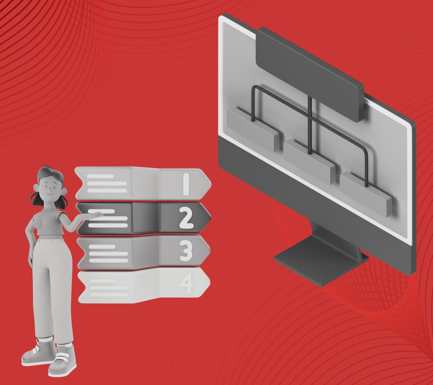
- Size matters for hierarchy - Make your H1 noticeably larger than H2, H2 larger than H3, creating a clear visual roadmap for readers.
- White space is your friend - Give headings breathing room above and below to prevent cramped layouts and improve scannability.
- Mobile screens are unforgiving - Test heading displays on smaller devices, where space limitations can break your design.
- Typography choices drive conversions - Sans-serif fonts with high contrast perform better than decorative options on digital screens.
- Color coding creates clarity - Use your brand colors strategically to differentiate heading levels without sacrificing accessibility standards.
What Are Website Headings?
Website headings are the titles and subtitles that structure and organize content on web pages. They serve as signposts that guide readers through your content hierarchy, much like chapter titles in a book.
From a technical standpoint, headings are HTML elements labeled H1 through H6, with H1 being the most important (typically the main page title) and H6 being the least important. Each heading level represents a different level of importance and helps search engines understand your content structure.
Functionally, headings break up large blocks of text into scannable sections. They allow readers to quickly grasp what each section covers and jump to the parts most relevant to them. Well-written headings also improve accessibility for screen readers and other assistive technologies.
Beyond organization, headings play a crucial role in SEO. Search engines use heading tags to understand your content's main topics and subtopics, which influences how your pages rank for relevant searches.
The most effective website headings are clear, descriptive, and properly nested. For example:
- H1: "Email Marketing Strategy Guide"
- H2: "Building Your Email List"
- H3: "Lead Magnets That Convert"
- H3: "Opt-in Form Placement"
This creates a logical flow that both humans and search engines can easily follow.
Effective heading design is about creating a roadmap for your audience. When done right, they provide clarity and improve the user experience, making it easier for visitors to absorb the information. It’s a subtle yet powerful way to enhance both readability and SEO performance.
Now that we have covered the basics, it’s time to focus on how to turn simple headings into engaging and functional elements that improve both user experience and SEO.
How to Design and Format Headings for Your Website: 6 Best Practices
Designing headlines that make a strong impression requires a combination of psychology and strategy. Your heading decisions directly impact whether visitors stay on your page or bounce to competitors.
1. Use Clear Visual Hierarchy
Establish distinct size differences between heading levels to guide readers through your content structure. Your H1 should be noticeably larger than H2, which should be larger than H3. This visual stepping creates a roadmap that helps users navigate your information effortlessly.
2. Choose Typography That Enhances Readability
Select fonts that remain legible across all devices and screen sizes. Sans-serif fonts typically work better for headings than serif fonts on digital screens. Ensure sufficient contrast between text and background colors to accommodate users with varying visual abilities and lighting conditions.
3. Apply Consistent Spacing and Alignment

Maintain uniform spacing above and below each heading level throughout your website. Consistent margins create visual rhythm and a professional appearance.
Left-align headings for easy scanning, as centered text becomes harder to read when headings span multiple lines or vary in length.
4. Implement Strategic Color Coding
Use color purposefully to differentiate heading levels or highlight important sections. Stick to your brand color palette while ensuring accessibility standards are met. Color should enhance hierarchy, not create confusion about which headings belong to which content sections.
5. Design for Mobile-First Display
Test how your headings appear on smaller screens where space is limited. Larger heading fonts may need adjustment for mobile viewing. Consider how line breaks affect readability and ensure your heading design remains effective across all device sizes and orientations.
Also read: Implementing Mobile First Design for Your Website
6. Balance White Space Around Headings
Give your headings room to breathe by incorporating adequate white space above and below each one. Proper spacing prevents your content from feeling cramped and helps headings stand out as natural break points. This visual separation improves content scannability significantly.
Small details like font choices, color contrast, and spacing adjustments can dramatically impact your conversion rates. However, without deep knowledge of user behavior patterns and conversion psychology, you are shooting in the dark, essentially.
As a B2B SaaS-focused web design studio, we are here to help you transform these heading design principles into measurable business results through data-driven design decisions.
A Little About Beetle Beetle
At Beetle Beetle, we specialize in creating high-converting websites that help B2B SaaS companies turn visitors into customers through strategic design and messaging. Over the past six years, we've designed and developed more than 100 SaaS websites, consistently driving measurable results for our clients.
Our approach has helped companies achieve conversion increases of up to 230% month-over-month by combining customer research, conversion-focused copywriting, and strategic visual design.
We don't use templates or generic approaches - every website we create is built specifically for your audience and their journey.
Our process involves deep research into your customers' needs, followed by custom design and development that makes your product's value crystal clear to prospects.
Ready to get one step ahead of your competitors? Hire Beetle Beetle for website design today!
FAQs
1. How do I design headings that grab attention on my website?
To design attention-grabbing headings, use clear, concise language, bold fonts, contrasting colours, and strategic placement to make sure they stand out and guide the reader's focus.
2. What are the best font styles to use for web headings?
When designing headings for the web, choose legible fonts like sans-serif styles (e.g., Arial or Helvetica) to ensure readability across devices, with a balance of size and weight for emphasis.
3. How can I create a visual hierarchy with my headings?
To create a visual hierarchy, use varying sizes and weights for headings (H1, H2, H3), ensuring your main heading is most prominent, and subheadings are easily distinguishable for better content navigation.
4. Why are white space and margins important when designing headings?
White space and proper margins around headings improve readability and focus. It allows the heading to stand out and ensures the content isn’t visually overwhelming, enhancing the overall user experience.
5. How do I design headings that improve SEO?
Design headings with SEO in mind by incorporating relevant keywords, structuring them hierarchically, and ensuring they are clear and compelling. This helps search engines index your content better and improves your visibility.


