


Website visitors form opinions about your business within a few milliseconds of landing on your page. Color choices during those critical moments can determine whether someone stays or leaves immediately.
The wrong accent colors create confusion about where to click, what actions to take, and what your brand actually represents. Even worse, they can make visitors question your credibility before reading a single word.
Studies show that color increases brand recognition by 80%. This means strategic accent color selection directly impacts how memorable and trustworthy your website appears to new visitors.
This article breaks down the science behind color choices and shows how to select a scheme that works for your brand and audience.
Before We Dive In:
- Accent Color Impact: Accent colors highlight key elements, like buttons and links, guiding user interaction and creating visual interest.
- 3-Color Rule: Limit your website's color scheme to three main colors - primary, secondary, and accent - to maintain a clean, cohesive design.
- 60-30-10 Rule: Distribute colors with 60% for the primary color, 30% for the secondary, and 10% for the accent to keep the design balanced and visually appealing.
- Choosing the Right Accent: Pick an accent color that complements your brand and evokes the desired emotion, enhancing usability and engagement.
Primary Colors vs Accent Colors in Website UI Design
Primary colors and accent colors serve distinct but complementary roles in website UI design. Primary colors form the backbone of your website’s visual identity, driving the main look and feel of your design.
Your website needs two distinct color categories to function properly. Primary colors cover the largest visual areas, while accent colors highlight specific elements that require user attention.
Primary colors dominate your background, main content areas, and navigation elements. These colors establish your brand's visual foundation and appear across 60-70% of your website's surface area. When visitors land on your page, primary colors create their first impression of your business identity.
Accent colors serve the opposite purpose. They draw attention to buttons, links, notifications, and call-to-action elements that drive conversions. You should use accent colors sparingly, covering only 10-30% of your total design space.
The relationship between these color types determines user experience quality. When your primary color is navy blue, an orange accent creates a strong contrast that guides visitors toward important actions. This contrast prevents users from missing critical buttons or getting lost in your content.
Many websites look visually unappealing because they reverse this hierarchy. Using bright colors as primary elements overwhelms visitors and makes accent colors invisible. Your eye needs visual rest areas to appreciate highlighting effectively.
Color psychology amplifies these functional differences. Primary colors communicate your brand personality and industry credibility.
Accent colors trigger specific emotional responses that encourage clicking, purchasing, or subscribing. Getting this balance wrong costs you conversions every single day.
Now, let’s explore the most widely used website accent colors and their best use cases, shall we?
10 Most Effective Accent Colors for Website Design
When choosing accent colors, make sure to align them with your brand identity while ensuring they enhance user experience. Here, we'll cover some of the most impactful accent colors and how they can be used to great effect.
1. Red
Impact on User Emotion
Red is bold, dynamic, and powerful. It grabs attention instantly, which is why it’s often used for calls to action (CTAs). It triggers excitement and urgency, making it ideal for promotions or important notifications.
Best Use Cases
Red works best when paired with neutral primary colors like white or black. Use it sparingly for buttons, banners, or links to avoid overwhelming users. Too much red can cause visual fatigue.
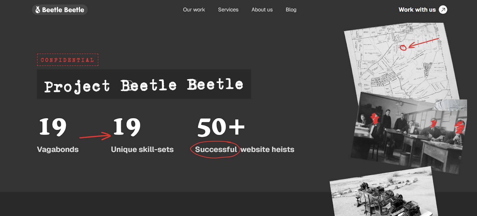
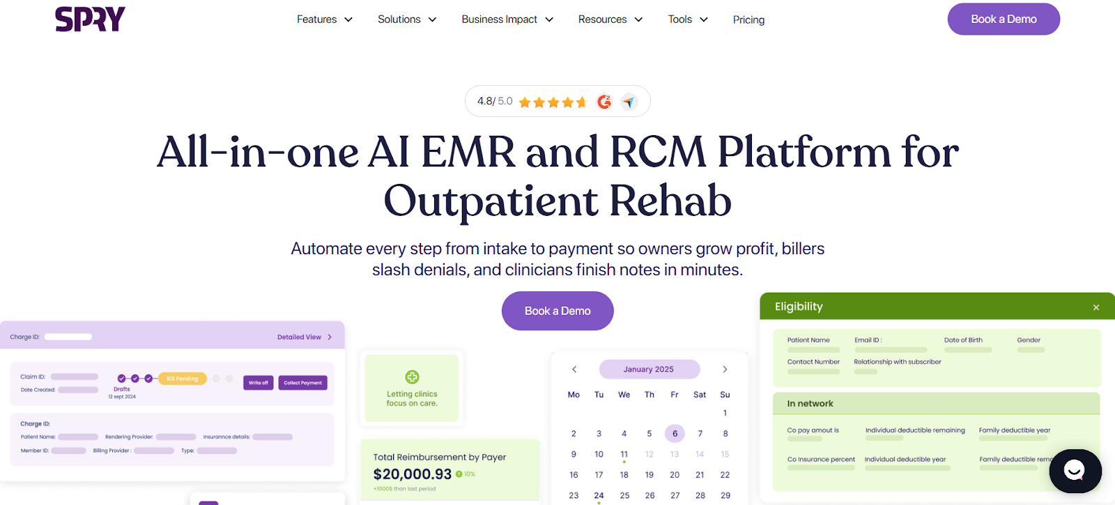
https://www.beetlebeetle.com/about
2. Blue
Trust and Calmness
Blue conveys professionalism, trust, and calmness. It is commonly used in corporate and financial websites due to its ability to inspire confidence. Users feel safe and assured when they see blue, which can positively impact their decision-making process.
Best Use Cases
Blue is perfect for CTAs, hyperlinks, and navigation elements. It works well with both light and dark primary colors, making it versatile for any type of website.
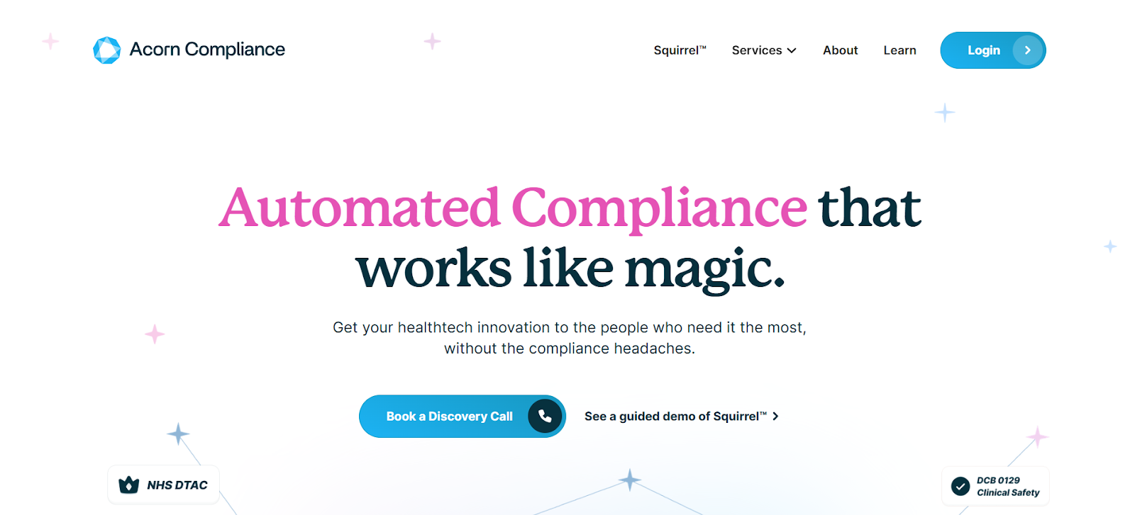
https://www.acorncompliance.com/
3. Green
Symbol of Growth and Stability
Green represents growth, stability, and balance. It’s associated with environmental sustainability and health, making it an ideal accent color for eco-friendly, wellness, and finance-related websites.
Best Use Cases
Green is often used in CTAs or notifications that signal positive actions, like "sign up" or "learn more." It pairs well with neutral tones and natural color schemes.

4. Orange
Energetic and Inviting
Orange combines the energy of red and the optimism of yellow, making it vibrant and inviting. It sparks enthusiasm and creativity, encouraging action from visitors.
Best Use Cases
Orange is ideal for interactive elements like buttons or links, especially when you want users to feel engaged and motivated. It pairs best with cool primary colors for a balanced design.
5. Yellow
Optimism and Attention-Grabbing
Yellow is the color of optimism, energy, and attention. It’s the brightest color in the spectrum, drawing immediate focus. Used strategically, it can invoke positivity and encourage engagement.
Best Use Cases
Yellow accents are perfect for highlighting key areas like sale banners, promotions, or attention-grabbing CTAs. However, it’s best used sparingly to prevent overwhelming the user’s visual experience.
6. Purple
Creativity and Luxury
Purple is often associated with creativity, luxury, and elegance. It exudes a sense of sophistication and exclusivity, which is why it's favored in high-end brands and creative industries.
Best Use Cases
Purple is ideal for luxury real estate websites or high-end fashion brands, where it helps convey exclusivity and elegance. It’s also seen in creative industries like marketing agencies or design firms, highlighting innovation and sophistication in premium service offerings.
7. Pink
Playfulness and Approachability
Pink is a playful and approachable color that fosters a sense of warmth and friendliness. It’s often used for products or services targeting younger audiences or brands aiming for a fun, trendy feel.
Best Use Cases
Pink is ideal for fashion, beauty, and lifestyle brands. Use it for CTAs, product highlights, or playful elements in your design to convey approachability without sacrificing style.
8. White
Cleanliness and Simplicity
White represents cleanliness, simplicity, and minimalism. It’s a color that allows other design elements to stand out, creating a spacious and clear visual experience.
Best Use Cases
White is perfect for backgrounds, navigation bars, and text, offering a neutral base that makes other accent colors pop. It helps balance more intense colors and enhances the overall user experience with its simplicity.

https://fyno.io/
9. Black
Sophistication and Power
Black is often seen as sleek, powerful, and sophisticated. It gives a sense of authority and elegance, making it perfect for premium brands or websites focused on high-end products.
Best Use Cases
Black can be used for CTAs, footer designs, and text to create contrast and highlight important sections. When paired with vibrant or metallic accent colors, it adds a luxurious feel without overwhelming the design.
10. Gray
Neutral and Elegant
Gray is a timeless, neutral color that communicates balance and professionalism. It allows other colors to shine while offering a sophisticated backdrop.
Best Use Cases
Gray is best used for text, borders, and backgrounds, making it ideal for websites with a minimalist design. It also complements more vibrant accent colors, creating a clean, polished look.
If you think choosing the right accent color guarantees a better user experience, you're only half right. Color selection matters, but how users actually interact with these colors depends on dozens of contextual factors that most businesses completely overlook.
Effect of Website Colors on User Experience
Website colors affect user experience through three key pathways: cognitive processing, emotional responses, and navigation patterns. Understanding these mechanisms helps you predict how color changes will impact actual user behavior.
- Faster visual processing - Your brain identifies colors before reading text or recognizing shapes.
- Reduced cognitive load - High contrast between primary and accent colors makes scanning effortless.
- Better element recognition - Clear color distinction helps users instantly identify clickable areas.
- Emotional priming - Colors trigger subconscious feelings that influence decision-making speed.
- Navigation clarity - Consistent accent colors create predictable interaction patterns.
- Reduced confusion - Systematic color usage eliminates guesswork about which elements are interactive.
- Improved task completion - Users follow intended conversion paths when colors guide them logically.
If you own a B2B SaaS business and are serious about getting your business website right down to the last detail, you need professional visual branding. It's a science of strategic design decisions that includes precise application of color theory to drive measurable business outcomes.
How Beetle Beetle Can Help
Beetle Beetle specializes in writing, designing, and building high-converting websites specifically for fast-growing SaaS companies. Their clients see measurable results, with signup conversion rates increasing by 39% in just three weeks.
Our team combines strategic messaging, visual storytelling, and conversion-focused design to create websites that turn prospects into customers. With over 100 B2B SaaS brands in our portfolio over six years, we understand the specific design challenges B2B companies face.
Get a website that actually converts your best prospects into paying customers. Hire Beetle Beetle for website design & development, or revamp today.
FAQs
1. What is an accent color in web design?
An accent color in web design is a secondary color used to highlight key elements of a website, such as buttons, links, or calls to action. It complements the primary color scheme and draws attention to specific actions you want users to take. The accent color helps create visual interest and guides user interaction.
2.What is the 3-color rule for websites?
The 3-color rule for websites is a guideline suggesting that a website should use three main colors: a primary color, a secondary color, and an accent color.
This limited color palette helps create a cohesive design, reduces visual clutter, and ensures that each color has a purpose. By sticking to three main colors, a site maintains consistency and clarity.
3. What is the 60 30 10 rule in website design?
The 60-30-10 rule in website design is a color distribution strategy that helps achieve a balanced and visually appealing design. According to this rule,
- 60% of the website should be covered in a dominant color (usually the background or base color)
- 30% should be the secondary color (used for content like buttons and headings)
- 10% should be the accent color (used for calls to action and highlights)
This balance keeps the design visually harmonious and prevents overwhelming the user.
4. How do you choose the right accent color for your website?
Choosing the right accent color involves understanding your brand’s identity, target audience, and the psychological impact of different colors. It’s important to select a color that complements your primary colors while evoking the desired emotion or action from users.
A good accent color enhances usability, guides user interactions, and aligns with the overall mood of your site.


