


Websites are often the first point of contact between a business and its potential customers. Yet many fail at this stage, not because of poor products or services, but because their sites lack clarity, speed, or structure.
Visitors leave quickly when information is hard to find, layouts feel cluttered, or performance lags. High-performing websites, by contrast, minimise these barriers through thoughtful design and consistent execution.
They focus on what matters: guiding attention, presenting information clearly, and ensuring seamless interaction. Examining how these websites operate offers practical insight into building online experiences that hold attention and support measurable business growth.
Key Insights
- Context beats content - Where you place elements matters more than what those elements say or show
- Progressive disclosure wins - Reveal information gradually rather than overwhelming visitors with everything upfront
- Behavior trumps demographics - What visitors do on your site predicts conversion better than who they are
- Speed perception equals trust - Fast-loading sites automatically feel more credible and professional to users
12 High-Performance Website Features That Drive Conversions
1. Above-the-Fold Value Proposition Testing
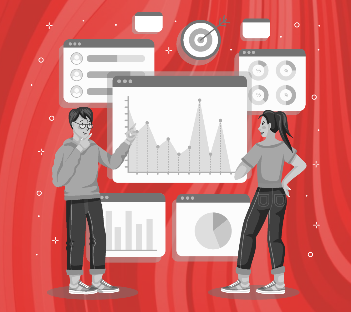
Top performers A/B test their hero sections continuously. HubSpot runs multiple different headline variations monthly, measuring micro-conversions like scroll depth and demo clicks.
The winning versions focus on outcome-specific language rather than feature lists. This data-driven approach increases initial engagement a lot more compared to static messaging.
2. Progressive Information Disclosure Architecture
High-converting sites reveal complexity gradually. Slack's pricing page shows three tiers initially, with advanced options appearing after user interaction. This prevents cognitive overload while maintaining transparency.
Users process more information when it's presented in digestible chunks rather than comprehensive displays that overwhelm decision-making processes.
3. Consistent Branding
Every detail on a site tells visitors something about your business. Fonts, colors, icons, and imagery should feel aligned, not random. High-performing websites stick to a consistent style and tone across every page, from product tours to CTAs.
That consistency builds trust, strengthens recognition, and creates a brand personality people remember long after leaving the site.
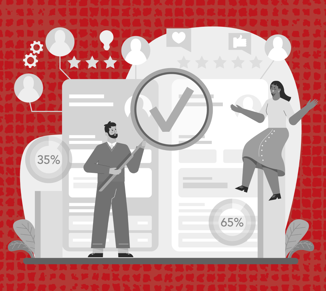
4. Social Proof Placement Psychology

Where you put testimonials matters more than how many you have. Place customer logos right next to your main call-to-action button.
Save video testimonials for after pricing pages, where cost objections surface. The timing creates trust exactly when doubts creep in. Strategic placement beats quantity every single time in conversion impact.
5. Friction-Optimized Form Design
Long forms can sabotage conversions instantly. Ask for just email and company size upfront. Save the detailed questions for your actual sales call. This approach feels less committal while giving you enough information to qualify leads properly. Removing barriers early generates more qualified prospects than comprehensive forms that scare people away.
6. Contextual Chat Trigger Implementation
Generic chat bubbles annoy visitors. Instead, trigger chat based on what someone's actually doing. Wait longer on feature pages, but jump in quickly on pricing pages. Use exit-intent to catch people leaving with targeted questions about what they just viewed. Behavior-driven chat feels helpful rather than pushy or intrusive.
7. Mobile-First Loading Speed Architecture

Mobile users expect pages to load instantly. Load the critical stuff first, then fill in details as people interact. This progressive approach keeps visitors engaged while heavier elements load quietly in the background. Speed on mobile isn't optional anymore - it directly impacts whether people stick around or bounce immediately.
8. Conversion Path Funnel Mapping
Different visitors want different levels of commitment. Offer free trials for ready buyers, demos for researchers, and downloads for early-stage prospects. Each path should collect just enough information for proper follow-up. Multiple options increase overall conversions because you're meeting people where they are in their buying journey.
9. Trust Signal Integration Strategy
Security badges belong next to payment forms, not buried in footers. Privacy compliance notices work best on data collection pages. Context matters - show trust signals exactly when visitors need reassurance about taking action. Strategic placement reduces form abandonment because people see proof of safety right when security concerns surface.
10. Personalization Engine Implementation
Show different content based on who's visiting. Small companies see small business case studies, while enterprise visitors get large-scale examples. This happens automatically through IP detection and behavior tracking. Relevant content keeps people engaged longer because they see themselves reflected in your success stories and use cases.
11. Exit-Intent Conversion Recovery
Catch people before they leave with something relevant to their visit. If someone viewed your templates, offer template suggestions. If they checked pricing, provide a consultation offer. Match the intervention to their demonstrated interest. Generic discount popups feel desperate - behavioral matching feels thoughtful and increases recovery rates significantly.
12. Core Web Vitals Optimization Strategy
Slow page loading speed hinders conversions before visitors even see your content. Focus on three key metrics: loading performance, interactivity, and visual stability.
Compress images aggressively, minimize JavaScript execution, and prioritize above-the-fold content loading. Even a one-second delay triggers impatience. Fast-loading sites feel more trustworthy and professional than slow ones.
Also read: Website Speed Optimization: Tips for Faster Websites in 2025
If you believe your site lacks the fundamentals that make top-performing websites work, it might be in your best interest to audit your website and consider a full redesign. However, redesigning a B2B SaaS website in particular is not an easy undertaking.
The process demands clarity around positioning, careful attention to user journeys, and an understanding of how design directly supports conversion goals.
Without a structured approach, it’s easy to invest heavily in visuals while missing the functional improvements that actually drive results.
How Beetle Beetle Can Help?
At Beetle Beetle, a website revamp starts with research. We study your users, map their journeys, and benchmark your competitors. From there, we refine messaging, redesign layouts, and rebuild in Webflow with performance, clarity, and SEO in mind.
Our sprint-based process delivers results in weeks, not months, while keeping you involved at every stage. Past clients have seen measurable growth in conversions after a revamp.
If you think your site isn’t pulling its weight, get a free website audit today and uncover gaps that may be costing you sign-ups and revenue.
FAQs
1. What defines a high-performing website?
A high-performing website balances speed, usability, and clarity. It removes friction in user journeys while supporting measurable goals like sign-ups, demos, or purchases.
2. How often should a SaaS website be redesigned?
On average, every 2–3 years. However, an earlier redesign may be needed if performance metrics decline, messaging changes, or competitors set higher benchmarks.
3. Does redesigning always mean starting from scratch?
Not necessarily. Many redesigns focus on restructuring layouts, refining messaging, and improving technical performance, while retaining what already works.
4. What mistakes slow down SaaS websites?
Heavy images, unused scripts, poor hosting, and unoptimized code are common culprits. Fixing these often improves speed and engagement quickly.
5. Why is a website audit important before redesigning?
An audit highlights design, content, and technical gaps. It ensures the redesign addresses real issues instead of making surface-level changes that don’t move the needle.


