


It doesn't matter how great your product or service is if it's not marketed properly - harsh but true, and we both know it.
Recent data shows that 20.4% of businesses close within their first year, while 49.4% don't survive past five years. Not all of these ventures had poor products or services. Many possessed genuine potential but failed to build memorable brands.
So, what sets a brand apart? Is it the product? The tone? Maybe. But more often than not, it's a combination of consistent presence and how people feel when they see your name. A dynamic logo can plant that feeling better than a static, boring logo.
Dynamic logos might seem like a minor detail in business strategy, but small changes create a massive impact. Want to learn how to design dynamic logos for your brand and how they can enhance brand recognition? Keep reading.
TL;DR (Key Takeaways):
- Dynamic logos work best when built as systems with fixed rules and flexible parts, not just animated versions of a static design.
- A dynamic logo isn’t for every brand, but if you’re reworking layouts constantly or running heavy digital campaigns, it’s worth considering.
- Raster animations become pixelated when scaled, while vector formats maintain quality across all device sizes and reduce file sizes.
- They solve real-world problems like scaling across platforms, audience segmentation, and high campaign turnover without diluting the brand.
- Choosing the right tools (Figma, After Effects, Lottie, etc.) helps streamline both creativity and consistency across teams.
What Are Dynamic Logos, Exactly?
Dynamic logos are visual identities that change, move, or adapt based on context, platform, or user interaction. Unlike static logos that remain fixed, dynamic logos incorporate motion graphics, animation, or variable elements that respond to specific triggers or environments.
Think of them as living logos that react to where they appear and how users interact with them.
A static logo sits unchanged on business cards, websites, and products. Dynamic logos shift between versions - they might pulse during loading screens, change colors for different seasons, or animate when you hover over them. The logo remains recognizable but gains personality through these controlled variations.
Technical components of dynamic logos include vector-based animations, CSS transitions, JavaScript interactions, and responsive design elements. These logos maintain brand consistency while offering flexibility through -
- Predetermined variations
- Color shifts
- Or animated sequences that activate during loading screens, hover states, or seasonal campaigns.
The core principle is to build a logo system, not just a single static mark. It means setting clear rules for how the logo adapts across platforms - be it on a website, an app, packaging, or video.
At the same time, key elements stay fixed: typography, color palette, proportions, and layout structure. These consistent anchors are what hold the system together and protect brand recognition, no matter how much the visuals shift around them.
5 Brands Successfully Using Dynamic Logos for Inspiration

This adaptability allows brands to feel more responsive, modern, and culturally aware without sacrificing recognizability. These logos are especially effective in digital-first environments, where screens and interactions call for motion, change, and relevance.
Here are five standout examples of brands that have nailed this concept:
1. Google
Google stands out with different logos for almost every occasion, and fans anticipate new variations. Their daily Doodles transform the traditional logo into interactive experiences celebrating holidays, anniversaries, and cultural events. The technical approach involves scalable vector graphics that maintain readability across all devices.
2. Spotify
Spotify's logo adapts through color variations and pulsing animations that sync with music playback. Their 2024 Wrapped campaign exemplifies Spotify's role in culture, continuously pushing boundaries through dynamic visual storytelling that changes based on user listening data.
3. MTV
MTV pioneered dynamic logos before it became the norm. The basic "M" and "TV" remain, but the fill, animation, and texture change constantly to match cultural shifts, seasons, or show types, keeping it fresh without confusing the audience.
4. Personal Identity by MIT Media Lab
The Media Lab’s dynamic logo system generates custom logos for internal teams, all derived from the same grid structure. Each version is unique, but still recognizably part of a shared visual DNA. It’s a systematic design at scale.
5. City of Melbourne
The “M” logo shifts color, form, and pattern depending on use case(tourism, government communication, or community outreach), yet maintains its core geometry. It reflects a city that’s diverse and always in motion.
Each of these examples proves that a dynamic logo is a strategic design system that expands brand recall while allowing room for evolution.
With a (hopefully) clear idea of what a dynamic logo is, let’s learn how to create these unique visual elements.
How to Design Dynamic Logos for a SaaS (or Any Other) Brand?
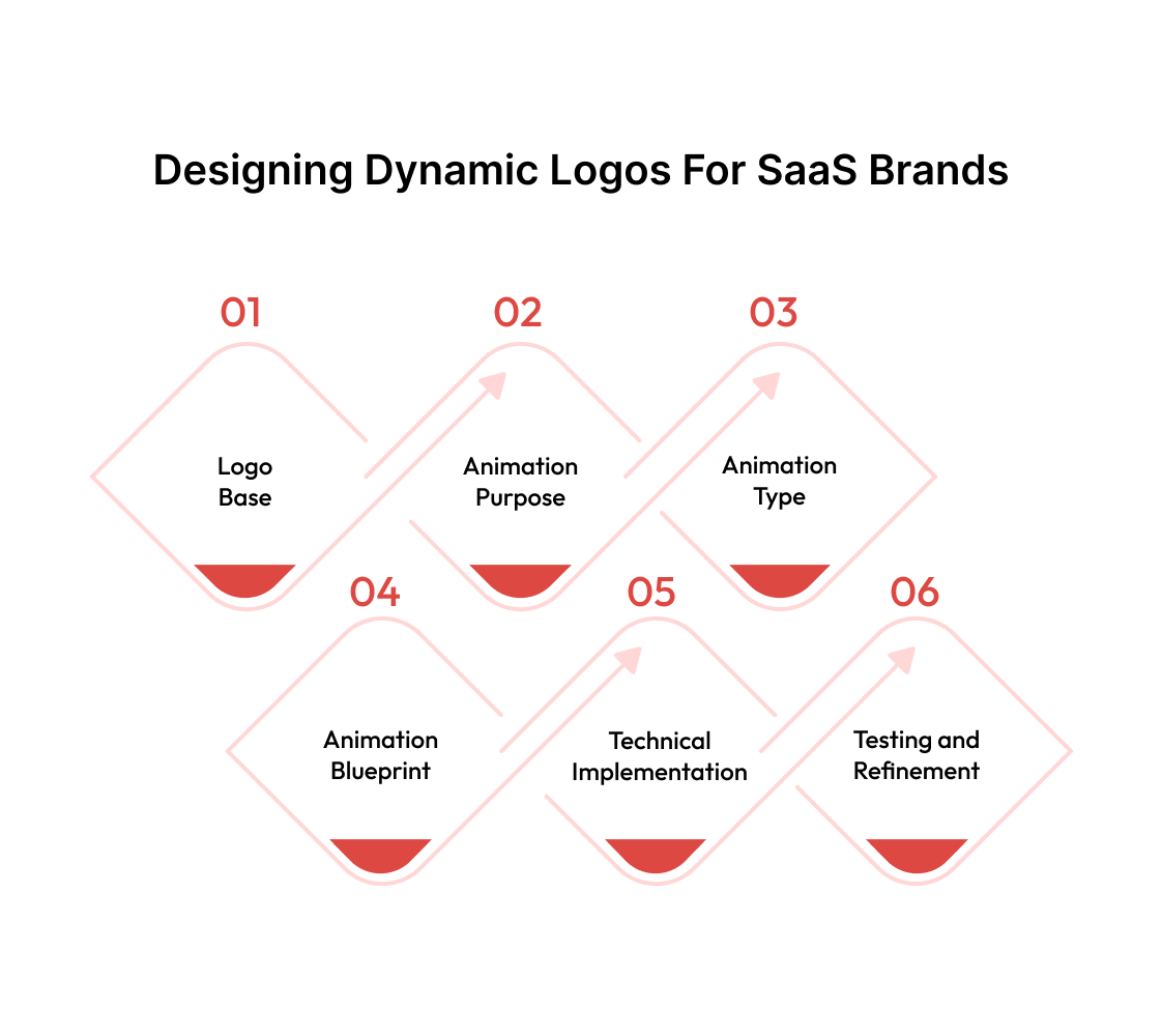
The process involves strategic planning, technical execution, and careful testing to ensure your moving logo enhances rather than distracts from your brand message.
1. Start With Your Static Logo Foundation
Your dynamic logo needs a solid base. Before adding any movement or variations, your static logo must work perfectly on its own. This means clear typography, balanced proportions, and recognizable elements that translate across different sizes.
Test your static logo at tiny favicon sizes and large billboard dimensions. If it becomes unreadable or loses impact at any scale, fix these issues first. Dynamic elements will only amplify existing problems, not solve them.
Document your logo's core elements - colors, fonts, spacing, and proportions. These become your constraints for any dynamic variations. Breaking these rules destroys brand consistency.
2. Define Your Animation Purpose
Every movement in your logo should serve a specific function. Random animations look amateur and annoy users. Professional dynamic logos solve problems or enhance user experience.
Common purposes include providing loading feedback, celebrating user actions, indicating system status, or creating memorable brand moments. Netflix's loading animation informs users that content is being loaded. Google's Doodles celebrate cultural moments. Both serve clear purposes beyond looking fancy.
Write down exactly why your logo needs to move. If you cannot articulate a clear reason, stick with static versions until you find one.
3. Choose Your Animation Type
A. Micro-Animations
Small movements that respond to user interactions. Examples include hover effects, button presses, or form submissions. These animations last 0.2 to 0.5 seconds and provide immediate feedback.
B. Loading Animations
Movements that indicate system processing. They should loop seamlessly and never suggest the system has frozen. Duration varies based on actual loading times, but should remain engaging without becoming hypnotic.
C. Seasonal Variations
Logo changes that reflect holidays, seasons, or special events. These maintain brand recognition while showing cultural awareness. They typically replace static logos for predetermined periods.
D. Interactive Animations
Refers to complex movements triggered by specific user behaviors. These involve mouse tracking, scroll position, or device orientation. They create engaging experiences but require careful performance optimization.
4. Design Your Animation Framework
A. Timing and Easing
Movement speed affects perception. Fast animations feel urgent or exciting. Slow movements appear elegant or sophisticated. In our experience, most interface animations work best between 200-500 milliseconds.
Easing curves control how movement accelerates and decelerates. Linear movement feels robotic. Natural easing mimics real-world physics - objects accelerate when starting and decelerate when stopping.
B. Motion Principles
Follow established animation principles. Anticipation prepares viewers for movement. Squash and stretch add life to geometric shapes. Overlap and follow-through create believable motion sequences.
Avoid movements that conflict with user expectations. Buttons should depress when clicked, not expand. Loading indicators should progress forward, not backward.
5. Technical Implementation
A. Vector-Based Creation
Here's where many designers end up making mistakes. They create beautiful animations in raster formats that look perfect on their designer's high-resolution monitor, then wonder why everything looks terrible on actual user devices.
Vector animations solve this problem by storing movement as mathematical instructions rather than individual pixels. When your logo needs to display at any size, the math scales perfectly. A 16-pixel favicon and a 1000-pixel banner use the same crisp instructions.
Adobe After Effects, paired with vector workflows, gives you professional results. The software thinks in terms of motion and timing, not just static design. This approach prevents the choppy, amateur feel that comes from manually creating frame-by-frame animations.
B. File Format Selection
Different platforms speak different languages. Your beautiful After Effects animation means nothing if the target platform can't understand it.
Mobile phones account for the highest share of website visits in global digital commerce and drive the majority of online purchases. It’s not a long shot to assume that most shoppers on slow connections will abandon your site if animations take too long to load.
This brings us to our next point.
C. Performance Optimization
Your laptop can handle multiple simultaneous animations without breaking a sweat. Your user's three-year-old smartphone cannot. This performance gap catches many brands off guard when their polished animations turn into stuttering messes on real devices.
Device overload happens when too many animations compete for processing power. The result is jerky movement that makes your brand look unprofessional. Limiting simultaneous animations prevents this problem before it starts.
Some users experience motion sensitivity that makes animations physically uncomfortable. Others use older devices that struggle with complex movements. Providing “Disable” options is both considerate and essential for accessibility and broader reach.
GPU acceleration moves animation processing from your device's general processor to specialized graphics hardware. This shift dramatically improves performance, especially on mobile devices where every bit of efficiency matters.
6. Testing and Refinement
A. Cross-Platform Testing
Your animation works perfectly on your development machine. This means absolutely nothing for user experience. Different browsers interpret animation code differently. Various devices have different processing capabilities. Some platforms don't support certain animation features at all.
Desktop success doesn't guarantee mobile success. Mobile processors prioritize battery life over performance. What runs smoothly on a desktop might stutter badly on mobile, especially when the device is running other apps simultaneously.
Fallback options save your brand when technical limitations arise. A static logo displays instantly and maintains a professional appearance when dynamic versions fail. This contingency planning prevents broken user experiences.
B. User Feedback Collection
Numbers don't lie, but they don't tell the whole story either. Bounce rates and engagement metrics reveal what happened, but not why it happened. You need both quantitative data and qualitative insights.
User testing sessions reveal the gap between what people say and what they actually do. Someone might claim they love your animated logo in a survey, then demonstrate clear frustration during actual interaction. Watching real behavior provides the truth that surveys miss.
Signs of confusion include hesitation before clicking, repeated attempts to interact with animated elements, or avoiding animated areas entirely. These behaviors indicate your animation is creating problems rather than solving them.
C. Performance Monitoring
Slow animations hurt user experience more than missing animations because they create false expectations. Users expect smooth, responsive interactions. When animations lag or stutter, they signal poor quality and unreliable technology.
Analytics tools measure the real-world performance of your animations across different devices and connection speeds. This data helps you identify problems before they become widespread user complaints.
Performance budgets force difficult decisions about animation complexity. When you must choose between elaborate movements and fast loading times, fast loading wins every time. Users will forgive missing animations, but won't forgive slow websites.
Before you dive into design, it's smart to get your toolkit in place. A dynamic logo demands more than just a good idea. You also need the right setup to bring each version to life smoothly across different platforms.
Also read: Website Speed Optimization: Tips for Faster Websites in 2025
Tools We Use for Dynamic Logo Design
There’s no single software that does it all, but a solid mix of the right tools can cover everything from structure to animation to export. These are the ones we at Beetle Beetle actually use when building flexible logo systems for clients.
Each serves a specific purpose in the process and keeps things efficient without compromising quality.
- Adobe After Effects: Best for bringing motion into the logo. It gives you full control over animation timing, transitions, and responsiveness, especially useful for video intros or scroll-triggered effects on websites.
- Figma: A go-to for laying out logo variations and building reusable components. Its live collaboration and variant tools make it easy to test how the logo behaves across devices and contexts.
- Adobe Illustrator: Still unbeatable for precise vector work. This is where we define the base structure - the part of the logo that never changes. Think geometry, alignment, and proportions.
- Principle: Helpful when prototyping how a logo might respond to taps, swipes, or hovers. Clean interface, quick export, and no steep learning curve.
- Lottie by Airbnb: If you want lightweight animated logos for mobile or web, this is your tool. It works directly with After Effects files and delivers smooth playback with small file sizes.
- Procreate: Good for early-stage sketching or experimenting with texture-based variations. Especially handy if you're building a hand-drawn or organic visual language into the logo.
- Blender: If you’re working with 3D elements, this open-source tool gives you the freedom to create depth, lighting, and motion that feels immersive. Great for brands exploring more dimensional identity systems.
- SVGator: For creating SVG animations without writing code. Useful when you need to build scalable, web-friendly animated logos that stay crisp across screen sizes.
- Spline: A newer option for designing and animating 3D logos directly in the browser. It’s visual, fast, and allows real-time preview. Ideal for digital-first brands.
Each tool here solves a specific part of the puzzle. Used together, they make building dynamic logos far more practical and scalable.
Once the toolkit is sorted, the bigger question is, Who actually benefits from going dynamic? It’s not a one-size-fits-all solution. However, for brands that appear in various formats every day - across devices, campaigns, and user journeys - a static logo can become a limitation over time.
Who Should Invest in a Dynamic Logo System?
A dynamic logo enables you to keep pace with the evolution of your brand.
Companies spend 10–20% of their annual budget on branding and rebranding. So, if your brand shows up across screens, channels, and formats daily, your logo should be built to flex without falling apart.
In industries where attention spans are short and visual consistency matters, dynamic identity systems are a legitimately practical need.
If your brand shows up across different digital environments, e.g., apps, social platforms, campaign microsites, or smart displays, you already know the design challenges.
If you're constantly adjusting your logo or layout just to make it work in each context, that's a clear signal: it's time to think about a dynamic logo system.
Also worth thinking about:
- Are you running frequent marketing campaigns that demand visual variation?
- Do you cater to diverse user groups or regions with different design needs?
- Is your team spending too much time adjusting the logo for new formats?
If the answer to any of these is yes, a dynamic logo system won’t just save effort - it will also bring consistency and adaptability without forcing design trade-offs.
While we don’t frequently recommend rethinking a brand’s core identity, when we do, we enjoy the process because it forces us to design with real-world behavior in mind.
As web designers, we are not always consumed by how a logo looks, but also by how it adapts across dozens of moving parts without losing meaning. That challenge is worth every bit of effort.
Advantages of Dynamic Logos in 2025
More brands are interacting with users in short bursts across multiple screens, platforms, and formats. Static logos weren’t designed for that kind of repetition. Dynamic logos let you show up differently without starting from scratch every time. The upside?
1. Unique Visual Identity
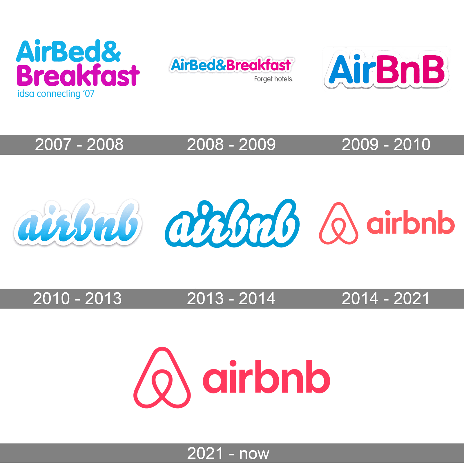
(Source Link:- Airbnb's logo transforms across different contexts)
Dynamic logos separate your brand from competitors stuck in static thinking. When every company in your industry uses traditional logos, movement becomes your differentiator. Airbnb's logo transforms across different contexts while maintaining recognition, allowing it to feel native to different cultures without losing brand consistency.
2. Improved Brand Storytelling
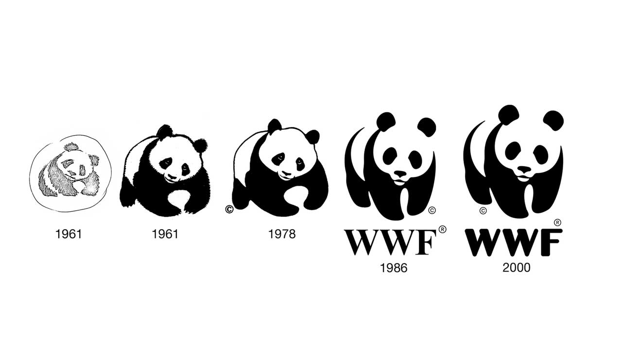
Dynamic logos convey complex brand messages that static versions cannot communicate. Movement allows you to show transformation, growth, or innovation through visual metaphor.
WWF's logo occasionally shows its panda symbol breaking apart and reforming. This symbolizes environmental fragmentation and restoration more powerfully than any static image.
Better Fit Across Digital Touchpoints
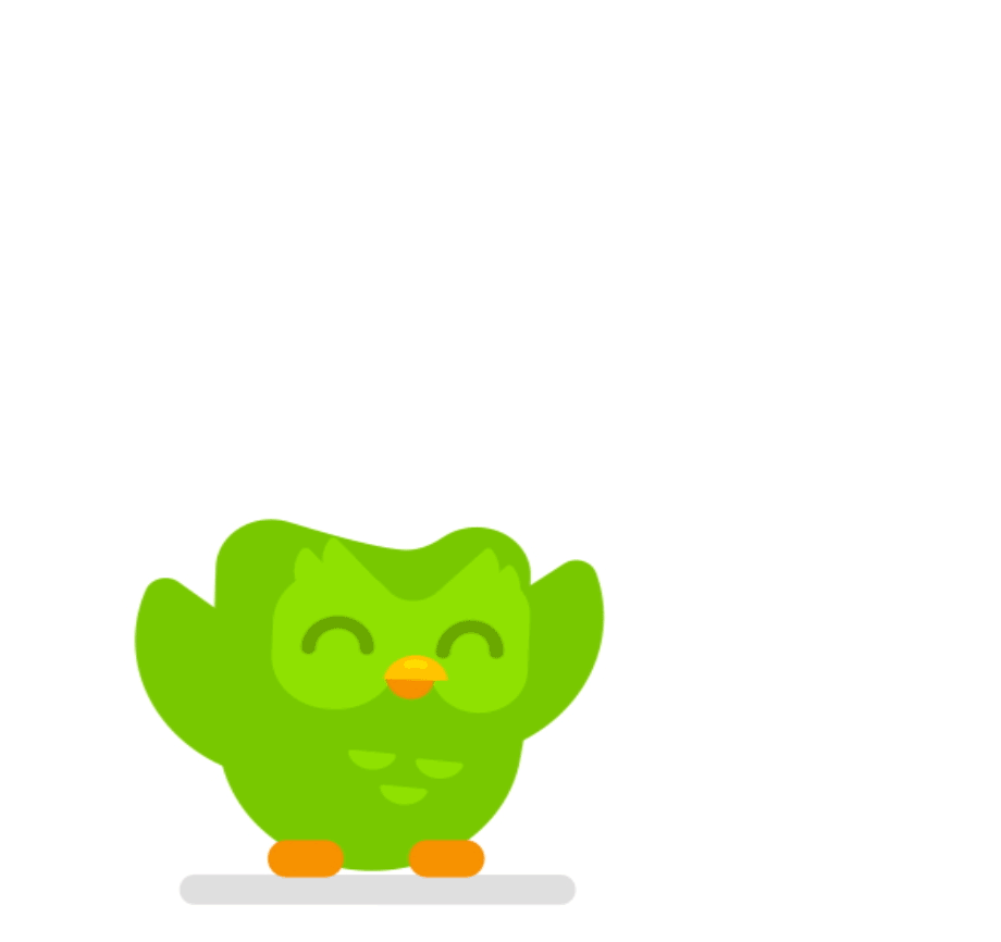
( Source:- Duolingo’s owl logo)
Not every screen is built the same. Your logo on a smartwatch can’t behave the same way it does on a billboard.
A flexible identity lets you match scale, context, and motion without redrawing the whole thing. Duolingo’s owl logo, for instance, reacts and changes shape depending on user actions in-app, without ever confusing the viewer.
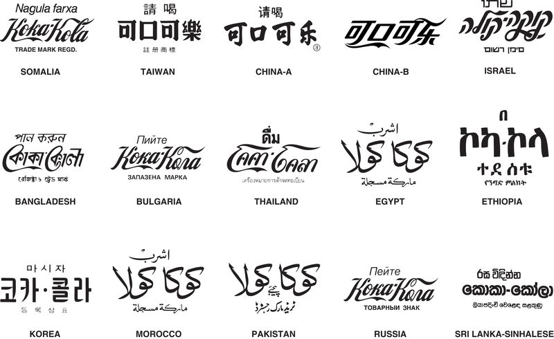
3. Easier Localization Without Losing Brand Consistency
For global brands, it’s important to stay consistent while still respecting local context. A dynamic logo system makes that easier.
Coca-Cola, for example, maintains its iconic script logo but regularly adjusts packaging, type treatments, and campaign visuals based on language, region, and cultural relevance.
Whether it's a special edition for Diwali or a can printed in Arabic script, the core identity holds, while everything around it flexes.
If building a flexible logo system in-house feels overwhelming, that’s normal. Between design tools, animation specs, and brand rules, it’s a time sink. Choose efficiency over guesswork by outsourcing your website visual branding to an agency that has done it before.
Discover a One-of-a-kind Visual Identity With Beetle Beetle
A static logo might look clean on paper, but it rarely holds up across real-world use. Brands grow, platforms multiply, and attention spans shrink. A logo system built with movement and variation in mind is what keeps your identity usable and future-ready.
At Beetle Beetle, our web designers build with adaptability at the core. Our B2B SaaS web design experts dig deep into your market, review competitor positioning, and identify what makes your brand worth remembering.
A dynamic logo isn’t treated as a standalone element. It becomes a natural extension of your broader identity system across interfaces, touchpoints, and formats.
Alternatively, if you’re looking for end-to-end web design and development, right from market research to CMS setup and launch, we’re built for that too.
Wondering if your brand would benefit from a flexible logo system? We can walk you through it. Schedule an intro call with us today.
FAQs
1. How to design a dynamic logo?
Start with a solid static logo foundation, then define the specific purpose for animation. Use vector-based software like Adobe After Effects for scalable results, then optimize for your target platforms with appropriate file formats like SVG for web or Lottie for mobile apps.
2. What are the three golden rules of logo design?
Keep it simple enough to recognize at any size, make it memorable through distinctive elements rather than complexity, and ensure it remains timeless by avoiding trendy design elements. These rules apply whether creating static or dynamic logos.
3. What are the five principles of effective logo design?
Memorability, simplicity, flexibility, timelessness, and functional usability across media (print, digital, motion, etc.).
4. Why are dynamic logos important for digital brands?
Because digital brands operate across multiple platforms and screen sizes, dynamic logos help maintain brand consistency while adapting to different user contexts.
5. What software is best for creating a dynamic logo system?
Tools like Adobe After Effects, Figma, Illustrator, and Lottie are commonly used together to design, animate, and deploy dynamic logos across formats.


