


Tl;dr:
- Adapt heuristics to your specific context: Generic usability principles need customization for B2B SaaS platforms, considering factors like lengthy sales cycles, complex decision-making processes, and subscription-based business models.
- Use exactly five evaluators for optimal results: Nielsen's research demonstrates that five independent evaluators can identify 85% of usability problems, while additional evaluators provide diminishing returns on investment.
- Combine expert evaluation with user validation: Heuristic evaluation provides quick usability insights, but should be validated with actual user testing to confirm that identified problems truly impact your target audience.
- Focus on systematic documentation and collaboration: Consistent recording formats and collaborative debriefing sessions ensure that findings translate into actionable improvements rather than scattered observations.
Users abandoning sign-up forms halfway through or bouncing from pricing pages without clicking anything isn’t new. Is it the copy? Maybe. Is it poor targeting? Could be. Is the website UX silently ruining it? Bingo. And this is not a mere conjecture.
A frequently cited study shows that 60% of users leave a site instantly if the experience feels clunky or confusing. While a full UX audit helps, it often misses the finer issues users trip over. UX heuristic evaluation can identify usability barriers that are deterring potential customers from engaging further.
In this guide, you will learn how to conduct thorough heuristic evaluations step-by-step. Plus, actionable tips on fixing the problems you discover.
What Is Heuristic Evaluation?
Heuristic evaluation is a usability inspection method where experts review your website against established usability principles. Let’s not confuse it with usability testing, where real users interact with your product while observers track their behavior and feedback in real time.
In heuristic evaluation, seasoned UX professionals identify where your interface breaks these principles and causes user friction.
The method commonly relies on Jakob Nielsen's 10 usability heuristics, which have guided digital design decisions for decades. Instead of watching users struggle, evaluators predict problems before they impact your conversion rates.
Why should you bother with heuristic evaluations of your website UX?
50% of consumers say their impression of a business depends on the company's website design. A systematic evaluation catches expensive usability problems early, before they damage your brand reputation and bottom line.
Requirements for Heuristic Evaluation
To perform a heuristic evaluation on website UX design, you would need the following:
- Clear understanding of website's purpose: Know your business goals, key user actions, and success metrics to evaluate meaningfully.
- Target audience definition: Understand user demographics, behaviors, and expectations to spot relevant usability issues effectively.
- Set of usability heuristics: Use established principles like Nielsen's 10 heuristics as your evaluation framework and scoring criteria.
- Expert evaluators: Include professionals with UX experience who understand both heuristic principles and business context thoroughly.
- Reporting method: Establish systems for documenting findings, prioritizing issues, and tracking fixes across your development cycle.
But wait a minute. Don’t heuristic evaluations sound a lot like UX audits? In practice, they often overlap, actually. That’s why it’s easy to confuse heuristic evaluation with comprehensive UX audits. However, they serve different purposes and timings in your design process.
UX Audit vs Heuristic Evaluation
UX audits and heuristic evaluations both improve user experience, but they work differently. A UX audit is a comprehensive review of your entire digital experience, examining everything from content strategy to technical performance.
It includes usability testing, analytics review, competitor analysis, and accessibility checks. The process takes weeks and involves multiple research methods to create a complete picture of user experience issues.
UX Audit Components:
- User research and testing
- Analytics and data analysis
- Content and information architecture review
- Technical performance assessment
- Accessibility compliance check
- Competitor benchmarking
Both methods are important in specific situations, but serve different needs in your design timeline. It's easy to think you can substitute one for another, but that approach often misses critical insights or wastes valuable resources.
To clear up your decision-making process, take a look at the table below, where we have compared both methods across key factors:
So, if a full UX audit gives you the big-picture story, and heuristic evaluation sharpens the lens on interaction issues, the next question is - how do you actually run one?
Your website's conversion problems won't fix themselves while you debate methodology. You need a methodical approach that examines every user touchpoint against proven usability principles.
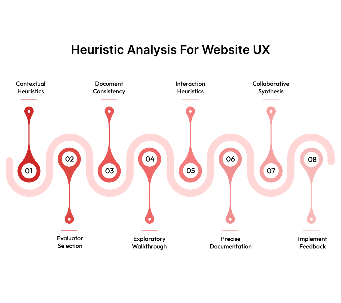
How to Conduct Heuristic Analysis for Website UX: Step-by-Step Guide
At Beetle Beetle, we've conducted heuristic evaluations for dozens of B2B SaaS websites that heavily rely on organic traffic and content marketing for lead generation.
These platforms face unique challenges - they must educate prospects about complex solutions while guiding them through lengthy consideration cycles.
Unlike e-commerce sites focused on quick purchases, SaaS websites need to build trust, demonstrate value, and capture leads at multiple touchpoints.
The biggest mistake teams make is applying generic heuristics without considering their specific business model. A standard "error prevention" heuristic means something completely different for a SaaS pricing page versus a checkout flow.
Therefore, your first point of action should be figuring out how to adapt conventional heuristic principles to your conversion funnel and user journey.
Step 1: Adapt Heuristics to Your Business Context
Nielsen and Molich's heuristics have proven their worth across decades of digital evolution and remain highly applicable today. These principles move from abstract guidelines to practical value when applied within specific contexts.
What disrupts usability in a social media app won’t necessarily affect an enterprise dashboard the same way. Each principle takes on a different weight depending on the product, audience, and task at hand.
In the B2B SaaS business context, Nielsen's "visibility of system status" heuristic becomes critical when evaluating SaaS onboarding flows. If users can't see their progress through a multi-step account setup, they'll abandon the process.
A violation might be a pricing calculator that processes without showing loading states, leaving users wondering if their click registered.
Now, test your UX against the “match between system and the real world” heuristic. If a pricing page uses internal product jargon instead of plain terms that buyers expect, it breaks this rule. The result? Confusion and hesitation, leading to a quick exit.
While these foundational principles remain popular, we also suggest looking into:
- Jill Gerhardt-Powals’ cognitive engineering principles: Designed to cut down mental effort and improve efficiency through logical structure and reduced complexity.
- Ben Shneiderman’s eight golden rules: Published 4 years before Nielsen’s usability heuristics. A solid foundation for any interface. It pushes for consistency, clear exits, and forgiving error handling, so users feel in control, even when something goes wrong.
- Alan Cooper’s About Face design standards: Highlights goal-driven design and natural workflows based on user behavior, not features.
- Weinschenk and Barker’s classification: Rooted in psychology, this model ties usability back to how users think, decide, and remember.
As technology and industry requirements continue to evolve, your evaluation criteria should adapt accordingly. To ensure maximum relevance for your specific platform, don’t treat any heuristic set as one-size-fits-all. You may need to trim, tweak, or expand the list based on your platform.
Let’s say your SaaS platform targets mobile-first users in emerging markets with limited bandwidth.
In that case, following standard heuristics that recommend rich media or animations might backfire. You’d need to focus more on performance and speed than on visual extras.
Step 2: Select the Right Evaluators
The quality of your heuristic evaluation depends entirely on who conducts the review. One study shows that individual evaluators typically find only 35% of usability problems in any interface.
This limitation isn't due to incompetence by any means. It reflects the complexity of user behavior and the subjective nature of usability assessment.
Nielsen recommends using 3 to 5 evaluators for optimal results. This number strikes the perfect balance between thoroughness and efficiency.
Adding more evaluators beyond five yields diminishing returns, where each additional person discovers fewer new issues while significantly increasing coordination costs and timeline delays.
Training your evaluation team ensures consistent, high-quality findings across all reviewers:
- Provide context briefings: Share business goals, user personas, and key conversion metrics so evaluators understand what constitutes success for your platform.
- Clarify the product’s context: What’s the primary device? Who’s the typical user? Allow the evaluators 15–30 minutes to walk through these questions before the review begins. This will help align everyone’s focus.
- Review heuristic definitions together: Ensure everyone interprets principles like "user control" or "error prevention" consistently within your context.
- Practice on sample pages first: Have evaluators work through non-critical sections to calibrate their assessment approach before reviewing important conversion paths.
- Establish severity scoring: Create clear criteria for rating problems as critical, major, or minor based on potential business impact rather than personal preferences.
This preparation investment pays off through more accurate problem identification and actionable recommendations that actually improve your conversion metrics.
Step 3: Choose a Consistent Format to Document Observations
Consistency matters just as much as accuracy. Evaluators need a shared space to record their observations, but not at the expense of independence.
You can opt for a structured spreadsheet, a simple whiteboard, or a customized version of Nielsen Norman Group’s workbook. The key is to pick one format and use it throughout.
Each evaluator should complete their review solo before seeing others’ notes. This avoids influence and surface-level consensus.
One thing we have learned over time: keep observation fields flexible enough for context. Not just “what’s broken,” but why it hurts the user, where it happens, and whether it affects trust or task completion.
Those layers make the feedback easier to act on, especially in industries where fixes need clear, focused direction.
Step 4: Start With an Exploratory Walkthrough
Begin with a free-form review of the interface. Let evaluators explore the site naturally, without looking at any heuristics yet. This helps them understand how things behave in real time, such as loading speed, button responsiveness, screen transitions, etc.
For instance, if a shopping app buries the “Add to Cart” button two scrolls down, this is when this issue will show up for the first time. This phase usually takes about two hours, depending on your product’s complexity.
Step 5: Apply Heuristics to Key Interaction Points
Now that evaluators are familiar with the product, they go back in, but this time, with the heuristics front and center. They focus on specific elements identified in the first pass and judge them against the usability principles.
For instance, when evaluating a mobile banking app's transfer feature against the "error prevention" heuristic, they'd check whether the interface confirms recipient details before processing transactions. They will also verify that it prevents duplicate submissions by ensuring proper button states.
Step 6: Document Problems With Precision
Evaluators must record problems with specific details rather than vague observations. Encourage them to note exact locations, describe user impact, and explain which heuristic was violated.
Instead of writing "confusing navigation," they should specify "main menu lacks visual hierarchy - users can't distinguish between primary and secondary options, violating the recognition rather than recall principle." This precision enables developers to understand and fix issues efficiently.
Step 7: Synthesize Findings Collaboratively
The final debriefing session brings all evaluators together to compare findings and create a comprehensive problem list. They should identify overlapping issues, discuss severity rankings, and suggest potential solutions based on violated heuristics.
Let’s assume multiple evaluators flagged the same form validation problem. In that case, the group might recommend implementing real-time feedback instead of error messages that appear only after submission, directly addressing the visibility of the system status heuristic.
Step 8: Act on the Feedback
Once you’ve mapped out the usability issues and agreed on what needs fixing, the next move is clear. Apply those insights to your design.
The changes should directly respond to the heuristics that were violated. Say the team identified a lack of system feedback after form submissions. The solution might involve adding real-time status indicators or confirmation modals to close that loop.
After updates are made, don't assume the job's done. Run another heuristic review, or even better, pair it with usability testing. That’s how you confirm if the fixes actually work in practice.
However, even with a structured process and a strong set of heuristics, heuristic evaluations aren’t foolproof.
We’ve seen them uncover friction points that traditional usability tests miss entirely, such as when an interface technically “works” but still confuses users due to poor feedback or flawed layout logic.
But the reverse is also true. Some issues don’t show up until real users interact with the product in unpredictable ways. That’s why it’s worth stepping back and weighing the pros and tradeoffs before treating the findings as a final verdict.
Pros of Heuristic Evaluation of UX Design:

- Fast turnaround without recruiting users: You can run an evaluation in a day or two without waiting on user scheduling or testing logistics.
- Cost-effective for early-stage feedback: Especially helpful for catching design flaws before development begins, saving time and budget on fixes later.
- Easy to repeat throughout the product lifecycle: You can re-run evaluations after each design cycle to validate improvements without needing full research sprints.
- Brings multiple expert perspectives: With a diverse evaluation team, you get a broader view of potential user pain points.
- Helps build a common language for usability: Useful for aligning design, dev, and product teams on what makes a good experience beyond personal opinions.
Limitations of Heuristic Evaluation of UX Design:
- Expert bias limitations: Evaluators may miss problems that real users experience or flag issues that don't actually matter to your audience.
- No behavioral validation: Findings represent educated guesses about user problems rather than observed user struggles and frustrations.
Now, we understand that not every team has the time or manpower to dig through every usability issue in-house.
Building this evaluation capability internally requires onboarding expert web UX designers who understand how to adapt heuristic principles from the ground up and train your team on consistent assessment methodologies.
As a growing organization that needs results quickly, you might not have the time or manpower to dedicate to developing this specialized skillset while managing your core business operations and product development cycles.
The solution?
Build Smarter, Convert Faster With Beetle Beetle’s UX Expertise
Heuristic evaluation can trip up even experienced teams when your business domain is as finicky as B2B SaaS.
The complexity of subscription models, multi-touch attribution, and lengthy sales cycles demands evaluators who understand both usability principles and conversion psychology.
Generic heuristic applications often miss the subtle friction points that kill qualified leads before they reach your sales team. Success requires evaluators who can spot when standard principles need SaaS-specific interpretation.
At Beetle Beetle, we design and develop custom Webflow websites for quality lead generation and fast conversions. We obsess over what users notice and what they don’t, so your product doesn’t lose momentum at critical touchpoints.
Our team combines systematic heuristic evaluation with conversion rate optimization techniques to ensure every design decision supports your lead generation goals.
Let’s build something your users won’t have to second-guess. Book a strategy call with us today to discuss your requirements.
FAQs
1. What are the 10 heuristics in Nielsen's heuristic evaluation method?
Nielsen's 10 usability heuristics checklist includes:
- Visibility of system status
- Match between the system and the real world
- User control and freedom
- Consistency and standards
- Error prevention
- Recognition rather than recall
- Flexibility and efficiency of use
- Aesthetic and minimalist design,
- Help users identify, diagnose, and recover from errors,
- Help and documentation
2. How much does a professional heuristic evaluation cost?
Professional heuristic evaluation costs depend on website complexity, number of evaluators, and scope of assessment. Simple websites with five evaluators cost less, while complex platforms requiring specialized expertise and extensive documentation cost more.
3. What is the main disadvantage of heuristic evaluation compared to user testing?
The main disadvantage is that heuristic evaluation relies on expert judgment rather than actual user behavior data. Evaluators might identify problems that don't affect real users or miss issues that only surface during actual usage scenarios and task completion.
4. How do you score severity in heuristic evaluation findings?
Severity scoring typically uses a 0-4 scale: 0 (not a problem), 1 (cosmetic problem), 2 (minor usability problem), 3 (major usability problem), and 4 (usability catastrophe). Scoring considers frequency of occurrence, impact on users, and persistence of the problem across user sessions.
5. Can one person perform a heuristic evaluation effectively?
While one person can perform a heuristic evaluation, it's not recommended for comprehensive results. Single evaluators typically find only 35% of usability problems, missing critical issues that multiple evaluators would catch through their diverse perspectives and expertise areas.


