

.jpg)


For B2B SaaS companies, a website isn’t just your digital storefront it’s your best-performing sales rep. But too many products underperform because the website fails to communicate value, guide user journeys, or build trust. Strategic B2B SaaS design fixes that. It aligns every pixel and piece of content with a business goal whether it’s getting more demo bookings, product signups, or qualified leads.
In this blog, we’ll break down the core principles of B2B SaaS design, highlight the most common design mistakes, and share real-world examples of how design directly impacts growth.
Key takeaways
- B2B SaaS design is about action, not aesthetics—driving demo bookings, trial signups, and leads.
- Clear CTAs, strong messaging, and responsive design are critical for conversions.
- Avoid common pitfalls like clunky UI, slow load times, and generic navigation.
- Beetle Beetle’s work with Spendflo and MailReach shows how high-converting design drives business growth.
What Is B2B SaaS Design and Why Does It Matter?
B2B SaaS design goes beyond making a site look good. It’s about creating an experience that builds trust, reduces friction, and moves prospects closer to a decision. For buyers comparing similar tools, your design can be the edge that tips the scales in your favor.
Here’s why it matters:
- First impressions drive decisions. Your website is often the first point of contact. A clean, fast, and thoughtful experience builds immediate credibility.
- It defines your sales journey. Unlike B2C, B2B buyers often require more information, trust signals, and strategic messaging. Great design turns complexity into clarity.
- It improves conversion. Strategic design choices from layout to copy hierarchy guide users toward high-value actions.
Key Elements of Effective B2B SaaS Design
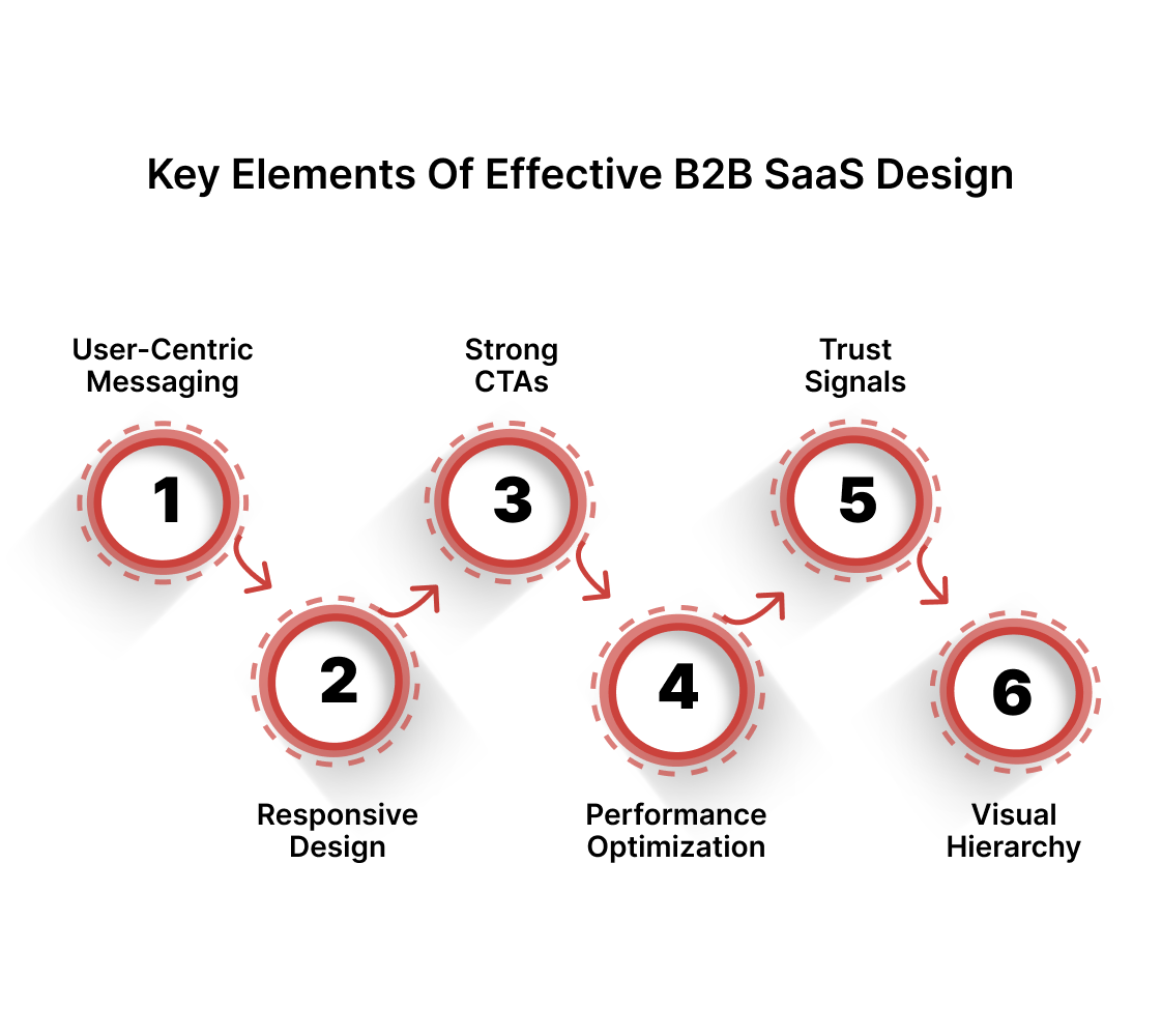
To convert curious visitors into high-intent leads, your site needs more than a sleek interface. It needs:
- User-Centric Messaging: Your content should speak directly to pain points and outcomes, not just features.
- Responsive Design: Every screen size should offer a frictionless experience, especially mobile.
- Strong CTAs: Whether it’s “Start Free Trial” or “Book a Demo,” your CTA should be clear, prominent, and above the fold.
- Performance Optimization: Fast load times reduce bounce and improve engagement. Target under 3 seconds.
- Trust Signals: Logos, case studies, social proof, and certifications all build confidence.
- Visual Hierarchy: Use size, color, and placement to guide users intuitively through content.
Common Mistakes in B2B SaaS Design You Must Avoid
1. Overcomplicating the UI
Your product may be complex, but your site shouldn’t be. Too many dropdowns, dense menus, or feature overload lead to confusion and drop-offs.
→ Keep it focused. Prioritize your core features and simplify paths to value.
2. Ignoring Mobile Experience
A huge share of discovery traffic happens on mobile. If your CTA buttons don’t work or your copy overflows awkwardly, you’ve lost the deal before it began.
→ Design mobile-first. Don’t just shrink desktop layouts, optimize for mobile behavior.
3. Not Listening to User Feedback
Analytics, heatmaps, and feedback forms reveal what users actually struggle with. Ignoring this data means designing in the dark.
→ Review and iterate. Let users show you where friction exists, then fix it fast.
4. Hiding Key Information
Decision-makers don’t want to dig for product features, pricing, or security info.
→ Make essentials easy to find. Good IA (information architecture) is silent but powerful.
5. Slow Load Times
Even a 1-second delay can kill conversions. B2B buyers are no more patient than B2C ones.
→ Audit your site regularly. Compress images, clean code, and run speed tests.
B2B SaaS Design Best Practices
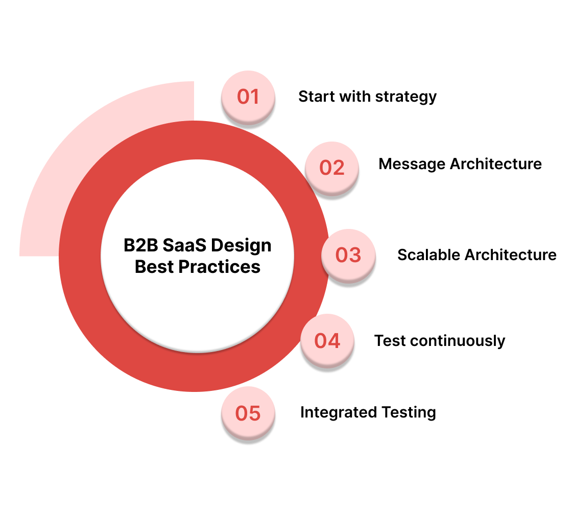
Here’s what the best-performing SaaS websites consistently do:
- Start with strategy. Every section of your site should answer: “What do we want the user to do next?”
- Use messaging frameworks. Like Jobs-To-Be-Done or problem-solution-benefit structures.
- Design scalable systems. Think modular components, design systems, and easy-to-update CMS.
- Test continuously. Headlines, CTA placements, and layouts should be tested—not guessed.
- Think content and design together. Layout and copy should be built in parallel, not sequentially.
Case Studies: B2B SaaS Design Done Right by Beetle Beetle
Spendflo — Streamlining SaaS Procurement
Spendflo partnered with Beetle Beetle to transform their site into a product education and conversion engine. Their previous messaging lacked clarity and wasn’t converting. Here’s what changed:
- Strategic Messaging: After deep user interviews and competitor audits, the core narrative was rebuilt to focus on outcomes.
- Conversion Paths: Key landing pages were restructured for clarity, leading to easier navigation and demo requests.
- Result: Higher time-on-site and a significant uplift in qualified leads.
MailReach — Elevating a Technical Product
MailReach needed a brand refresh and conversion-first website to match their premium positioning. Beetle Beetle delivered:
- Visual Redesign + Messaging Sync: A fresh, modern design with UX microcopy that explained technical concepts simply.
- Outcome: 82% increase in conversion rate per user post-launch.
Why B2B SaaS Design Is Your Growth Multiplier
Great SaaS design isn’t just an aesthetic exercise, it’s a growth lever. A well-designed website builds trust, guides action, and reflects the sophistication of your product.
At Beetle Beetle, we don’t just design websites. We design conversion engines built on insight, storytelling, and performance. From Spendflo to MailReach, our work helps B2B SaaS companies move faster and scale better.
Ready to see what a high-performing site can do for your business? Book a strategy call with Beetle Beetle. We’ll walk you through real results and show you what’s possible.
FAQs
1. How can I simplify a complex SaaS interface without losing functionality?
Use progressive disclosure. Introduce key features gradually, backed with clear labels, tooltips, and contextual onboarding.
2. What role does mobile optimization play?
It's critical. Many decision-makers first discover tools on mobile—even if they convert later on desktop. Make sure mobile CTAs and forms work flawlessly.
3. How do I ensure my website keeps improving?
Use tools like Hotjar, FullStory, or Google Optimize. Keep a regular test-and-learn cadence for headlines, layout, and messaging.
4. What design elements help build trust in B2B SaaS websites?
Social proof (logos, testimonials, case studies), clean design, fast performance, and privacy/security badges all contribute.
5. What’s the ideal number of CTAs on a page?
One primary CTA per page is ideal. You can support it with contextual or secondary CTAs (e.g., "Explore Features"), but don’t crowd the layout.


