

.jpg)


Top 10 Sample Sign-Up Pages for SaaS Websites for Design Inspiration
Converting website visitors into paying customers remains the single biggest hurdle most SaaS businesses face today.
Despite driving quality traffic to their sites, companies watch helplessly as conversion rates hover around disappointing 2-3% marks. Meanwhile, potential customers click away after spending mere seconds evaluating sign-up forms.
The problem runs deeper than most founders realize. Users have grown incredibly selective about sharing personal information, especially when they can't immediately grasp the value proposition.
They've been burned by complex onboarding processes and underwhelming software experiences. Consequently, they approach new sign-up pages with heightened skepticism.
However, certain companies consistently achieve conversion rates that would make their competitors envious. These industry leaders understand something fundamental about human psychology and user experience design.
They've cracked the code on transforming skeptical visitors into engaged trial users through carefully crafted sign-up experiences.
We've analyzed the sign-up/trial/demo pages of industry leaders to identify the specific design patterns and psychological triggers that drive conversions.
Before We Dive In:
1. Microcopy carries disproportionate weight.
Phrases like “No credit card needed” or “Takes 30 seconds” calm user hesitation and subtly reinforce trust.
2. One-click flows work best when backed by context.
A single-button sign-up is only effective if what comes next is obvious. Without clarity, even the simplest flows can backfire.
3. Personalization works better post-signup.
Trying to segment users too early with dropdowns or interest selectors slows them down. Save it for onboarding.
4. Visual hierarchy is more important than visual flair.
The eye should land on one thing at a time: headline, value prop, CTA. Anything else creates noise.
5. Repetition isn't the enemy; ambiguity is.
If your sign-up value prop shows up in the headline and again near the CTA, that’s reinforcement, not redundancy. What frustrates users more is having to guess what they’re signing up for.
1. Close CRM
Close masterfully balances friction reduction with credibility building through their dual-path approach. The Google sign-up option eliminates form fatigue, while the traditional email path captures users who prefer granular control.
Their strategic placement of G2 badges creates an authority halo effect that validates the decision before users commit personal information. The "no credit card required" messaging addresses the primary objection at the exact moment of hesitation.
2. Wayground (formerly Quizizz)
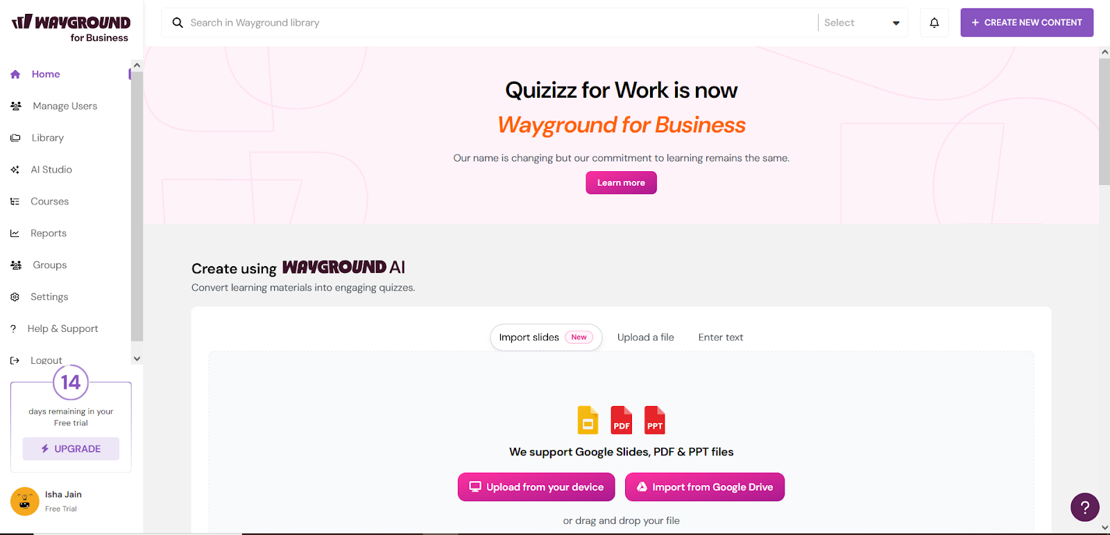
Wayground transforms the typically sterile sign-up process into an engaging social experience through visual storytelling.
The celebratory imagery of educators creates emotional resonance with their target demographic, while the "2 steps" promise sets clear expectations about the commitment level.
Their multi-platform authentication options acknowledge different user preferences without overwhelming the interface. The social proof integration feels organic rather than forced.
3. RevenueHero
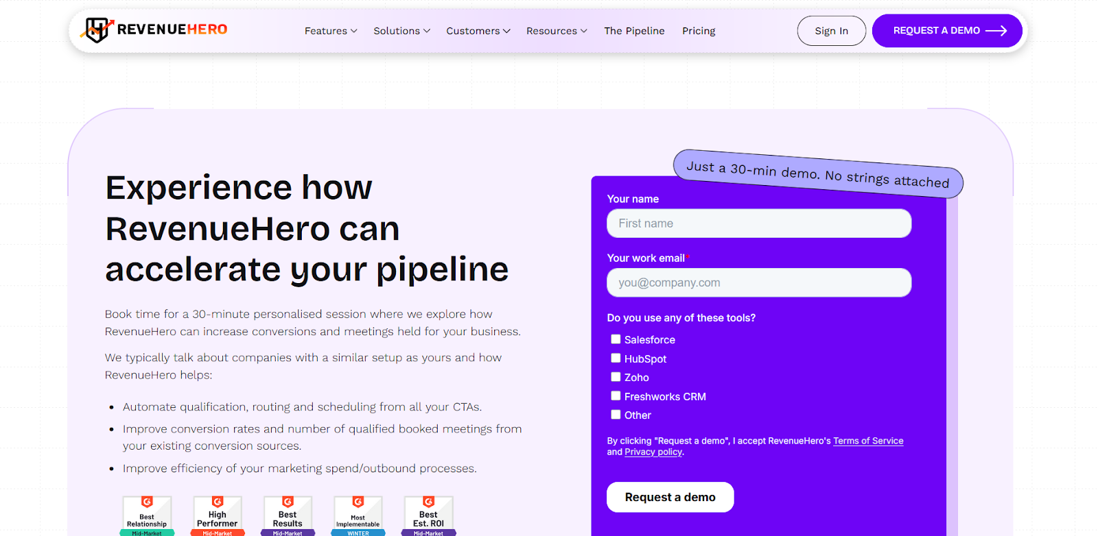
This is a rare example of a B2B signup that reads more like a guided pitch than a static form. Every checkbox in the form filters the user journey, allowing segmentation even before the call.
The standout: “Just a 30-minute demo. No strings attached” slotted as a speech bubble - conversational and human. However, the amount of text before the CTA may cause cognitive drag for speed-focused users.
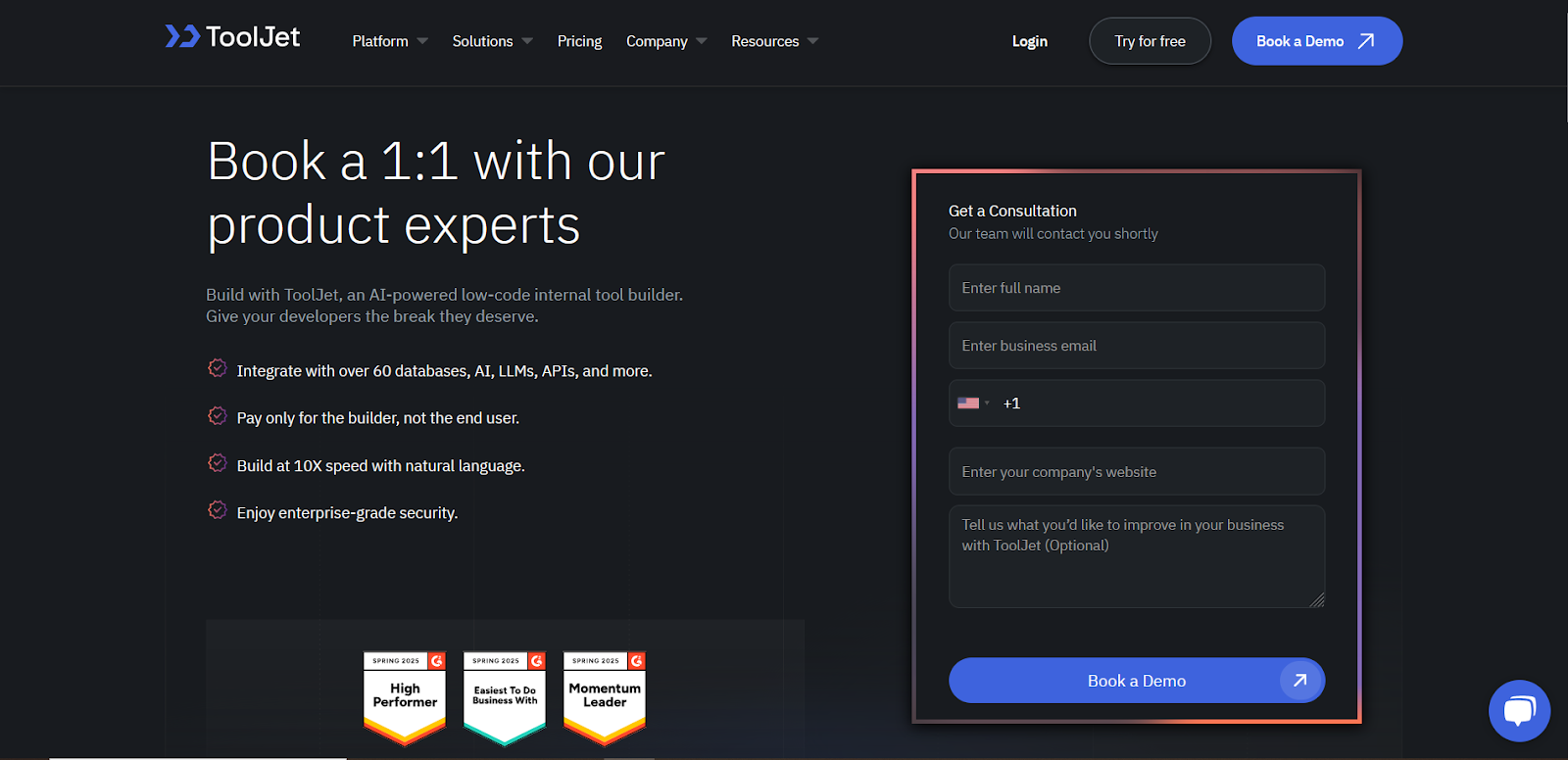
4. ToolJet
ToolJet's dark theme immediately signals their developer-focused positioning, while the consultation framework elevates perceived value. The optional feedback field provides qualification data without creating mandatory friction.
Their benefit statements use technical language that resonates with their engineering audience rather than generic business speak. The form structure mirrors enterprise sales processes, which aligns with their target market's expectations.
5. Instantly
Instantly uses numerical social proof strategically by highlighting "30,000+ clients" at the peak moment of decision-making. Their clean, minimal design removes cognitive load while the dual authentication options cater to different security preferences.
The benefit copy focuses on emotional outcomes ("surge in responses") rather than feature lists. Their approach treats sign-up as joining a successful community rather than starting a trial.
6. MailReach
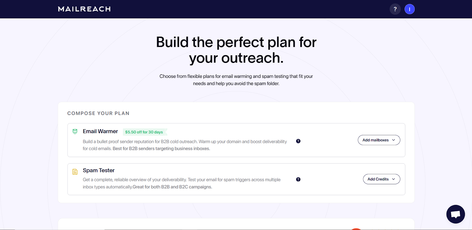
MailReach employs an asymmetrical layout strategy that balances simplicity with persuasion through environmental design.
The left-side form maintains minimal friction with just four fields, while the right panel creates a conversion-focused ecosystem filled with quantified benefits and social proof.
Their "137% average reply rate growth" statistic serves as a powerful anchor point that reframes the cost-benefit analysis in the prospect's mind. The testimonial placement capitalizes on the peak moment of decision-making uncertainty.
7. StudiesWithFriends
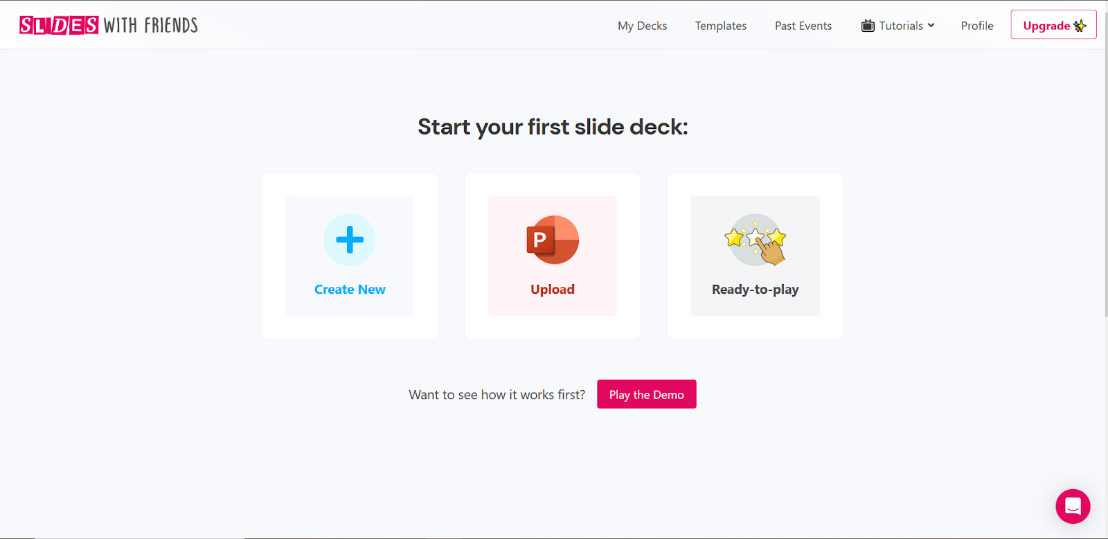
StudiesWithFriends revolutionizes onboarding through progressive disclosure, asking users to self-segment before traditional account creation. This psychological commitment technique increases completion rates by making users invest in the process before encountering friction.
The illustrated use-case options create mental ownership while the friendly visual design reduces the perceived formality of commitment. Their approach transforms sign-up from a transaction into a personalization journey.
8. Quipli
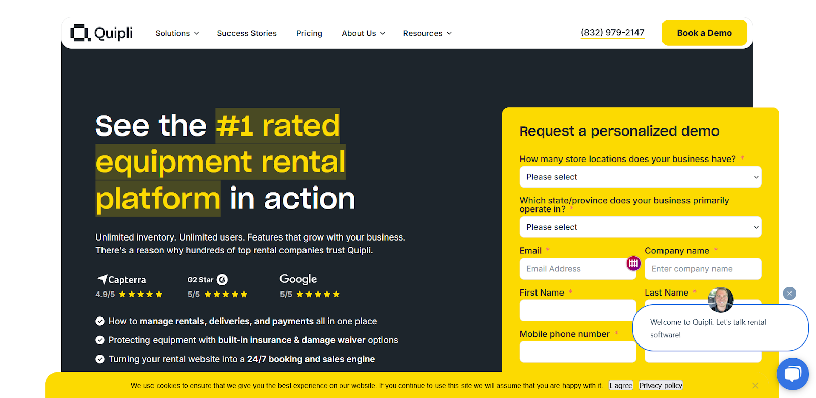
Quipli demonstrates sophisticated lead qualification through their demo request form, collecting business intelligence that enables personalized sales conversations.
The qualifying dropdown questions about store locations and geographic focus serve dual purposes: they segment prospects while making the form feel consultative rather than extractive.
Their bright yellow form against the dark background creates unmistakable visual priority while the extensive benefit list justifies the higher information commitment required.
9. Fyno
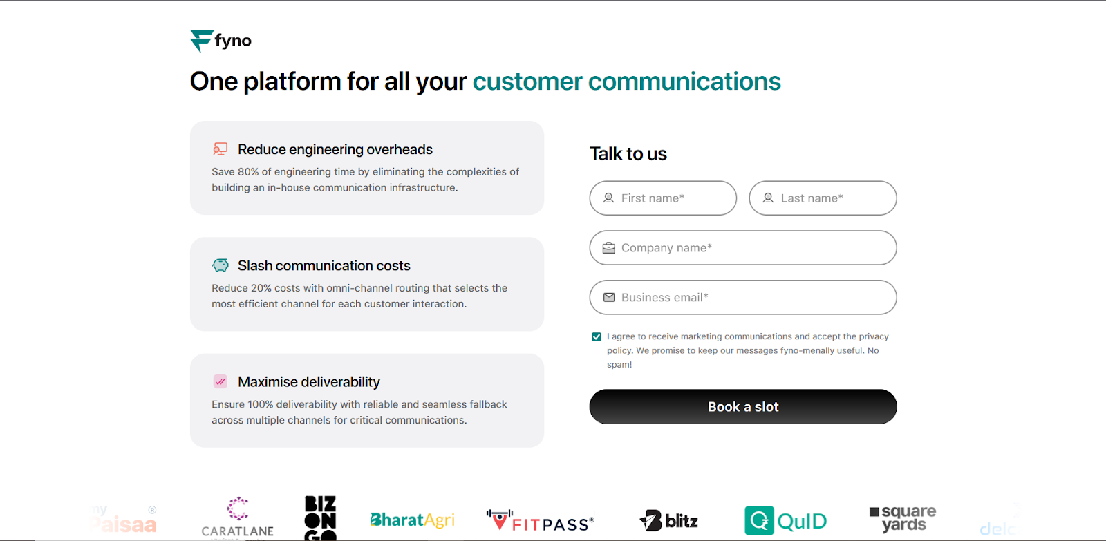
Fyno's clean, developer-focused design philosophy extends to their sign-up experience, emphasizing technical benefits over emotional appeals.
The benefit blocks use quantified claims like "Save 80% of engineering time" that speak directly to their technical audience's decision-making criteria.
Their minimal form design removes cognitive friction while the enterprise logo social proof bar establishes credibility without overwhelming the interface. The approach treats sign-up as an engineering evaluation rather than a marketing conversion.
10. Autocab
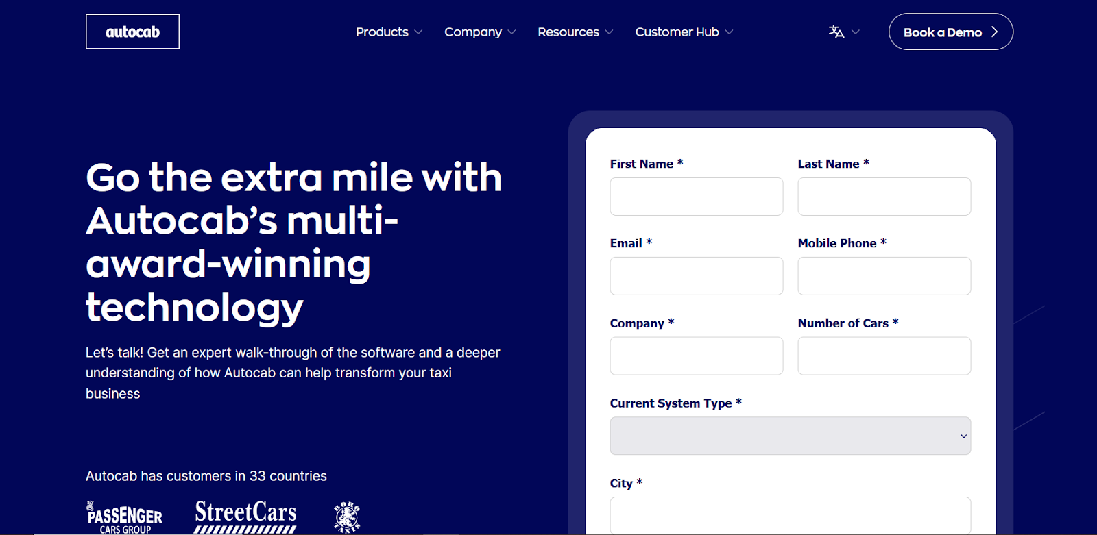
Autocab’s sign-up experience feels enterprise-grade from the first scroll — dense, form-forward, and unapologetically thorough. The deep navy palette signals seriousness, while the full-width form with granular fields (down to “Number of Cars” and “Current System Type”) makes one thing clear: this isn’t for casual users.
There’s no soft sell - just a hard pivot into qualification. While it may overwhelm smaller prospects, it suits the B2B fleet decision-maker who’s already comparing vendors. The brand tone is confident, but leans transactional over welcoming.
It’s pretty evident that while each sign-up page reflects its brand’s personality, the best-performing ones have something in common: they respect the user’s time, intention, and mental state.
But how do you strike the right balance between persuasion and simplicity? Between data collection and trust-building? Between form and feeling?
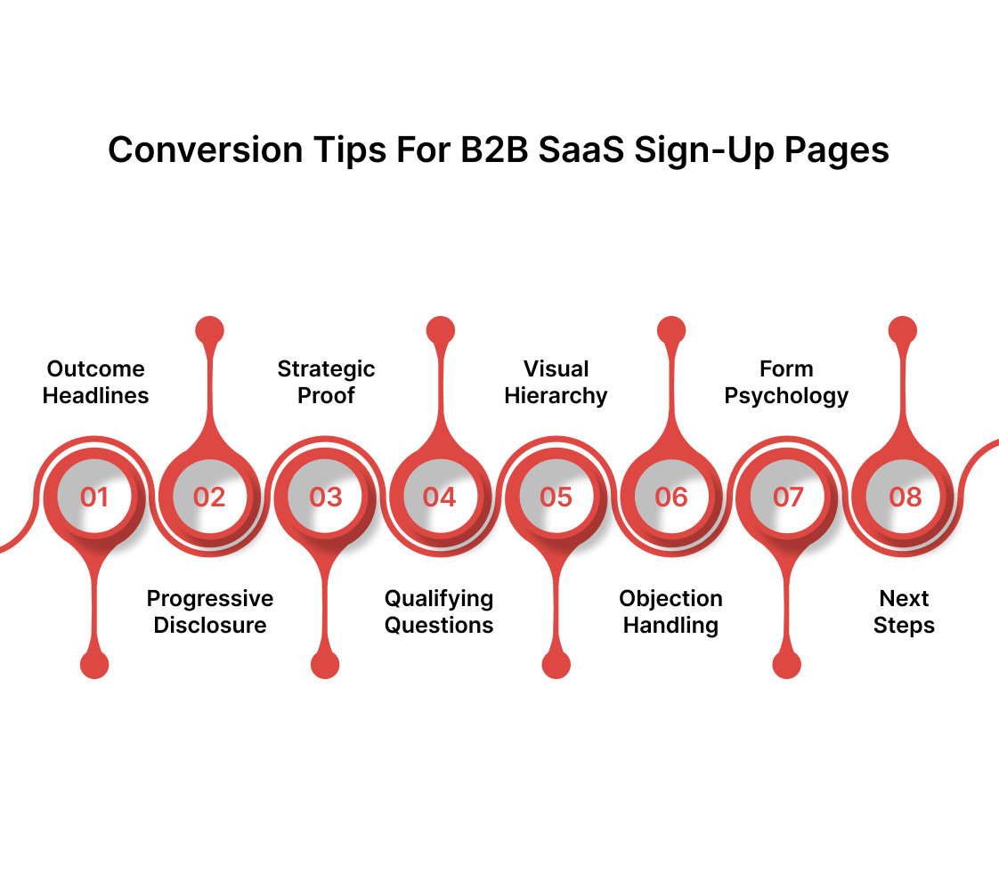
Tips for Designing a Conversion-Optimized Sign-up/Demo Request Page for B2B SaaS
Building an effective sign-up experience requires understanding the delicate balance between information gathering and user experience optimization.
The most successful pages treat every element as a strategic decision rather than a design afterthought. Each component should work together to create a seamless progression from interest to commitment.
- Lead with outcome-focused headlines rather than feature descriptions - Users care about results they'll achieve, not the technical capabilities of your software. Replace generic phrases like "Powerful CRM platform" with specific benefit statements like "Close 40% more deals with automated follow-up sequences."
- Implement progressive disclosure for complex products - Break information requests into logical steps that feel like natural conversation progression. Start with basic contact information, then layer in qualifying questions that demonstrate your understanding of their business challenges.
- Position social proof strategically at decision points - Place testimonials, logos, or usage statistics at moments when users experience the highest uncertainty. The most effective placement occurs immediately adjacent to your primary call-to-action button.
- Use qualifying questions as value demonstrations - Transform necessary lead qualification into consultative experiences by framing questions around business outcomes. Instead of asking "Company size," ask "How many sales reps need pipeline visibility?"
- Create visual hierarchy that guides attention naturally - Design your page layout so users' eyes move logically from value proposition to social proof to form completion. Use contrast, spacing, and color psychology to create an invisible conversion pathway.
- Address the primary objection in your value proposition - Most B2B buyers worry about implementation complexity, time investment, or integration challenges. Surface these concerns immediately and provide clear reassurance through your messaging and social proof selection.
- Optimize form fields based on conversion psychology - Minimize required fields while maximizing perceived value. Each additional field should either qualify the lead more effectively or provide information that enables better initial conversations.
- Show what happens next: A single line below the CTA, like “You’ll get a calendar invite instantly” could reduce post-click anxiety.
How Beetle Beetle Can Help
At Beetle Beetle, we design sign-up flows that reflect product clarity and business maturity. Our team has worked with 100+ SaaS brands ( from YC-backed startups to growth-stage players), shaping conversion paths that feel natural, not forced.
We obsess over the micro-decisions users make between “maybe” and “book a demo.” That means message hierarchy, layout logic, visual confidence, and real-world use cases all get tightly aligned.
Let’s build a sign-up experience your users won’t abandon. Book a call to discuss your vision and goals.
Frequently Asked Questions
1. What's the ideal number of form fields for a B2B SaaS sign-up page?
A: For trials, limit to 3-4 fields (name, email, company). Demo requests can handle 6-8 if they qualify leads effectively. Each field should serve your sales process. Test configurations to balance lead quality with conversion rates.
2. Should I require a credit card for free trials?
A: Credit cards reduce sign-ups by 20-40% but improve trial-to-paid conversion. Skip for high-touch sales processes, require for self-service products. Consider your business model and average deal size.
3. Single-step or multi-step sign-up forms?
A: Multi-step works better for complex B2B products requiring commitment. Single-step suits simple products, prioritizing low abandonment. Choose based on deal size and sales cycle complexity.
4. What social proof works best on B2B sign-up pages?
A: Customer logos from target market companies, specific testimonials with metrics, and usage statistics like "trusted by 10,000+ teams." Avoid mixing too many types; focus on addressing primary prospect concerns.
5. How can I reduce form abandonment?
A: Use real-time validation, progress indicators, minimize required fields, and offer multiple sign-up options (Google SSO, email). Address objections directly and ensure mobile optimization.


