


You must have come across those B2B SaaS websites where the product screenshots look like they were taken during a coffee break. Or maybe the generic dashboard mockups that tell you absolutely nothing about what the software actually does.
Perhaps it was Slack's early wireframe-style illustrations that made you wonder why some companies nail visual communication while others stumble.
Achieving that sweet spot where the design complements your message, enhances understanding, and drives conversions is a balancing act. Many brands still struggle to achieve this balance.
The visuals either become too complex, confusing the viewer, or too vague, leaving a gap in understanding. So, how can you get it right? How do you make sure your audience can quickly grasp your product’s value without getting lost in details or oversimplification?
Before we get into that, let’s quickly go over the basics, shall we?
Key Insights:
- Your style choice matters more than your design skills: Enterprise buyers trust realistic visuals. Startup founders respond to stylized approaches. Get this backwards and you're undermining your credibility before anyone reads your copy.
- Tools won't save a bad strategy: Adobe Illustrator can't fix unclear messaging. Procreate won't make your brand voice consistent. Master your communication goals first, then worry about software.
- Brand misalignment kills conversions: Beautiful illustrations that feel disconnected from your brand confuse prospects. If your visuals don't reinforce your positioning, they're working against you.
- Most teams overthink and underdeliver: Complex doesn't mean effective. The best product illustrations communicate one clear concept simply. Everything else is noise that reduces understanding.
What Is Product Illustration for SaaS?
Product illustration translates software functionality into visual stories that make sense at first glance. Think beyond basic screenshots or boring interface captures.
Companies like MailReach use custom illustrations to show email deliverability concepts through visual metaphors that instantly communicate complex technical processes.
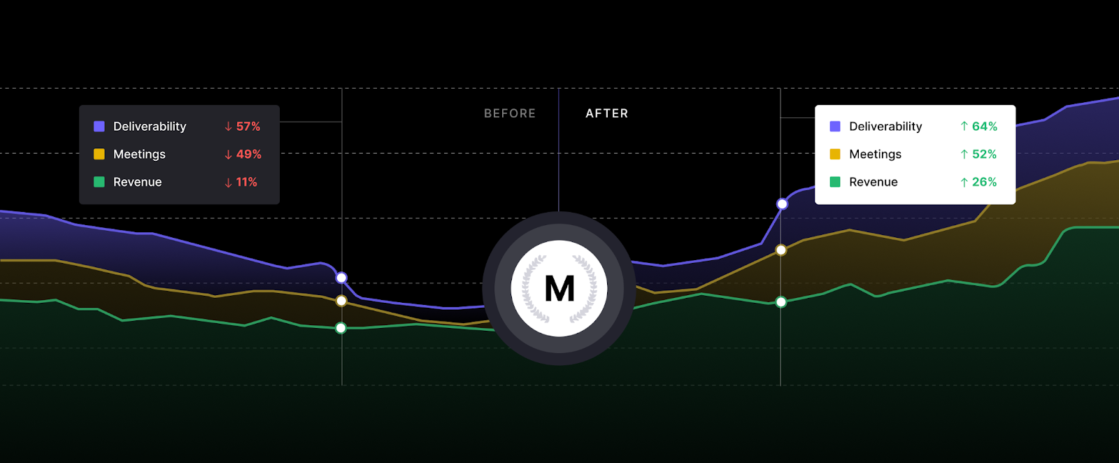
Source: https://www.mailreach.co/
These aren't decorative graphics but strategic communication tools that bridge the gap between what your software does and what users actually see happening.
The style you choose sends a message before users even read your copy. Your visual approach needs to match both your product's personality and your audience's expectations.
Different Styles of Product Illustration
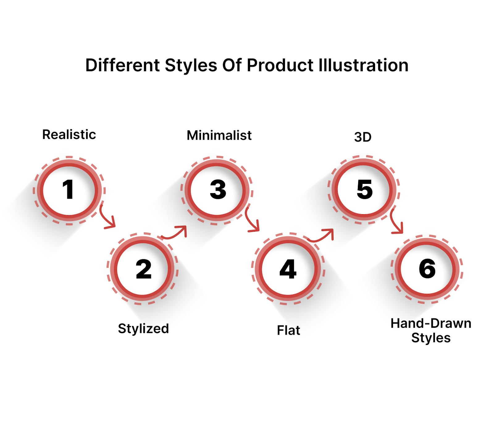
When it comes to product illustration, the style you choose can say a lot about your product. The right style can make a complex tool look easy to use, while the wrong one can confuse your audience.
- Realistic vs. Stylized: Realistic illustrations provide an in-depth, almost lifelike view of your product, while stylized visuals tend to simplify the product’s features to their most essential elements. Choosing the right one depends on your brand’s tone and the level of detail you want to convey.
- Minimalist, Flat, 3D, and Hand-drawn Styles: From minimalist, which focuses on sleek, clean visuals, to 3D, which adds depth and complexity, each style serves different purposes. Hand-drawn styles often evoke a sense of creativity, while flat designs make the experience more modern and user-friendly.
- Choosing the Right Style: Your product type should guide the decision. For a complex, feature-rich platform, realistic or 3D may help communicate the depth. For a more straightforward SaaS offering, minimalist or flat styles may better capture the essence.
Once you've settled on a style direction, the next challenge becomes execution. The tools you choose will either support your vision or limit what's possible.
Tools You Need to Create Stunning Product Illustrations
You don't need a massive budget to create professional illustrations, but you do need the right tools for your skill level and project requirements.
- Adobe Illustrator: Ideal for creating vector-based, scalable product illustrations. Perfect for precise lines, detailed shapes, and logos. Best for high-quality, professional-grade designs.
- Procreate: Excellent for hand-drawn or stylized illustrations. It offers a natural drawing experience, especially for those working on a tablet. Great for more organic, creative designs.
- Sketch: Best for UI/UX design and web-based product illustrations. Simple, clean, and efficient, with a strong focus on vector work. Ideal for digital products and web mockups.
- Affinity Designer: A strong alternative to Illustrator with a one-time payment option, offering vector and raster graphics capabilities. Great for versatile, cost-effective design work.
- CorelDRAW: Great for detailed vector work with excellent text management. Ideal for multi-page documents and product illustrations that require a bit more polish and intricate detailing.
- Figma: Primarily used for UI design and prototyping, but can also be used for product illustrations, especially for SaaS platforms. Collaborative and cloud-based, making it easy to work in teams.
Free vs. Paid Tools: If you’re on a budget, there are solid free alternatives like Inkscape or GIMP that can still deliver impressive results. While paid tools like Adobe Photoshop offer more advanced options, free tools often suffice for simpler projects or getting started.
Getting comfortable with tools solves the technical side, but it doesn't guarantee that your illustrations will align with your brand’s core identity. That requires understanding how visuals connect to your broader brand strategy.
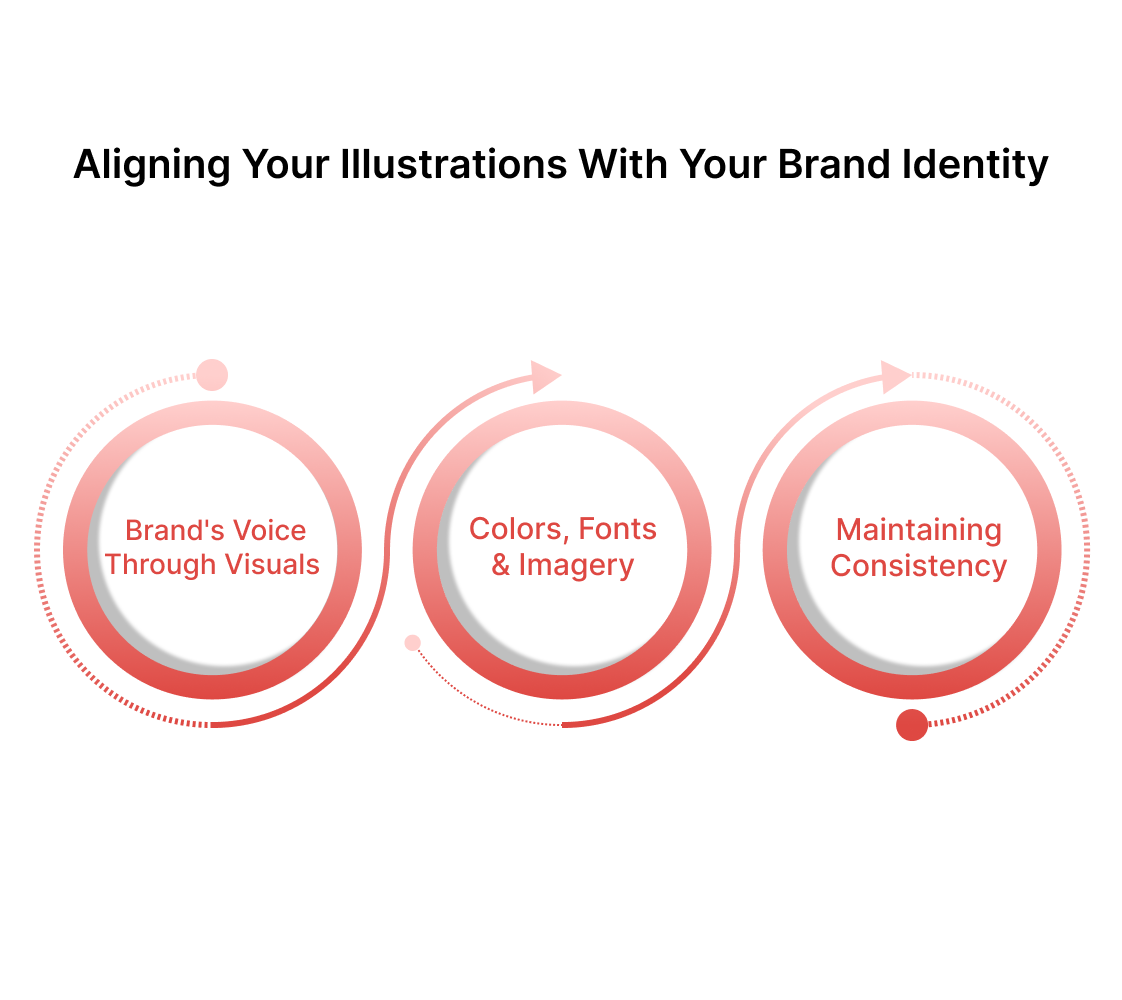
Aligning Your Illustrations with Your Brand Identity
Your illustrations should feel like a natural extension of your brand voice, not a separate creative exercise. When someone sees your visuals without context, they should still recognize your company's personality and values.
This happens through deliberate choices about visual elements that reinforce rather than compete with your brand message.
1. Carving out your brand's voice through visuals
Brand voice translates into visual language through consistent stylistic choices. A playful brand uses rounded shapes, bright colors, and informal compositions. Professional brands lean toward clean lines, structured layouts, and restrained palettes.
Your illustrations need to speak the same language as your copy, creating unified experiences that reinforce your positioning.
2. The role of colors, fonts, and imagery in product illustration
Colors trigger emotional responses before conscious thought kicks in. Your choices should align with your brand palette while serving the functional purpose of guiding attention and creating hierarchy.
Typography in illustrations needs to match your brand fonts or complement them harmoniously. Imagery style should reflect your brand's relationship with your audience - formal, casual, technical, or approachable.
3. Maintaining consistency across platforms
Consistency doesn't mean copy-paste the same thing everywhere. A LinkedIn post needs different dimensions than a website hero image. But the style should feel connected. Create guidelines so anyone on your team can make illustrations that belong together.
Brand alignment creates the foundation, but it won't help if your illustrations are too clever for their own good.
Brand consistency compounds over time, building recognition that makes your content instantly identifiable in crowded markets. Each illustration either reinforces or weakens this recognition depending on how well it aligns with your established visual language.
This brings us to our next point.
Balancing Creativity with Functionality
Here's where most SaaS companies lose their way. Creative illustrations grab attention, but functional design converts visitors into customers. The tension between these goals creates the biggest challenge in product illustration.
1. Keeping the illustrations practical and informative
Every visual element should serve a communication purpose beyond looking attractive. Icons need to be immediately recognizable. Color coding should follow logical patterns that users can learn and apply.
Compositions should guide the eye toward the most important information first. When creativity serves these functional goals, it enhances rather than distracts from your message.
2. Avoiding over-complication
Complex illustrations might showcase your design skills, but they often fail at their primary job of communication.
- Remove elements that don't directly support your core message.
- Use white space strategically to give important elements room to breathe.
- Test your illustrations by showing them to people unfamiliar with your product - if they can't understand the main point within seconds, simplify further.
3. Using illustrations to highlight key product features
Illustrations excel at making abstract software features concrete and understandable. Show workflows in action rather than static interface screenshots. Use visual metaphors that connect unfamiliar concepts to familiar experiences.
Highlight the outcomes and benefits of features rather than just their mechanics. Transform feature lists into visual stories that demonstrate value.
4. Testing illustrations with real users
Your internal team already knows how your product works, which makes them terrible judges of whether your illustrations actually communicate clearly. Get your visuals in front of people who've never seen your product before.
Watch how long it takes them to understand the main concept. Notice where their eyes go first and what questions they ask. Real user feedback reveals gaps between what you think you're communicating and what people actually see.
This balance between creativity and function becomes your guiding principle, but even well-intentioned efforts can derail when common mistakes creep into the process.
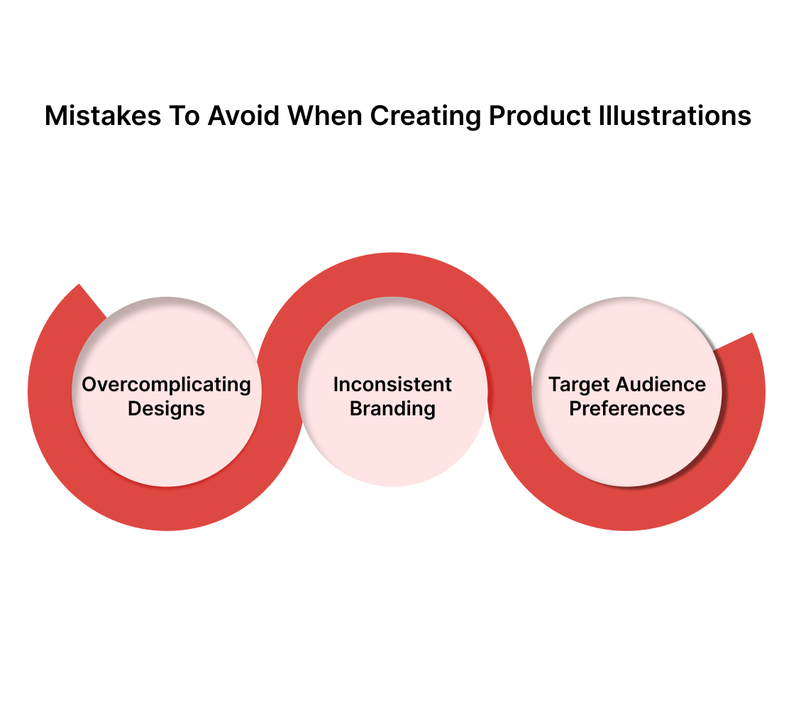
Mistakes to Avoid When Creating Product Illustrations
Even companies that understand these principles can stumble when execution doesn't match intention. These mistakes are easier to prevent than fix after launch.
1. Overcomplicating designs and losing focus
Adding more visual elements may feel like you are adding more value, but it usually creates confusion instead. Each additional element competes for attention and dilutes your main message.
Stick to one primary concept per illustration. Use supporting elements sparingly and only when they genuinely enhance understanding. When in doubt, remove rather than add.
2. Inconsistent branding or unclear messaging
Inconsistent visual styles make your company look disorganized and unprofessional. Mixed color schemes, varying illustration styles, and conflicting messages create cognitive friction that reduces trust.
Establish clear guidelines and stick to them across all materials. Train team members on brand standards or centralize illustration creation to maintain consistency.
3. Ignoring target audience preferences
Beautiful illustrations that don't resonate with your audience waste resources and miss conversion opportunities. Enterprise buyers expect different visual approaches than startup founders.
Technical audiences appreciate different levels of detail than business users. Research your audience's visual preferences and test your illustrations with real users before committing to large-scale implementation.
The Reality Check
With these elements in place, you're now prepared to create product illustrations that not only look great but also communicate effectively. But here's the thing: knowing what needs to be done and actually executing it are completely different challenges.
You're already juggling product development, customer acquisition, fundraising, and team management. Adding illustration design to that list means either sacrificing quality on something else or stretching your team beyond capacity.
Most internal teams produce illustrations that technically check all the boxes but miss the subtle elements that make visuals truly compelling. The spacing feels off. The color choices seem arbitrary. The metaphors don't quite land with the target audience, and so on..
When your product illustrations are holding back conversions, the cost of amateur execution quickly exceeds the investment in professional expertise, are we right or are we right?.
Take a Shortcut with Beetle Beetle
We've worked with over 100 B2B SaaS companies, from seed stage through Series C. At Beetle Beetle, our method is built on market research about what actually drives conversions in different industry verticals.
We know how enterprise buyers process visual information differently from SMB decision-makers because we've tested it thousands of times.
Most agencies deliver beautiful artwork that misses business objectives. We start with your conversion goals and work backward.
Our clients typically see 40-60% better page engagement and 25% more demo requests within three months. We handle everything from concept to final files so your team can focus on what they do best.
Ready to turn your illustrations into conversion assets? Schedule a strategy call today to see how we can fix your visual communication.
FAQs
1. What is product illustration, and why is it important for SaaS businesses?
Product illustration is the visual representation of a product, designed to communicate its features, benefits, and functionality. For SaaS businesses, it simplifies complex ideas, making it easier for potential customers to understand the value your software provides.
2. How do I choose the right style for my product illustrations?
The style should reflect your product’s personality and align with your brand identity. For example, minimalist styles work well for clean, user-friendly SaaS platforms, while more detailed or 3D illustrations may be needed for complex products. It’s important to match the visual style to the complexity and tone of your offering.
3. What tools are best for creating product illustrations?
Popular tools like Adobe Illustrator, Procreate, and Affinity Designer are widely used for creating high-quality product illustrations. For beginners, free tools such as Inkscape or GIMP can still produce solid results without the steep learning curve.
4. How can product illustrations improve customer engagement?
Effective product illustrations make it easier for potential customers to quickly understand your software’s features and benefits. Well-designed visuals can enhance user experience, boost confidence, and lead to higher conversion rates by simplifying complex information.
5. Can product illustrations be used in marketing materials?
Absolutely. Product illustrations are versatile and can be used across a variety of marketing materials, including websites, brochures, social media ads, and email campaigns. They not only capture attention but also reinforce your brand’s messaging and product benefits.


