

Navigation design is the strategic arrangement of menus, links, and interface elements that help users find information and improve their experience. The global web design services market is projected to grow at a CAGR of 8.5% from 2023 to 2030, reflecting the demand for intuitive designs. For fast-growing B2B SaaS companies, creating effective navigation can feel complex when aiming to increase customer acquisition and conversion rates.
A well-planned structure simplifies the user journey, making content easier to access and reducing friction. Different patterns, from side menus to full-screen layouts, offer unique advantages depending on the site’s structure. This blog examines proven navigation design patterns that can enhance user engagement on B2B SaaS websites.
Key Takeaways:
- Improved User Experience: A well-structured navigation system simplifies the user journey, allowing visitors to find key content effortlessly. Intuitive design patterns reduce user frustration, encouraging longer site visits and engagement.
- User Retention: By implementing responsive and accessible navigation designs, websites ensure that users can easily return to key sections, leading to a better overall experience and higher retention rates.
- Optimized for Mobile Users: Mobile-responsive navigation patterns, such as bottom bars and hamburger menus, ensure a smooth experience across devices, allowing users to navigate without any loss of functionality.
- Enhanced SEO Performance: Well-organized navigation not only benefits users but also helps search engines crawl and index your site more effectively, leading to improved visibility and rankings.
Importance of Navigation Design in Websites
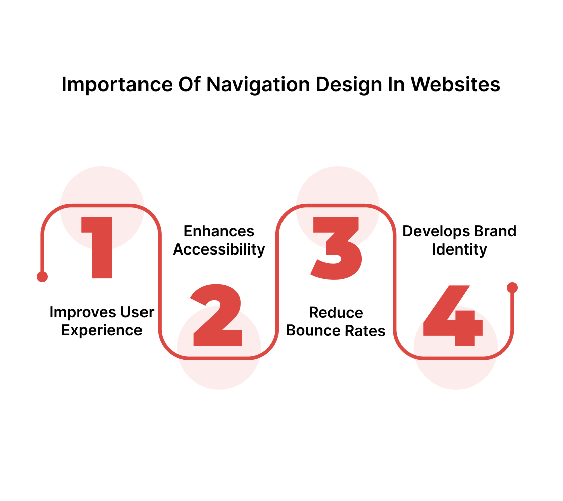
Navigation design serves as a roadmap, guiding users to the content or actions they are seeking, thereby increasing overall user satisfaction and engagement rates.
- Improves User Experience: An intuitive navigation design reduces the time spent searching for information, making the website more user-friendly and accessible.
- Enhances Accessibility: Navigation designs provide clear paths to related content or services, encouraging users to explore more pages on a website and increasing engagement rates.
- Reduce Bounce Rates: When users can easily navigate through a website, they're more likely to stay longer and visit more pages. Poor navigation, on the other hand, leads to frustration, resulting in increased bounce rates.
- Develops Brand Identity: A consistent navigation design is an integral element of a B2B SaaS design, helping improve brand identity and credibility. A navigation design pattern also provides a cohesive user experience through the use of color schemes and layouts.
Let's explore some of the popular navigation designs popular among B2B SaaS websites in 2025.
10 Prominent Navigation Design Patterns for Websites
A report suggests that, on average, every dollar invested in UX delivers $100 in returns, which translates to an ROI of 9.900%. Navigation designs play a prominent role in enhancing user experience, and the following navigation designs can help improve the engagement rates of SaaS websites.
1. Side Navigation
.png)
Source: Widelab website
Side navigation places the menu on the left or right side of the screen, offering a structured layout for websites with multiple sections.
Why it works:
- Organizes Complex Data: By stacking links vertically, side navigation accommodates numerous categories and subcategories without overwhelming the visitor with excessive data.
- Enhances Scannability: Web visitors can quickly scan the list of links, making it easier to locate desired sections, especially on content-rich sites.
- Maintains Accessibility: A website with a side navigation layout remains consistent across various screen sizes, including mobile devices, desktops, and more, ensuring navigation remains accessible.
2. Top Navigation

Source: Lightmatter website
Top navigation, also known as horizontal navigation, places the menu bar at the top of the page, typically above the primary content. Such navigation design patterns are suitable for websites with fewer sections.
Why it works:
- Simplicity: The top navigation's compact layout provides immediate access to the key sections of a website without cluttering the web page.
- Better User Experience on Mobile: This is a typical pattern found in optimized websites for mobile devices, which adapt well to dropdown menus and hamburger icons.
- Focused Navigation: A website with a top navigation layout enables the primary sections to be visible, allowing users to access data with minimal distractions.
3. Breadcrumb Navigation

Source: Shein website
Breadcrumb navigation shows the user's current location within a website's hierarchy and is displayed as a series of clickable links.
Why it works:
- Enhances Website Usability: Breadcrumbs improve overall navigation by guiding users back to higher-level pages with fewer clicks.
- Improves SEO: Breadcrumb navigation helps search engines understand the website's structure, enhancing SEO and crawlability, and increasing rankings by making internal links easier to follow.
- Higher Engagement Rates: With easy accessibility of the trail of links. Breadcrumbs reduce the likelihood of users feeling lost on complex websites, improving the overall user experience.
4. Full-Screen Navigation
Source: Canals Amsterdam website
Full-screen navigation is a navigation design pattern in which the menu expands to cover the entire screen, often using hamburger icons or other menu buttons.
Why it works:
- Better Visual Appeal: Utilizing the entire screen for navigation allows for a clean, focused interface without the constraints of smaller menu bars, making it visually appealing and user-centric.
- Streamlined User Interaction: The design encourages visitors to explore a website without distractions, making it ideal for websites with complex or multimedia content.
- Minimalistic Design: Full-screen navigation works well on mobile devices and is a popular choice for minimalist website designs, providing a clean and modern experience.
5. Dropdown Navigation
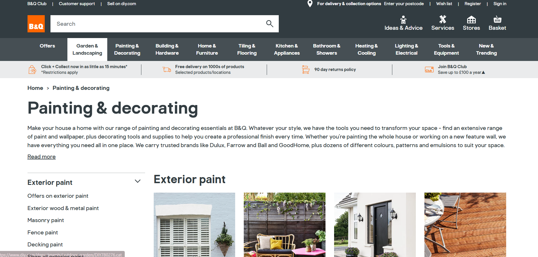
Source: B&Q website
Dropdown navigation design provides additional menu options when users hover or click on a menu item. It is common for websites with multiple categories or subcategories to use dropdown navigation that does not fit in the primary navigation bar.
Why it works:
- Efficient Space Utilization: By displaying submenus only when needed, dropdown navigation saves space while providing access to a wide range of options, making it effective for content-heavy websites.
- Improves User Interaction: It allows users to explore various sections of a website without being overwhelmed by multiple options upfront.
- Flexible for Complex Menus: Dropdowns can accommodate multiple levels of nested lines, making them ideal for hierarchical content.
6. Hamburger Menu
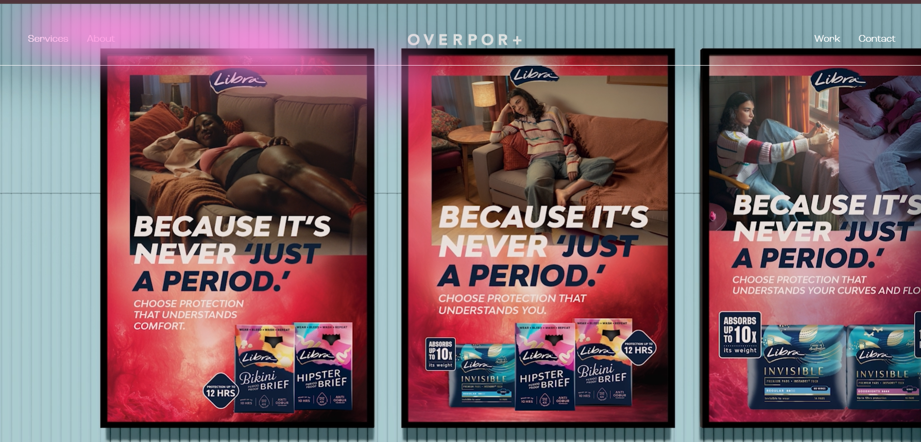
Source: Overport website
The hamburger menu is a compact navigation design where the menu is hidden behind the three-line icon, which expands when clicked or tapped. It is particularly common for mobile-responsive websites to provide an efficient way to save space.
Why it works:
- Promotes Focused Content: By hiding the menu until the user interacts with the icon, the hamburger menu helps to focus on the primary content, reducing distractions while browsing the site.
- Improves Mobile Experience: On mobile devices, a hamburger menu creates a user-friendly interface by consolidating the navigation into a single icon, making websites accessible.
- Space-Saving Design: The hamburger menu enables a minimalist layout, hiding navigation options, and is particularly useful for smaller screens with limited space.
7. Gesture-Based Navigation

Source: Diego Stevens Website
Gesture-based navigation enables users to interact with a website or app using touch gestures, such as swiping, pinching, or tapping, rather than relying on traditional navigation menus.
Why it works:
- Intuitive Interaction: Gesture-based navigation design utilizes familiar actions, such as swiping and pinching, which users frequently perform on their devices.
- Optimized for Touchscreens: The navigation pattern is ideal for mobile-first designs, providing smooth transitions between pages or sections without the need for visible menu bars, thereby enhancing the mobile user experience.
8. Bottom Bar
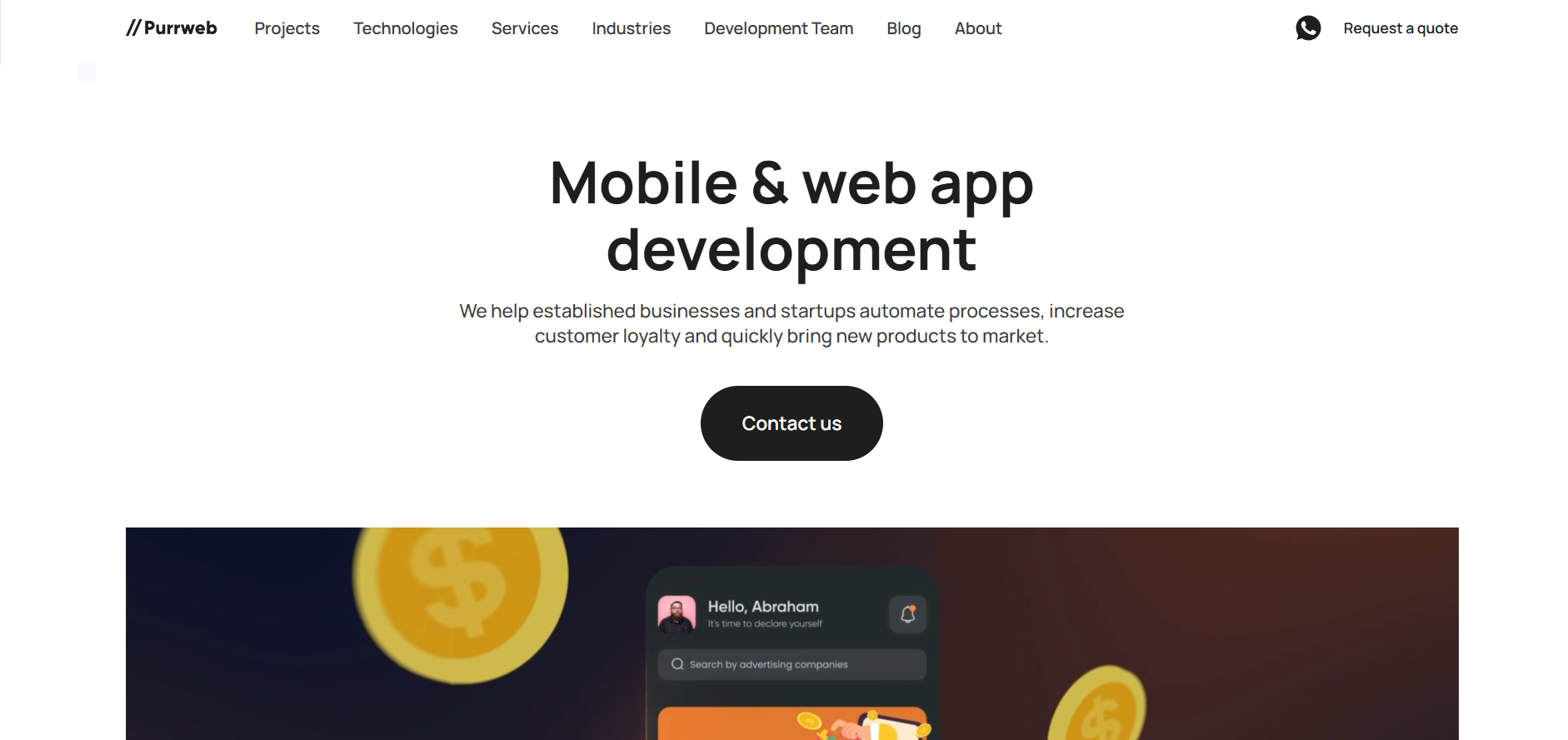
Source: Purrweb website
Bottom bar navigation places the menu at the bottom of the screen, often used in mobile apps and responsive websites.
Why it works:
- Optimized for Thumb navigation: Placing the menu at the bottom makes it more accessible for users to navigate with their thumbs, especially on larger mobile screens.
- Ideal for Shorter Content Pages: Bottom bar navigation is beneficial for websites and apps that focus on shorter, task-based interactions, keeping the primary screen clean and free for content.
9. Call-to-Action

Source: Patagonia website
Call-to-action (CTA) navigation is designed to direct users' attention to key actions or goals, such as signing up, making a purchase, or learning more.
Why it works:
- Improves Conversion Rates: By strategically placing CTA buttons in a navigation menu, SaaS B2B businesses engage their users with content, sign-up services, and more.
- Focused User Action: CTA navigation is designed to prompt the user to take a specific action without distraction, resulting in higher engagement and conversion rates.
10. Footer Navigation
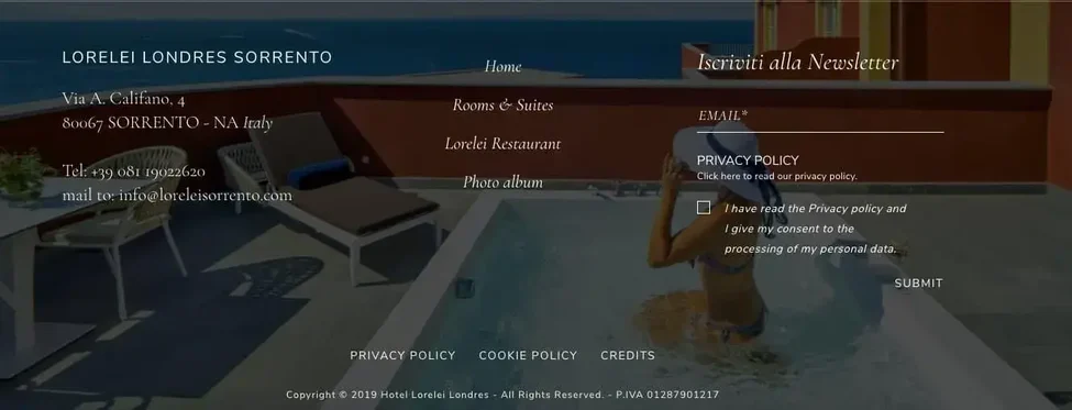
Source: Lorelei Londres website
Footer navigation appears at the bottom of a webpage, allowing users to access important links that may not fit in the primary navigation areas.
Why it works:
- Offers Secondary Information Access: Footer navigation design often includes less urgent links, such as terms of service or privacy policies, ensuring users find necessary information without cluttering the primary navigation.
- Enhances User Experience on Long-Form Pages: For websites with extensive content, footer designs allow users to access other sections without needing to scroll back to the top, increasing overall usability.
To integrate effective navigation designs into SaaS websites, let's explore the following best practices for navigation design.
Best Practices for Navigation Design Patterns

A well-designed navigation system helps web visitors quickly navigate through a website's content.
Here are some of the best practices to consider when designing navigation patterns for your B2B SaaS website:
- Consistency Across Pages: Users expect to find the same navigation elements in the same place on every page. Consistent placement and design reduce confusion, helping users feel more comfortable navigating your website.
- Mobile-Friendly Design: With 64% of website traffic already coming from mobile devices in 2025, it is essential to ensure navigation works across all screen sizes. Consider responsive designs, such as hamburger menus or bottom bar navigation, for a smooth experience.
- Test With Real Users: Conduct usability tests, A/B tests, or gather feedback to understand how users interact with your site and refine your navigation design based on their behavior.
- Clear and Descriptive Labels: Use concise, descriptive text for navigation items so users immediately understand what each link offers. Avoid jargon and keep labels action-oriented where relevant.
- Prioritize Key Actions: Place the most important links, such as product details, pricing, or sign-up, where they are easily visible and accessible. This supports faster decision-making and higher engagement rates.
- Limit Menu Depth: Keep the navigation structure shallow, ideally with no more than two levels of depth. It prevents users from feeling lost and speeds up access to essential content.
Also read: Most Overlooked Website UI UX Mistakes.
Now, let's explore how Beetle Beetle can help you revamp your B2B SaaS websites with effective navigation designs.
How Beetle Beetle Can Help With Navigation Designs?
Beetle Beetle specializes in revamping your B2B SaaS websites with user-friendly navigation designs that enhance user experience across websites. With a data-driven approach, we ensure that every design element is strategically placed to maximize user engagement.
Our team revamps websites with navigation designs that work effortlessly across devices, supporting both quick browsing and in-depth exploration. We apply information architecture, accessibility standards, and SaaS-specific UI patterns to enhance usability. This tailored approach enhances engagement, retention, and conversions, aligning your navigation design with measurable business outcomes.
Through in-depth user behavior analysis and usability testing, we refine navigation structures to ensure they align with your users' needs and expectations. We continuously monitor user interactions to identify areas for improvement and friction points, ensuring smooth navigation.
If you are looking to optimize your website's navigation design and enhance user engagement, hire Beetle Beetle today for designs that drive conversions.
FAQs
1. What are the best navigation design patterns for improving website usability?
The best navigation patterns include top navigation, side navigation, and dropdown menus. Each pattern should be chosen based on the site’s content and user needs for optimal usability.
2. How does mobile navigation design impact user experience and engagement?
Mobile navigation must be responsive, ensuring that menus adapt to different screen sizes. A well-optimized mobile design enhances usability, resulting in improved engagement and lower bounce rates.
3. Why is a clear visual hierarchy important in navigation design?
A clear visual hierarchy in navigation helps users easily find key sections. By prioritizing important content, it enhances user experience and ensures intuitive interactions, driving better website performance.
4. How can breadcrumb navigation enhance SEO and user experience?
Breadcrumb navigation improves SEO by providing search engines with a clear site structure. It also enhances user experience by enabling easy backtracking to higher-level pages, reducing user frustration.
5. What role does accessibility play in web navigation design?
Accessible navigation ensures websites are usable by all users, including those with disabilities. By following WCAG guidelines and incorporating features such as keyboard navigation, you enhance usability and improve SEO rankings.